Fenix: Move home screen 3 dot menu to bottom
on normal web content, 3 dot menu button is at bottom of screen as part of URL bar. But on Home screen 3 dot menu button is at top of screen alongside private browsing icon. I find it confusing, I have to look in 2 different places depending on browser context. Could 3 dot menu button (and private browsing button?) be at bottom of Home screen to match normal page content?
UX update:
Ok, let's move the 3-dot menu to the bottom as well as the new tab (+) icon and the search.
Would it be possible to launch that as A/B test against the current version?
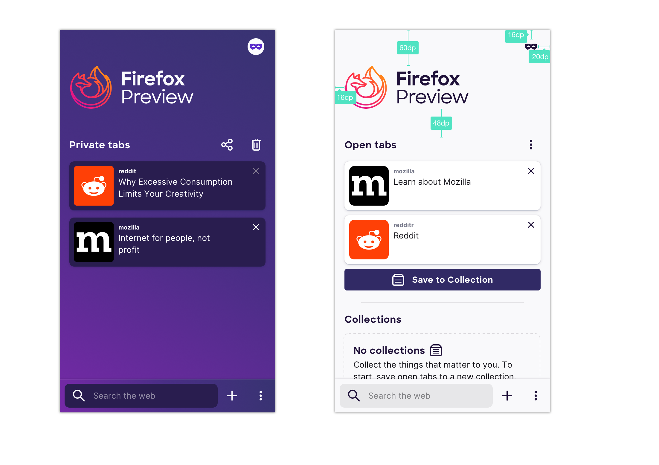
- animation stays as is
- menu moves to bottom bar from top right corner
- plus moves to bottom bar from open tabs section
Additional acceptance criteria:
- Include fixing all UI tests broken by this change.
 Cheap-Skate
All 13 comments
@vesta0 here's a design for moving the 3-dot menu and private mode to the bottom and also restructuring the home and site menus so that they align and people can rely on motor memory – access to history and bookmarks is also added as shortcut to the home screen menu (bottom row). I discussed this with @shorlander and we feel moderately confident about it and would love to monitor how it performs in the beta
https://mozilla.invisionapp.com/share/QSRWREJMV9D#/372970523_Latest
 topotropic
on 9 Jul 2019
topotropic
on 9 Jul 2019
@topotropic I like it -- had a question/feedback though -- why can't we also have the addressbar in the usual place instead of the whitespace between the mask and the new tab buttons?
If the addresbar was there, the user could simply open a new tab by typing instead of tapping the search or enter address input towards the top of the screen.
There is prior art for this in desktop -- open a private browsing window on desktop, and the address bar is present along with the search box in the viewport.
 yoasif
on 9 Jul 2019
yoasif
on 9 Jul 2019
@topotropic love the new design. Do we also want to move the Fenix logo higher (too much white space at top and make it smaller to make more room for tab visibility?
 vesta0
on 10 Jul 2019
vesta0
on 10 Jul 2019
Love the new design, makes more sense. Thanks
I like yoasif's idea, there's now a nice space in the bottom row for the search box. Advantages
(1) the search box and the + new tab icon do exactly the same thing, the search box is arguably redundant, but is a useful hint about how best to do a search
(2) the search box moves around the screen based on scroll offset, which I find irritating, I can't use muscle memory.
(3) when the search box is at the top of the screen it's hard to reach one handed, I have to scroll it down which is an extra step.
(I can file a separate issue on this if you like)
Cheap-Skate
on 10 Jul 2019
collecting homescreen related things into a single place for ux to take a look at. removing ux label.
 lime124
on 25 Jul 2019
lime124
on 25 Jul 2019
Launching a UR test week of 8/19, should have more insights by 8/21.
 liuche
on 16 Aug 2019
liuche
on 16 Aug 2019
@lime124 @vesta0 @liuche this is ready to be pulled into the next sprint if you want to, I updated the initial comment with the specs
topotropic
on 11 Sep 2019
@vesta0 since this is something that UX has prioritized so I assume it's important for Q3/Q4, so I'll just move these to the bottom of the Feature backlog.
liuche
on 12 Sep 2019
This is a lot of changes on the eng side, with a lot of areas for behavioral edge cases.
We'll also need to update UI tests.
We decided to have a spike to investigate the risks/issues/sizing of this issue, if we can break it down, and having a design review.
liuche
on 13 Sep 2019
@boek I added the private mode view to the initial issue https://github.com/mozilla-mobile/fenix/issues/561#issue-411172797
topotropic
on 20 Sep 2019
Tapping the + symbol and tapping the address bar behave identically (new tab)
I suggest:
- keep the tabs screen address bar behavior (new tab)
- remove the "+" and
- add the "tabs" button
- Tapping the "tabs" button from the "tabs" screen should take you back to the currently selected tab
- if no tabs are open, it should only show the address bar
Example
1.Browse the web
- Tap "tabs" button (takes you to tabs screen)
- On tabs screen:
3a. tap "tabs" button (takes you back to your open tab)
or
3b. type into the address bar (opens new tab. Current behavior)
 nahuhh
on 26 Sep 2019
nahuhh
on 26 Sep 2019
Thanks for the feedback @nahuhh; I agree, that it seems redundant – the advantage of having the plus there is that you can quickly go from browsing the web to a new tab by tapping twice in the same area (first tab on "Tabs" button, then on plus).
This is also part of a bigger effort to re-work new tab, home, open tabs and will most likely change in the near future. Thanks again for your feedback!
topotropic
on 26 Sep 2019
Verified as fixed in the latest Nightly build from 9/25 using Samsung Galaxy S10+(Android 9).
Please note that the navigation bar works as expected.
Based on my comment I will close this issue.
 abodea
on 26 Sep 2019
abodea
on 26 Sep 2019
Related issues
topotropic
·
3Comments
abodea
·
3Comments
 csadilek
·
3Comments
abodea
·
3Comments
csadilek
·
3Comments
abodea
·
3Comments
 AndiAJ
·
3Comments
AndiAJ
·
3Comments