Fast: Style Extensibility in FAST Components
Style Extensibility in FAST Components
Overview
This document will outline the goals and requirements for how components in this library can be stylistically customized by app authors. It will then put forth several implementation options, detailing the pros and cons of each. The goal of this document is to help FAST maintainers determine which approach to styling extensibility we will support for this library.
Goals
@microsoft/fast-components aims to be exceptionally flexible regarding the visual design customization capabilities of the system. Components will be delivered out-of-box with Microsoft's design opinion, but these opinions must be easy to comprehensively override or augment to achieve other design opinions as well as address casual application concerns. With that in mind, the core style override scenarios identified for any piece of UI are:
- change CSS properties of a single or set of component instances.
- change CSS properties for all instances of a component.
- component extensions, where component A' extends component A.
Non-goals
In the future, we would like to provide extensibility points for recipes (derived custom properties that cannot be calculated in CSS today).
This includes:
- register and use new recipe(s) for an existing component
- replace the implementation of a recipe for all consumers of that recipe name
These are non-goals because adding those capabilities will not affect how an app author goes about writing the CSS to override the component properties. The recipes as specced today will generate custom CSS properties, so a mechanism to adjust which properties are available and what the values of those properties are will not impact how the properties are assigned to CSS properties of an element.
Problem space
The primary complication for these scenarios stems from the desire to enable styling elements rendered in the shadow tree. By default, elements existing in a component's shadow tree cannot be styled externally. This means that an app-author cannot, by default, adjust the visual design of component internals aside from those assigned to custom css properties.
Solutions
There are two general models we can use to address our goals:
- expose configurable elements as CSS Shadow Parts
- expose custom CSS properties for all configurable properties of an element
- Custom properties penetrate shadow trees, allowing app authors to change those values and adjust styling of component internals
CSS Shadow Parts
CSS Shadow Parts are the platform's answer to this problem. By exporting as Shadow Parts the notable and styled elements of our custom components, we provide ample opportunity to add and override arbitrary CSS values on exposed shadow tree elements. Goals 1. and 2. are easily addressed with the following:
<!-- shadow-root -->
    <div part="container">
        <slot></slot
    </div>
<!-- end shadow-root -->
```css
/* Adjust all instances /
fast-custom-element::part(container) {
/ Change existing property */
background-color: red;
   /* Add arbitrary new property */
   border: 1px solid blue;
}
/* Adjust a single instance */
fast-custom-element.fancy::part(container) {
border: 1px dashed yellow;
}
Goal 3. is also easily facilitated using Shadow Parts. First, we'll create some quick markup and CSS to power a *neutral button* style.

```html
<!-- ButtonTemplate -->
<!-- shadow-root -->
    <button part="root">
        <slot></slot>
    </button>
<!-- end shadow-root -->
/**
 ButtonStyles
 */
/**
 Default button styles.
 Note that we're using design-system values directly in this stylesheet
 */
button {
    width: auto;
    height: calc(1em * var(--density) + 1em);
    padding: 0 calc(var(--design-unit) + var(--design-unit) * var(--density) * 2);
    background: var(--neutral-fill);
    color: var(--neutral-foreground);
}

button:hover {
    /* ... */
}
Next, we'll create a new stylesheet that overrides a few of the neutral button styles. We'll then compose the new stylesheet with the ButtonStyles stylesheet and ButtonTemplate:
/**
 AccentButtonStyles
 */
button {
    background: var(--accent-fill);
    color: var(--accent-fill-cut);
}
button:hover {
    /* ... */
}
@customElement({
    name: "fast-accent-button",
    template: ButtonTemplate,
    dependencies: [css`${ButtonStyles}${AccentButtonStyles}`],
})
export class FastAccentButton extends Button {}
We now have an accent button with a few overrides to the default button, which can also be overridden in the same way the default button can be overridden.
Pros of CSS Shadow Parts
- CSS Shadow Parts significantly reduce the volume of component-specific custom properties, which has several advantages:
- reduced surface area for bugs
- reduces variable mappings that must be resolved during the paint process, speeding up render performance
- Reduced code volume leads to smaller payload
- Easier to understand override scenarios and fewer named keys that app-authors need to remember when override scenarios arise.
- App authors can override any CSS property, not just the exposed custom properties.
- When custom properties serve as a component's public style API, we get stuck as the middle-agent balancing opportunities to override on one hand and code bloat on the other. Shadow Parts allow arbitrary overrides without any default code-bloat by the library.
- It's the answer to this exact problem by the platform.
Cons of CSS Shadow Parts
- Support for CSS Shadow Parts is not exhaustive. While supported by Firefox and Chromium, latest Safari does not support CSS Shadow Parts. It does look like it was released as part of #94 tech preview October 2019.
- Utilizing CSS Shadow Parts as the primary extensibility point limits how an override can be performed, in the same way that other pseudo-classes and elements are limited. CSS Shadow Parts cannot be selected for from the style attribute of an element, so the style attribute cannot be used as an extensibility point to override parts of a component.
CSS Custom Properties
The other model for providing extensible styles for custom elements is to expose a large number of custom CSS properties that each component uses in their stylesheet. Because custom properties penetrate shadow trees, this provides and extensibility point for authors to control the values used by custom element stylesheets. Lets see how our button component would be implemented in this model:
/**
 ButtonStyles
 */
/**
 * Default button styles. Note that we've defined an custom property API (of sorts) with the following:
 * --button-height
 * --button-padding
 * --button-fill-rest
 * --button-foreground-rest
 * ...
 * We've also provided fallback values in case none of these properties exist
 */
button {
    width: auto;
    height: var(--button-height, calc(1em * var(--density) + 1em));
    padding: var(--button-padding, 0 calc(var(--design-unit) + var(--design-unit) * var(--density) * 2));
    background: var(--button-fill-rest, var(--neutral-fill-rest));
    color: var(--button-foreground-rest, var(--neutral-foreground));
}

button:hover {
    /* ... */
}
When we address goals 1. and 2., it's important to note that we can only override the CSS properties that we've created a custom property for. As it stands, width is not assigned to a custom property, so it is in effect a private property that cannot be changed from outside the shadow tree. That aside, lets look at the override scenarios:
Goals 1. & 2. can be addressed with the following:
   /* Adjust all instances */
   fast-button {
       --button-height: 32px;
       --button-fill-rest: green;
   }

   /* Adjust a single instance */
   fast-button.fancy {
       --button-height: 84px;
   }
Scenario 3. can also be addressed using the same approach, however there is a nuance to note; When extending a component, the variable names exposed by the extended component will not match the names of the extending component (eg --button-height vs --accent-button-height). We'll either need to be okay with this, or remap variable names from the extended component to the extending component (--button-height: var(--accent-button-height)). Lets look at an example:
/**
 AccentButtonStyles - Re-mapping example
 */
:host {
     /*
      * Note we will need to re-define the default values for each extended component, which is redundant, tedious, and error prone.
      */
    --button-height: var(--accent-button-height, calc(1em * var(--density) + 1em));
    --button-padding: var(--accent-button-padding, 0 calc(var(--design-unit) + var(--design-unit) * var(--density) * 2));
    --button-fill-rest: var(--accent-button-fill-rest, var(--accent-fill-rest));
    --button-foreground-rest: var(--accent-button-foreground-rest, var(--accent-foreground-cut))
}

/* Overriding the above element externally */
fast-accent-button {
    --accent-button-height: 38px;
}
If we don't re-map custom property names:
/**
 AccentButtonStyles - If we don't re-map custom properties, we only need to re-assign the values necessary to create the extended style. This will result in less code, but it also means that app authors overriding the *extended* component will need to use the property names of the *extended* component.
 */
:host {
    --button-fill-rest: var(--accent-fill-rest);
    --button-foreground-rest: var(--accent-foreground-cut);
}

/* Overriding the above element */
fast-accent-button {
    --button-height: 38px; /* Note we've assigned "--button-height" and not "--accent-button-height" here.
}
Pros of CSS Custom Properties (as an extensibility model)
- The approach is supported in every modern browser.
- Properties can be overridden by both a CSS rule and a style attribute.
Cons of CSS Custom Properties (as an extensibility model)
- Using CSS properties will require us to explicitly define every extensibility point and every property that can be overridden. This will lead to:
- code-bloat
- feature-requests to parameterize new properties
- does not meet the goal of being arbitrarily extensible.
- Maintaining a graph of custom properties is error prone, tedious, and will require more documentation. We would also need to define how we treat removals of those properties - is it a breaking change?
- If we chose to re-map variables for extending components, that is even more code bloat. Not doing so could become confusing for app-authors to use
Final notes
It is important to note that the two models are not mutually exclusive and that we can implement both. I would go further to propose we always implement part attributes in our components where appropriate. That means what we're really discussing is do we implement CSS custom properties as a component styling extensibility point, and if so, do we want to re-map extended component properties to extending component properties.
It's also worth noting that design system properties will work with either model, because design system properties are defined as css custom properties. Changing the design system property values will "just work".
 nicholasrice
All 7 comments
Putting on my less-objective hat: I would love to see us move forward with CSS Shadow Parts as the primary mechanism for style extensibility because:
- It's the platform's answer to the problem (use the platform)
- We won't have to rip out a bunch of work when full support in Safari does come
- We won't force app-authors to audit all of their CSS when we do rip out all the custom properties (or otherwise be version locked).
- We won't have to maintain lists and graphs of component-specific custom properties
- It follows a progressive enhancement model, where more capabilities are available to feature-rich browsers.
If we accept that, for an unknown period of time, Safari won't have the same extensibility support that the other browsers have (ability to style component internals aside from those controlled by design-system properties), I think we can save ourselves a significant amount of feature and documentation work, keep the overall size of the CSS down, keep CSS maintainable, and deliver truly customizable components that scales for everyone.
If we cant accept that Safari won't have the same styling extensibility support, we'll need to move forward with one of the two custom property conventions.
nicholasrice
on 20 Feb 2020
It looks like ::part is not in Edge 80 either?
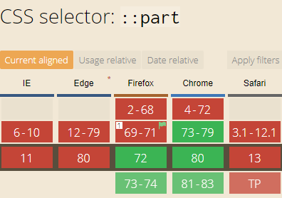
 Falkicon
on 20 Feb 2020
Falkicon
on 20 Feb 2020
Thanks @nicholasrice and @bheston for researching this and putting it together.
@Falkicon I think that chart may be out of date. I'll try to confirm today. I definitely know that the beta I'm running has the part attribute present in the DOM at least.
@nicholasrice I agree that we should absolutely place part attributes in our templates. There's no harm in doing that if the browser doesn't support it, but it will be present for browsers that do. There will be folks who have scenarios like only Electron, Chromium-only, etc. where they know they don't have to worry about Safari. However, since it hit Safari in tech preview in October of last year, that's a good sign that it's not too far behind.
So, perhaps a hybrid approach. Start by defining the part attributes where appropriate. Then, based on our customer's needs, gradually add additional CSS custom properties for specific scenarios. We can then document these properties for each component, potentially noting that they are "temporary" and will be deprecated in a future release once parts are broadly supported. But, in the mean time, feel free to use them, and if you can't accomplish what you need style-wise, reach out to us and we'll explore adding a property, etc.
(I hesitate to mention this but we could also do some "dirty" tricks such as exposing a container-style attribute that allows someone to provide inline styles, which we then map to the container part internally via a binding. It would mimic part styling but would only be accomplishable via inlining, not directly in CSS. Just noting this for completeness. Again, if we did this, we'd want to plan
to deprecate.)
 EisenbergEffect
on 20 Feb 2020
EisenbergEffect
on 20 Feb 2020
@Falkicon Yea that table is inaccurate. I just downloaded Version 80.0.361.53 and verified it works:


nicholasrice
on 20 Feb 2020
I believe we have consensus that @microsoft/fast-components will move forward with ::part support and will not, in general, expose component-specific custom properties as a styling extensibility mechanism.
nicholasrice
on 20 Feb 2020
I'm late to the party here, but based on our conversations I agree this will give us the most flexibility going forward and won't unnecessarily force us into a model that wasn't very advantageous for the current platform offerings. I think there will be other opportunities for standardizing styles across various partners if we need to.
 bheston
on 21 Feb 2020
bheston
on 21 Feb 2020
Late as well! But agree with the consensus and also agree with @EisenbergEffect point that implementing ::parts from that start does not cause any harm. Form what I understand it sounds like theoretically we can have a stance that ::parts is the right way but nothing would stop someone from overriding variables if they choose to do so.
 eljefe223
on 24 Feb 2020
eljefe223
on 24 Feb 2020
Related issues
 limefrogyank
·
4Comments
limefrogyank
·
4Comments
 PhilippSonntagORGADATA
·
4Comments
PhilippSonntagORGADATA
·
4Comments
 awentzel
·
6Comments
awentzel
·
6Comments
 gqio
·
3Comments
gqio
·
3Comments
 tbetous
·
4Comments
tbetous
·
4Comments
Most helpful comment
@Falkicon Yea that table is inaccurate. I just downloaded Version 80.0.361.53 and verified it works:

