Enterprise: Modal: fullsize responsive issue on Android phones in Landscape mode.
See an issue on Androids using fullsize 'responsive' on modals when viewing in Landscape mode.
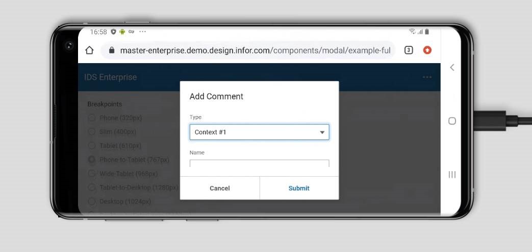
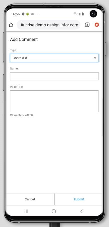
Used the following URL
https://master-enterprise.demo.design.infor.com/components/modal/example-fullsize-responsive.html
Using browser stack in my example.
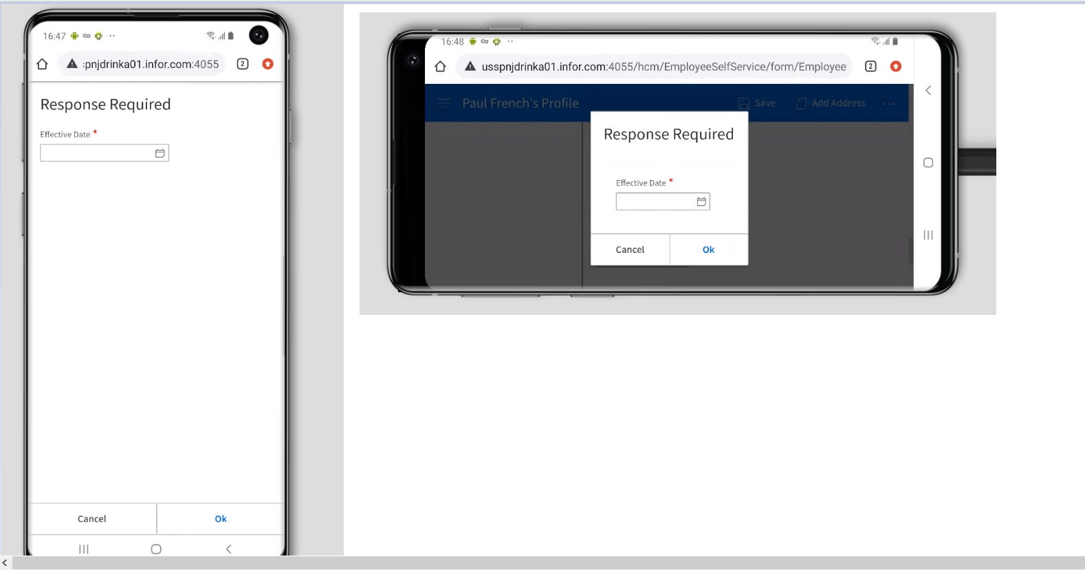
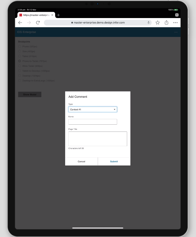
In portrait mode the modal expands to the screen edges.
In landscape mode the modal doesn't expand to the screen edges.
See screen shots.
Platform
- Device: Samsung Galaxy S10
 drinkaj
All 5 comments
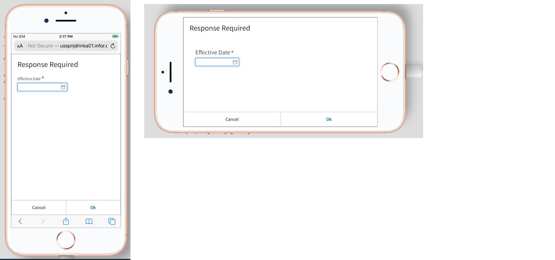
Working on Mobile devices but not on iPad
Mobile & Samsung Tablet:
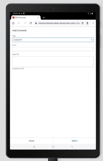
iPad Pro 12.9 2020 Chrome
 janahintal
on 12 Mar 2021
janahintal
on 12 Mar 2021
this was made for iphone configuration. the ipad has too much space so its not really setup for that. Is that right @ericangeles ?
 tmcconechy
on 12 Mar 2021
tmcconechy
on 12 Mar 2021
@tmcconechy that's correct. Basically, the iPad Pro's screen resolution is about 2048 x 2732 px and has a viewport size of 1024 x 1366 px which is considering as a medium desktop.
 ericangeles
on 15 Mar 2021
ericangeles
on 15 Mar 2021
Yes thats what i thought. So i think this should be considered done
tmcconechy
on 15 Mar 2021
Thanks for this. :D Will now move this ticket to Done.
janahintal
on 18 Mar 2021
Related issues
 CindyMercadoReyes
·
3Comments
CindyMercadoReyes
·
3Comments
 EdwardCoyle
·
4Comments
EdwardCoyle
·
4Comments
 SofiK
·
3Comments
SofiK
·
3Comments
 swetteinfor
·
3Comments
swetteinfor
·
3Comments
 pwpatton
·
3Comments
pwpatton
·
3Comments
Most helpful comment
Yes thats what i thought. So i think this should be considered done