Enterprise: Application menu: too much spacing level spacing when icon used in accordion header in uplift theme.
Describe the bug
A clear and concise description of what the bug is.
Steps to reproduce the behavior:
- Switch the Theme to Subtle from More button on the right
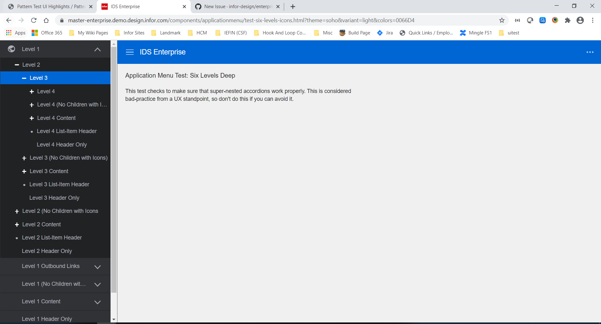
- Expand the Level 1 with the globe icon
- Expand down to level 2 and level 3 to see sub menus
Note the spacing
Now switch the Theme to Vibrant from More button on the right
- See how much more spacing is used.
Version
- ids-enterprise: [e.g. v4.9.0 or v4.10.0]
Screenshots
If applicable, add screenshots to help explain your problem.
Platform
- Infor Application/Team Name: [e.g. Infor XYZ, Infor ABC]
- Device: (if applicable) [e.g. iPhone 6 or Samsung Galaxy S6]
- OS Version: [e.g. Windows 10 or iOS 8]
- Browser Name: [e.g. chrome, safari, stock browser]
- Browser Version: [e.g. 22, 66.0.3359.181 (Official Build) (64-bit)]
Additional context
Add any other context about the problem here.
 drinkaj
All 6 comments
@inforandy could you please look at this with design with a higher priority. Was talking to @kevinwhitedesign and i think this padding should probably be reduced for the levels (maybe to 8pt grid (4s and 8s increments)). This spacing is a bit excessive and causing issues when there are 3-6 levels in common use cases with larger text.
@pwpatton dont think this can make this sprint as it is more complex...
 tmcconechy
on 28 Jul 2020
tmcconechy
on 28 Jul 2020
@tmcconechy isn't this just excessive space when an icon is on the first accordion level vs no icon? doesn't seem like the icon should be causing any extra left-padding. Can't we at least just fix that on this ticket and make another ticket if we want other improvements?
 pwpatton
on 28 Jul 2020
pwpatton
on 28 Jul 2020
@EdwardCoyle after trying it a bit and talking with @EdwardCoyle it's not like one rule. Its a series of rules that makes each level line up, and its accordion and app menu examples and other related things that all need adjusting.
And it is following the original design that the + icon lines up with the text. But it is extra spacious, agreed changes can be made. We just would like design to look at it and come up with a solution that works given this case so we don't have to do this all twice and/or wrong when we just went through changing this not long ago https://github.com/infor-design/enterprise/issues/2925
tmcconechy
on 28 Jul 2020
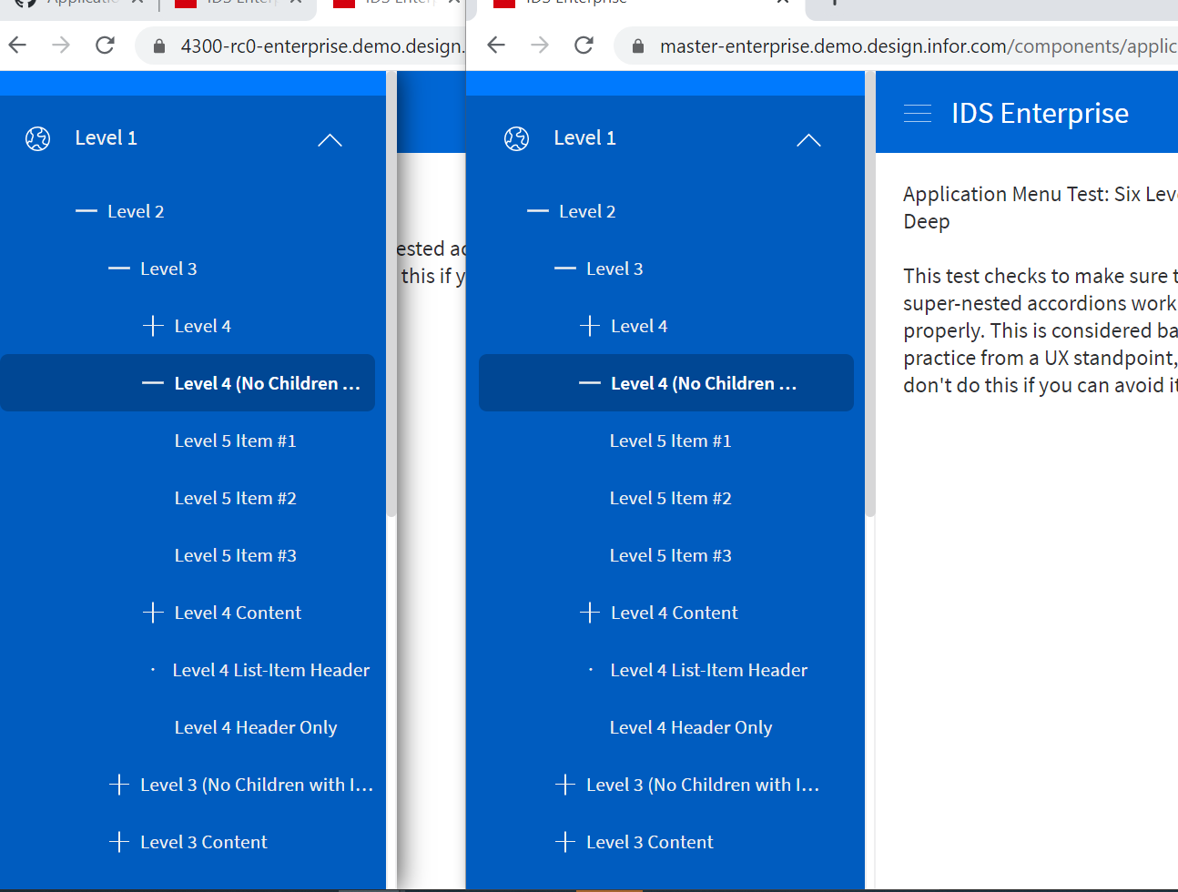
For now ~ Lets remove the first level indenting to be similar to before.
tmcconechy
on 3 Aug 2020
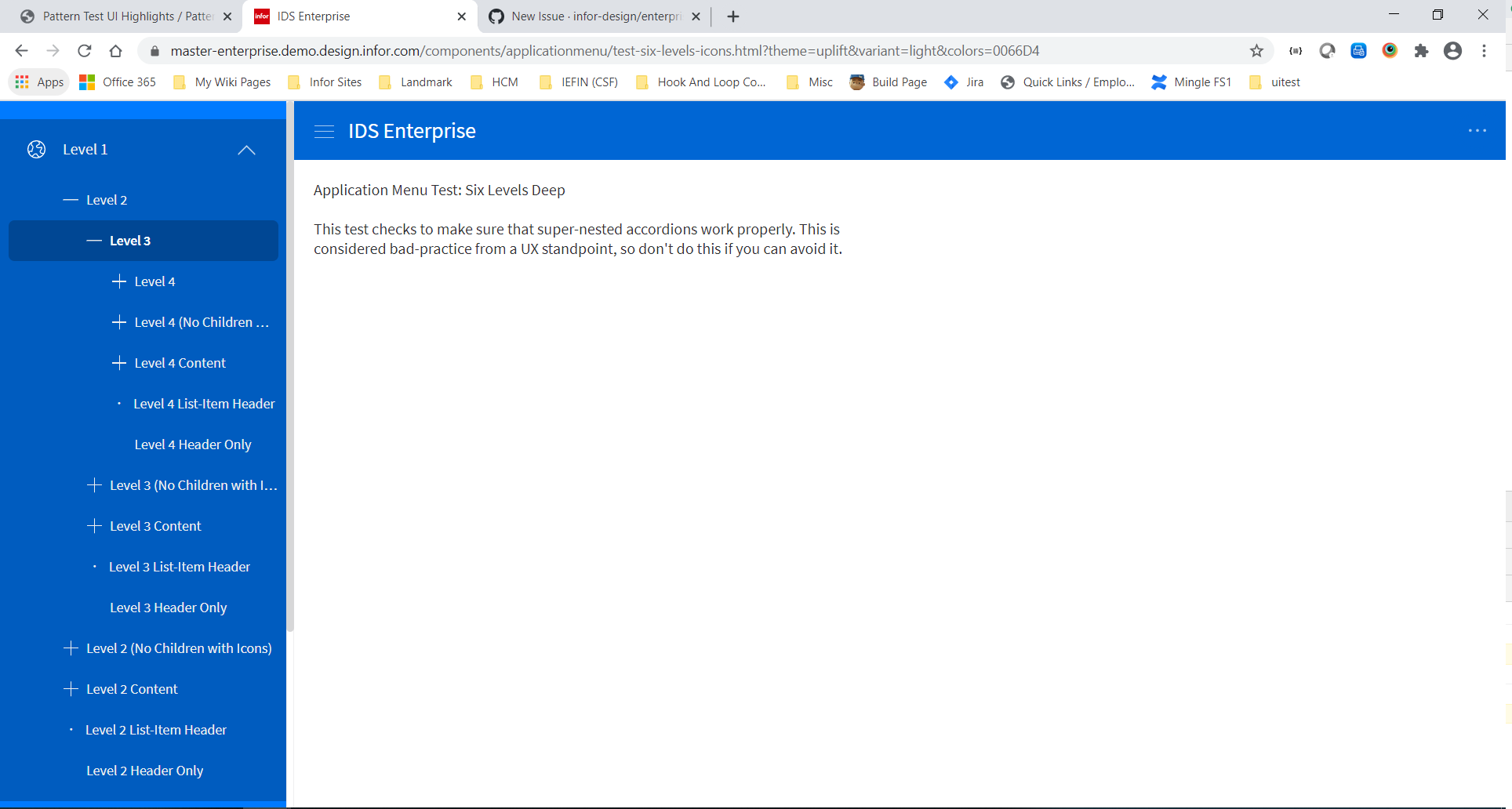
@kevinwhitedesign we made a change for this see the updated version https://master-enterprise.demo.design.infor.com/components/applicationmenu/test-six-levels-icons.html?theme=uplift&variant=light&colors=0066D4
We just moved it over. Feel free to review and comment if you have any further suggestions
tmcconechy
on 21 Aug 2020
QA Passed on my end. Thank you.
Old Version (Left Side) | Fix (Right Side)
 janahintal
on 24 Aug 2020
janahintal
on 24 Aug 2020
Related issues
 CindyMercadoReyes
·
3Comments
CindyMercadoReyes
·
3Comments
 dubde
·
4Comments
janahintal
·
3Comments
pwpatton
·
3Comments
dubde
·
4Comments
janahintal
·
3Comments
pwpatton
·
3Comments
 jbrcna
·
3Comments
jbrcna
·
3Comments