Enterprise: Breadcrumb: Truncate "hidden" items, display important items
Is your feature request related to a problem or use case? Please describe.
A design enhancement to the IDS Breadcrumb has been requested with the following requirements:
The breadcrumb UI pattern is widely used and effectively gives the user an overview of where she is in a given navigation path. It also provides a simple way to navigate to previous states or pages. Today there are css classes in IDS that can be used to create breadcrumbs, but there is no component with clear examples and the current breadcrumb implementation is lacking two important features.
- Correct truncation.
- Possibility to see truncated parts of the breadcrumb path
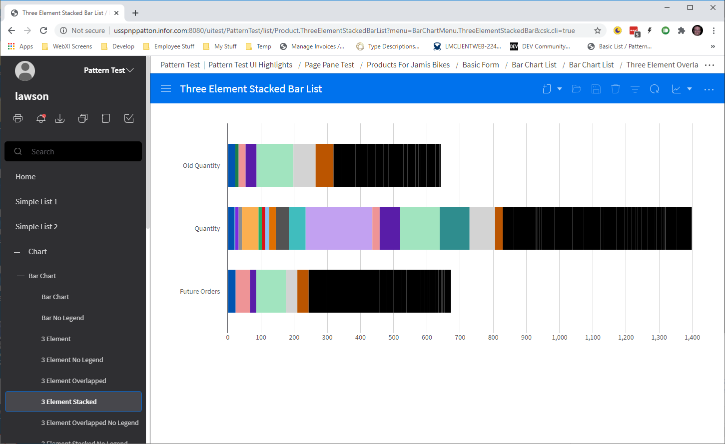
...- Breadcrumbs should be truncated when they don't fit on the screen and the lowest level breadcrumb should always be visible. Today it's the first thing that disappears.
- It should be possible to view and click parts of the breadcrumbs that has been truncated, so the user can navigate to that state. One example of this is the file system navigation bar on most computer operating systems.
After working through trying to implement these requirements into the current design, I've discovered the following pitfalls that need some design guidance:
- Our current breadcrumb design had only anticipated a handful of breadcrumb items being present at once, and never implemented "truncation" in the way this request is expecting. Currently the line of breadcrumbs will wrap to a second line if it gets long enough.
- If we squish down the size of the breadcrumbs to a single line, and allow for expanding the size of "important" ones, we need to make design decisions on things like:
- how many breadcrumbs should ever be visually present at once on a single line?
- do we ever "throw away" any breadcrumbs on the line?
- does clicking a breadcrumb automatically expand it?
- should we have the standard "show truncated text in a tooltip" design pattern for breadcrumb items?
Additional context
Originally listed as a requirement in infor-design/enterprise-ng#700, per @gushanson's request
Examples


All 13 comments
The work on the JS breadcrumb component has landed in master: https://master-enterprise.demo.design.infor.com/components/breadcrumb/example-add-remove.html can demonstrate the current scenario of what happens with too many breadcrumbs.
@inforandy is this something we could have design take a look at?
Way way way back i talked with a designer and we decided to just make it flow like that to the next line. Dont think we need to get really fancy with it. But doesnt hurt to have a look
Agreed, doesn't need to be fancy. They specifically asked for truncation as a feature though, just wanted to make sure it gets some input.
@tmcconechy @EdwardCoyle so is this a way not to have wrapping overflow then?
In landmark we are looking for a way to have these on a single line no mater how large it gets since not all screen we have are single page scrolling.
Yes, but TBD with design. Thats the use case exactly.
we also have desire to place this breadcrumbs control in a different area.
- above the header bar (probably the best idea)
- within the headers eyebrow area (may not be feasible if we are placing the toolbar in header as well).


@tmcconechy @inforandy any idea if Design has had a chance to address this?
Pretty sure not. Lets move this out for now.
cc @inforandy
Hi @tmcconechy, here's my observation upon testing. Would like to know if it is expected. Thank you.
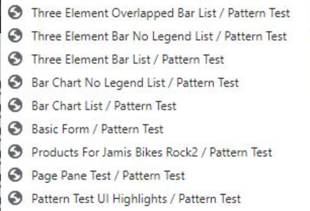
- '...' navigation button to select a Breadcrumb is not working
Link: https://master-enterprise.demo.design.infor.com/components/breadcrumb/example-navigation-breadcrumbs.html#
*Expected: When I select Pattern Test, then it would show the breadcrumb selected.

Yes @janahintal that is expected. As the order does not change of the bread crumb items in this example. It is always the same order unless the developer changes pages for real where it would change. Its a link that does nothing at this time. So that behavior is expected
@janahintal Much of the breadcrumb behavior has been intentionally left to the app developers, since there isn't a very clear "spec" on what the selected action will be.
Noted on this. Thank you for the confirmation. Will now move the ticket to Done. 👍
Most helpful comment
Yes @janahintal that is expected. As the order does not change of the bread crumb items in this example. It is always the same order unless the developer changes pages for real where it would change. Its a link that does nothing at this time. So that behavior is expected