Enterprise: Datagrid: Default column width renders too wide
Describe the bug
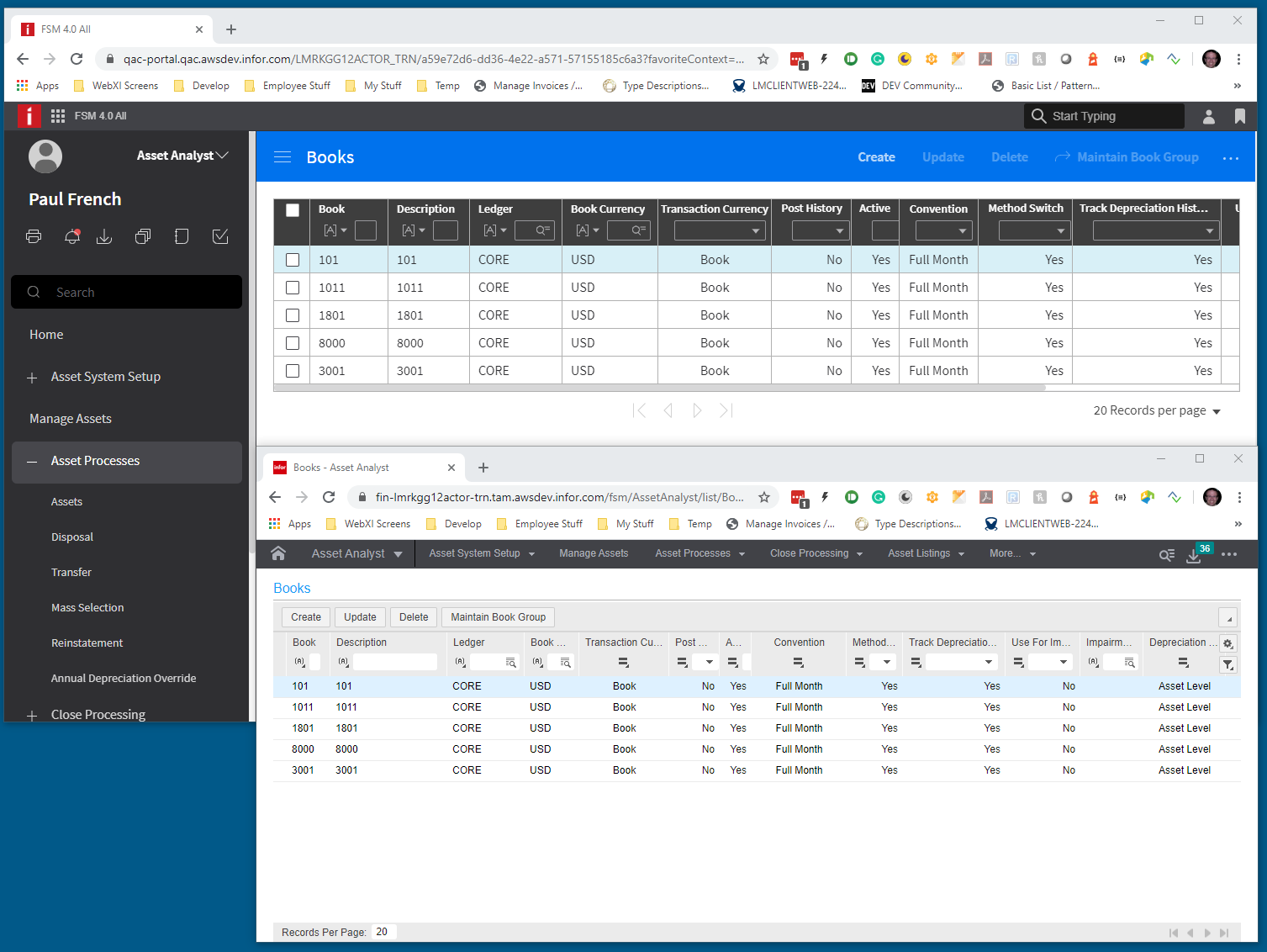
One pushback we are getting in landmark for 4.x is that there is too much horizontal scrolling for datagrids compared to the 3.5.
To Reproduce
Steps to reproduce the behavior:
- See me for how URL/login and credentials.
Expected behavior
Want to columns to be greedy about reclaiming white space.
Version
7.1.1 of ng/ 2.28 of ep
Screenshots
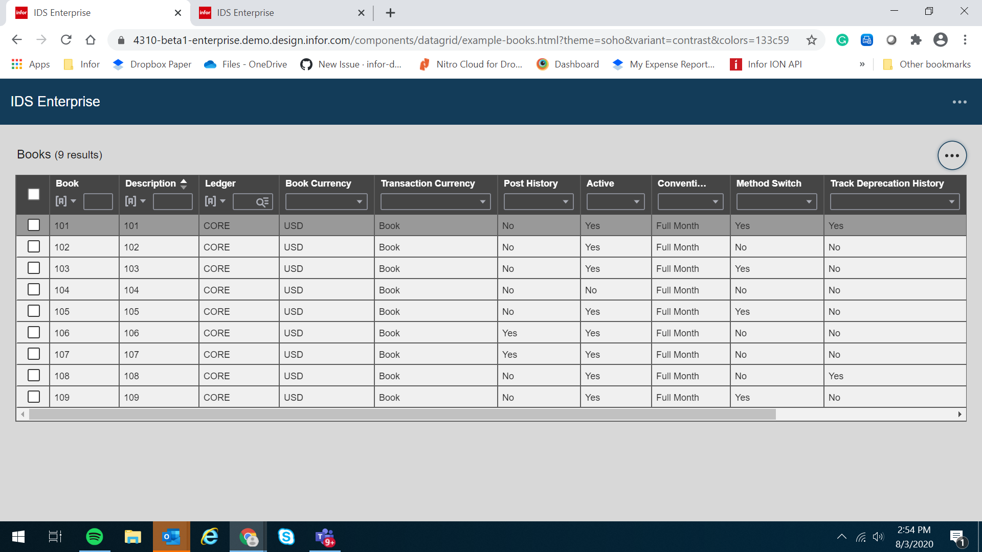
In this case many columns seem to take more space than is needed. Some have their filter fields taking up more width than their cell.

In 3.5 this was much less of an issue because in landmark we set the size to fit on the columns and had a much smaller font.

A more aggressive reclaim of white space could be of at least marginal improvement.
Platform
- PC
- Window10
- Latest Chrome
Additional context
Add any other context about the problem here.
 pwpatton
All 22 comments
@pwpatton can you maybe give me the JSON data, grid settings and column settings for this grid example? I think i could make an example out of that.
 tmcconechy
on 15 Jun 2020
tmcconechy
on 15 Jun 2020
So i studied 3.5 the difference is that it doesn't fill the grid area. It just sizes the columns to the data and stops. Do we want that? Leaving a space on the left?
This could be an option, we just add an empty column at the end. But with less columns it wont evenly spread.
Do we want an option for spaceColumn? Or just a shorter defaulting of column sizes and still stretching it if need be?
tmcconechy
on 17 Jun 2020
Also #3755 will record quite a bit of space by just changing the font size and margin
tmcconechy
on 17 Jun 2020
Can we fit as best as possible with little white space when the the container is narrow but spread them out if the container is large enough?
pwpatton
on 17 Jun 2020
The problem is really only when there is less columns and space than the datagrid width. At that point it goes and stretches the columns out across overriding whatever you set for widths so at that point the columns get big enough to stretch, stretching each one a bit beyond what it would be at the narrow size.
So i can just set the initial "narrow" size but once the grid is much wider than all the defaults the begin to stretch across. Then the only way is to make an extra blank stretching column
I.E. We are partially stuck by the table / browser it has a specific algorithm we cant override. https://www.w3.org/TR/CSS21/visudet.html#propdef-max-width things like maxwidth wont work, it just gets stretched.
Ok, what i will do is look for some tweaks on the size. Making it the size of number of characters in the filter container. Should reclaim some. Then can also add the spacer column and you can try it out
tmcconechy
on 17 Jun 2020
I think we could deal with a spacer column if it looked more like the other cells. And by spacer I mean one at the end that isn't one of the data columns. When it cuts off like before customer really didn't like it.
pwpatton
on 17 Jun 2020
yeah would just be black space on the header and then the row would continue . i'll work up some options on this.
tmcconechy
on 17 Jun 2020
@pwpatton just so im comparing apples to apples. Can you send me the JSON data for that "books" page. Would need both the columns and dataset data.
Thanks!
tmcconechy
on 26 Jun 2020
Woah, this was pushed out to 31? Can we talk?
 lipetzan
on 9 Jul 2020
lipetzan
on 9 Jul 2020
Yes, we can talk. It was too much work/plus other things added. Had to push. But we did do https://github.com/infor-design/enterprise/issues/3995 which does help a lot i think.
tmcconechy
on 9 Jul 2020
@pwpatton
Also Still looking to get this data (columns and data for this example) ...to accurately test and start this. Or at least either the columns or dataset?
tmcconechy
on 9 Jul 2020
Found two problems so will adjust this.
1) if on short row height its sizing as if the padding was "normal" - extra 16px per cell. this is maybe a helpful fix
2) its giving too much space for the filter row
tmcconechy
on 10 Jul 2020

BTW dont need the data per se anymore i made an example
tmcconechy
on 10 Jul 2020
The default width still renders wide for some columns that do not have long data although there has been a size reduction.
 janahintal
on 3 Aug 2020
janahintal
on 3 Aug 2020
This is correct @janahintal (or at least what i was trying to do).
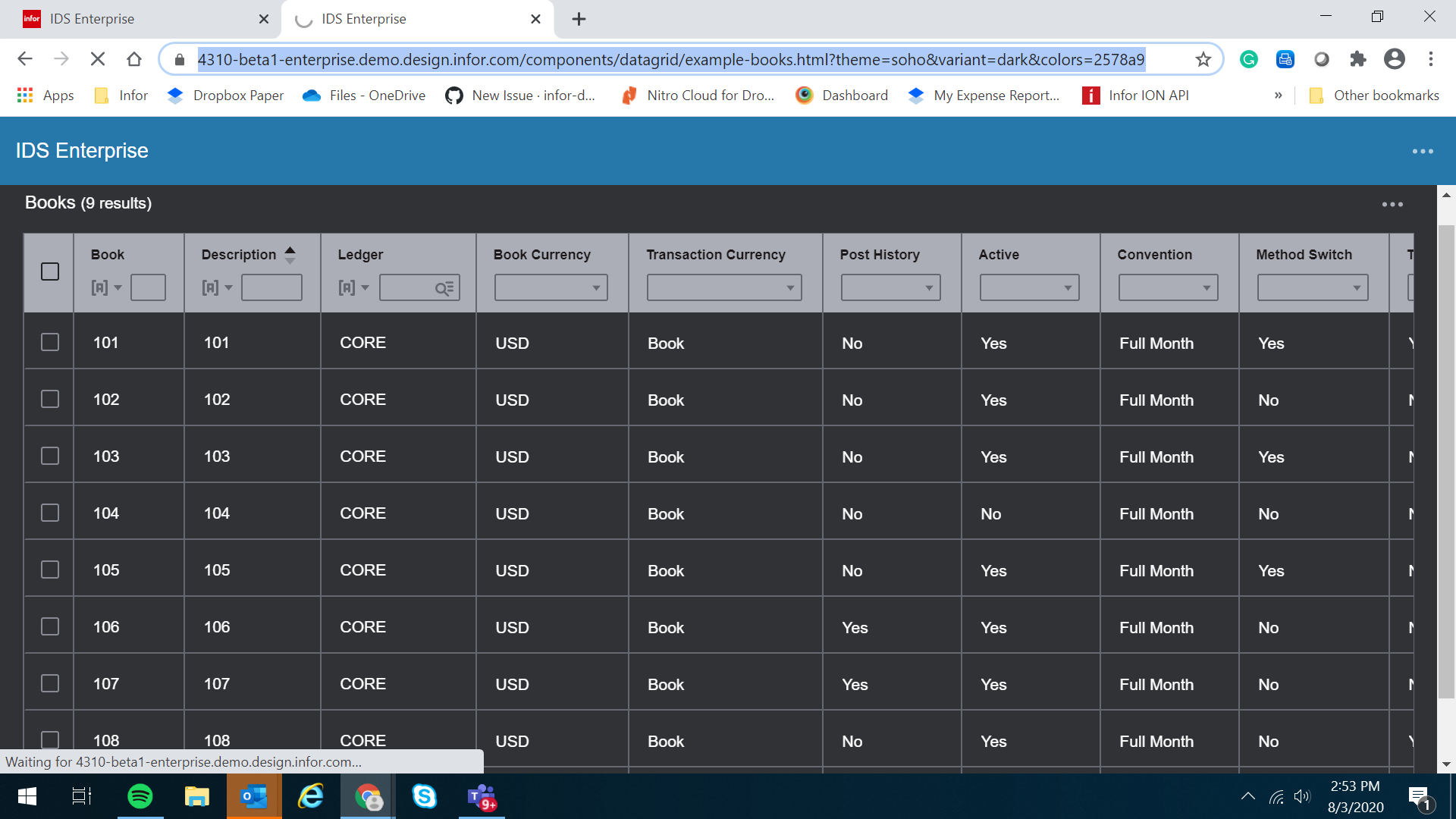
https://4310-beta1-enterprise.demo.design.infor.com/components/datagrid/example-books.html -> this page has a small amount of reduction and sizes including the header
https://4310-beta1-enterprise.demo.design.infor.com/components/datagrid/example-columnsizing.html -> is the same xample with data size only truncating the header
tmcconechy
on 3 Aug 2020
@tmcconechy is't the idea that we still need a min size for the filter bar so that filter fields don't get truncated out of view. I think one thing that could improve that as well is to only show the down arrow and not the icon in the data case.
pwpatton
on 3 Aug 2020
I tried to just keep it consistent to one character for the filter. After all it was emphasizing the data. So that should be close. Also its pretty hard to makeout the header text unless its 5-6 characters
tmcconechy
on 3 Aug 2020
Let me know when a package is ready with this change.
 claudenbach
on 3 Aug 2020
claudenbach
on 3 Aug 2020
@tmcconechy @claudenbach isn't this already in 7.5.0-beta.2?
pwpatton
on 3 Aug 2020
No i didnt make a beta 2 yet as i was waiting for our testing to proceed further. (Cant make a build for every issue).
But its ready now so there will be a 7.5.0-rc shortly today
tmcconechy
on 3 Aug 2020
Ok made a mistake but its ready. There is a 7.5.0-rc1 which has 4.31.0-rc.0
tmcconechy
on 3 Aug 2020
Thank you guys for the confirmation. Working fine on my end & will now move this to done.
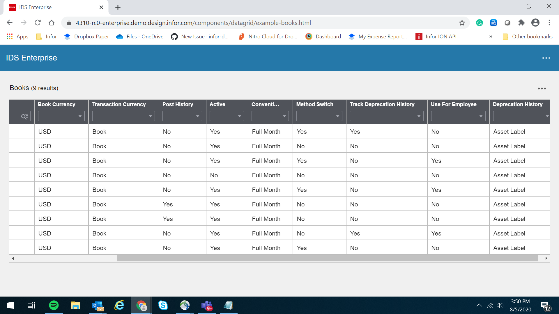
Retested it in https://4310-beta1-enterprise.demo.design.infor.com/components/datagrid/example-columnsizing.html & https://4310-rc0-enterprise.demo.design.infor.com/components/datagrid/example-books.html

janahintal
on 5 Aug 2020
Related issues
 swetteinfor
·
3Comments
swetteinfor
·
3Comments
 jbrcna
·
3Comments
janahintal
·
3Comments
jbrcna
·
3Comments
janahintal
·
3Comments
 brianjuan
·
3Comments
jbrcna
·
3Comments
brianjuan
·
3Comments
jbrcna
·
3Comments