Enterprise: Icons: the 'amend' icon is incorrect when using the vibrant theme
Describe the bug
The amend icon is different when using the vibrant theme vs the subtle theme. Believe the icon is correct in the subtle theme.
To Reproduce
- Using the existing test-form-buttons.html example
- Change the definition of a column, to use the icon 'amend'
- Click on the more icon to change the theme between Subtle and Vibrant
Expected behavior
Amend icon would be the same regardless of the theme
Version
v4.27.0-dev
 claudenbach
All 39 comments

claudenbach
on 13 Mar 2020
Almost all the icons are different in each theme. That was part of the point of it. So i think that assumption is incorrect.
Is it really more the meaning is way different? I.E. one is like a ledger and one is an edit "pen"? What does amend mean if so so i can describe it to developers.
 tmcconechy
on 13 Mar 2020
tmcconechy
on 13 Mar 2020
@tmcconechy I'm a bit confused too. It seems the icons' svg html files are built coming from ids-identity, however in the live demo from design.infor.com I'm seeing the icons correctly: https://design.infor.com/code/ids-enterprise/latest/demo/components/icons/example-index?theme=uplift&variant=light
 nbcp
on 18 Mar 2020
nbcp
on 18 Mar 2020
I also have another icon with this issue, 'update-preview'  that is showing like a refresh icon in uplift

nbcp
on 18 Mar 2020
The design.infor.com site shows the uplift style of the icons. And the designers that made these made certain decisions. So i sort of agree that
update-preview -> looks identical to reload
amend -> looks identical to edit and lost its meaning.
locked -> also the locked / unlock icon looks like a hand bag
@inforandy - Could you add this to the design list to check.
tmcconechy
on 18 Mar 2020
Hi @tmcconechy any update on this one?
nbcp
on 14 Apr 2020
@inforandy @lucacolumbu - Do we have any design resources available that can correct these icons? Thanks
tmcconechy
on 14 Apr 2020
@tmcconechy thanks tim, will have someone take a look
 inforandy
on 14 Apr 2020
inforandy
on 14 Apr 2020
@tmcconechy hey tim, these are the correct vibrant icons we intended to replace the subtle icons. when designing the uplift set we got rid of most object-specific shapes, such as the "amend" icon which was specific to a spreadsheet row, and replaced it with the more general action shape, in this case "edit". the same applies to update preview — instead of a context specific shape as seen in the subtle icons, we reduced down to the basic action, which was "update", or "refresh". if these icons do not serve their intended purpose in these contexts, maybe we can point to other icons within the uplift set.
 elizabethhartley
on 15 Apr 2020
elizabethhartley
on 15 Apr 2020
I see @elizabethhartley i guess the complaint is it had meaning in the other theme that is now not the same. Does that work with that explanation? @claudenbach @nbcp ? I guess my follow up question would be what is the difference between amending and editing? Sounds like a different word for the same action?
As for update-preview? What does that do? Is refreshing the same thing?
tmcconechy
on 15 Apr 2020
FInal outcome of this issue:
Keep as Is / Change Rejected:
update-preview -> now less object specific so looks similar to reload
amend -> now less object specific so looks similar to edit
Already Fixed:
locked -> also the locked / unlock icon looks like a hand bag
tmcconechy
on 29 Apr 2020
If I understand this correctly, this seems arbitrary and incorrect. the Landmark implementation of "amend" is for a helper list. The generic "edit" icon doesn't not have the same meaning. This is a regression in my opinion. The icon change at the IDS level did not adequately consider how other products were using it currently and that decision's downstream impact.
 jamie-norman
on 29 Apr 2020
jamie-norman
on 29 Apr 2020
So as i see it the current problems are with:
amend -
update preview -
Can you explain @jamie-norman what those do? It's probably arbitrary to change them to be the same as edit and reload. But i think maybe we could come up with some that capture the usage in a non object specific way (which was the just of the icn changes in uplift). This is my suggestion...
Can we restart with what those two do?
tmcconechy
on 29 Apr 2020
@jamie-norman could i get an quick explanation of those. We will make a design jira to try and fix it further to better match the case + the design change. https://jira.infor.com/browse/HLPE-363
cc @inforandy
tmcconechy
on 30 Apr 2020
The "amend" icon was being used for a helper list, which pulls up a select list similar to the way the lookup/select list (search-list icon) works. Not totally sure about "update preview."
Quick gif: https://recordit.co/hFytWvNGTp
jamie-norman
on 30 Apr 2020
Btw as for update-preview, it was meant to be used as "preview", can we also please change that name to just "preview" to avoid confusion to us all? The meaning is completely off with how it looks just like the refresh icon, why do we even need 3 different icon names for the same icon? refresh, refresh-current, update-preview all looks the same (https://design.infor.com/product/identity/icons).
I believe the preview icon should look similar the way it's done before in https://design.infor.com/code/ids-enterprise/4.26.0/demo/components/icons/example-index?theme=uplift&variant=light since it represents the action better.
see https://jira.lawson.com/browse/LMCLIENT-29584 for more context
nbcp
on 4 May 2020
Yeah i see we dont have a preview icon. I would think we would. We maybe have to add a preview icon so there is both. Then add a different amend icon (amend is adding to a ledger as you dont edit it you always add).
tmcconechy
on 4 May 2020
@tmcconechy I've been using the eye icon for preview in recent designs.
if amending is adding to a ledger, should the icon be add?
we don't want to get back in the habit of being too prescriptive.
elizabethhartley
on 4 May 2020
The specific case I'm referencing is for bringing up a helper list that allows the user to fill in a field with a value from a pre-defined set. So, "amend" isn't really literal. It's adding, but from a list, so I don't know if a simple "add" icon would suffice. I think what I've been asking for is that icons are not replaced or deprecated without understanding their use in other product teams
jamie-norman
on 4 May 2020
I'm pretty sure ledger is a common thing. So maybe an + onto a document or something? Dont think its just an add icon. But i think a new preview document (like preview for printing) whatever we want for that could work. Isnt that usually more like document with a magification glass on it?
tmcconechy
on 4 May 2020


@jamie-norman here are a few icons we have that might suffice — what do you think?
elizabethhartley
on 4 May 2020
Good morning, thanks for all the input. We should set up some time to talk about this further, understand the ask, and see how we can move forward. @jamie-norman @elizabethhartley, I have some questions, we had an old "Amend' icon, why did we not convert it into the new style.
I am new so having a meeting to discuss would be great. thanks A
 aaron-usiskin
on 4 May 2020
aaron-usiskin
on 4 May 2020

jamie-norman
on 4 May 2020
couple of quick ideas for adding to list.
If you want to set up a call, that's fine with me. Should probably include Phillip Patton as well
jamie-norman
on 4 May 2020
@jamie-norman those look nice. I will set up a meeting to get me caught up and move this forward. Can you send me the file you created the icons in?
aaron-usiskin
on 4 May 2020
helper-list.zip
I created them in Illustrator, dragged em into Sketch, and then exported.
jamie-norman
on 4 May 2020
@jamie-norman THANKS
aaron-usiskin
on 4 May 2020
@jamie-norman figma file here √
aaron-usiskin
on 4 May 2020
Hi everyone, it's been a while is there any update on this one yet? Do we have a draft preview of the new proposed icons? I guess it's enough for me as long as they don't overlap with the meaning of other existing icons to avoid confusion.
nbcp
on 12 May 2020
I found an additional case where the icon has lost meaning. This is in the tree. We used to have a "#icon-tree-node" icon that looked like a base level of a UI tree. Now its just a circle that looks like a radio button that you can select. This is confusing.
Can we change this too?
With
https://master-enterprise.demo.design.infor.com/components/tree/example-select-multiple.html
Additional context: https://github.com/infor-design/enterprise/issues/3936#issuecomment-632654115
tmcconechy
on 22 May 2020
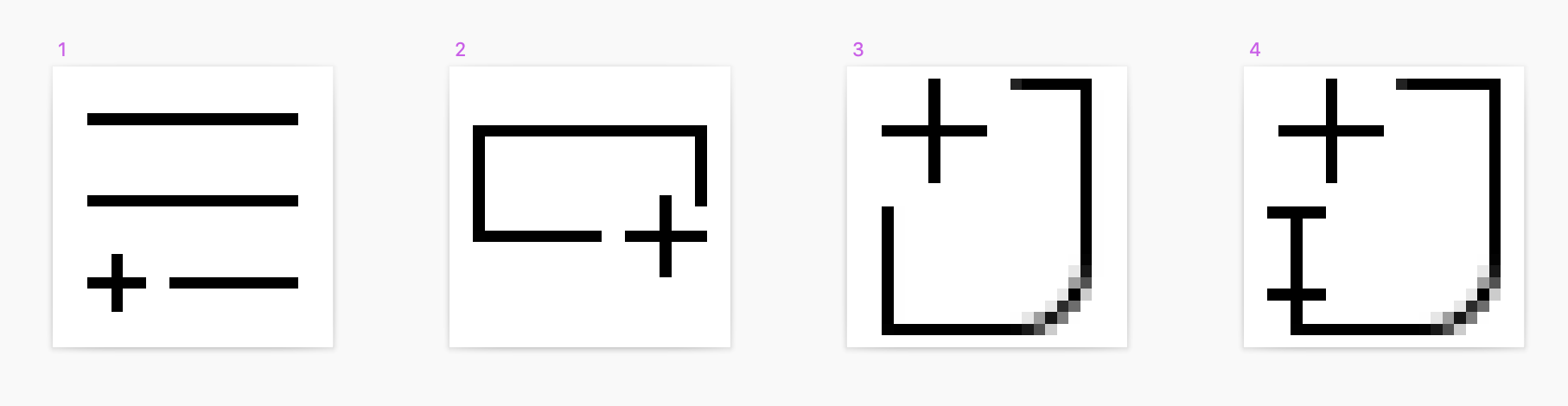
here are four options for amend, let me know what you think @aaron-usiskin @jamie-norman
elizabethhartley
on 27 May 2020
@elizabethhartley my preference is option 1, since this is used in the context of a list
jamie-norman
on 27 May 2020
@jamie-norman great! we're merging this into the ids-icons-standard.sketch file in design system/sketch/theme-uplift now
elizabethhartley
on 27 May 2020
@elizabethhartley are we fixing any other icons mentioned here?
- icon-tree-node (lost meaning)
- update-preview
- amend (you mentioned)
tmcconechy
on 27 May 2020
@tmcconechy those are different tickets in our jira board — we'll be dealing with them separately
elizabethhartley
on 27 May 2020
I added https://github.com/infor-design/enterprise/issues/3978 to track the two other icon changes getting into EP code.
tmcconechy
on 28 May 2020
A new Amend icon has been designed, and approved:
https://jira.infor.com/browse/HLPE-363
The icon has been merged into the design system here:
https://github.com/infor-design/design-system/pull/447
 lucacolumbu
on 28 May 2020
lucacolumbu
on 28 May 2020
Added a PR for the changed icon (4.30). Closing this as this is done. Note again i made #3978 for the remaining icons.
PR: https://github.com/infor-design/enterprise/pull/3979/files
tmcconechy
on 28 May 2020
QA Passed
v4.30.0-dev
https://master-enterprise.demo.design.infor.com/components/icons/example-index.html?theme=uplift&variant=light&colors=0066D4
 jbrcna
on 10 Jun 2020
jbrcna
on 10 Jun 2020
Related issues
jbrcna
·
3Comments
jbrcna
·
3Comments
 fitzorama
·
3Comments
fitzorama
·
3Comments
 janahintal
·
3Comments
janahintal
·
3Comments
 guoliang
·
3Comments
guoliang
·
3Comments