Enterprise: Colors: Color Pallete Page Doesn't Change By Theme
Describe the bug
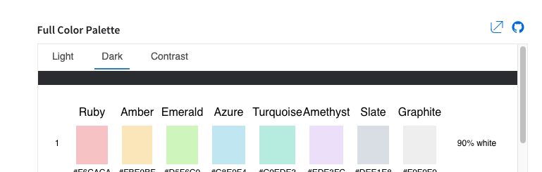
On the colors demo app page we made changes so it does not change when changing theme. This is because the colors are used across ALL themes, so at least one color will get hidden if we change the background color to something other than white.
To Reproduce
Steps to reproduce the behavior:
- Go to https://design.infor.com/code/ids-enterprise/4.25.0/colors
- Click on the buttons to change theme to dark
- Notice a small strip of dark
- Also the Ruby 06 should be #DA1217 its incorrect here https://github.com/infor-design/design-system/blob/master/design-tokens/theme-uplift/color-palette.json#L71 (also fix this at the same time)
If we go to the page outside of the docs page its just keeping the background white no matter the theme as i thought was a good idea at the time http://latest-enterprise.demo.design.infor.com/components/colors/example-index.html?theme=uplift&variant=dark
Expected behavior
Dont know but we have these three options
- Change the page to change background color, but add something like a border around each color so its noticeable?
- Keep as is with white in all themes and remove the theme switch ability from https://design.infor.com/code/ids-enterprise/4.25.0/colors
- Remove the extra "strip" on top when changing themes on https://design.infor.com/code/ids-enterprise/4.25.0/colors
Version
- ids-enterprise: [e.g. v4.25]
Screenshots
Platform
- Chrome
Additional context
Originated from an internal Email
 tmcconechy
All 8 comments
cc @kentonquatman @kentonquatman
tmcconechy
on 6 Feb 2020
I would expect the background change to dark so we have kind of preview how the palette looks in dark mode. Even more, I would expect there might be eventually different palette in dark mode, but that might require palette which will not mention colors directly, but items or cases where such colors shall be used. If we have single color paletter for light dark and contrast then we don't need to show it 3 times with some dummy strip at the top.
 BalkiX
on 6 Feb 2020
BalkiX
on 6 Feb 2020
The problem is the colors are for all three themes. But i could change the background again. It just means one color will be "invisible" which will probably work ok if we stick a 1px white border around the colors or something.
tmcconechy
on 6 Feb 2020
We could use a 1px border with 20% opacity around each swatch. The border color could be black by default, and switched to white for the dark theme.
Example: https://www.figma.com/file/AyWzji2JTkmSNgTenMhLY4/Color-Palette?node-id=0%3A1
 kentonquatman
on 6 Feb 2020
kentonquatman
on 6 Feb 2020
Passed QA testing on all browsers. Tested in http://master-enterprise.demo.design.infor.com/components/colors/example-index.html. Will retest once beta is deployed.
 brianjuan
on 10 Feb 2020
brianjuan
on 10 Feb 2020
I think we should remove the labels to the right of the color swatches (90% white, 50% black, etc...)
I don't think they're accurate for the subtle themes and I don't think they add anything for the vibrant themes. I'm worried they'll just add confusion.
kentonquatman
on 10 Feb 2020
Will do @kentonquatman wasnt sure of that either but just kept them as per the design to start.
tmcconechy
on 10 Feb 2020
removed the labels to the right of the color swatches (90% white, 50% black, etc...). will take a while to deploy but its done
tmcconechy
on 12 Feb 2020
Related issues
 swetteinfor
·
3Comments
swetteinfor
·
3Comments
 CindyMercadoReyes
·
3Comments
CindyMercadoReyes
·
3Comments
 jbrcna
·
3Comments
jbrcna
·
3Comments
 guoliang
·
3Comments
guoliang
·
3Comments
 dubde
·
4Comments
dubde
·
4Comments
Most helpful comment
I think we should remove the labels to the right of the color swatches (90% white, 50% black, etc...)
I don't think they're accurate for the subtle themes and I don't think they add anything for the vibrant themes. I'm worried they'll just add confusion.