Enterprise: Forms: Responsive required field is missing the required asterisk when label overflows
Describe the bug
When using the responsive styling, required fields lose the asterisk when the label is too long
To Reproduce
Steps to reproduce the behavior:
- Go to 'https://design.infor.com/code/ids-enterprise/latest/demo/components/input/example-index'
- In dev tools, add the form-responsive class to the div with the page-container class
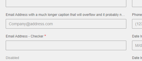
- In dev tools, edit the email address field's label to be something long like 'Email Address with a much longer caption that will overflow and it probably needs to be longer than this'
- The asterisk does not appear:
Expected behavior
I would expect to see the asterisk after the ellipsis when the label of a required field is long enough to overflow
Version
4.22.1
Screenshots
Platform
chrome version 78.0.3904.87
Additional Comments
We're looking to fix this in our next release. Even if the fix won't be happening right away, any information on how you would fix the styling would be appreciated for us to implement it while waiting for a fix. Normally we wouldn't recommend having a long caption, but our customers can put whatever text they want into their UI.
 mheskamp
All 8 comments
Possible fix:
- Shorten the
label.requiredselector with a calc likewidth: calc(100% - 10px); - change this rule somehow
label.required:not(.inline):not(.accessible)::after, .label.required:not(.inline):not(.accessible)::after {
  content: '*';
  color: #e84f4f;
  display: inline-block;
  font-size: 1.8rem;
  left: calc(100% - 10px);
  line-height: 0;
  position: absolute;
  top: 8px;
}
The problem here is that this will push all indicators over so you would need to do this just for the fields with the big labels only. So to solve this we might have to introduce a separate element (breaking change) or change the design somehow (label on the right size or other way like a border? So this is maybe not an easy issue.
Other Possible Workarounds.
- Shorten your label
- See also https://github.com/infor-design/enterprise/issues/443 - for why we dont support multi line labels. It is possible to remove the `white-space: nowrap but the labels will not line up.
 tmcconechy
on 13 Nov 2019
tmcconechy
on 13 Nov 2019
Thanks Tim, we appreciate the quick response! Since there's no easy fix and you have it as a to do in December, we will likely just wait to see what direction you take and conform to that.
mheskamp
on 13 Nov 2019
Yeah i put it in that sprint bucket for now. Lets see what we can do. Check out the dates tho.
https://github.com/orgs/infor-design/projects -> sprint starts Dec, release end of Jan
tmcconechy
on 13 Nov 2019
URL below to test this issue:
http://localhost:4000/components/form/test-long-labels.html
 CindyMercadoReyes
on 3 Feb 2020
CindyMercadoReyes
on 3 Feb 2020
Yep sorry that should have been mentioned on the PR. I adjusted it. This URL was made for this issue.
http://localhost:4000/components/form/test-long-labels.html
tmcconechy
on 3 Feb 2020
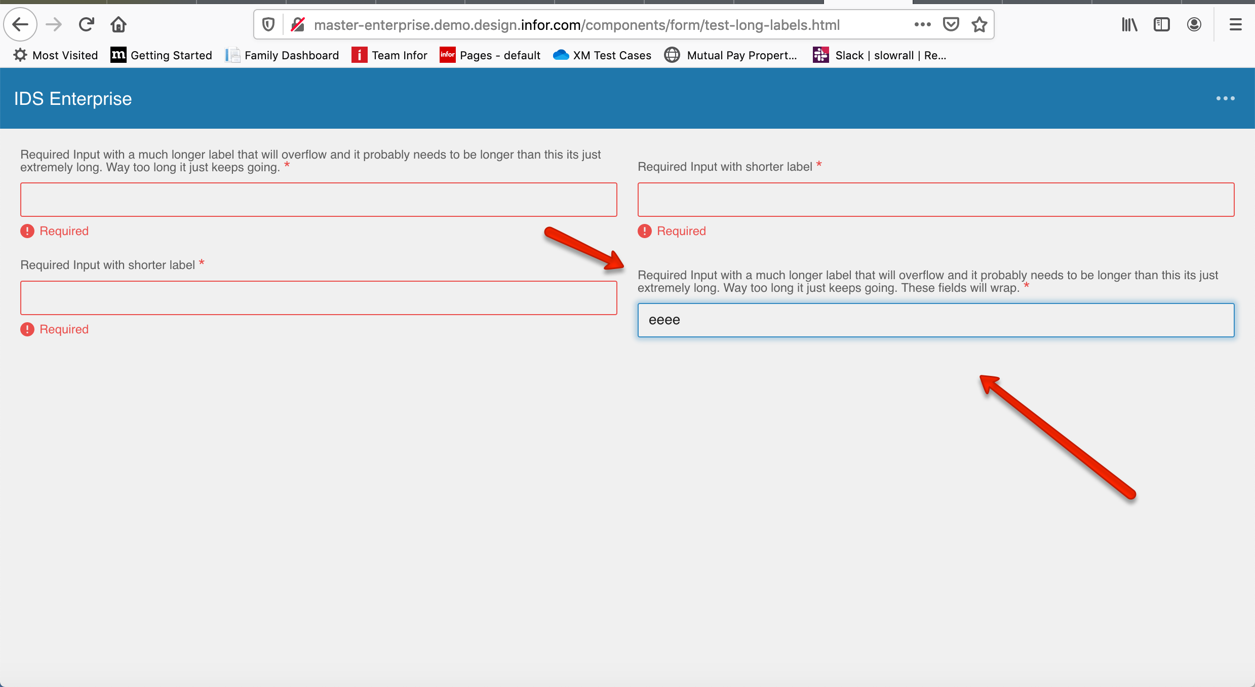
Moving this ticket to QA failed. I already spoke to Tim about it. If one field has an error and the other doesn’t the field boxes are misaligned. Please see screen shot attached.
CindyMercadoReyes
on 3 Feb 2020
This issue is now resolved. Thank you.
Verified in http://master-enterprise.demo.design.infor.com/components/form/test-long-labels.html?colors=0066D4&theme=uplift&variant=dark across all platform.
Also retested
http://master-enterprise.demo.design.infor.com/components/form
 janahintal
on 11 Feb 2020
janahintal
on 11 Feb 2020
This issue is now resolved. Moving this ticket to Done column.
CindyMercadoReyes
on 11 Feb 2020
Related issues
CindyMercadoReyes
·
3Comments
 SofiK
·
3Comments
SofiK
·
3Comments
 guoliang
·
3Comments
guoliang
·
3Comments
 SasiPalanati
·
3Comments
janahintal
·
3Comments
SasiPalanati
·
3Comments
janahintal
·
3Comments