Must be Responsive and mobile friendly
 SacDin
All 8 comments
@SacDin , And there is. True need a hack.
JS:
$('#elfinder').elfinder({
       ...
       resizable: false,
       ...
});
and
$(window).resize(function () {
      var h = $(window).height();
      if ($('#elfinder').height() != h) {
          $('#elfinder').height(h).resize();
      }
});
CSS
body {
      margin: 0;
}

#elfinder {
      border: none;
}

.elfinder-toolbar, .elfinder-statusbar {
      border-radius: 0 !important;
}
 Kravalg
on 2 May 2016
Kravalg
on 2 May 2016
elFinder uses jQuery UI, so it's responsive as jQuery UI is. About mobile friendly... it's likely another feature. There are no plans for it yet.
 troex
on 2 May 2016
troex
on 2 May 2016
@SacDin , @troex : Developers always on the right things is not enough time. So, we can relax and continue to use hacks or add your own Pull request.
Kravalg
on 2 May 2016
Maybe a partial implementation would be to:
- Allow the cwd tree to be fully hidden (with an icon to expand/collapse?), currently has a minimum/maximum width, but is resizable (there is an option to put the 'up folder level' entry into the file pane I believe)
- Allow the toolbar to be fully hidden (with an icon to expand/collapse)
 dleffler
on 3 May 2016
dleffler
on 3 May 2016
Allow the cwd tree to be fully hidden
What about swipe to close/open ? I'm now work in progress.
 nao-pon
on 3 May 2016
nao-pon
on 3 May 2016
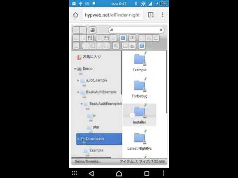
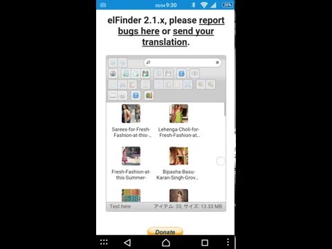
And I added swipe to open/close toolbar. You can try on demo site.
nao-pon
on 4 May 2016
In elFinder 2.1.12 it will be pretty much fixed.(ref. #1373) So I close this issue. And we waiting more requests. Please make new issues of that.
nao-pon
on 30 May 2016
@Kravalg Where did you add those codes you mentioned above?
 ahrasis
on 26 Jan 2019
ahrasis
on 26 Jan 2019
Related issues
 Mozhdeh-d
·
14Comments
Mozhdeh-d
·
14Comments
 lab21gr
·
24Comments
lab21gr
·
24Comments
 ghigio2000
·
12Comments
dleffler
·
11Comments
ghigio2000
·
12Comments
dleffler
·
11Comments
 jacceko
·
17Comments
jacceko
·
17Comments
Most helpful comment
What about swipe to close/open ? I'm now work in progress.
