Electricitymap-contrib: Paint electricity sources in left panel based on their zone carbon intensity
Currently the energy sources in the left panel use somewhat arbitrary fixed colors (defined by modeColor):
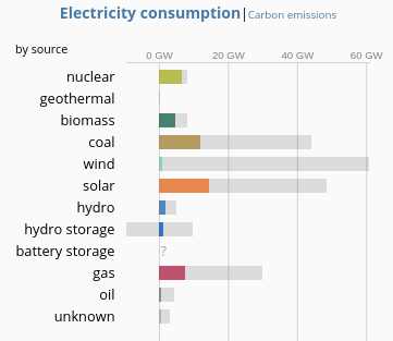
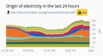
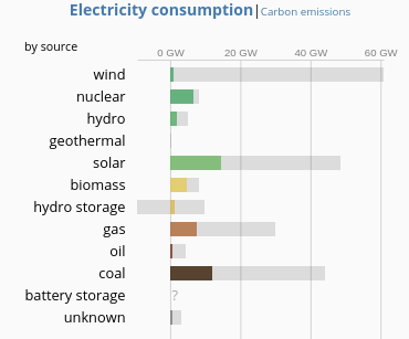
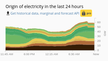
I was thinking we could be sending a stronger and more consistent visual message if the colors were based on the carbon intensity of the source per zone. We could also sort the sources according to their carbon intensity to get a smoother spectrum - e.g. this is what we'd get for the graphs above:
This approach also naturally extends to the colorblind mode and would enable us to address #2158 directly.
Thumbs up if you like the idea! :slightly_smiling_face:
 fbarl
fbarl
All 8 comments
I think this would make it much more intuitive. However, I also think it makes it harder to visually differentiate between low-carbon sources in the historical view - it is harder to tell which line is solar or wind, for example.
That said, I am in favour of the idea!
 robertahunt
on 4 May 2020
robertahunt
on 4 May 2020
Too confusing, IMO
For coal, oil and gas it might work, but e.g. wind and nuclear are just too close. Furthermore, it would make it harder to tell apart generation from imports. (_Is that oil, or just dirty import from Poland?_ _Is that solar, or just clean import from France?_) Doubly so for imports that have a static carbon intensity value, either because they're offline or don't have real-time data.
I like the idea, but it would make ElectricityMap less usable. I'd really choose function over form here
 q--
on 4 May 2020
q--
on 4 May 2020
@q-- I see what you're saying, this approach would definitely make it harder to tell energy sources apart (as well as generation vs. imports). In fact my suggestion was based on the premise that this would be a worthwhile compromise if it would enable us to better highlight the carbon intense vs. renewable sources :slightly_smiling_face:
Or to rephrase it a bit differently, between:
- Telling all the electricity sources apart clearly
- Distinguishing between the _bad_ and _good_ sources clearly
My impression is that you'd prioritize (1) while I feel we should switch our attention more to (2) - do you think it makes sense to phrase it like that? Maybe it points better at the compromise we'd be making than my original issue description :stuck_out_tongue:
fbarl
on 4 May 2020
hi @fbarl ! The recent colors are kind of "natural" for energy geeks^^ people are used to seeing these on many websites/reports/studies/... and their color somehow relates to the sources.
On the other hand, I'd favor some grouping options. Expanding your idea, I thought about something like a "renewable view" vs. "fossil view" or "residual load view" vs. "baseload view" or "low carbon" vs. "fossil". this would need changing of the order first in addition to the colors.
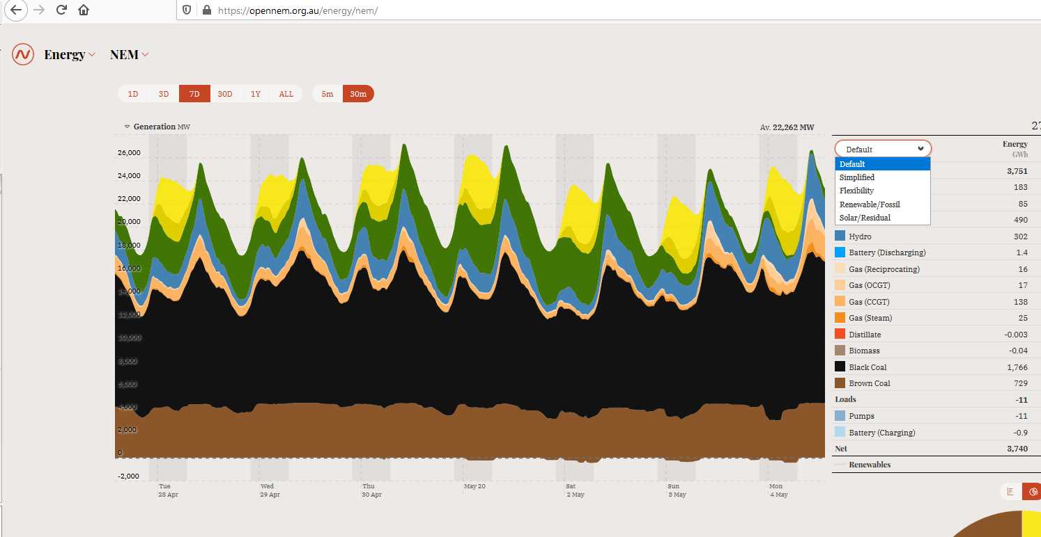
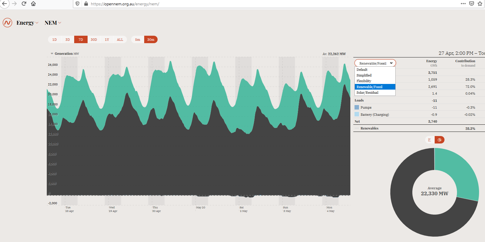
you can try residual vs. base load on:
https://isep-energychart.com/en/graphics/electricityproduction/?region=all&period_year=2019&period_month=4&period_day=1&period_length=1+week&display_format=residual_demand
and some other options on opennem:
https://opennem.org.au/energy/nem/
 alixunderplatz
on 4 May 2020
alixunderplatz
on 4 May 2020
Thanks for the explanation @alixunderplatz! I tried to expand my arguments a little bit in https://github.com/tmrowco/electricitymap-contrib/issues/2467#issuecomment-623423229, but they might be off and a bit simplistic comparing to how the sources are usually visualized (I really didn't know the current colorset was somewhat standard :smile:).
In any case, maybe the grouping you suggest would be the right middle road to take, I'd just like us to also keep #2158 in mind.
fbarl
on 4 May 2020
Hey all, any advances on the subject?
The top figure from @alixunderplatz comment displays a quite intuitive breakdown, with a colour palette that would satisfy the need to distinguish better from low carbon intensity sources and high carbon intensity sources will also allowing to distinguish all production types pretty clearly.
If anyone wants to try to apply that theme to eMap and send a screenshot of the result, the code to update is present under
const modeColor = {
  solar: '#f27406',
  wind: '#74cdb9',
  hydro: '#2772b2',
  'hydro storage': '#0052cc',
  battery: 'lightgray',
  'battery storage': 'lightgray',
  biomass: '#166a57',
  geothermal: 'yellow',
  nuclear: '#AEB800',
  gas: '#bb2f51',
  coal: '#ac8c35',
  oil: '#867d66',
  unknown: '#ACACAC',
};
in web/src/helpers/constants.js
[EDIT] one could use something like https://image-color.com/ to extract the color codes from alix's screenshot
 pierresegonne
on 2 Jul 2020
pierresegonne
on 2 Jul 2020
Thanks for the extra tips @pierresegonne!
I personally feel that we should probably close this issue as my original proposal doesn't seem to be the right approach given the existing conventions.
The top figure from @alixunderplatz comment displays a quite intuitive breakdown, with a colour palette that would satisfy the need to distinguish better from low carbon intensity sources and high carbon intensity sources will also allowing to distinguish all production types pretty clearly.
That's a good point though, but on the second thought I'm a bit hesitant to tamper with the existing colorset without a more explicit visual objective in mind :thinking: I'd still support someone with a better eye for design than me to try the change though :smile:
fbarl
on 9 Jul 2020
Seems like the people have spoken! I'll close this for now unless it gets prioritised from the product team.
cc @Kongkille
 corradio
on 22 Dec 2020
corradio
on 22 Dec 2020
Related issues
alixunderplatz
·
3Comments
corradio
·
4Comments
alixunderplatz
·
3Comments
 StefanAO
·
4Comments
StefanAO
·
4Comments
 brunolajoie
·
3Comments
brunolajoie
·
3Comments
Most helpful comment
I think this would make it much more intuitive. However, I also think it makes it harder to visually differentiate between low-carbon sources in the historical view - it is harder to tell which line is solar or wind, for example.
That said, I am in favour of the idea!