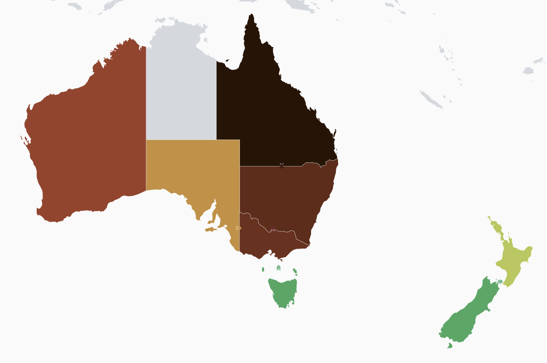
Electricitymap-contrib: Should we remove red from the color scale?
From this picture, to me it seems a bit hard to see which area is worse than another.
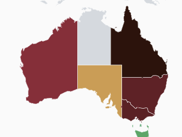
I'm thinking (and proposing) that maybe if the scale went from orange to brown to darkbrown (and less do a detour to the red), we wouldn't have that problem?
Let me know if this is a shared opinion or just my personal bias :)
Olivier
 corradio
All 9 comments
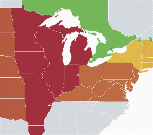
I think this is mostly only an issue in Australia where there aren't many nearby regions to give context through intermediate colours.
It seems clearer in North America for example:
 jarek
on 28 Jun 2018
jarek
on 28 Jun 2018
Although to be honest taking a second look at this America screenshot I wouldn't be sure if MISO is cleaner than PJM without checking
jarek
on 28 Jun 2018
Hallway test anecdote: I showed both of the above screenshots to a third person who wouldn't have otherwise known what the correct answer was, and they got the ordering correct in both. Could someone else try it with their neighbours? "What would you say is the relative order in terms of how 'green' the areas are?"
However a question was raised whether the colour scheme works for colour blind people. (We do have a colour-blind mode, but it's not exactly easy to spot on the first glance if you don't know it's there.)
jarek
on 28 Jun 2018
I like the red but it can be confusing unless the carbon scale is present. I will try and do some tests with people who have zero experience with the map or electricity later today.
edit: one got it perfectly and the other struggled very badly.
 systemcatch
on 29 Jun 2018
systemcatch
on 29 Jun 2018
Color scale seems clear to me, but i'm definitively biased! :D
On Fri, 29 Jun 2018 at 12:18, Chris notifications@github.com wrote:
I like the red but it can be confusing unless the carbon scale is present.
I will try and do some tests with people who have zero experience with the
map or electricity later today.—
You are receiving this because you are subscribed to this thread.
Reply to this email directly, view it on GitHub
https://github.com/tmrowco/electricitymap/issues/1483#issuecomment-401313600,
or mute the thread
https://github.com/notifications/unsubscribe-auth/AVEnG-2mmpZU7JvL2C7nPEdxIiZd3Tzvks5uBf7XgaJpZM4U7Opa
.
 brunolajoie
on 29 Jun 2018
brunolajoie
on 29 Jun 2018
In general I like the idea of removing the red step. We are currently representing the extreme end of the carbon scale with black, which I think is good, as it kind of symbolizes "extreme pollution" (I imagine sooty, black clouds of pollution). Red is also a colour which (at least to me) symbolizes some kind of an extreme (extreme heat, extreme danger, etc), and I don't really see how having red as an intermediary step on our color scale adds anything beyond potential confusion.
There is a potential issue however. There are a lot of people who have a weak color blindness, but who have strong enough color vision to not have to use the color blind mode. For these people (up to 8% of the male population), removing the red step might make the scale less clear, as distinguishing green/brown/orange-ish colors is the main issue for people with weak color blindness. However, if we also made the color scale scale with light/dark colors (going from a light green to black), then that might alleviate this problem.
In any case I think user testing is the only way forward on this. We should consider making a prototype new color scale 🙂
 jbuverud
on 29 Jun 2018
jbuverud
on 29 Jun 2018
When you have countries whose bottom source of electricity according to Electricitymap's sorting is gas and imports are coming from a territory at certain carbon intensities, the imports and gas look very similar in color in the graph:
 Hyric89
on 6 Jul 2018
Hyric89
on 6 Jul 2018
As another data point, I asked another un-involved person (has some technical knowledge) and they also interpreted the relative order in the two screenshots correctly. I think if anything we should look at colour blindness.
jarek
on 12 Jul 2018
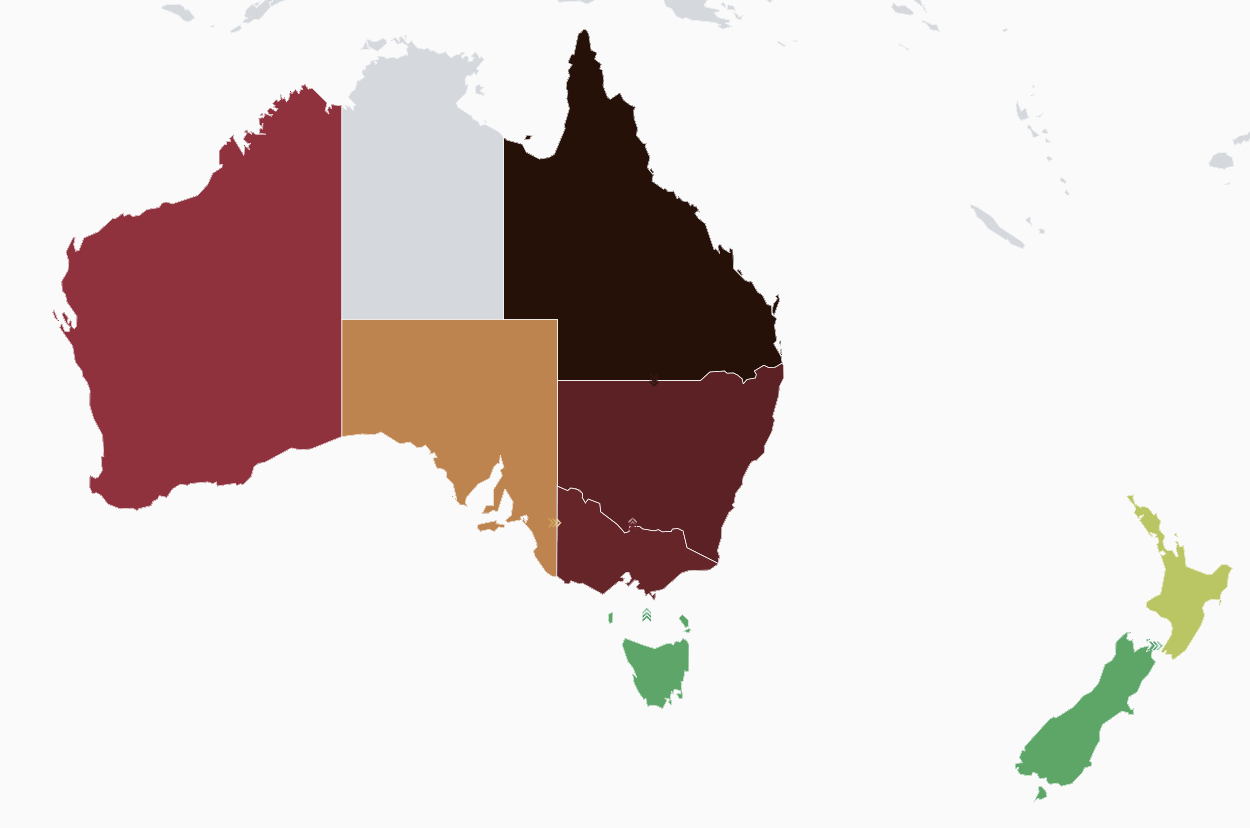
To make the case clearer, I've made a proposal.
The pathological case (to me) seems to happen when we have a country at 600g which shows in red, as red seems (to me again) not to fit very well into the scale green->orange->red->darkbrown.
The idea is that if we remove red with a darker orange / light brown, maybe the order will be a bit more obvious.
Original:
new:
I think the lower example looks better and is more intuitive, as it only mixes two colors (green and brown) intead of three (green, red, brown). Again, this is mostly because I do not perceive red to fit naturally in the green -> brown transition, so I wanted to make that red a bit closer to orange.
@ovbm final word is yours. I can make a PR if you wish. It only requires changing 600g color to #9E4229
corradio
on 27 Jul 2018
Related issues
corradio
·
4Comments
corradio
·
4Comments
brunolajoie
·
3Comments
 alixunderplatz
·
4Comments
alixunderplatz
·
3Comments
alixunderplatz
·
4Comments
alixunderplatz
·
3Comments
Most helpful comment
To make the case clearer, I've made a proposal.
The pathological case (to me) seems to happen when we have a country at 600g which shows in red, as red seems (to me again) not to fit very well into the scale green->orange->red->darkbrown.
The idea is that if we remove red with a darker orange / light brown, maybe the order will be a bit more obvious.
Original:


new:
I think the lower example looks better and is more intuitive, as it only mixes two colors (green and brown) intead of three (green, red, brown). Again, this is mostly because I do not perceive red to fit naturally in the green -> brown transition, so I wanted to make that red a bit closer to orange.
@ovbm final word is yours. I can make a PR if you wish. It only requires changing 600g color to #9E4229