Electricitymap-contrib: Descriptive zone names
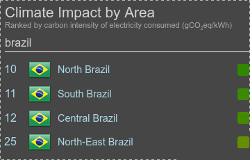
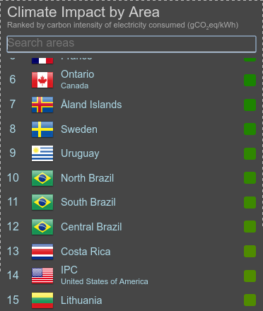
I really like how subregions with definite names are rendered in the new list:
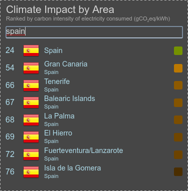
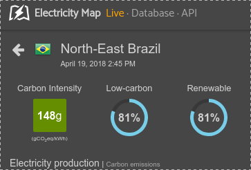
but I'm not so keen on those with descriptive names:
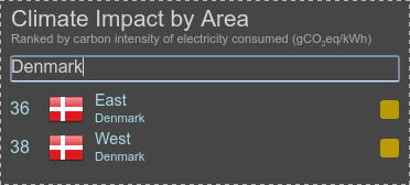
It's a bit hard to explain what seems wrong about those, but I think my main complaint is that these names don't stand on their own. For cases like Yukon and El Hierro the small-text is mostly only used to inform users who might not know where Yukon is, or which La Palma is meant. However "West" doesn't mean anything on its own, and one _needs_ either the smaller text or the flag (which people might not know).
Suggested guideline: if it wouldn't be the title of the region's Wikipedia article (as is the case with for example North Island), don't use it as the main name of the zone.
Currently affected are:
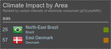
- Denmark East/West
- Brazil zones
- Malaysia
Suggested solution: rename to "West Denmark", "Brazil North-East", "Peninsular Malaysia", or similar. Better yet if we could have their proper local names - though admittedly electrical subdivisions might not have names that ordinary people know.
While we're at it I would also flip the order in the "full name" displayed in the detail view, so that it's "California (United States)" and not "United States (California)".
I'm writing because this has been bugging me a bit, but this is only my opinion. Does anyone else have thoughts about this?
 jarek
jarek
All 8 comments
I agree both with the issue and with your proposed solution 👍 It makes sense for the area names to be unique and self-descriptive for people with the local knowledge.
I also agree that the area details view header needs to be updated with similar styling to that in the list. Both with regards to the main title/subtitle division, but also with regards to the size of the flag. But this redesign should definitely be a separate issue.
 jbuverud
on 18 Apr 2018
jbuverud
on 18 Apr 2018
It's a good idea to have self-descriptive area names indeed, but i'd keep the same ordering btw subzone and zone. Like, for instance:
- California (United States of America)
- West Denmark (Denmark)
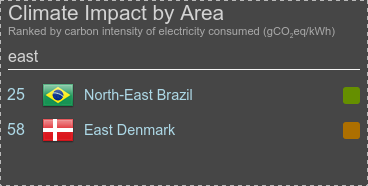
- North-East Brazil (Brazil)
- Peninsular Malaysia (Malaysia)
What dyou think?
 brunolajoie
on 19 Apr 2018
brunolajoie
on 19 Apr 2018
I think that was exactly what @jarek was proposing :smile:
jbuverud
on 19 Apr 2018
@jbuverud do you have an ideas as to how to fix? Currently you do some pattern matching based on parenthesis right?
As I see it we need to add new fields in translations (country name in addition to zone name). That would enable us to have:
- Country name: Denmark, Zone name: West Denmark
- Country name: USA, Zone name: SPP
- ...
and if no country name is used we just display the full zone name.
 corradio
on 19 Apr 2018
corradio
on 19 Apr 2018
I fully agree with the proposed solution. One other small thing, some of the subzone & zone names are quite long which is fine for the list but makes the hover boxes look a bit skewed. We might want to split the longer names onto separate lines to make it more readable.

 systemcatch
on 19 Apr 2018
systemcatch
on 19 Apr 2018
With the following renames we could do this without changes to rendering code:
- "Denmark (West)" renamed to "West Denmark"
- "Denmark (East)" renamed to "East Denmark"
- "Malaysia (Peninsula)" renamed to "Peninsular Malaysia"
- "Brazil (North-East)" renamed to "North-East Brazil"
- other Brazil zones renamed the same way
Developer console mock-ups:
jarek
on 19 Apr 2018
Or, following Bruno's suggestion:
Also I would just replace "United States of America" with "United States" or "USA", at least in the English version.
jarek
on 19 Apr 2018
I think the last option (Bruno's suggestion) is the best. I thought that was your original proposition, but I guess I misunderstood 🙂
And yes, updating the translation with an extra field would definitely be the most robust solution to this. My current current paranthesis pattern matching/string substitution isn't ideal. Updating the translation files would take a bit of extra work, but I definitely think it's worth it 👍
jbuverud
on 23 Apr 2018
Related issues
 alixunderplatz
·
3Comments
alixunderplatz
·
3Comments
 StefanAO
·
4Comments
StefanAO
·
4Comments
 pascalheraud
·
4Comments
systemcatch
·
3Comments
pascalheraud
·
4Comments
systemcatch
·
3Comments
 jzlcdh
·
5Comments
jzlcdh
·
5Comments
Most helpful comment
Or, following Bruno's suggestion:
Also I would just replace "United States of America" with "United States" or "USA", at least in the English version.