Easy-digital-downloads: 3.0 - Orders - Remove Right Aligned Labels and Standardize Form Controls
Bug Report
Expected behavior
Labels should be able to be variable length.
Actual behavior
If a label is too long it overflows incorrectly:
Other sections have a different fixed-width to account for longer strings, but will still break with translations:
Steps to reproduce the behavior
1) Visit "Orders > Add New > Order Details"
2) Translate strings to something longer than they are now.
Information (if a specific version is affected):
EDD Version (or branch): release/3.0
Any other relevant information:
Some items were previously fixed in: https://github.com/easydigitaldownloads/easy-digital-downloads/issues/7523
This would be a really good time to standardize this markup and CSS before we start spiraling out of control with different UI patterns for different areas.
Right now on the Orders screen we have:
<div class="input-wrap">
    <label>Line 1:</label>
    <input type="text" name="edd_order_address[address]" value="">
</div>
<div class="edd-order-payment-key edd-admin-box-inside">
    <span class="label">Key</span>
    <input type="text" name="payment_key" readonly="" value="">
</div>
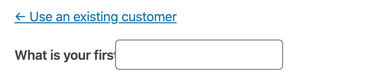
<p>
    <strong>What is your first name:</strong>
    <input type="text" name="edd-new-customer-first-name" value="" class="medium-text">
</p>
<div class="column-container change-customer">
    <label for="customer_id" class="edd-order-details-label-mobile">Assign to an existing customer</label>
    <select name="customer-id" id="customer_id"></select>
</div>
All attempting to accomplish the same thing but needing specific CSS to do so.
We need a reusable and flexible way to setup EDD form controls that are not context-specific (nor screen-specific).
Related https://github.com/easydigitaldownloads/easy-digital-downloads/issues/7701, https://github.com/easydigitaldownloads/easy-digital-downloads/issues/7737
Work towards this should be based off try/edd3-orders which includes the changes from https://github.com/easydigitaldownloads/easy-digital-downloads/issues/7523
 spencerfinnell
All 29 comments
Totally agree that this should be tackled. Getting IDs on inputs and labels attached will help with accessibility.
The current CSS isn't mobile friendly and the specificity for things like width and height are not ideal. Some thoughts/suggestions for the CSS:
- replace specific widths with flexbox (on larger screens--mobile devices need everything full width generally) and when specific widths are desired, use
flex-basis. This could begin to fix the issue with large labels while still keeping the current visual appearance. - use WordPress core classes such as
regular-textwhen appropriate (see the "Order Extras" fields) to take advantage of core styling - remove specific heights on inputs (WP core changes that based on screen size; would be nice to inherit)
Should these inputs start using the EDD()->html functions? Those are not consistent in their output (#7701) but if we can start fixing issues in those output functions, and use them wherever we want to create inputs, we're not starting from scratch every time we want to add a new input field.
 robincornett
on 14 Apr 2020
robincornett
on 14 Apr 2020
Should these inputs start using the EDD()->html functions? Those are not consistent in their output (#7701) but if we can start fixing issues in those output functions, and use them wherever we want to create inputs, we're not starting from scratch every time we want to add a new input field.
My concern with first implementing new markup there is it immediately affects all EDD screens (and potentially areas in the frontend if extensions are using it). I think starting with adding consistency to the Orders screen will allow two things:
- Keep changes to a specific screen, making it easier to test changes
- Allow us to flesh out and legitimize the markup and style changes before implementing globally
spencerfinnell
on 14 Apr 2020
In an attempt to standardize the label / input blocks for edd, I propose we use something like this:
Text Inputs
```html
`
**Radio Buttons**
html
````
Check Boxes
```html
````
Numbers
```html
````
Some of these are probably not perfect code, but you can get the idea. With @spencerfinnell 's help, I borrowed the block formatting from Bootstrap and the labeling structure from BEM.
I'm still working on examples for select and probably a few others, but I wanted to get the discussion going now. Please share your thoughts / ideas / best practices...
 LisaCee
on 15 Apr 2020
LisaCee
on 15 Apr 2020
Overall, I think it looks lovely and I could totally be on board with this. Some thoughts, in no particular order:
- I would include core WP styles on inputs as much as possible (in addition to the edd ones). So the text input might look like this (just the addition of the
regular-textclass):
<div class="edd-form-control">
    <label for="edd-new-customer-first-name" class="edd-form-control__label">
        <?php esc_html_e( 'First Name', 'easy-digital-downloads' ); ?>
    </label>
    <input type="text" class="edd-form-control__input regular-text" name="edd-new-customer-first-name" id="edd-new-customer-first-name">
</div>
- How would we handle the
edd-form-controlon settings pages (if we eventually extended this markup to settings pages), since they're in<td>there? Would adding that "extra"<div>in matter? This may not be a relevant question today, but something to keep in mind for the future. - One issue to consider is fields with non-label elements which need to be accounted for. An example is the price field on a download, which currently looks like this:
<div id="edd_regular_price_field" class="edd_pricing_fields">
    $<span id="edd-edd_price-wrap"><input type="text" name="edd_price" id="" autocomplete="" value="30.00" placeholder="" class="edd-price-field"></span>
</div>
That $ can be displayed before or after the <span><input>, depending on a user setting (This particular example doesn't have extra markup in the <span>, but depending on the parameters passed to the EDD()->html->text() function, it could). The "Refund Window" input on a download screen is similar in that it has "Days" added after the <input>...would similar input/extra text combinations need extra markup?
- I do like the idea of creating a "master" input group div/class--I think we could update a lot of CSS to be more flexible and mobile friendly with this alone (multiple fields, especially in repeatable rows, have specific widths set). Also think I'm a fan of BEM so I can roll with this.
robincornett
on 16 Apr 2020
I would include core WP styles on inputs as much as possible (in addition to the edd ones). So the text input might look like this (just the addition of the regular-text class):
Definitely when implementing, but let's not rely on any of the WordPress core CSS for any structural styles (which I don't think there are). i.e don't apply or rely on display: block; on .regular-text because that class likely won't be added to the input outside of the admin screens.
How would we handle the edd-form-control on settings pages (if we eventually extended this markup to settings pages), since they're in
there? Would adding that "extra" in matter? This may not be a relevant question today, but something to keep in mind for the future.I don't think this should cause any issues. In my head the idea would be to automatically apply some spacing between multiple direct instances of
.edd-form-control(via.edd-form-control + .edd-form-control:not(:last-of-type)) but single instances would essentially just be an extra wrapping element with nothing applied.One issue to consider is fields with non-label elements which need to be accounted for. An example is the price field on a download, which currently looks like this:
This is why I've become a fan of also wrapping the actual
inputwith anotherdiv. It gives flexibility for aligning items as a full group.<div class="edd-form-group"> <label for="price" class="edd-form-group__label">Price</label> <div class="edd-form-group__control"> <input type="text" class="edd-form-group__input" /> </div> <span class="edd-form-group__help">Help</span> </div>Or, in theory, a
.edd-amount-controlincluded:<div class="edd-form-group"> <label for="price" class="edd-form-group__label">Price</label> <div class="edd-form-group__control"> <div class="edd-amount-control"> <span class="edd-amount-control__currency is-before">$</span> <input type="text" class="edd-form-group__input edd-amount-control__input" /> </div> </div> </div>That gives us the ability to space the label and control consistently no matter represents the control.
So, @spencerfinnell , add
.regular-textclasses to the text inputs and add adiv class=-"edd-form-group__controlaround theinputs? Would theedd-amount-controlonly be forinput/spanswith currency involved?add .regular-text classes to the text inputs
When we go through and make the changes to this new structure we will ensure inputs have them where appropriate, but I don't think they should necessarily be a part of defining this "master" component as a whole. Is that reasonable @robincornett?
add a
div class="edd-form-group__control"around the inputsIs my vote, but certainly open to further discussion if there are objections.
Also note that I switched the outer wrapping
divclass to.edd-form-groupvs.edd-form-control, since the "control" now becomes one item inside of the group (label, control, help).Would the edd-amount-control only be for input/spans with currency involved?
The
.edd-amount-controlwas just a hypothetical example of a more customized control that could be used (vs. just aninputtag). Nothing needs to be changed specifically for this.Depending on what you mean by defining...generally my inclination is to use
regular-textas a default, and override when/where/as needed. So from a code standpoint, my preference would be for a text input to have a required class ofedd-form-group__input(or whatever we are on now), and then a default which can be overridden. (FWIW, theEDD()->html->text()method usesregular-textas a default but it is frequently overridden.) Does that make sense?👍1Is this the gist of the changes?
```html
````
👍1Yep, I'm happy with:
<div class="edd-form-group">
    <label for="my-input" class="edd-form-group__label">
        Label
    </label>
    <div class="edd-form-group__control">
        <input type="text" id="my-input"  class="edd-form-group__input regular-text" />
    </div>
</div>
Basic
input[type="text"]andselectcontrol implementations likely won't really need any additional CSS. Checkboxes, radio groups, and multiple consecutiveedd-form-groupinstances will likely need some tweaks.@LisaCee Let's finish https://github.com/easydigitaldownloads/easy-digital-downloads/issues/7737 first, then do you want to start implementing this on items in the "Order Attributes" box? Remember this should be a completely portable component so it should be a _child_ of things like
.edd-admin-box-inside(that handles borders and padding inside the box).👍1Looking at some improperly labeled radio inputs and wanted to update that markup example:
<div class="edd-form-control">
    <fieldset>
        <legend>Select how the discount will be applied:</legend>
        <label for="global" class="edd-form-control__label">
            <input type="radio" class="tog edd-form-control__input" name="scope" value="global" id="global" checked="checked"/>
            <?php esc_html_e( 'Apply discount to entire purchase.', 'easy-digital-downloads' ); ?>
        </label>
            <label for="not_global" class="edd-form-control__label">
                <input type="radio" class="tog edd-form-control__input" name="scope" value="not_global" id="not_global"/>
                <?php esc_html__e( 'Apply discount only to selected %s.', 'easy-digital-downloads' ); ?>
        </label>
    </fieldset>
</div>
Source: WebAIM ... also see the note that a fieldset/legend may not always be necessary.
👍1@robincornett My inclination would be:
<fieldset>
    <legend>Radios</legend>

    <div class="edd-form-group edd-form-group--inline">
        <label for="my-input-1" class="edd-form-group__label">
            Label
        </label>
        <div class="edd-form-group__control">
            <input type="radio" id="my-input-1"  class="edd-form-group__input regular-text" />
        </div>
    </div>

    <div class="edd-form-group edd-form-group--inline">
        <label for="my-input-2" class="edd-form-group__label">
            Label
        </label>
        <div class="edd-form-group__control">
            <input type="radio" id="my-input-2"  class="edd-form-group__input regular-text" />
        </div>
    </div>
</fieldset>
Where the
.edd-form-group--inlineensures the label and control appear on the same line.Just an observation that checkbox inputs and radio
inputsusually appear before their associatedlabels.Some markup wraps both the input and the text inside the
<label>element (see Lisa's first example, which I think is fairly typical). Looking at some resources, it appears that maybe we should change that to:```html
(Sorry, I didn't catch the inversion of the input and label originally.)
Wrapping both the input and text in a label does not appear to be problematic from a usability standpoint--everything seems to work and it's not flagged by accessibility checkers--but I would suggest that we pick one approach for both checkboxes and radio inputs and stick with them. My guess is that wrapping them together may prevent some potential styling issues (or them getting separated if the options are all presented inline, but that may be preventable with the
edd-form-group--inlinestyling), but that's only a guess.@robincornett What about using
flexboxordering to adjust the visual order of thecheckboxorradioandlabel? The previous markup should work with that.I would use
flexboxordering as a last resort. When possible, it's better to build the markup in the order you want to display it...I know it's not always possible, but here it is.Then is there downside to keeping the rest the same, and just switching the order when needed?
<div class="edd-form-group edd-form-group--inline"> <div class="edd-form-group__control"> <input type="radio" id="my-input-2" class="edd-form-group__input regular-text" /> </div> <label for="my-input-2" class="edd-form-group__label"> Label </label> </div>I would keep labels before inputs for most cases, but checkboxes and radio inputs should be input, then label. As long as we are consistent about that, and wrapping input behavior (let's vote to stop doing that), I think we're good.
and wrapping input behavior (let's vote to stop doing that)
@robincornett For all groups, or just checkbox and radio? I like having the extra wrapper to more easily manage items like the second example here: https://github.com/easydigitaldownloads/easy-digital-downloads/issues/7739#issuecomment-614728730
Sorry, I meant let's stop wrapping an input inside of a label, such as
<label><input></label>, which apparently generally used for "implicit labels", which doesn't apply to us. I'm fine with the ones you have been suggesting, @spencerfinnell.A more authoritative source on ordering labels and inputs.
@robincornett Great! I think we have a general consensus here then, and I'll work with @LisaCee to start implementing these on the Order screen, and then we can reevaluate, adjust, and apply to other screens as necessary.
👍1Adding @robincornett 's comment from issue #7744:
Also, thinking through our discussions about radio inputs and grouped controls, I did some more digging and I think the hour/minute inputs would benefit from being "grouped" using a
UPDATED Proposal attempting to bring together our entire discussion:
Text
```html````
Radio
```html````
Checkbox
```html````
Number
```html````
What did I miss?
It seems likely that this may be "punted" until after the initial 3.0 release, but it will be nice to have it all decided, even if it may be implemented later.
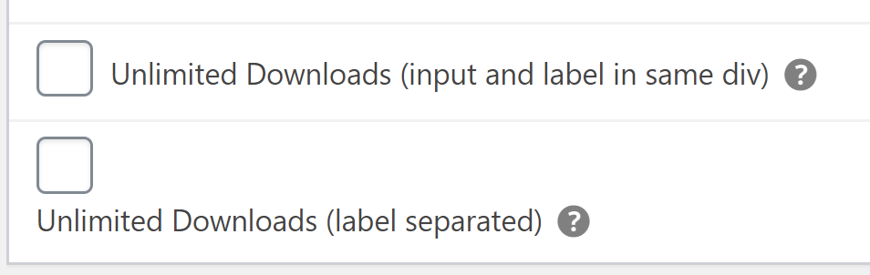
Okay, looking this over again and I'm liking this, _except_ I do not think we want to have checkbox/radio inputs in one
divand then their labels inside of another as we currently have them. Default CSS rules fordivis going to mean that anytime we want to use this markup, we _must_ make sure that CSS is applied to keep those on the same line. I think the input and label for these two elements, at least, need to be inside of the samedivcontainer, and if you want to put a wrapper around the label, it should be aspaninstead.I edited a checkbox field on the orders screen to show this:
(note:.edd-admin-box .label--has-tipshould be changed toinline-flexregardless)Ideally, we do not want to override native CSS/HTML behavior, just use it properly, and enhance as needed.
👍2Technically, because of how other inputs (like text fields and select) behave, I think we could always keep the label/inputs together in the same container, and override as specific scenarios indicate a need, and add things like currency symbols, etc. using
spansince that's an inline element.Okay, looking this over again and I'm liking this, _except_ I do not think we want to have checkbox/radio inputs in one
divand then their labels inside of another as we currently have them. Default CSS rules fordivis going to mean that anytime we want to use this markup, we _must_ make sure that CSS is applied to keep those on the same line. I think the input and label for these two elements, at least, need to be inside of the samedivcontainer, and if you want to put a wrapper around the label, it should be aspaninstead.I edited a checkbox field on the orders screen to show this:
(note:.edd-admin-box .label--has-tipshould be changed toinline-flexregardless)Ideally, we do not want to override native CSS/HTML behavior, just use it properly, and enhance as needed.
I agree.
ashleyfae on 20 Apr 2020
Okay, looking this over again and I'm liking this, except I do not think we want to have checkbox/radio inputs in one div and then their labels inside of another as we currently have them. Default CSS rules for div is going to mean that anytime we want to use this markup, we must make sure that CSS is applied to keep those on the same line.
@robincornett This means for any non-radio or non-checkbox we'll be applying CSS to either the
labelorinputto ensure the items are on separate lines -- overriding the HTML. Having the wrapperdivcreates correct default behavior for all other types of inputs.Either way though, the advantage of ensuring we always have these specific classes applied to the HTML means we _can_ safely make CSS adjustments where necessary.
This means for any non-radio or non-checkbox we'll be applying CSS to either the label or input to ensure the items are on separate lines -- overriding the HTML.
That's true, but I think it's the better default choice. Keeping the label and input in the same container ensures they are always grouped together. A text field label and input on the same line can be ugly, but that's a visual preference (and I agree that in a lot of cases, they should be on separate lines). A checkbox/radio label/input on separate lines can be confusing and disruptive. If no CSS were loaded, or if a user decided to replace the CSS completely without regard to special classes we might add (such as
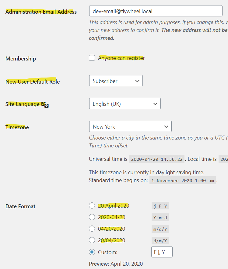
*--inlineor*--block), would inputs still look like they go with their associated labels?As I thought about this off and on during the weekend, the other thing that occurred to me is that checkbox and radio inputs are generally different from text and select inputs by their very nature. I think a great example of how they're different can be found on the WP General Settings screen:
I've highlighted all of the
<label>elements. I think this more clearly shows what I'm trying to explain here...semantically, the labels for the text and select inputs are linked (because offor), but they are separated by quite a lot of markup. The samethcell "labels" for the checkbox and radio fields are not their actual<label>; they just appear the same visually. The actual checkbox and radio input labels are not separated from their inputs, because it would render the visual output nonsensical. (Note: WP Core here has apparently wrapped the checkbox/radio inputs in their related labels, fwiw.)I think what I am trying to say is that checkbox and radio inputs do not necessarily need to be treated the same as other inputs, but they should be consistent with themselves and each other, and no inputs should _require_ to truly look correct (ugly can still look correct).
@robincornett Thanks for all of the great feedback. :) Great talking it out.
For the sake of ensuring we have some form of consistency in 3.0, I started implementing what I think is the ultimate compromise!
https://github.com/easydigitaldownloads/easy-digital-downloads/tree/issue/7739
Check out the markup for a list of radios vs. a standard email input:
It keeps
input + labeltogether forradioandcheckboxtypes and allows them to be easy to use inside afieldset.👍1Thanks, @spencerfinnell ... the radio inputs there look good to me.
One suggestion: change the help text class to use
description edd-form-group__help(or vice versa). With that, you do not need to recreate the CSS in EDD; it will just use WordPress core's.descriptionstyling, which is nearly identical.Thank you for the care and attention you are giving to this topic!
👍1Was this page helpful?0 / 5 - 0 ratingsRelated issues
davidsherlock · 4Comments
colomet · 4Comments
boluda · 4Comments
amdrew · 5Comments
scottbuscemi · 5Comments
Most helpful comment
Okay, looking this over again and I'm liking this, _except_ I do not think we want to have checkbox/radio inputs in one
divand then their labels inside of another as we currently have them. Default CSS rules fordivis going to mean that anytime we want to use this markup, we _must_ make sure that CSS is applied to keep those on the same line. I think the input and label for these two elements, at least, need to be inside of the samedivcontainer, and if you want to put a wrapper around the label, it should be aspaninstead.I edited a checkbox field on the orders screen to show this:

(note:
.edd-admin-box .label--has-tipshould be changed toinline-flexregardless)Ideally, we do not want to override native CSS/HTML behavior, just use it properly, and enhance as needed.