Easy-digital-downloads: 3.0 - Improve UI/UX on the order list table.
This issue branches off from: https://github.com/easydigitaldownloads/easy-digital-downloads/issues/6642
Problem
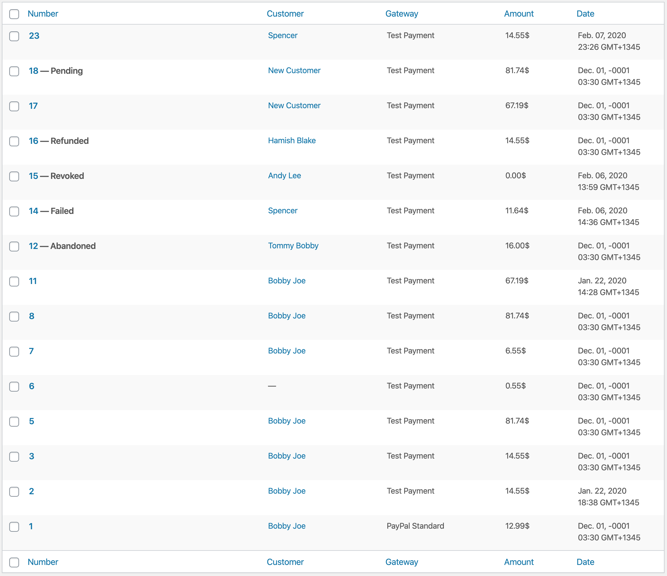
The issue being addressed is that it's hard to click on an Order number from the Orders table, especially when the Order number is only one or two characters. See below:
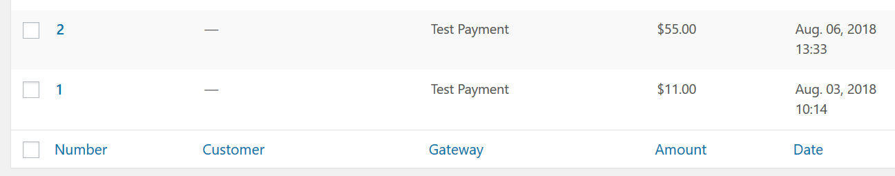
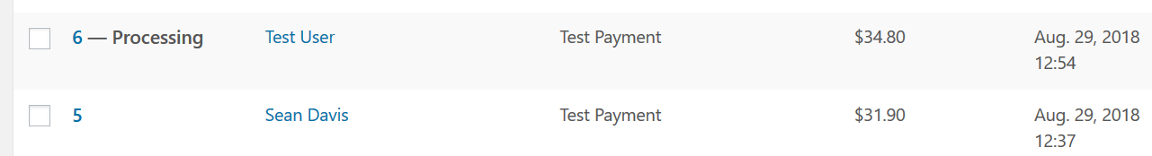
The Order numbers would be easier to click if they were longer. One suggested solution was to make them display: block;. However, that isn't recommended because non-complete Orders will show what "State" the Order is in. For example:
Suggested solution
I think a simple way to solve this is to prepend all Order numbers with View Order:. This approach provides several benefits, such as:
- It's familiar, considering the payment history table in previous versions of EDD will show
View Order Detailslinks for each row. - It provides a little bit more consistency from the table itself, to the edit screen for an Order. The edit screen has a heading of
Edit Order: 2. Clicking into it from aView Order: 2link is pretty consistent. - The fact that it's currently _just_ a number makes it even more mysterious than normal. Sure, the context of the page should tell you that it's an Order number. But considering the user never _chose_ that Order number because it's created automatically, it just kind of leaves the inexperienced user assuming.
View Order: 2makes it pretty clear that it's an Order number. - It adds decent length to the link, even for Order number
1, while leaving plenty of room for "states."
Here's how it would look (read comments below the image):
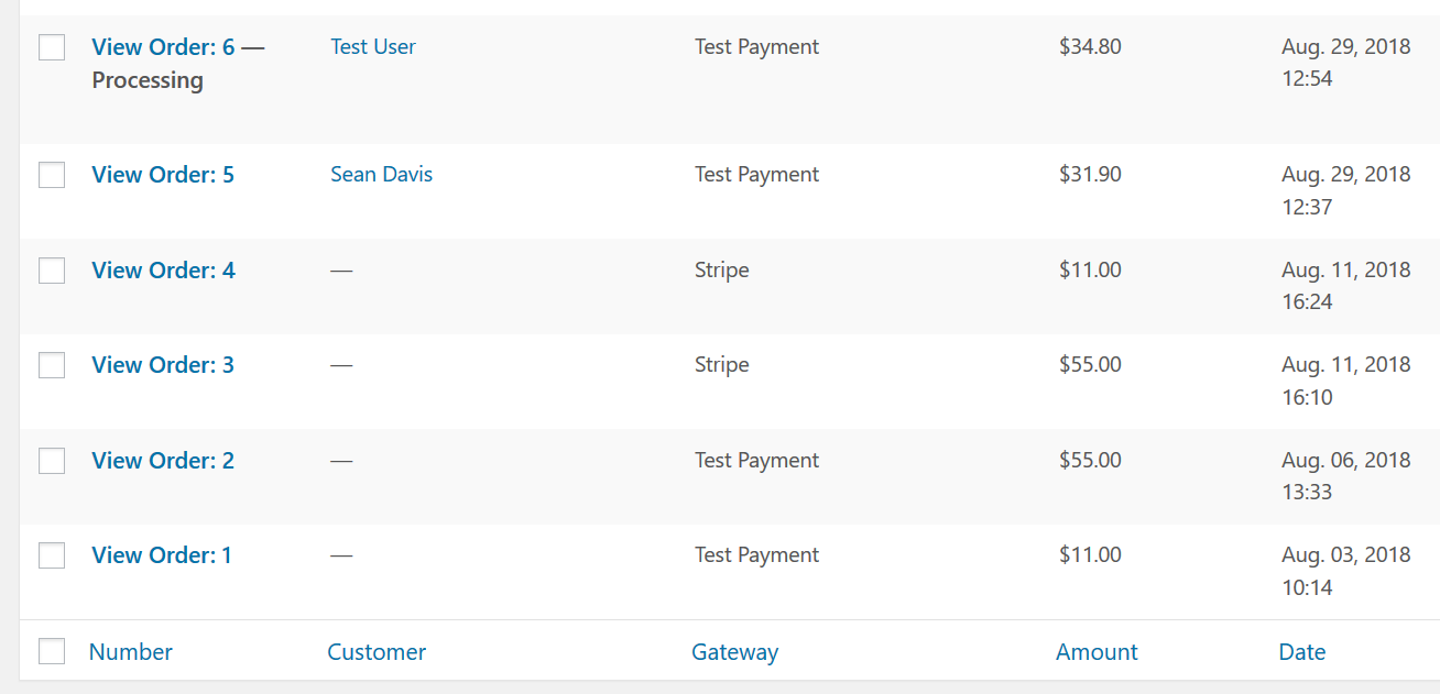
As you can see, this solves the original problem but still has the potential to cause wrapping. That's not a deal breaker, but it's something we should address. The number of columns, and the column widths have gotten out of hand in the past. Perhaps certain columns, like Number, should have more defined widths while others have loose but effective restrictions.
Comment by @cklosowski:
As a testing note, we should be sure to verify that these columns all still look good with Fraud Monitor and Campaign Monitor enabled (two items that I know add their own columns to the orders/payments list table).
Comment by @JJJ:
- We should set a max width on all custom columns
- We should educate add-on maintainers that having their own column widths is strongly encouraged and polite
 SDavisMedia
All 27 comments
PR #7561 uses some JS to handle click actions on the <td>. If the target is the base <td> or the status (<strong>) it redirects to the .row-title action.
 spencerfinnell
on 6 Feb 2020
spencerfinnell
on 6 Feb 2020
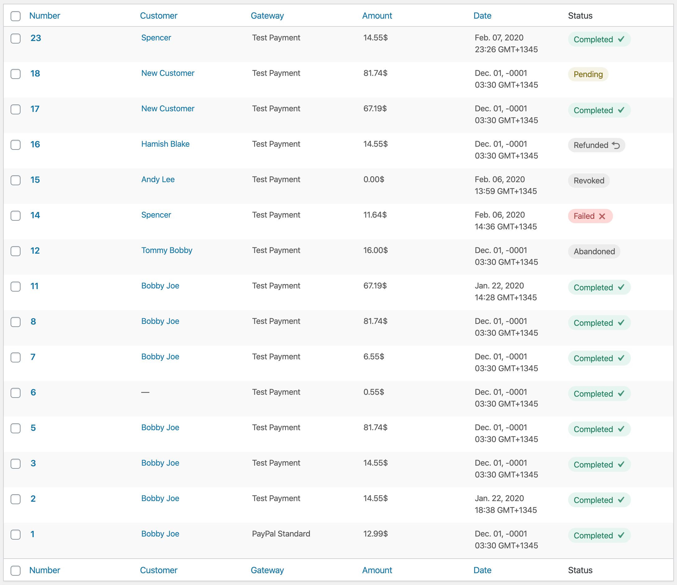
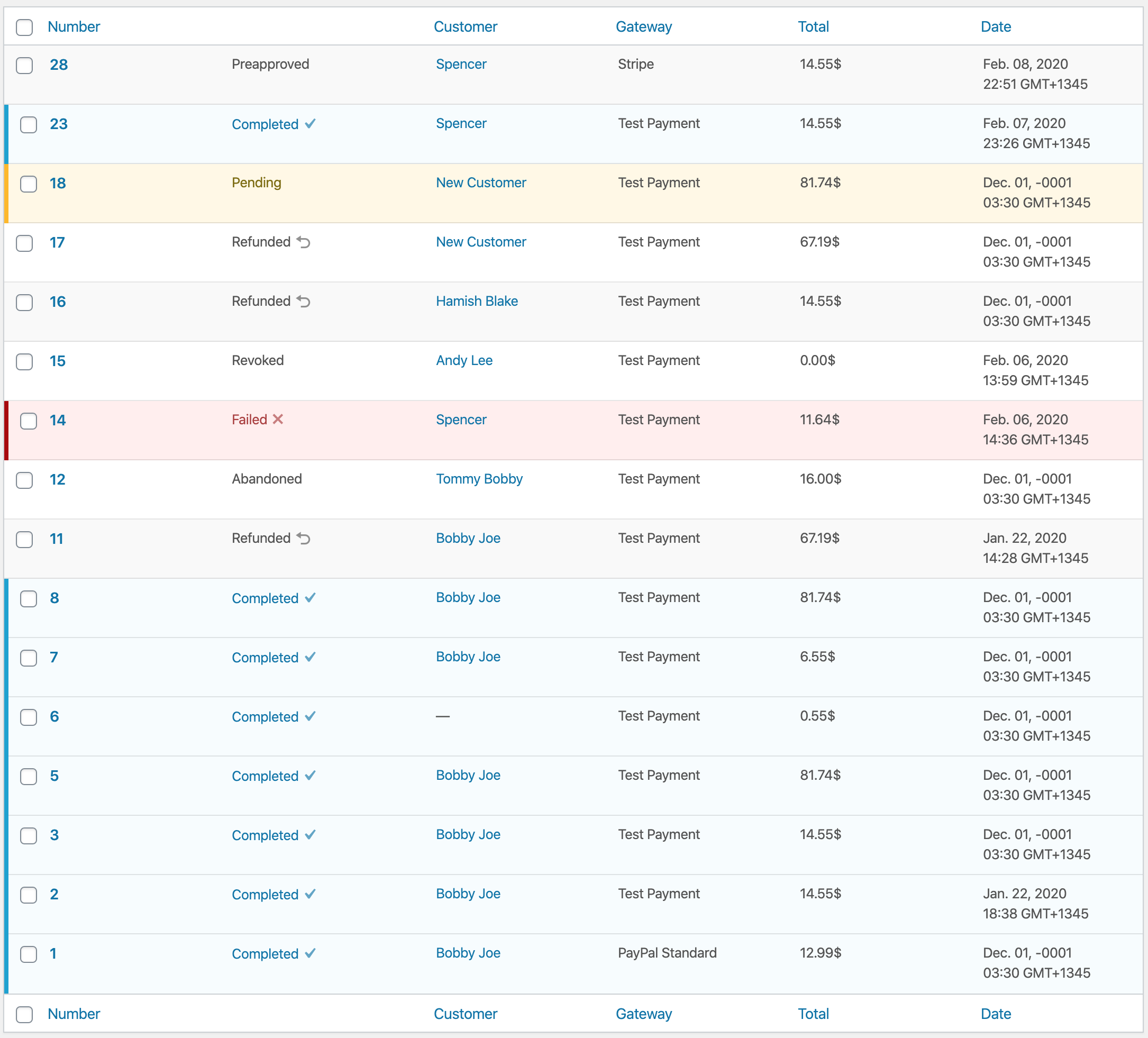
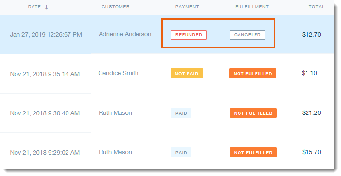
I think having a separate column for Status might help clear up scenarios like this:
Treating all non-complete statuses the same makes it very hard to scan recent Orders. To someone keeping an eye on incoming orders it's not immediately clear what may be wrong with the Order.
I think colored status labels in their own aligned column would help make this more scannable.
spencerfinnell
on 7 Feb 2020
colored status labels in their own aligned column would help make this more scannable.
Unfortunately, that isn’t part of the WordPress Admin area design language. Statuses are filterable & clickable above the area where your screenshot cuts off. A column for them in the list-table becomes redundant.
States (like are there currently) are how list-table items show off their important attributes.
Perhaps most importantly, Statuses are all hard-coded everywhere still, thanks to WordPress not having a standard for handling them. I’m reluctant to add anymore secondary meta meanings to them (colors, here) because that means hard-coding the colors to the statuses in a way we will have a hard time dealing with down the road.
I think the status/states are fine-enough for now and 3.0 as is, and this could be prioritized later if user feedback proves this to actually be confusing to the majority of shop owners.
 JJJ
on 7 Feb 2020
JJJ
on 7 Feb 2020
I agree it works for core's design language, but there are only two statuses that can appear appended to the item: Draft, or a page setting designation. The "All Posts" list is still scannable with appended states because you know if you see something other than a post title it's almost guaranteed to be a Draft.
EDD however has 8 statuses in core, and potentially more with extensions (such as Preapproval, and Preapproval Pending with Stripe, Renewal with Recurring). With 8-10+ possible states being shown in a list you have to _really_ focus on each row to determine what is going on. master's separate column lets you at least have a dedicated place to look that isn't affected by the length of the order number.
spencerfinnell
on 7 Feb 2020
FWIW, I prefer a dedicated status column. Between release/3.0 and master, the presentation of the order status in master is easier to grok in master. That might just be because I"m used to it, but I don't think that's it.
 pippinsplugins
on 7 Feb 2020
pippinsplugins
on 7 Feb 2020
I also think from a user-happiness and user-confidence point of view having a nice reassuring green "Complete" visible on orders would help a lot. What's nicer than seeing a big list of completed Orders that you know with 100% certainty need no immediate action?
Item states that need no action can remain neutral, and states that need attention may get a highlight.
spencerfinnell
on 7 Feb 2020
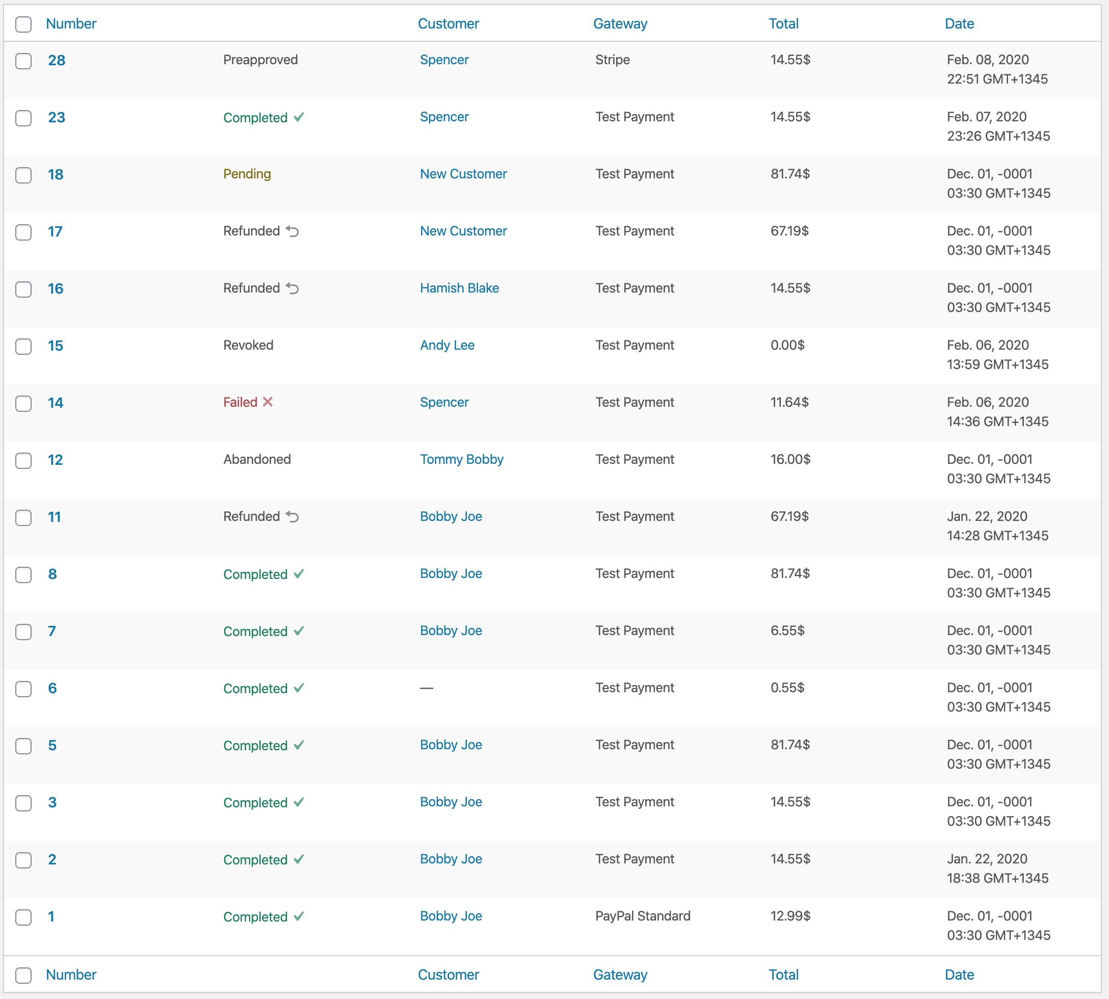
Maybe something like:
| Before | After |
| --- | --- |
|  |
|  |
|
The separate column also negates the need for #7561 since we can make the clickable area of the number the full width of the column.
spencerfinnell
on 7 Feb 2020
Removing the status column could also be seen as a backwards compatibility concern. The Stripe extension adds more actions to this column (however incorrect that might be), which breaks in release/3.0.
spencerfinnell
on 7 Feb 2020
The After looks nice but the labels look like pill buttons to me.
What's nicer than seeing a big list of completed Orders that you know with 100% certainty need no immediate action?
I don’t think your After conveys this. It still requires groking the right-most column. Again, WordPress offers an existing design convention of having different colored columns (blue, pink, etc...) that would convey that feeling better than yet-another-new UI that requires learning and understanding over what already exists universally in the entire WordPress admin area.
JJJ
on 7 Feb 2020
Again, WordPress offers an existing design convention of having different colored columns (blue, pink, etc...)
@JJJ Where is this pattern used? I'm not familiar with that.
Edit: Unless you mean rows?
spencerfinnell
on 7 Feb 2020
An alternative with just text colors and moved to the second column position, minus a visible table header label:
spencerfinnell
on 7 Feb 2020
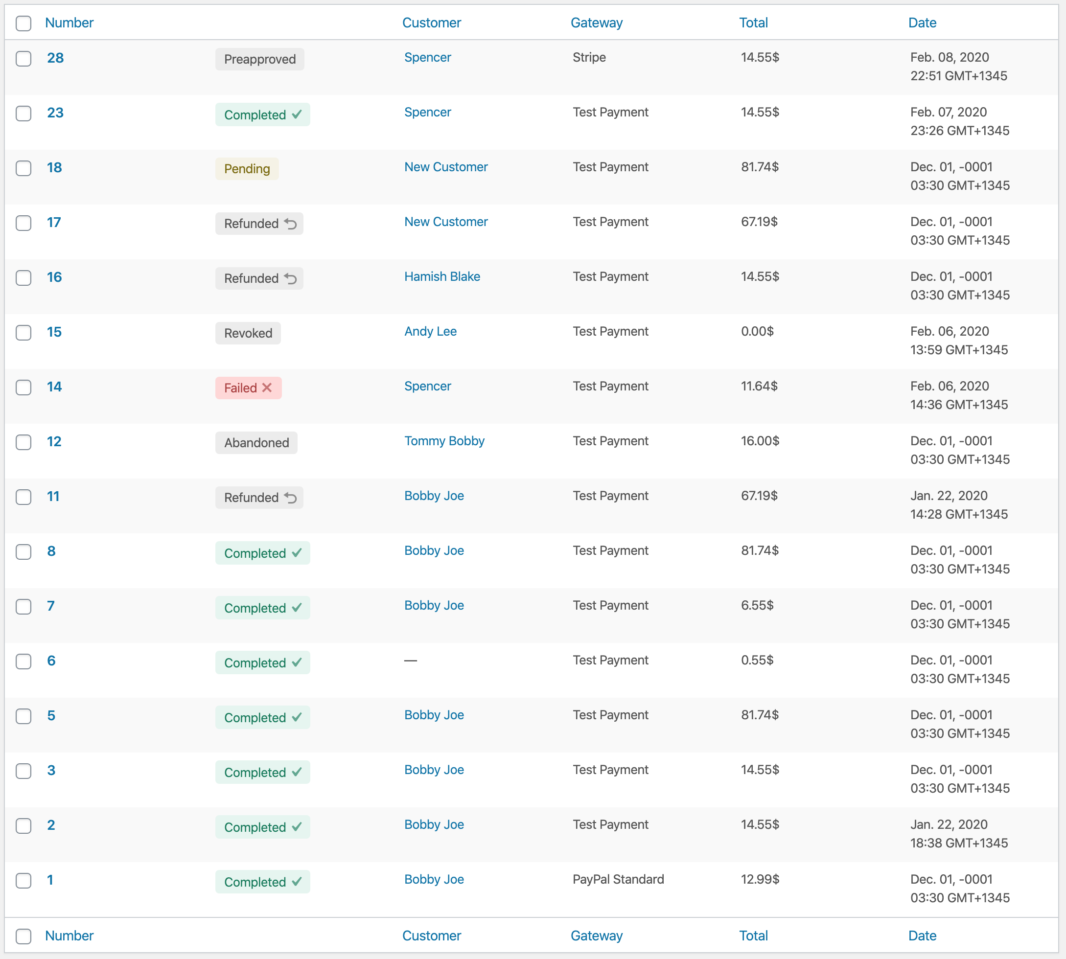
Second column with less round badges:
spencerfinnell
on 7 Feb 2020
I really like the latest version.
pippinsplugins
on 7 Feb 2020
Matching the Plugin list, which I think is what @JJJ was referring to:
It feels busy/heavy to me personally. Maybe not having alternate stripes for standard rows would help.
Edit:
spencerfinnell
on 7 Feb 2020
I personally don't believe utilizing the plugin list styling outside of the plugin list is any less of a "non-traditional" WordPress experience.
I also think WordPress core doesn't contain all the design patterns needed for an eCommerce platform and we can create some of our own that respect and take in to consideration the existing UI elements and and stylings.
Edit: Pending comments do use an alternate row background color as well.
spencerfinnell
on 7 Feb 2020
I meant row, not column, but yeah I see you figured that out. Sorry, was typing quickly from mobile (still am fwiw.)
Plugins, Comments, Network Themes and Sites all use light blue. Comments and Sites use pink. bbPress also uses Pink. Many plugins do the same as needed to convey something that needs attention or is “negative” in some way.
Please trust that I’m not simply blindingly trying to block creativity here, and that the decisions we made with 3.0 up until now were done with intent, care, research, and planning. We also set out to simplify existing interfaces to counter the added complexity from adding Refunds and Reporting in. It’s great to see anyone else is doing the same thing, and picking up the ball and moving it forward.
(The biggest WordPress Core pet-peave of mine in the past ten years is how complex and unique every user interface and screen has become, and how much evidence exists to support the fact that users dislike needing to relearn nuanced UI decisions that us as creators think is better for them without having conducted any research to prove or disprove our ideas.)
I’m not saying we shouldn’t experiment or be creative. I happen to disagree that this is the place and time to do that, because it is confusing to have a Status column and a Status filter.
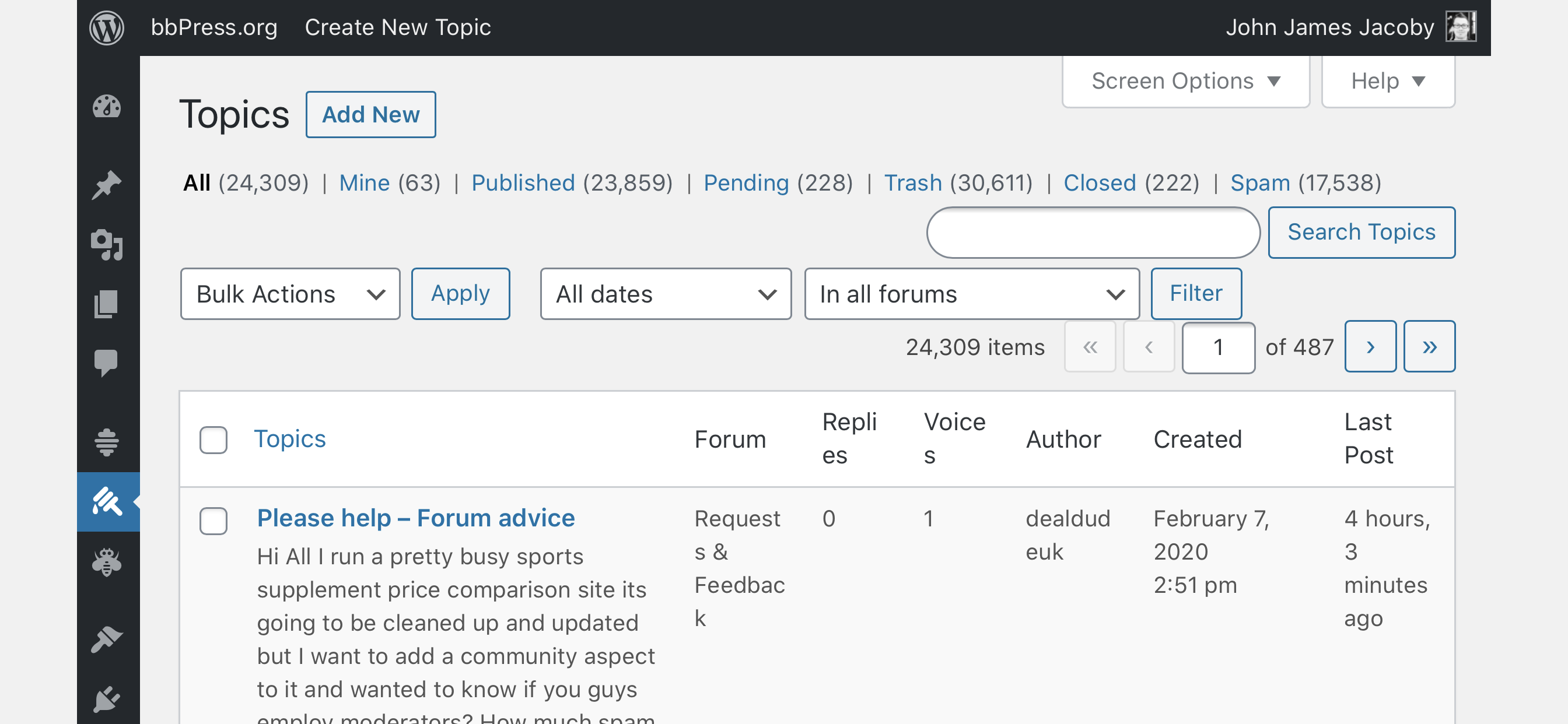
For example, bbPress has multiple custom statuses, does not have a column, and 300k installs or users have never brought this up as a problem:
My Post Type Switcher plugin adds a Post Type column, and while no one has complained about it, I don’t like it there either, but users did complain about the lack of a column there, so I added it.
If we feel like shop owners need clarity around what types of orders they are looking at, and if we feel like that means inventing a new UI convention for our users to learn, we should have a deep log of evidence to support this, and we owe it our users to do more than stab at ideas and make decisions based on our feelings.
The previous payment status column was found to be redundant in the context of the current design, so we agreed to remove it. It being a back-compat break is the most compelling reason to bring it back. We were very careful to avoid breakages, but it’s always plausible we missed something.
Whether the row colors feel heavy or not unfortunately isn’t really up to us to change, because it’s how WordPress works.
If we are rethinking how to draw attention to different statuses and why, I believe strongly that needs deeper scrutiny (and possibly a different issue in GitHub) than “I like that better than this.”
Do any other Sandhills plugins have a similar need? Can we design a universal language of our own that our properties can adhere to?
JJJ
on 8 Feb 2020
I like this one the best so far:
https://github.com/easydigitaldownloads/easy-digital-downloads/issues/7239#issuecomment-583632530
Does this design language work for Refunds, and for individual Order Items inside of an Order view too? If we are using this here, we should be thinking about using it everywhere else that is of similar functionality and importance.
JJJ
on 8 Feb 2020
Great feedback @JJJ, thank you for the thoughtful reply. I know it's not intentional blocking :)
I happen to disagree that this is the place and time to do that, because it is confusing to have a Status column and a Status filter.
For example, bbPress has multiple custom statuses, does not have a column, and 300k installs or users have never brought this up as a problem:
Great example, and clearly you've thought about this issue before. My concern with that screen is similar to that of the Orders screen -- not all of the statuses are immediately obvious. A "Closed" topic receives a slight dulling but there's no indication what that actually means at first glance until you see the "Open" link on the row action. The Pending state receives an appended "Pending" string and background color, which helps.
I think one advantage bbPress has as well is that Spam topics are excluded from the "All" list. The Orders screen currently shows _everything_, which might be contributing to the the Orders screens difficult groking.
If we are rethinking how to draw attention to different statuses and why, I believe strongly that needs deeper scrutiny (and possibly a different issue in GitHub) than “I like that better than this.”
I think (_I feel_) statuses of Orders simply hold a different and greater weight than an appended string next to the order number. It is equally as important as the Number, Customer Name, Gateway, Total, or Date.
Having the filterable statuses at the top of the page to me is completely separate functionality and compliments the information in the Order row -- the same way there is a Date filter but there is still a Date column, or the Gateway filter but there is still a Gateway column.
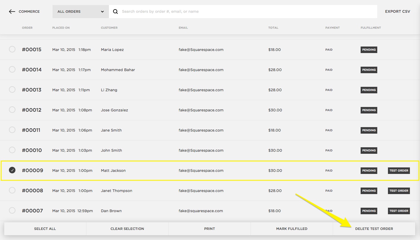
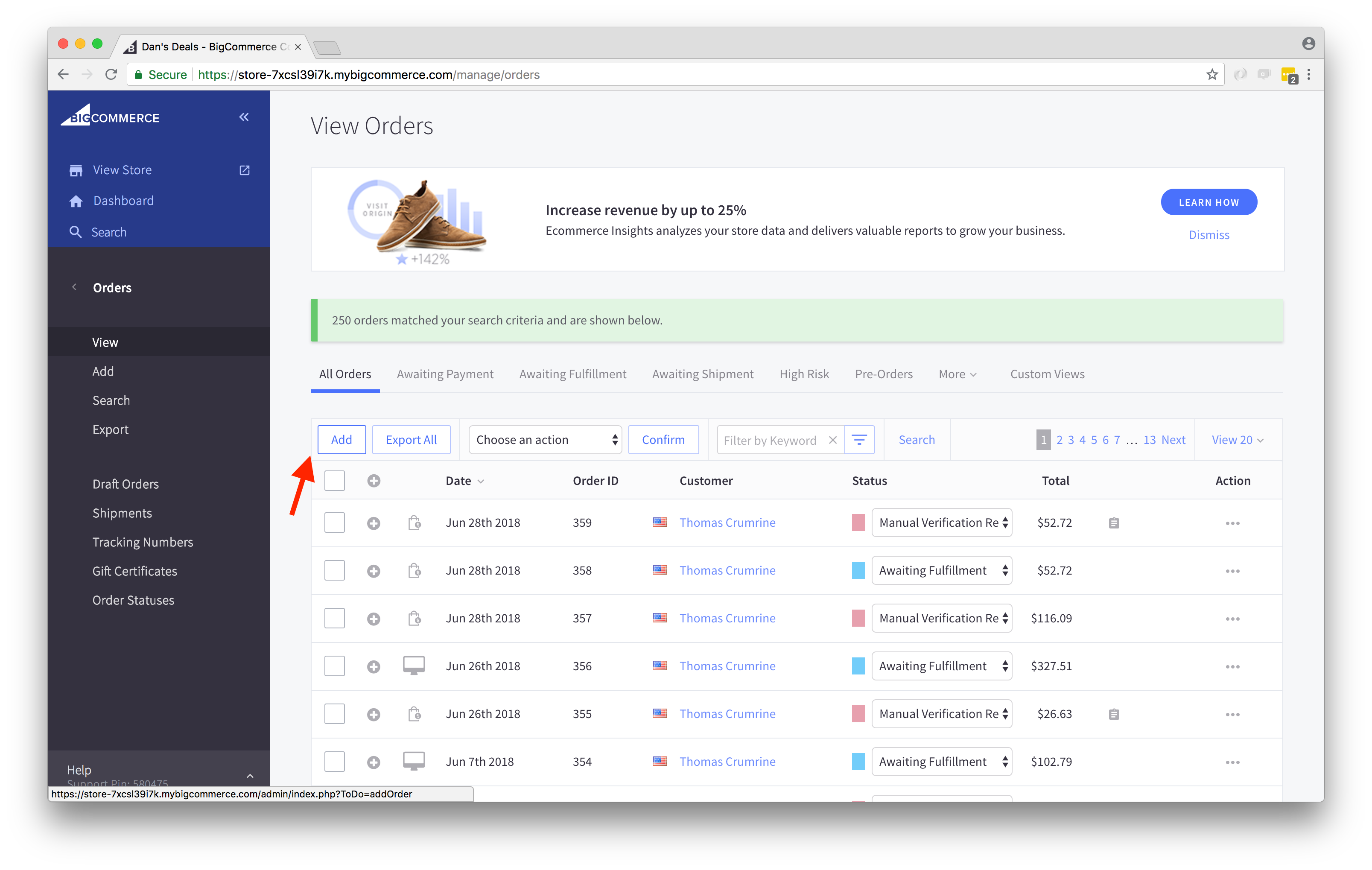
I struggle to find an eCommerce solution that does not very explicitly show the status of an order as important as any other of the relevant overview information (images from Google, annotations not mine):
Shopify:

Squarespace:
BigCommerce:
Wix eCommerce:
WooCommerce:

Square Point of Sale:
Do any other Sandhills plugins have a similar need? Can we design a universal language of our own that our properties can adhere to?
AffiliateWP includes a dedicated status column for the Affiliates, Referrals (which includes custom styling), Payouts, and Creatives:
Restrict Content Pro includes dedicated status columns for Memberships, Membership Levels, Discounts, and Payments.
spencerfinnell
on 8 Feb 2020
I like this one: https://github.com/easydigitaldownloads/easy-digital-downloads/issues/7239#issuecomment-583544934 or this one: https://github.com/easydigitaldownloads/easy-digital-downloads/issues/7239#issuecomment-583632530
I am a big fan of maintaining the WordPress UI and "blending in", but I don't feel either of the above options are too much of a departure. Sure, WordPress core doesn't do it, but we haven't redesigned an entire UI; we've just added some colours. I don't feel this introduces any kind of learning curve to adapt to our design. The colours are still minimal and have the added benefit of making the list table easily scannable to pick out the status of the latest orders.
 ashleyfae
on 8 Feb 2020
ashleyfae
on 8 Feb 2020
I like the placement of this one and the design of this one.
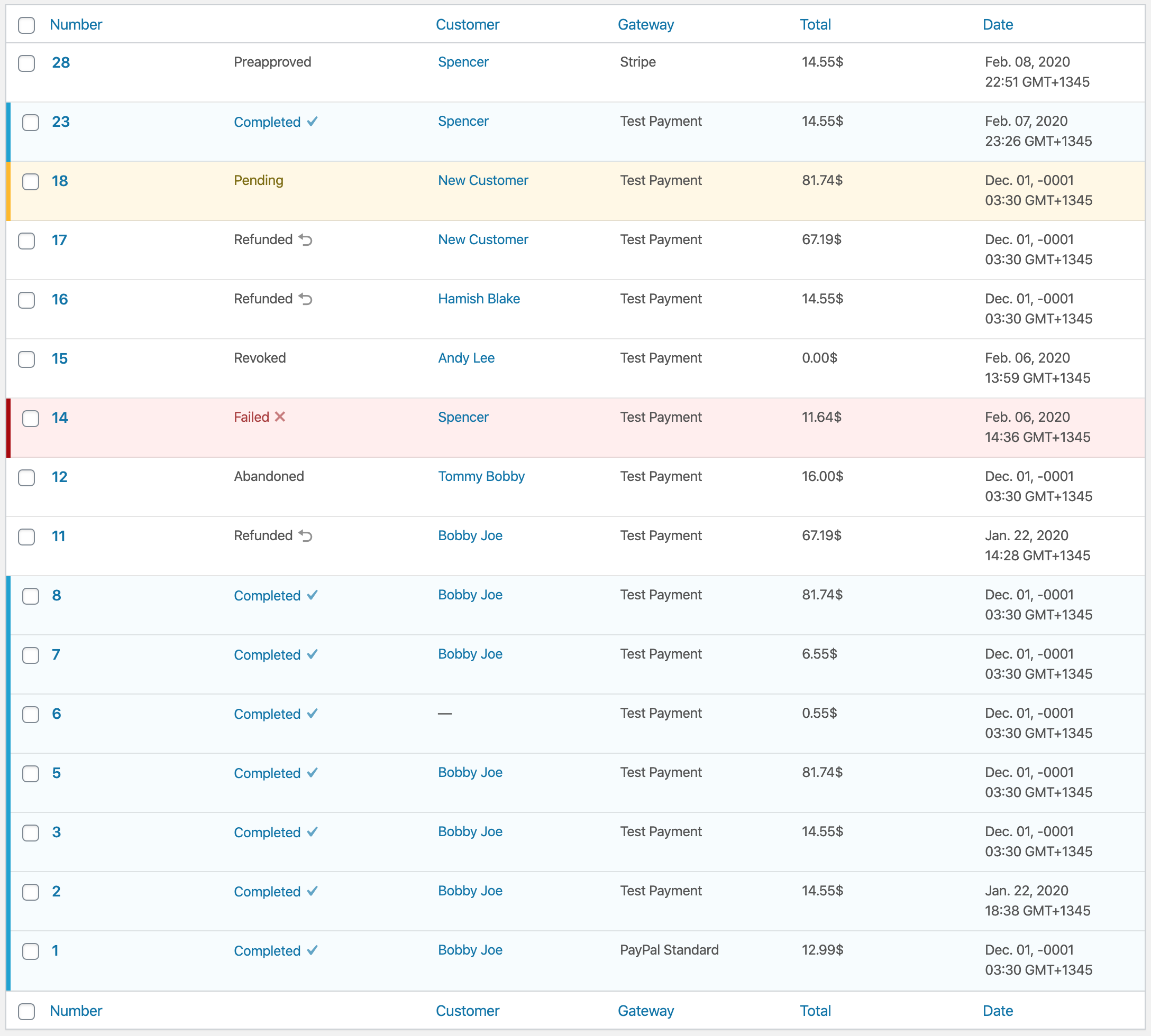
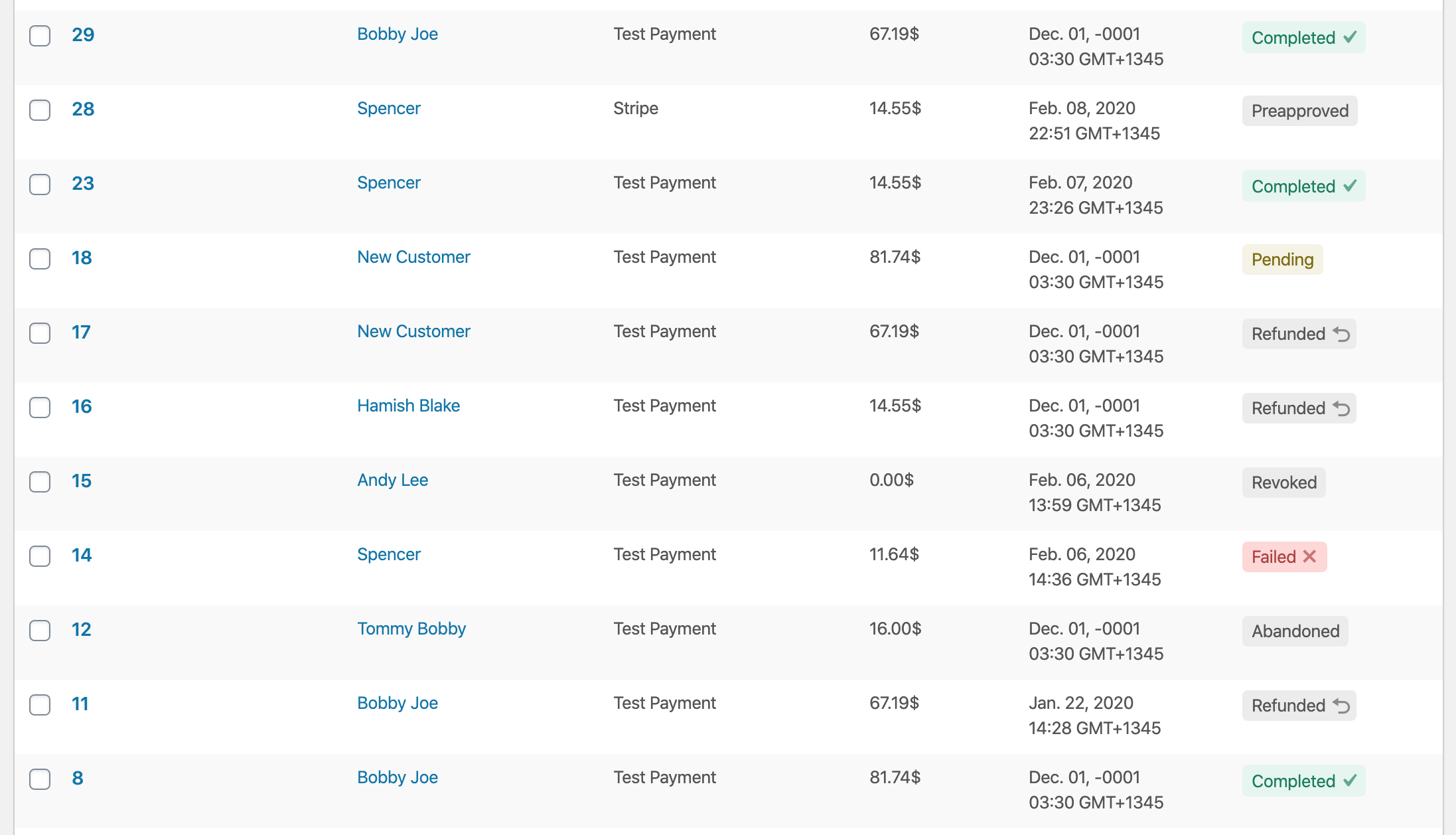
For the sake of forward progress, let's proceed with a dedicated status column and color-coded statuses. If feedback ends up being negative in beta or beyond, we can always adjust.
pippinsplugins
on 10 Feb 2020
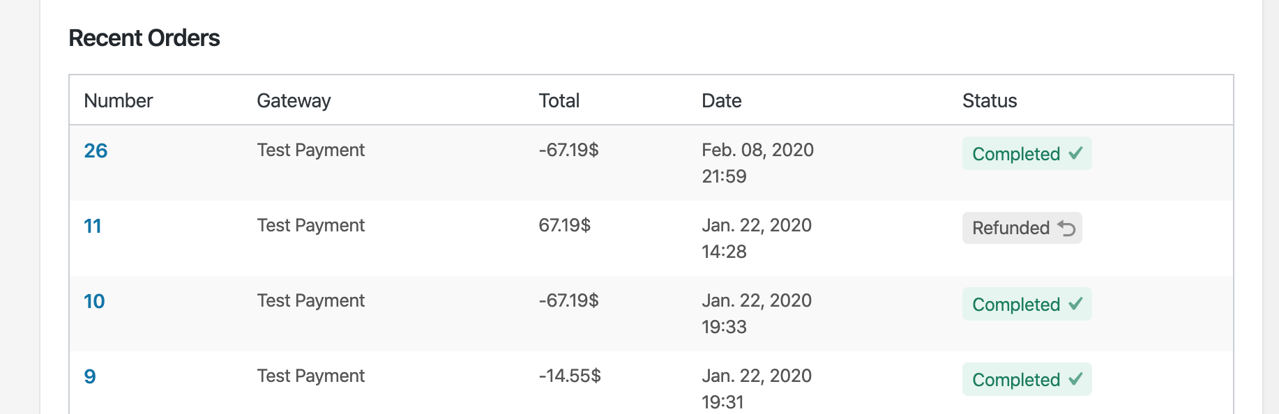
PR #7574 adds a separate column to the Orders screen for "Status". Uses the same badge on the Customer's "Recent Orders" table and refunded Order Items.
spencerfinnell
on 10 Feb 2020
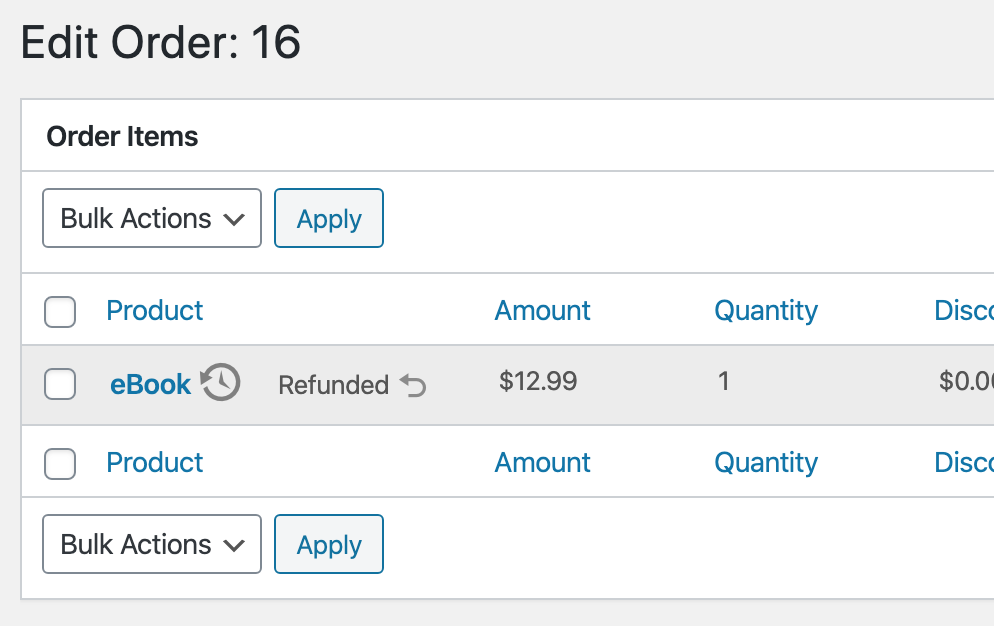
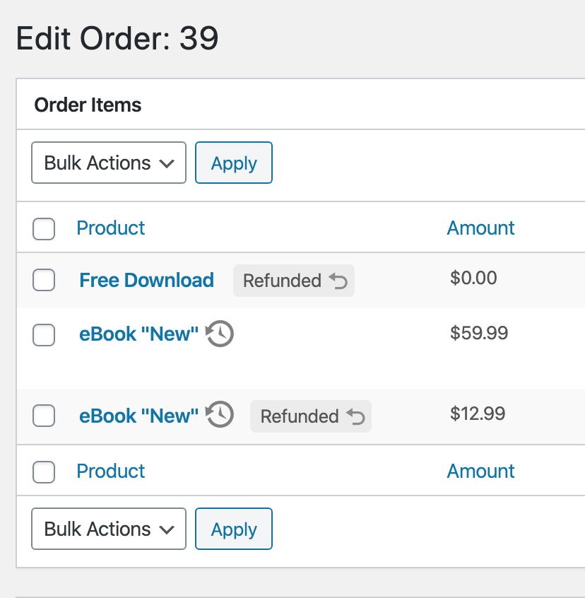
Gentle nudge that too much iconography can be confusing (the clock next to "eBook").
Is Sugar Calendar, we added a Legend under "Help". I know it's hidden and not many people think to look there, but it's the an API for that purpose:
Also, in the Order Items screenshot, "Refunded" is nearly identically to how it was previously, not as its own column in the table, but as a State modifier to the Product itself. 😅
JJJ
on 10 Feb 2020
Gentle nudge that too much iconography can be confusing (the clock next to "eBook").
I agree. I've been experimenting with some alternatives there, as well as small things like #7572
Also, in the Order Items screenshot, "Refunded" is nearly identically to how it was previously, not as its own column in the table, but as a State modifier to the Product itself. 😅
Indeed. I believe it makes sense in this context compared to the main screen for a couple of reason:
- It aligns with my original sentiment that it can work when there are only a couple possible states (in this case, just one: Refunded)
- It is much more likely that there are far fewer items in this table vs. the main Order list, making it easier to scan.
- Adding an extra column here eats at already scarce horizontal width. There are still issues regarding this with products that have names more than a word or two.
Perhaps adding the background color for the Refunded row muddies the intention of the "badge" and possibly undoes some of the pattern set forth in the previous screen. Keeping the standard striped table has the badge more apparent:
^ That might make more sense.
spencerfinnell
on 10 Feb 2020
I think that does make more sense.
Another gentle nudge that this issue was created by @SDavisMedia specifically to address the UX around clicking the Order Number in the Orders list-table, and is creeping pretty far out of scope to include new visual design elements into all Order/Item related screens.
JJJ
on 10 Feb 2020
@JJJ The initial issue was around that but I failed to notate that Sean and I had a long conversation about this (I distinctly remember sitting in the Hutch taproom on the call 😄) and we agreed this was the same issue we should use to improve the overall design.
@spencerfinnell So I’m confused on what the ‘clock pointing back’ icon means in the last screenshot here:
That would be my only question. I do like the current design you’ve got in the attached PR and I think it is a great move forward. However it does not approach the main issue we had which is with single digit order numbers, it does cause an issue with the hit box of the click being too small.
 cklosowski
on 22 Feb 2020
cklosowski
on 22 Feb 2020
@cklosowski That is an icon that shows the product name has changed since the original purchase. Related https://github.com/easydigitaldownloads/easy-digital-downloads/pull/7573
The full "row" of the Order ID should be clickable:
Do we think the initial perceived clickable area is still too small?
I've reverted a few of the changes in #7574 to focus the PR to only the main Orders list table. Refund status for individual order items will be addressed in #7582
spencerfinnell
on 22 Feb 2020
I guess that’s probably ok. We can see how it’s perceived and go forward.
cklosowski
on 24 Feb 2020
Related issues
 Ismail-elkorchi
·
3Comments
Ismail-elkorchi
·
3Comments
 JeroenSormani
·
5Comments
JeroenSormani
·
5Comments
 DevinWalker
·
6Comments
JJJ
·
5Comments
DevinWalker
·
6Comments
JJJ
·
5Comments
 zackkatz
·
5Comments
zackkatz
·
5Comments
Most helpful comment
I also think from a user-happiness and user-confidence point of view having a nice reassuring green "Complete" visible on orders would help a lot. What's nicer than seeing a big list of completed Orders that you know with 100% certainty need no immediate action?
Item states that need no action can remain neutral, and states that need attention may get a highlight.