Easy-digital-downloads: 3.0: Finalize View/Edit Order Details
Enhancement Request
Explain your enhancement (please be detailed)
Make the final changes to the UI/UX for the view/edit order details.
Justification or use case
For 3.0 changes. I'll get a list of the changes to verify as I finalize things.
- [x] Remove Edit/Delete from individual Items on an order
- [x] Remove Edit/Delete from Bulk Actions
- [x] Add
type="email"to the input for the Email tab when customer only has one email address - [x] Fix Copy Download File actions
- [x] Fix Add Order JS from loading on View/Edit Order page (which caused JS conflicts)
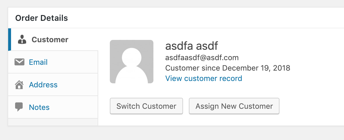
- [x] Improve the Customer Section
- [x] Improve the Email Section when multiple email addresses exist.
 cklosowski
All 13 comments
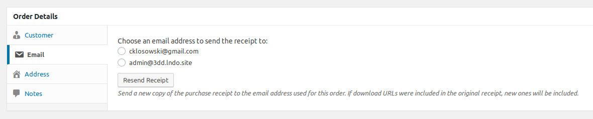
In the "Email" tab of "Order Details" the input is missing type="email" which leads to missing styles.
 spencerfinnell
on 29 Nov 2018
spencerfinnell
on 29 Nov 2018
@easydigitaldownloads/core-team could I get some review on this page now? just to make sure things that should exist, exist, and functionality still works now that I've done some clean up?
Keep in mind 'refunding' isn't quite fully complete. I still need to hook up the 'refund' actions to create refund orders.
cklosowski
on 4 Dec 2018
A few items I'd like to see:
In the
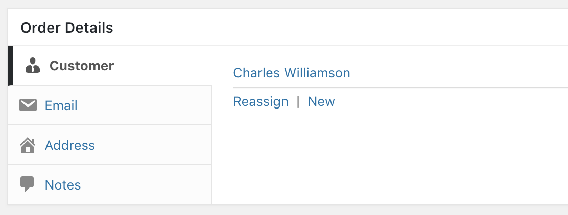
Customertab, I'd like to see theNewandReassignlinks visually separated / distinct from the customer name. They blend together too much right now.
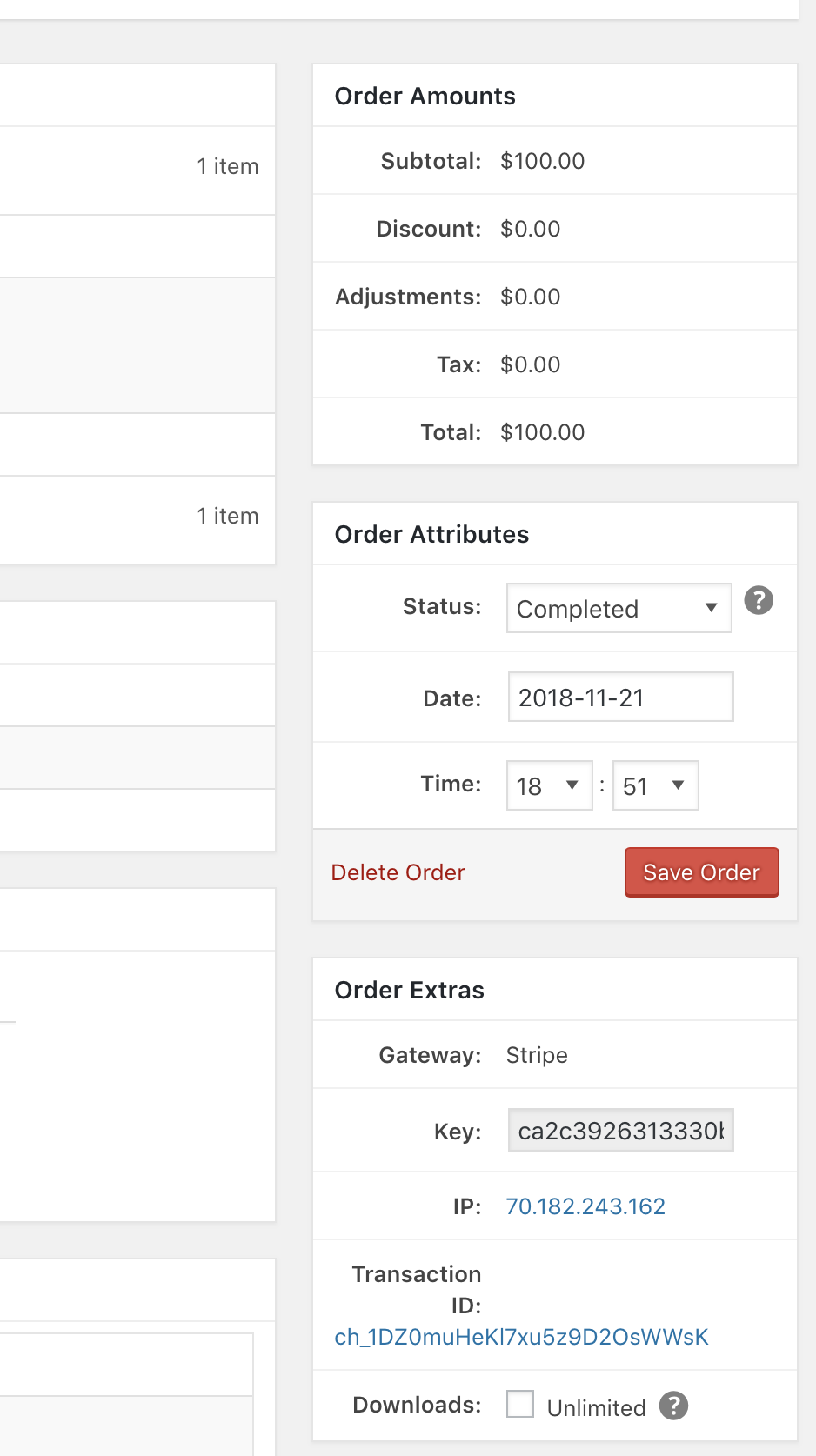
I do not like the right aligment of the field names in the right metaboxes. I'd like to see the labels left aligned.
In the
Emailtab I'd like to see the email address(s) of the customer shown by default. The button jump when revealing the select field is jarring. There's a ton of real estate available so I don't see any reason to hide that select menu.
 pippinsplugins
on 5 Dec 2018
pippinsplugins
on 5 Dec 2018
In the Customer tab, I'd like to see the New and Reassign links visually separated / distinct from the customer name.
Buttons would be nice.
I do not like the right aligment of the field names in the right metaboxes. I'd like to see the labels left aligned.
This has been mentioned a few times because it fails extra with non-English installs. I thought there was a ticket somewhere but I can't find it now.
spencerfinnell
on 5 Dec 2018
 SDavisMedia
on 5 Dec 2018
SDavisMedia
on 5 Dec 2018
I do not like the right aligment of the field names in the right metaboxes. I'd like to see the labels left aligned.
Oddly enough I prefer this as it's FAR easier to read to me, since I can go right down the column instead of having to see the actual content have differing whitespace between them.
cklosowski
on 6 Dec 2018
I dig the alignment as well. Compared to what it is right now pre-3.0, I think it's _much_ better.
However, in usual Sean fashion, I don't think it's 100% necessary for label/value to be inline. I know it's the norm, but it clearly presents consistency issues.
If readability is an issue, having one line for the label and a new line for the value (with word wrap) simply makes sense. This isn't the greatest example, but it illustrates what I'm referring to:

I understand that the content would take up more vertical space, but I value balancing all concerns over just one of them. It doesn't have to take up a dramatic amount of space either. Font sizes and padding go a long way.
I'll toss in one more example just for fun:
SDavisMedia
on 6 Dec 2018
Let's leave them as is.
pippinsplugins
on 13 Dec 2018
There also seems to be some extraneous or incomplete code in the update order routine:
$new_total is defined as current total or a form input value which doesn't exist on the page.
It's never updated then checked against what will always be the original value:
(That condition also has an undefined variable $status but never errors because the first condition will always fail)
If the total is meant to be updated based on added/removed download's subtotals and taxes then somewhere around https://github.com/easydigitaldownloads/easy-digital-downloads/blob/release/3.0/includes/admin/payments/actions.php#L224 $new_total should be recalculated.
spencerfinnell
on 19 Dec 2018
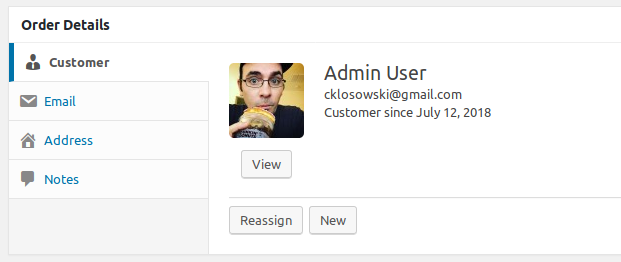
Updated to change the Customer Overview section as well as the resend receipt section:
cklosowski
on 24 Jan 2019
@SDavisMedia @spencerfinnell at a quick glance am I committing any faux pas?
cklosowski
on 24 Jan 2019
@cklosowski Added a branch with a few tweaks ^
- Makes button actions more clear
- Uses a
<button>for Cancel actions instead of a link. - Changes "View" button to a standard link.
spencerfinnell
on 28 Jan 2019
Oh, I like those @spencerfinnell I'll go ahead and merge those into my branch
cklosowski
on 29 Jan 2019
Related issues
 boluda
·
4Comments
boluda
·
4Comments
 DevinWalker
·
6Comments
DevinWalker
·
6Comments
 amdrew
·
5Comments
amdrew
·
5Comments
 mikeyhoward1977
·
5Comments
mikeyhoward1977
·
5Comments
 Ismail-elkorchi
·
3Comments
Ismail-elkorchi
·
3Comments