Easy-digital-downloads: 3.0: Reposition Download Settings metabox tooltips
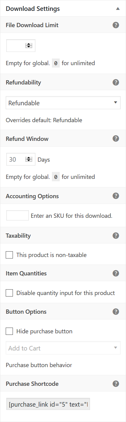
Currently in master, the Download Settings metabox on the download edit screen looks a bit rough and can be difficult to follow in certain cases. The tooltips are jagged, because they display at the ends of setting labels, which vary in length. Furthermore, some of the tooltips describe an entire section of the metabox, though they display beside content that needs explaining. Depending on your perspective, that can be confusing.
What I want to do for 3.0 is reposition the Download Settings tooltips to always be right-aligned and in the heading of a section. And from there, whether a section has one setting, or multiple settings, the tooltip can explain them all piece by piece.
This enhancement depends on 3.0.
component-administration
 SDavisMedia
All 2 comments
SDavisMedia
on 3 Aug 2018
❤3
Yup. Way better. Merged!
 JJJ
on 3 Aug 2018
JJJ
on 3 Aug 2018
👍1
Was this page helpful?
0 / 5 - 0 ratings
Related issues
 nabeghe
·
5Comments
JJJ
·
5Comments
nabeghe
·
5Comments
JJJ
·
5Comments
 amdrew
·
5Comments
amdrew
·
5Comments
 boluda
·
4Comments
boluda
·
4Comments
 DevinWalker
·
6Comments
DevinWalker
·
6Comments
Most helpful comment