Dnn.platform: Login control styling improvement
Description of problem
As mentioned in several other issues, the Login control is difficult to style and even by default the alignment is off. I investigated this and this is caused by the labels not being injected in a similar way.
IMO there's a simple fix to at least make the login easier to style without completely re-doing it.

The reason for this is that as "label " is used to align the "rows" and the HTML next to the inputs is different for then one next to the buttons.
Username HTML:
<div class="dnnFormItem">
  <div class="dnnLabel">
    <label for="dnn_ctr_Login_Login_DNN_txtUsername" id="dnn_ctr_Login_Login_DNN_plUsername" class="dnnFormLabel">Username:</label>
        </div>
        <input name="dnn$ctr$Login$Login_DNN$txtUsername" type="text" id="dnn_ctr_Login_Login_DNN_txtUsername" autocomplete="off">
    </div>
Login button HTML:
<div class="dnnFormItem">
        <span id="dnn_ctr_Login_Login_DNN_lblLogin" class="dnnFormLabel"></span>
        <a id="dnn_ctr_Login_Login_DNN_cmdLogin" title="Login" class="dnnPrimaryAction" href="javascript:__doPostBack('dnn$ctr$Login$Login_DNN$cmdLogin','')">Login</a>
        <a id="dnn_ctr_Login_Login_DNN_cancelLink" class="dnnSecondaryAction" causesvalidation="false" href="/testsite">Cancel</a>

    </div>
The alignment issue is caused by the missing <div class="dnnLabel"> next to the buttons.
This makes it virtually impossible to get the alignment right,even with a lot of custom CSS and even then you need to start using id's for styling (bad practice).
Description of solution
Wrap the <span id="dnn_ctr_Login_Login_DNN_lblLogin" class="dnnFormLabel"></span> inside a <div class="dnnLabel">.
I think this should not influence any existing solutions, it's a lot more logical and it will at least align the elements on a default installation.
File: DNN Platform/Website/DesktopModules/AuthenticationServices/DNN/Login.ascx
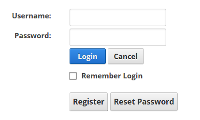
After this simple fix:
Description of alternatives considered
Make the html templatable, but that's a huge task
Affected browser
- [x] Chrome
- [x] Firefox
- [x] Safari
- [x] Internet Explorer
- [x] Edge
Related:
https://github.com/dnnsoftware/Dnn.Platform/issues/3269
https://github.com/dnnsoftware/Dnn.Platform/issues/2469
 Timo-Breumelhof
All 17 comments
If can we agree on this I'll create a pull request for it. :-)
Timo-Breumelhof
on 5 Dec 2019
@Timo-Breumelhof first off, I think this is good and probably should be implemented. The question...is this a "breaking change"? I just can't help but to think of all the people who may have styled this in their theme, and changing the DOM could potentially break their implementation - depending of course on how they did it.
That said, I'd be in favor of rolling this in ASAP! 😄 👍
 david-poindexter
on 5 Dec 2019
david-poindexter
on 5 Dec 2019
@david-poindexter IMO if you look at it from a structural point of view, you could also say this is a bug.
The HTML does not comply with our own form standard.
I wonder on how many sites this would cause issues, I tested it on my own default theme with custom styling and nothing changed
Timo-Breumelhof
on 5 Dec 2019
@Timo-Breumelhof here is an example of how some may style the DNN login in the context of a theme. This is the default styling in nvQuickTheme:
https://github.com/nvisionative/nvQuickTheme/blob/master/src/scss/components/_login.scss
david-poindexter
on 5 Dec 2019
@david-poindexter I have my own styling for it too, but the issue remains that the HTML is inconsistent IMO
Timo-Breumelhof
on 5 Dec 2019
Login and Registration IMO need a 1up or a +1 however you want to look at it. However before we get too excited here @donker I believe setup an RFC for this https://github.com/dnnsoftware/Dnn.Platform/issues/2471 and we should focus on these bigger changes here as they are coming sooner than you think. Minor changes should be welcome for 9 that don't "Break" things in any way if possible.
Version 10 is where you want to target these changes IMO. We should coordinate an effort using this RFC and then post up a new issue specifically for each of those agreed on changes from the talking points in the RFC when a PR gets made for it.
This is something we need to coordinate better and we are working on as a community so this login improvement RFC is a good challenge and way to help us all understand how we can work together to hammer out tasks sooner than later and get things done before a major version change so it has time to be tested as best as we can as a community team.
I liked the RFC's here on github but we can put them in the forum. Then we can get to a last post that summarizes things possibly editing the original post to show the RFC's current concerns and talking points along with anything agreed on.
A contributor can then see the things that need done and make an attempt at a PR solution creating the issue then a pull request on github when they feel they have a workable solution.
@Timo-Breumelhof at the same time as waiting until 10 if no one rejects it being added now to 9 I am ok with it. Maybe we need a way to test things to see what might break, and post a solution to use the old form file from an older DNN install if they have issues.
The registration form can use this tune-up as well I believe but they are code bound changes not as simple as this file you are currently working on. I can help with that one if you know what needs done if needed. I imagine it would be similar to this form so I can follow this as a template and then allow everyone to put their two cents in. But if you can do it that would be awesome!
 thabaum
on 5 Dec 2019
thabaum
on 5 Dec 2019
I am against changing the markup (DOM) whenever a non-breaking solution is possilbe. The fact that the markup or class names being inconsistant is not a bug, it is wrong but not a bug and fixing it will break existing themes.
- If a css only solution is possible, that would be my preference (I did not look in details but I pretty sure with all the css ways of doing stuff and the fact we no longer have to support (or be pretty) in IE11, this is probably possible.
- If a css only solution is not possible, then I would move this to 10 AND CLEARLY DOCUMENT IT, this type of change will be hard to know about unless very clear in the breaking changes of the release notes.
 valadas
on 8 Dec 2019
valadas
on 8 Dec 2019
Well, enhancing nothing, because its a breaking change, is not a strategy.
 kurtwilbies
on 9 Dec 2019
kurtwilbies
on 9 Dec 2019
IMO it will not break existing themes. But I do think changing this in DNN 10 would be good.
Timo-Breumelhof
on 9 Dec 2019
Well, enhancing nothing, because its a breaking change, is not a strategy.
@kurtwilbies nobody is saying not to enhance it. It is simply a matter of how and when. We have policies in place for addressing breaking and non-breaking changes.
IMO it will not break existing themes. But I do think changing this in DNN 10 would be good.
@Timo-Breumelhof I agree this should probably be targeting v10.
We do need to be careful not to base too much on opinions when it comes to potential breaking changes. I can think of several recent (serious) issues that occurred in official releases specifically for this reason. ;-)
david-poindexter
on 9 Dec 2019
I'll try to explain why I closed this issue.
To me the fact that the login page does not align does fall in the category "bugs".
It looks bad and parts of DNN that look clumsy in a default install are bad for DNN IMO and should be fixed.
It's only a small alignment issue, but we have a lot of them and they make DNN look less professional than competitors.
I tried to find the smallest "fix" which is structurally sound and has the least impact. I wanted to scale this styling issue back to an actionable item, instead of start a discussion that ends up in a "complete rewrite".
I looked at the HTML and the CSS and although one could fix the issue by completely re-doing the CSS (for instance in the way @david-poindexter posted) that would really be a breaking change as it will mess up other users styling in a way more extreme way than this suggested change.
One could in theory also fix the current CSS (in line with the CSS currently used which is is trying to work around the inconsistent HTML IMO), but that would be building messy CSS on existing messy CSS.
That's not an option to me as it would also influence the custom styling of existing sites.
It remains that IMO the HTML is incorrect and any CSS "fixes" could also mess up what users used as custom styling. (I even think the risk of influencing custom login pages is higher when we change the CSS than by adding these two div IMO)
I'm all for not introducing breaking changes in minor versions, but if this minor HTML change is breaking change, any change is.
I guess the majority of the devs here don't agree with me, that's fine, but introducing this as a "fix" in DNN 10 is pretty ridiculous IMO as the resulting HTML is far from ideal.
This was really intended as a bug fix.
So I closed the issue.
Timo-Breumelhof
on 10 Dec 2019
@Timo-Breumelhof thanks for re-opening. Hopefully we can come to a consensus for a quick “fix” that would be acceptable for 9.5.0. Then, perhaps a bigger overhaul for 10.0.0.
david-poindexter
on 11 Dec 2019
Ok, I am triaging this for now as an enhancement for 10, but nothing is set in stone and we can adjust if a contribution comes in earlier. Just need to triage the issue somewhere to clean the backlog
valadas
on 17 Jan 2020
@Timo-Breumelhof thanks for re-opening. Hopefully we can come to a consensus for a quick “fix” that would be acceptable for 9.5.0. Then, perhaps a bigger overhaul for 10.0.0
@david-poindexter Do you have any other suggestions apart for my "fix the HTML" suggestion?
Timo-Breumelhof
on 20 Jan 2020
I believe the login and registration forms should be redone. I think a new DNN Authentication Module could be created possibly and allow a user to choose to use it.
I believe 2FA should be added to it as well...
I think things should move to multi-page login/registrations and simplify the process and make it as simple as most modern day login forms with recovery options.
There is a long time discussion here for version 10 login improvements.
https://github.com/dnnsoftware/Dnn.Platform/issues/2471
I think this discussion needs joined in with that one and a complete rebuild to a more modern styling approach would be the way to go. It is a pain in the butt to move all the styles around especially the tooltips and popups.
I almost have a complete CSS rebuild for the login style I was going to contribute. But it is awful to want to read and follow for edits IMO.
I believe I had mentioned something about this in the past as well which is why I thumbs up it. We need a community solution to agree on and soon as 10 is on it's way!
I think 2FA and browser detection should be added to it as well IMO... which we would need the 2FA .net objects in the form to make styles and not break things in 10.
For version 9 just a CSS fix that tunes things better is nice enough that helps it work on smaller screens but everyone dealing with it so long 10 is too close to worry too much about it and things here are really part of that discussion I mentioned above that needs brought up here.
thabaum
on 8 Mar 2020
We have detected this issue has not had any activity during the last 90 days. That could mean this issue is no longer relevant and/or nobody has found the necessary time to address the issue. We are trying to keep the list of open issues limited to those issues that are relevant to the majority and to close the ones that have become 'stale' (inactive). If no further activity is detected within the next 14 days, the issue will be closed automatically.
If new comments are are posted and/or a solution (pull request) is submitted for review that references this issue, the issue will not be closed. Closed issues can be reopened at any time in the future. Please remember those participating in this open source project are volunteers trying to help others and creating a better DNN Platform for all. Thank you for your continued involvement and contributions!
![stale[bot] picture](https://avatars.githubusercontent.com/in/1724?v=4&s=40) stale[bot]
on 6 Jun 2020
stale[bot]
on 6 Jun 2020
This issue has been closed automatically due to inactivity (as mentioned 14 days ago). Feel free to re-open the issue if you believe it is still relevant.
stale[bot]
on 20 Jun 2020
Related issues
 kbratuysuz
·
3Comments
david-poindexter
·
3Comments
kbratuysuz
·
3Comments
david-poindexter
·
3Comments
 hismightiness
·
5Comments
hismightiness
·
5Comments
 iJungleboy
·
3Comments
iJungleboy
·
3Comments
 ohine
·
3Comments
ohine
·
3Comments
Most helpful comment
@david-poindexter IMO if you look at it from a structural point of view, you could also say this is a bug.
The HTML does not comply with our own form standard.
I wonder on how many sites this would cause issues, I tested it on my own default theme with custom styling and nothing changed