Distributed: Visualize split between dask keys and memory leaks/other
I'm working on a change to the GUI that will show, for each worker, how much of the worker's RSS is being allocated to dask keys (as reported by the sum of the sizeof() outputs) vs. everything else.
I also intend to split the "everything else" into "old" and "new" memory, defined as follows:
- "dask keys": WorkerState.nbytes, in other words the sum of the output of sizeof() for each dask key stored (not counting those spilled to disk)
- "other old": minimum across the last 30 seconds (configurable) of the measures of (RSS - dask keys)
- "other new": latest measure of RSS - dask keys - "other old"
The idea is that this should let us smooth out temporary peaks caused by delays in gc, delays in the python memory manager releasing the RAM to the OS, and memory temporarily allocated by the task functions.
I intend to use this more stable measure of (dask keys + other old) in all future non-time-critical heuristics that require to measure the total RAM usage of a worker - namely, the larger rebalance() rewrite I'm busy with.
In the GUI, the top-left graph would change as follows:
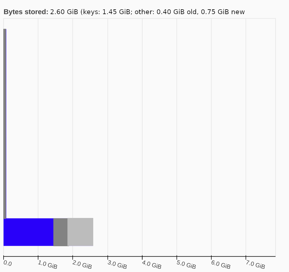
At the moment, the bars are fully blue and represent the whole RSS.
After the change, for each worker you'd have 3 stacked bars (blue: keys, dark grey: other old, light grey: other new) which add up to the RSS.
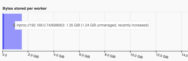
The hover tooltip for the individual workers will also change to match the top textbox.
The bar currently changes color to yellow and red to alert of high memory usage; I'd change it to a yellow/red box around it or something similar.
In the "workers" tab, I plan to add 3 new columns next to "memory" to break it down.
XREF https://github.com/dask/distributed/pull/4614 for the implementation of a drop-down to opt in/out of the extra columns to avoid making the table too crowded.
CC @jacobtomlinson, @jsignell , @jrbourbeau for opinions.
Note that all this excludes the dask keys currently spilled to disk. I'm considering adding a fourth bar on top for them.
 crusaderky
All 10 comments
In general I love the idea of using stacked bar charts to show more
information about memory usage. I think that this would make it a lot
easier to understand memory issues at-a-glance.
On Thu, Mar 25, 2021 at 6:19 AM crusaderky @.*> wrote:
I'm working on a change to the GUI that will show, for each worker, how
much of the worker's RSS is being allocated to dask keys (as reported by
the sum of the sizeof() outputs) vs. everything else.
I also intend to split the "everything else" into "old" and "new" memory,
defined as follows:
- "dask keys": WorkerState.nbytes, in other words the sum of the
output of sizeof() for each dask key stored (not counting those spilled to
disk)- "other old": minimum across the last 30 seconds (configurable) of
the measures of (RSS - dask keys)- "other new": latest measure of RSS - dask keys - "other old"
The idea is that this should let us smooth out temporary peaks caused by
delays in gc, delays in the python memory manager releasing the RAM to the
OS, and memory temporarily allocated by the task functions.I intend to use this more stable measure of (dask keys + other old) in all
future non-time-critical heuristics that require to measure the total RAM
usage of a worker - namely, the larger rebalance() rewrite I'm busy with.In the GUI, the top-left graph would change as follows:
[image: mockup]
https://user-images.githubusercontent.com/6213168/112463862-acc38580-8d5a-11eb-8ca5-c4e1487d26fd.pngAt the moment, the bars are fully blue and represent the whole RSS.
After the change, for each worker you'd have 3 stacked bars (blue: keys,
dark grey: other old, light grey: other new) which add up to the RSS.The hover tooltip for the individual workers will also change to match the
top textbox.
The bar currently changes color to yellow and red to alert of high memory
usage; I'd change it to a yellow/red box around it or something similar.In the "workers" tab, I plan to add 3 new columns next to "memory" to
break it down.XREF #4614 https://github.com/dask/distributed/pull/4614 for the
implementation of a drop-down to opt in/out of the extra columns to avoid
making the table too crowded.CC @jacobtomlinson https://github.com/jacobtomlinson, @jsignell
https://github.com/jsignell , @jrbourbeau
https://github.com/jrbourbeau for opinions.Note that all this excludes the dask keys currently spilled to disk. I
think we'd need a separate (opt-in?) graph for those, e.g. another graph
with 3 stacked bars per worker:
- dask keys only in memory
- dask keys with a copy both in memory and on disk
- dask keys exclusively on disk
—
You are receiving this because you are subscribed to this thread.
Reply to this email directly, view it on GitHub
https://github.com/dask/distributed/issues/4634, or unsubscribe
https://github.com/notifications/unsubscribe-auth/AACKZTFDHPYQCKU3TFPPQZLTFML43ANCNFSM4ZZEZPNA
.
 mrocklin
on 25 Mar 2021
mrocklin
on 25 Mar 2021
Yeah I like this idea too. I think it adds nice layers of information to this visual.
 jsignell
on 25 Mar 2021
jsignell
on 25 Mar 2021
+1 from me too. Expanding the existing worker memory plot seems like a nice addition! I'm looking forward to visualizing, amount other things, memory leaks on workers.
We'll want to choose terms for the "dask keys", "other old", and "other new" quantities carefully to ensure users have an accurate understanding of what is being visualized.
Additionally, having this extra level of information for scheduling decisions is also going to be nice to have : )
 jrbourbeau
on 25 Mar 2021
jrbourbeau
on 25 Mar 2021
Two design issues I'd like people to brainstorm on:
naming conventions
Here's the provisional names for the various measures of memory. These will be all exposed to the final users through the GUI.
Can you think of more user-friendly names?
histogram
When there are more than 50 workers, the top-left graph in the GUI which shows the (stacked) bars of each worker is replaced by a histogram which currently shows how many workers there are in a certain bucket of RSS usage.
Giving this histogram the same treatment as the individual bars is not trivial.
Options:
- keep the histogram as it is now (showing the RSS); then within each bucket perform a mean of the measures and paint them in in the vertical bars. I really don't like this as it doesn't convey that e.g. you have 1-2 nodes with a huge memory leak going on, because the nodes will be likely on the right side of the histogram, but the total height of the vertical bar for them will be very low.
- keep the histogram as it is now, showing RSS by default, and add a drop-down menu which lets you show a different memory measure (always 1 memory measure visualized at any given time). This is OK-ish but lacks immediacy - you won't get the insights you want unless you actively faff around with it.
- get rid of the histogram and go back to a graph showing the individual workers, like the one for less than 50 workers except that:
- it's a continuous stacked areas graph, with no delimiter between each worker.
- workers are sorted on the fly by RSS, from highest to lowest
- optionally, we may add a drop-down menu that lets the user choose by which measure to sort
This visualization problem is something i faced in the past multiple times, and I must say I was always pleased by how (3) looks as it gives very fast insight on any pain points, e.g. an unbalanced cluster, memory leaks, or even individual nodes with anomalous behaviour (as long as you don't have more workers than pixels in your drawbox)
crusaderky
on 30 Mar 2021
naming conventions
I'm not sure the term RSS will be familiar to folks, it wasn't to me. Perhaps something like total or system or process or unmanaged would communicate more.
I guess the main thing we are trying to differentiate here is "memory managed by dask" and "memory overhead not managed by dask". So perhaps borrowing some system like terms from tools such as top, free or glances may be more familiar to folks.
histogram
as long as you don't have more workers than pixels in your drawbox
I think you make a really interesting point here. I agree that having individual workers is going to show more information but on very large clusters a histogram is going to be a better graph but will convery less information.
Perhaps having both a stacked areas graph and a histogram available as two separate panels will allow for a best of both. Specifically my preference would be both 2 and 3 in separate plots.
 jacobtomlinson
on 31 Mar 2021
jacobtomlinson
on 31 Mar 2021
I'm wondering if it is possible to put a question mark / info marker somewhere on the side of the visualization which when hovered offers a more detailed description of what can be seen and possibly a link to the docs with even more information.
 fjetter
on 8 Apr 2021
fjetter
on 8 Apr 2021
@fjetter what do you think is missing in the current hover tooltip in this PR? other than the link to the docs
crusaderky
on 8 Apr 2021
The image below shows the tooltip which is currently available which is sufficient for the bar specific hover. I'm rather talking about a "dashboard explanation" tooltip. An info box somewhere next to the whole plot which explains what the box is actually showing. Answering the questions of "what is unmanaged memory"? That would target primarily new users and could also be added to all other plots.
fjetter
on 8 Apr 2021
I'll see if I can add a static (i) button that links to the docs
crusaderky
on 8 Apr 2021
That's a great idea @fjetter! @crusaderky if adding a plot-wide tooltip ends up not being straightforward, feel free to punt on it for now. We can always tackle that in a follow-up PR -- as @fjetter mentioned, we might want to add something similar for all our plots
jrbourbeau
on 8 Apr 2021
Related issues
 quasiben
·
7Comments
quasiben
·
7Comments
 djhoese
·
3Comments
djhoese
·
3Comments
 m-albert
·
6Comments
m-albert
·
6Comments
 DPeterK
·
3Comments
mrocklin
·
4Comments
DPeterK
·
3Comments
mrocklin
·
4Comments
Most helpful comment
The image below shows the tooltip which is currently available which is sufficient for the bar specific hover. I'm rather talking about a "dashboard explanation" tooltip. An info box somewhere next to the whole plot which explains what the box is actually showing. Answering the questions of "what is unmanaged memory"? That would target primarily new users and could also be added to all other plots.