Desktop: Activity text / file name cut off too early
Hello,
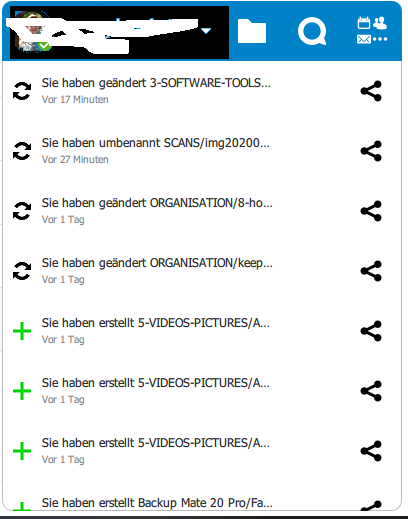
in Desktop Client 3.0 Windows the new Apperance of events is unreadable, all the Texts are cropped and i am unable to read what has exactly changed, no mouse hover to see whats the whole text of it.
 apg1980
All 5 comments
Hi,
same under Linux (Mint 20, Cinnemon). This new design seems to be quite a step backwards in terms of usability to me. Any chance to make this view optional and give users the choice to go with the old view?! Or at least add the option to change the size of that window?!
Thx!
 haukepetersen
on 28 Aug 2020
haukepetersen
on 28 Aug 2020
@DominiqueFuchs @jancborchardt opinions on how to improve the new design to deal with this? (tooltip looks like a good stop gap measure, although admittedly it's kind of lacking in space to display text)
 er-vin
on 31 Aug 2020
er-vin
on 31 Aug 2020
Same on macOS, this changelog view is nearly useless.
opinions on how to improve the new design to deal with this
Just show the icon and the filename.
Also show on the top row an icon to open a changelog window with complete folder path. In this window, any filtering (show changes, added files, system messages, any 'contains' text) could be easily added.
 helmut72
on 4 Sep 2020
helmut72
on 4 Sep 2020
Yep, so we should fix this by using a different wording:
Yeah, so a better structure for the file messages would be:
Filename.pdf
Edited 4 hours ago · Documents / Project / Customer A
If it’s by someone else:
Design review call – Text app.md
Added by Julius · 2 days ago · Documents / Project / Customer A
Yes, this can now of course cause the path to ellipsize. That is fine though. Also, we could middle-ellipsize the path so that both start and end is visible? What is definitely more important is what the file name is and who changed it.
Also you can tell from the screenshot that the text is ellipsized too early – one icon width too early in fact. The ellipsizing should always depend on how many icons are actually there in the row, so that it ellipsizes correctly no matter if there are 1 or 2 action icons.
 jancborchardt
on 15 Sep 2020
jancborchardt
on 15 Sep 2020
Yep, so we should fix this by using a different wording:
Yeah, so a better structure for the file messages would be:
Filename.pdf
Edited 4 hours ago · Documents / Project / Customer AIf it’s by someone else:
Design review call – Text app.md
Added by Julius · 2 days ago · Documents / Project / Customer AYes, this can now of course cause the path to ellipsize. That is fine though. Also, we could middle-ellipsize the path so that both start and end is visible? What is definitely more important is what the file name is and who changed it.
Also you can tell from the screenshot that the text is ellipsized too early – one icon width too early in fact. The ellipsizing should always depend on how many icons are actually there in the row, so that it ellipsizes correctly no matter if there are 1 or 2 action icons.
I like the form you're proposing there. I just got one concern. We got a report somewhere (can't find it now...) where people mentioned the need to copy/paste the path + file. If that's split in two that makes it harder I guess. Do we care?
er-vin
on 21 Sep 2020
Related issues
 MichaIng
·
3Comments
MichaIng
·
3Comments
 Ich5003
·
3Comments
Ich5003
·
3Comments
 kaysond
·
3Comments
kaysond
·
3Comments
 Valdiralita
·
3Comments
Valdiralita
·
3Comments
 js-d-coder
·
3Comments
js-d-coder
·
3Comments
Most helpful comment
Hi,
same under Linux (Mint 20, Cinnemon). This new design seems to be quite a step backwards in terms of usability to me. Any chance to make this view optional and give users the choice to go with the old view?! Or at least add the option to change the size of that window?!
Thx!