The dark theme was an excellent addition to GitHub Desktop and something I use daily. When time allows, I'd love to see this make an appearance in the Electron version.
For reference, here are the light and dark themes in GitHub Desktop today:
Light:

Dark:

 NickCraver
All 76 comments
I'm going to second this, emphatically. I'm working on my side project at night in a dimly lit room turning my head between two monitors connected to two computers. One runs the previous GitHub desktop with the dark theme, the other is the new version with its blindingly white background. I've adjusted my displays brightness down and I'm running f.lux. It's still catches me off guard and the lines of code appear a bit washed out when reviewing.
 robault
on 21 Jun 2017
robault
on 21 Jun 2017
Thanks for the suggestion!
This idea is interesting for the future, but this is beyond the scope of our current roadmap.
I'm going to add the future-proposal label to this issue and close it out, so that we don't get overwhelmed with our backlog! We'll revisit these as part of our next planning session.
 joshaber
on 30 Jun 2017
joshaber
on 30 Jun 2017
@joshaber Is the "future-proposal" tag used in planning going forward? Or possibly a better question: Since this issue is closed, will it be looked at again? I don't see this mentioned in CONTRIBUTING.md and my sensitive eyes are getting concerned...
 kmscode
on 18 Jul 2017
kmscode
on 18 Jul 2017
@kmscode Yup! See https://github.com/desktop/desktop/blob/1c0a13df6d1303a9561276e02a7f815f8c1ef7aa/docs/process/issue-triage.md#future-proposals for more info.
joshaber
on 18 Jul 2017
@joshaber FANTASTIC! And thanks for the super quick response!
kmscode
on 18 Jul 2017
So this feature was already in GitHub Desktop but it got removed?
 rsmolkin
on 1 Sep 2017
rsmolkin
on 1 Sep 2017
@rsmolkin it was only in the classic Windows app
 shiftkey
on 2 Sep 2017
shiftkey
on 2 Sep 2017
Can we still download the version that has the dark appearance? (3.3.4.0)
If so where?
My laptop has it, but just installed this new version on my desktop and I hate it. Blinding.
 c2k-
on 25 Sep 2017
c2k-
on 25 Sep 2017
@joshaber Why was the dark theme removed from the new GitHub for Desktop, as the old version of GitHub Desktop had a dark theme? Since most coding editors use a dark theme by default, combined with this being an option in the old Windows application, clearly this wasn't an oversight but an overt removal.
 JW0914
on 7 Oct 2017
JW0914
on 7 Oct 2017
I think it's a matter of perspective here. It wasn't "removed", because this was a rewrite, but the lack of parity is a definite regression.
What I don't understand is why this issue is closed (cc @joshaber). It's the second most upvoted issue in this repo, despite being closed. Or put another way:
What does it take to get on the roadmap? Since users clearly miss this functionality. This should be re-opened, IMO. Having it closed just seems to spite users' highest voted wants. How do you design a roadmap of what users want if it involves closing highly voted issues with no action? Or again put another way, who is this client being built for, if not GitHub users voting here?
NickCraver
on 7 Oct 2017
@nickcraver
I'm not a fan of this being closed either.... But the project managers did have a solid response and plan for this backlog item... The answer was largely acceptable
https://github.com/desktop/desktop/issues/1515#issuecomment-316184182
They've been really responsive to all issues that I've looked at. I just hope that this one gets on the radar sooner rather than later... Especially with all the reactions and duplicate issues opened.
kmscode
on 7 Oct 2017
I started making a dark theme stylesheet!

You can paste this into the console (View > Toggle developer tools) to inject it:
/*var link  = document.createElement('link');
link.rel  = 'stylesheet';
link.type = 'text/css';
link.href = 'https://rawgit.com/1j01/d8f8d11785d8fb21a70654e7aa8a4553/raw/desktop-dark.css';
document.head.appendChild(link);*/
(Update: persistent (html-injecting) version here!)
Update: Use the install instructions on the gist!
Does this help bump up the timeline for this feature? 😃 🤔
 1j01
on 7 Oct 2017
1j01
on 7 Oct 2017
@kmscode we clearly have very different definitions of "solid response" and "acceptable"...
JW0914
on 8 Oct 2017
@jw0914 again.... I'd rather this still be open so it's more front and center. But they responded to my specific query that they have a documented plan to deal with "future requests" that are closed. They could have said "yeah, sure... we'll get to it... Trust us" and added a "black hole" tag.
@1j01 looks great! I think you should totally submit a PR. They have accepted others and included them in final releases from what I could tell in the change log. Help us all out (especially us lazy ones)!
kmscode
on 8 Oct 2017
@kmscode Most don't find the ambiguous one liner an acceptable answer... hence the reason multiple issues exist regarding this topic specifically.
I didn't want to cut and paste the the same thing across different issues on the off chance I'd get flagged for spamming, but I did post something to the effect that the answer given was not, and is not, satisfactory due to this being a conscious, overt decision to _not_ build this with a dark theme
"_Most coding applications use a dark theme by default, which, combined with this being an option in the old Windows application, indicates this clearly wasn't an oversight but an overt removal._
_There's fundamental & practical reasons why coding applications use a dark theme by default, and since the original GitHub Desktop had a dark theme, not only is this a major regression, it's flat out irritating to most users since this was a conscious, overt decision to not include a dark theme, not an oversight._"
JW0914
on 8 Oct 2017
@JW0914 100% valid points and I totally agree with you. But still, here we are. Here's hoping that this gets fixed sooner rather than later...
kmscode
on 8 Oct 2017
Thank you all for the feedback on this! I think this can be broadly boiled down to:
What does it take to get on the roadmap?
We don't have a great answer to this 😄 We're still figuring out how to best integrate and weigh the feedback we receive.
Our engineering and design resources are finite. Each feature we choose to work on means there are 10 other features we're choosing to not work on. Sometimes those choices are hard, and sometimes we make the wrong choices.
We make those choices based on feedback like this, but also on our longer-term product direction. We're still working to find the balance between those two.
I know that's not a totally satisfying answer, so I ask for your patience as we work through this together 💖
joshaber
on 10 Oct 2017
@joshaber In fear of beating the dead horse. What criteria, if any, for a pull request adding this feature?
 OiYouYeahYou
on 13 Oct 2017
OiYouYeahYou
on 13 Oct 2017
In fear of beating the dead horse. What criteria, if any, for a pull request adding this feature?
Hey @OiYouYeahYou, I'll take a stab at addressing your question on behalf of @desktop/design and as the author of the dark theme in GitHub Classic for Windows.
This feature differs from other features which we happily accept PRs for since it involves a fair amount of design work which is, unfortunately, probably the scarcest resource we've got right now. If we (being @donokuda or myself) were to approach this as our next project we would start like any other feature or aspect of the app which needs design and get the overall direction sorted before we write any code. Whether it ends up being worked on by @desktop/core or external contributors have no bearing on that.
That doesn't mean that there aren't ways to help us get to a dark theme faster though.
We have a few illustrations and other supporting graphics in the app which are, at the moment, all hardcoded color-wise. There's some which we can convert from complex illustrations with outlines, rounded borders etc to straight up raw paths which we could then dynamically fill using CSS and I believe there are some which we'll need custom versions of entirely. If you are someone who knows your way around Illustrator, Sketch or Inkscape feel free to pick an SVG which only uses a single color and help us convert it to unfilled paths which we could then dynamically fill using CSS.
From an implementation perspective we need to start with mocks of how we want this to look, once we have that and a general sense of how we want this implemented engineering wise we could open it up for PRs. If you are a designer or someone who, like me, occasionally masquerades as one feel free to drop some mocks here. We work within the primer color system as much as we can.
 niik
on 13 Oct 2017
niik
on 13 Oct 2017
@niik Thank you for taking the time to provide a decent reply as to why a dark theme wasn't included =]
JW0914
on 14 Oct 2017
I updated my stylesheet to work with the awesome changes in https://github.com/desktop/desktop/pull/3000, and fixed & improved the menu bars.
(btw the code above loads the latest version of the gist,
and is intending for console history (up+enter) to be used for relatively easy reinjection)
I'm not really happy with my diff styling, specifically most of the visual cue of what is added or removed doesn't exist when the gutter is showing a selection. I didn't use the classic app as a reference because I didn't want to just copy the design in case I came up with anything better (not that I was _expecting_ to), but it definitely looks like the existing design should work better where the text itself is green and red.
I'm pretty happy with the non-rectangular borders I created for the flyouts though.
1j01
on 15 Oct 2017
Thank you. Up + ENTER when i start. Better than than eye strain :)
 Swashbucklingfox
on 5 Nov 2017
Swashbucklingfox
on 5 Nov 2017
@1j01 there is no way to have this automatically load on every launch is there?
 incace
on 5 Nov 2017
incace
on 5 Nov 2017
@incace um, well... now that you mention it, there is a way... 😄
(Update: more robust version here!)
Update: Use the install instructions on the gist!
var html = require("fs").readFileSync("resources/app/index.html", "utf8");
var link_to_inject = '<link href="https://rawgit.com/1j01/d8f8d11785d8fb21a70654e7aa8a4553/raw/desktop-dark.css" rel="stylesheet">';
html = html.replace(link_to_inject, "").replace("</head>", `\n${link_to_inject}</head>`);
require("fs").writeFileSync("resources/app/index.html", html, "utf8");
location.reload();
This should work until the next update, and then you can run it again.
1j01
on 6 Nov 2017
@1j01 looks like the latest update broke it ?
fs.js:584
Uncaught Error: ENOENT: no such file or directory, open 'resources/app/index.html'
    at Object.fs.openSync (fs.js:584:18)
    at Object.module.(anonymous function) [as openSync] (ELECTRON_ASAR.js:173:20)
    at Object.fs.readFileSync (fs.js:491:33)
    at Object.fs.readFileSync (ELECTRON_ASAR.js:505:29)
    at <anonymous>:1:26
 astewart-twist
on 16 Nov 2017
astewart-twist
on 16 Nov 2017
Apparently process.cwd() isn't reliable for this sort of thing,
but there's a better base path to use, process.resourcesPath.
This should be more robust:
var html_file = require("path").join(process.resourcesPath, "app/index.html");
var html = require("fs").readFileSync(html_file, "utf8");
var link_to_inject = '<link href="https://rawgit.com/1j01/d8f8d11785d8fb21a70654e7aa8a4553/raw/desktop-dark.css" rel="stylesheet">';
html = html.replace(link_to_inject, "").replace("</head>", `\n${link_to_inject}</head>`);
require("fs").writeFileSync(html_file, html, "utf8");
location.reload();
Update: Use the install instructions on the gist!
1j01
on 17 Nov 2017
I'm a bit new to the whole world of Git & GitHub etc as I'm trying to get my career back on track (long story). But I'd like to see a permanent option for dark theme in the Github Desktop. I googled and apparently got the OLD answer since the option is no longer listed under options!
I prefer dark themes & colors not just because I tend to be awake at night but because I am a person with low vision. Having no dark themes is a bit of a hit against blind, deafblind, low vision (both deaf and non-deaf).... and anyone with eye issues that cannot handle bright blinding white. I sincerely hope that this does get pushed back to the desktop in the very near future. Loved that the Atom Editor already had several nice dark themes!
 CQW-Code
on 19 Nov 2017
CQW-Code
on 19 Nov 2017
@CQW-Code The new GitHub application for Windows is a completely different application than the old version, with @niik going into detail in his comment as to why a dark theme was not included.
There are workarounds to getting a dark background with light text, with the code snippets above being a few. If those aren't necessarily what you're looking for, you may wanna check out GitKraken until a dark theme is hard coded into the application.
JW0914
on 20 Nov 2017
I took the liberty of editing @1j01's theme to improve some colors.
Here's my version.
And here's a screenshot:
Tested on Windows, Mac, and Linux. (It does not work with the AppImage.)
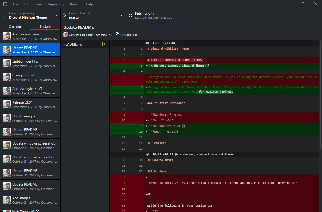
 ObserverOfTime
on 2 Dec 2017
ObserverOfTime
on 2 Dec 2017
@c2k- You can download the classic version from http://github-windows.s3.amazonaws.com/GitHub.application.
This stack overflow post has a lot of useful tips to assist in the installation: https://stackoverflow.com/q/25439865/3745896
I tried out the electron version, but eventually decided to migrate back to the classic one.
 jkjk822
on 17 Dec 2017
jkjk822
on 17 Dec 2017
@1j01 you are a champion of earth, thank you for saving my eyes!
 moeiscool
on 8 Feb 2018
moeiscool
on 8 Feb 2018
@moeiscool I recommend @ObserverOfTime's fork 🙂 (at least for now; it's what I'm using!)
1j01
on 9 Feb 2018
@niik Thank you for such a good answer, what is the status currently? @1j01 script works so well so that I'm not even sure what hardcoded colors gives you so much troubles :) The only thing which really destroys my eyes are the comments in source code, which is dark blue, actually all blue colors in whole UI is too dark, should be brighter, but else than that it's ok. Please tell us where could we start to contribute :) Thank you
 holms
on 21 Feb 2018
holms
on 21 Feb 2018
Why is this not implemented in the re-write and why is this issue closed?
 Kulu-M
on 23 Feb 2018
Kulu-M
on 23 Feb 2018
Why is this not implemented in the re-write
It takes up valuable designer time that the team has decided to spend building new features instead.
why is this issue closed?
https://github.com/desktop/desktop/issues/1515#issuecomment-312139418
 j-f1
on 26 Feb 2018
j-f1
on 26 Feb 2018
Using that hack every time is damned hard. Can we be your designers? Can we commit design layout?
holms
on 26 Feb 2018
@holms Feel free to open a PR, but I can’t guarantee that the team will accept it.
j-f1
on 26 Feb 2018
by modify with ui.css, you can choose every style you like
file path: GitHubDesktop\app-1.1.0\resoruce
 zalyf
on 27 Feb 2018
zalyf
on 27 Feb 2018
@zalyf If you just copy files to the app, they'll be overwritten on update.
I'd recommend forking @ObserverOfTime's gist to use the approach of injecting a stylesheet link.
Also that zip file link is broken, it downloads the css directly.
1j01
on 27 Feb 2018
@kulu-m @j-f1
why is this issue closed?
I had the same question...
Response:
https://github.com/desktop/desktop/issues/1515#issuecomment-316184182
kmscode
on 28 Feb 2018
@holms your comment was deleted as a violation of the Desktop Code of Conduct as it was unprofessional conduct. You may consider this an official warning.
 lee-dohm
on 1 Mar 2018
lee-dohm
on 1 Mar 2018
@holms your comment was deleted as a violation of the Desktop Code of Conduct as it was insulting or derogatory.
lee-dohm
on 8 Mar 2018
Now, this is censorship.
ObserverOfTime
on 8 Mar 2018
@ObserverOfTime we have no responsibility to give people who want to malign, abuse, or wish ill on the development team a platform from which to do so. We do, however, have a responsibility to enforce the Code of Conduct to ensure that this project is open and welcoming to all who want to participate in a constructive manner.
If you would like to discuss it further, I can be reached at [email protected]. Otherwise, your comment is off-topic and insulting. You may consider this an official warning under the Desktop Code of Conduct.
lee-dohm
on 8 Mar 2018
@joshaber It's been a while since your last status update on this one and it's been nearly a year since it was originally opened.
User Preferences aside... Some people have legitimate concerns with their eye sight and a dark theme is truly helpful in some scenarios. Clearly there's a lot of feedback on this issue (# of comments, # of 👍's , # of duplicate issues, etc)... And some of us are... ...let's say _passionate_... about having a dark theme.
With that said:
Maybe now/soon would be a good time for another status update?
I completely understand @niik 's fantastic comment explaining full details of the status of things from a design perspective... But maybe a 90% complete dark theme is better than no dark theme?
Accepting a PR based on some of the solid efforts that were shown within this this thread (and even maybe tagging it as a "beta" version within whatever UI option is presented) might go a long way to keep some users (myself included) content. A new issue on the backlog with the outstanding times to complete the dark theme could then be opened - ideally that should have a small number of (albeit more complicated) tasks (finalize colors, SVG graphics, etc)....
Just my $0.02 - plus I _really_ want a dark theme and I'm not in GH soooo much these days to be bothered with the workarounds provided. :wink:
Thanks in advance!
kmscode
on 8 Mar 2018
But maybe a 90% complete dark theme is better than no dark theme?
Exactly, I work at night and white screens especially githubs bright white hurts my eyes so I just won't use this app if it doesn't support a dark mode. I use stylus in Chrome to modify github's website to be dark as well. Plenty of people want this and are willing to work on it for you.
 SemperFu
on 20 Mar 2018
SemperFu
on 20 Mar 2018
Lets also add that more and more disabled & diseased individual also require dark themes. https://github.community/t5/How-to-use-Git-and-GitHub/Pain-beyond-making-you-sick/td-p/5615
 jungfaha
on 11 Apr 2018
jungfaha
on 11 Apr 2018
I need to put my sunglasses on since I was forced to upgrade the app
 khyler
on 3 May 2018
khyler
on 3 May 2018
Yeah, I agree, wish I hadn't bothered upgrading. Surely it's not that much effort for a dark theme? It's been > 12 months now.... Although, it's still a great app, just a bit bright for me!
 daveharvey
on 4 May 2018
daveharvey
on 4 May 2018
@daveharvey @khyler Check out the custom CSS linked further up the thread.
 charonn0
on 4 May 2018
charonn0
on 4 May 2018
Awesome, thanks, sorry didn't read further up... doh!
daveharvey
on 4 May 2018
Sorry for pushing this at this point, but I'm being prompted to update to this "new Github desktop".
I'm not really sure why they are dropping the old one since it's working just fine but here I am.
Let me be real guys, the new app looks bad, yeah it sucks. You will not get ppl to use unless u fix it asap.
Most ppl will keep the old one until this is, at least, a lil bit closer to the old design.
The "custom CSS" thing is a ugly hack and not a real solution since it only changes colors, not the design.
I would love to use the new app since I'm an electron user my self, but you guys need to either:
1 - Make this number one goal for at least one of your crew members, or
2 - Write a list of requirements for a PR that achieves this and let one of us do it.
Hope I'm not being too toxic, but seems this is a hole that can sink this ship and I'm just trying to make some noise about it.
 rafaelcastrocouto
on 7 May 2018
rafaelcastrocouto
on 7 May 2018
@rafaelcastrocouto, we consider your comment a violation of the Desktop Code of Conduct as it is insulting or derogatory. You may consider this an official warning.
_Hint:_ If you're asking if you're being "too toxic", the answer is "yes". _Any_ amount of toxicity is uncalled for.
lee-dohm
on 8 May 2018
Sorry if I hit a nerve, but there are some things I must highlight:
Number 3 on the "Code of Conduct" => "Gracefully accepting constructive criticism"
And ... I really didn't wanna come here and complain to you guys. But I was brought here by the forced update and by searching for a way to keep the program Github provided. The change came without any kind of explanation, and forcing it on the user like this is pretty toxic as well.
So instead of just saying:
"Unnecessary Sequel (3.3.6.1) 56edc3f
This version of Github Desktop is no longer actively developed. Please visit desktop.github.com to download the latest version."
It's not the latest version, it's a rewrite with a whole new design. Be honest with your users and please provide at least a page for we to download the old app until someday you fix this.
rafaelcastrocouto
on 8 May 2018
@ObserverOfTime your comment was deleted as a violation of the Desktop Code of Conduct as it was insulting or derogatory. You may consider this an official warning.
lee-dohm
on 10 May 2018
I'd like you to explain how that was insulting or derogatory.
ObserverOfTime
on 10 May 2018
Just wanted to drop a note in here to indicate that we are thinking about this issue again, and trying to find creative solutions to get this moving, but the comment earlier about constraints is still the current status of this request.
shiftkey
on 11 May 2018
@shiftkey - looks like a few users already provided some css to get this going... Maybe a short list of what would be needed to have a reasonably acceptable PR? Suggested pallet/color scheme to stick with? Where the option to enable it should exist within the UI? Etc... Mabye with that basic framework someone here could submit a PR that takes care of maybe 80% of the work? Then the design team can deal with fit/finish or spit/polish?
Got a lot of passionate dark theme users in this thread. I'd be willing to bet if you provide that type of info you'd have a PR in like 48 hours (maybe 4.8 hours even).
kmscode
on 12 May 2018
@kmscode unfortunately I can't help you out with that list currently - that's what we're figuring out at the moment. But there is one thing that is a pre-requisite to that list. In the earlier comment we had this request:
We have a few illustrations and other supporting graphics in the app which are, at the moment, all hardcoded color-wise. There's some which we can convert from complex illustrations with outlines, rounded borders etc to straight up raw paths which we could then dynamically fill using CSS and I believe there are some which we'll need custom versions of entirely. If you are someone who knows your way around Illustrator, Sketch or Inkscape feel free to pick an SVG which only uses a single color and help us convert it to unfilled paths which we could then dynamically fill using CSS.
We made some progress on this in #3773 but this stalled because we didn't figure out this problem:
I think the SVGs are in good shape now so the next step would be to discuss how we approach making them dynamically stylable. Did you already have something ready for that?
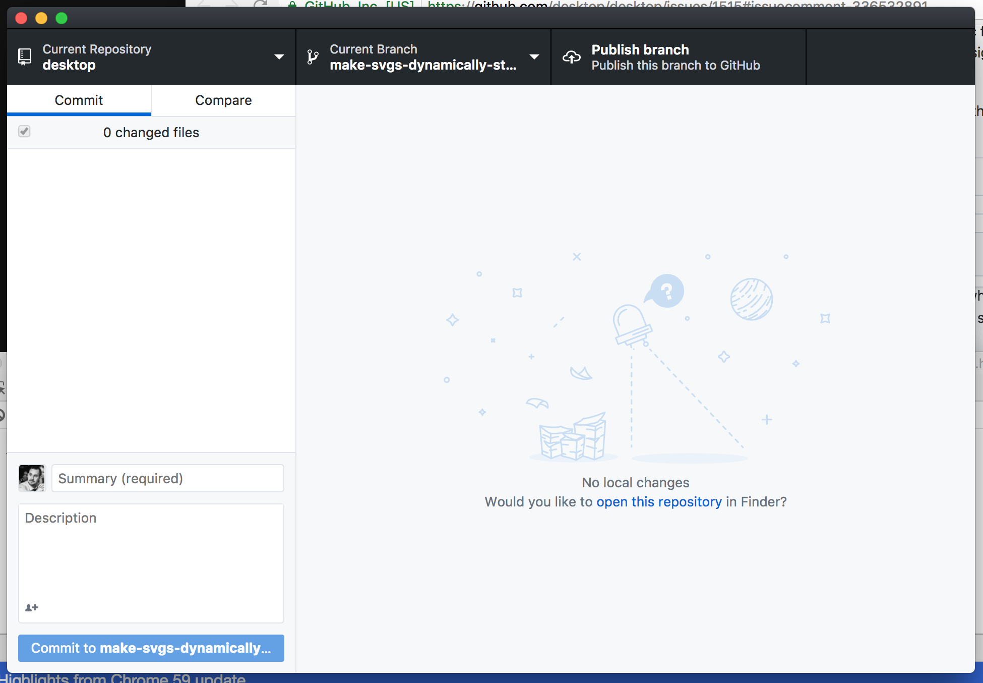
I've pushed up a new branch make-svgs-dynamically-styleable which is the rebase of that earlier work on top of master - if you run this up locally you'll see that all the SVGs are currently black:

For reference, this is what you should be seeing:
If someone wants to figure out how to properly style the updated SVGs within the context of the default theme, that will address at least that outstanding issue.
shiftkey
on 12 May 2018
@shiftkey I'm not as familiar with the constraints here - is embedding them inline an option? If so, we can style them with basic CSS. That's how we do icons at Stack and here on GitHub...but really works well for any size SVG.
NickCraver
on 12 May 2018
@NickCraver I'm not sure of the full range of options so I'll just point out how we're using these currently:
- We grab the URI to the SVG from disk at runtime
- That becomes the source for the
imgelement with a CSS class to help target them
- We have existing styles to apply to the image element
So I think CSS styling is a fine approach for now if we can get away with it. Poking at the old SVGs, for example the old empty-no-file-selected.svg from the screenshot above, there may be multiple colours in the SVG (a primary colour and something for shadows? 🤷♂️ ), in which case the SVGs themselves might need to be updated with attributes so they can be targeted correctly from CSS.
shiftkey
on 12 May 2018
First: I've never setup the project, so kudos on the onboarding documentation - spot on and no issues at all.
I've implemented a PoC for embedding the SVGs and styling them via CSS with a single SVG converted here: https://github.com/NickCraver/desktop/commit/0af750c8cee9218eef618b1d68a67a6598d8c19b (this may have messed up the aspect ratio slightly, but that's trivial to fix if so). Note: while we're using dangerouslySetInnerHTML={{ __html: BlankSlateImage }}, the HTML involved is well known and from a trusted source (the app itself). I would never use this to embed a third-party SVG (they may contain JavaScript), but if the source is known, we're good. I welcome any alternatives of course.
If we're okay going this route, someone could run with it and move everything over. Should decide where the colors live though, and common class names for them to share. Or, either of these could be done in a consolidation pass separately along with moving to a single theme SCSS where coloring lives. Hope this helps!
Here's a few screens from my local showing it in action:


NickCraver
on 12 May 2018
Thanks for digging into this again @NickCraver
(this may have messed up the aspect ratio slightly, but that's trivial to fix if so)
I had a quick look at this but couldn't spot anything obvious. I then got into reading about scaling SVGs and realised it was a yak not worth shaving right now.
I welcome any alternatives of course.
There are a few react libraries for rendering SVGs out there that are security-conscious. react-svg even seems to be able to take in paths (potentially bypassing the need for raw-loader?) and has a corresponding @types/react-svg package. That's what I'd recommend looking into next.
  <ReactSVG
    path="path/to/empty-no-repo.svg"
    svgClassName="svg-class-name"
    className="wrapper-class-name"
    onClick={() => {
      console.log('wrapper onClick')
    }}
  />
Version 1.2.0, still no dark theme.... That's crazy !!! I'm crying blood cause of you !! ^^
 MetaStazz
on 29 May 2018
MetaStazz
on 29 May 2018
Hey everyone, a quick update on this issue. We've incrementally been chipping away at some of the obstacles to building out a dark theme and we recently landed two SCSS refactor PRs (#4780 and #4810) to get us closer to a point where we use very few colors, shadows and gradient hard coded in our base styles. Today we opened #4849 which is our first iteration on a dark theme. Our current plan is to ship this as a preview and get some help from y'all to spot areas that we've missed. This PR is only the first step, we still have some work to do such as updating the preferences dialog. There's task list towards the end of the PR for those interested in following along.
I want to give a shout out to @OiYouYeahYou and @NickCraver for contributing towards solving our issues with the illustrations and @1j01 for their work on the external dark theme style sheet.
niik
on 1 Jun 2018
Popping back in to let y'all know that we just shipped GitHub Desktop 1.2.4 which includes a beta version of the dark theme. As I said earlier there may still be some rough edges and work that needs to be done so if you find something please open an issue and we'll take a look.
You can toggle back and forth between the light and dark theme by opening the preferences dialog on macOS / options dialog on Windows/Linux and hitting the 'Appearance' tab.
As for this particular issue I'm gonna call it done and close it out. I hope you all will enjoy the new theme.
niik
on 25 Jun 2018
Dark theme is nice until you have a dark themed window over a dark themed application, running a dark themed desktop, and NOTHING has any outlines. It's just a big dark screen with text all over it, and no way to find the edges of the windows or know where one window stops and another window starts.
Is there any way around this? Does the dark theme, or the light theme for that matter, have any options for tweaking?
 judgej
on 13 Aug 2019
judgej
on 13 Aug 2019
@judgej Thanks for the suggestion. Currently there is no workaround for this.
The underlying issue was discussed over in https://github.com/desktop/desktop/issues/3189. I added your comments to the bottom of the thread. Please follow along there.
 tierninho
on 13 Aug 2019
tierninho
on 13 Aug 2019
Thanks. It's a serious problem for me. I have problems with my sight that means I need to set up my desktop theme to help me see where things are. That's an OS property, and I expect applications that run on that OS to play nicely and not to override the window features such as borders, title bars, scroll bars etc. just for the sake of "being down with the cool kids".
judgej
on 13 Aug 2019
@judgej Thanks for the clarification and I hope it is not causing too much frustration. The dark theme is still in beta mode, so feedback like yours is very important.
Is it possible to include a screenshot so I can mirror your set up?
tierninho
on 13 Aug 2019
@tierninho I've just shut down for the day, but will get you one in the morning. Thanks again.
judgej
on 13 Aug 2019
I use black as my desktop background, and the dark theme in windows 10 and any app that supports it.
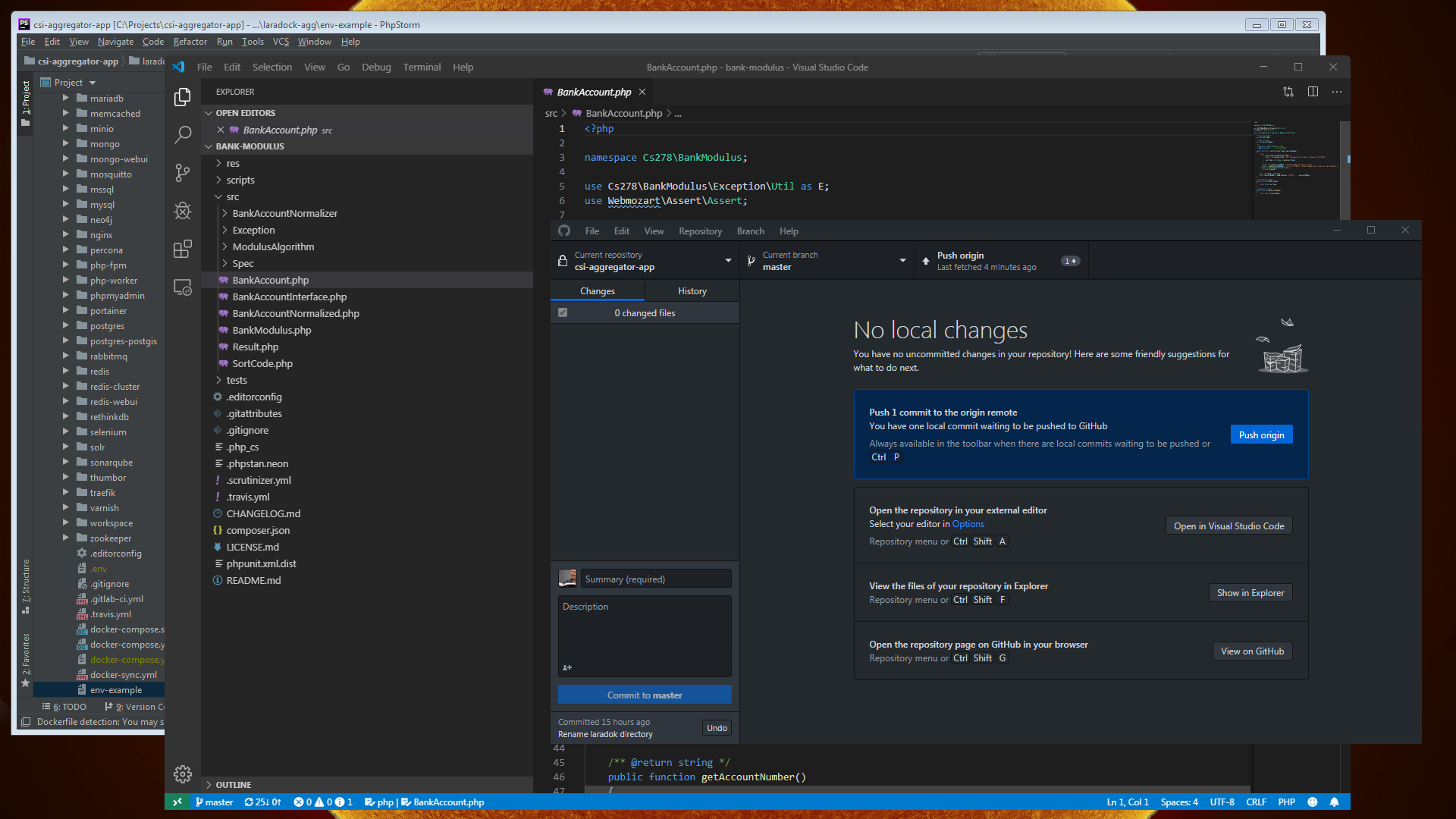
Trying to find the title bar and borders of most applications is really annoying because everything blends together. The only application that seems to have a border color by default is visual studio (it uses the footer color which changes based on the state of the application), but it only does this when it has focus. The same issue happens to other applications/windows if you turn on the accent color for title bars & borders so the issue for me also comes from windows itself.
This seems to not be an issue with light themes because of the drop shadows and borders that are applied, but when you use a dark theme none of that really carries over.
You'd never know it but in this shot #1ba1e2 is the windows accent color, but because none of the windows have focus windows isn't applying it to anything. This gets even worse in the evening because I also use f.lux.

 xt0rted
on 13 Aug 2019
xt0rted
on 13 Aug 2019
Over the day, the screen starts to look like this very quickly. I can use the light theme on Github Desktop to help a little, but the menu bar still merges into the background. The grey border around PHPStorm at the back my be considered wasted pixels to some, but they are pretty essential for me as I nip in and out of dozens of applications all day long, resizing, moving, changing emphasis. There are three applications here.
judgej
on 14 Aug 2019
@xt0rted and @judgej Thanks you for sharing and apologies for the frustrations. I will circle back very soon.
tierninho
on 14 Aug 2019
I wouldn't use phpstorm as an example, that border looks horrible. I agree there should be one but you only need a 1px outline like Visual Studio. A nice clean blue outline at the edge.

SemperFu
on 16 Aug 2019
The border on PHP Storm is not PHP Storm's border, it is my border, and that's my main point. I'm not arguing about what one person may consider looks nice over other opinions, because everyone has opinions over what looks good. My argument is that this product is overriding the OS settings seemingly because a designer thinks it looks nice and I guess "on-brand".
People also have to work with these things in a desktop environment. I don't turn on my GitHub Desktop to work on all day. I turn on my desktop and expect the applications that are privileged to be welcomed to run in that desktop to play nicely with the desktop.
judgej
on 17 Aug 2019
Related issues
 justinjdickow
·
56Comments
justinjdickow
·
56Comments
 AlcaDesign
·
69Comments
AlcaDesign
·
69Comments
 renegadedata
·
68Comments
joshaber
·
51Comments
renegadedata
·
68Comments
joshaber
·
51Comments
 lameyer
·
77Comments
lameyer
·
77Comments
Most helpful comment
I started making a dark theme stylesheet!
You can paste this into the console (View > Toggle developer tools) to inject it:(Update: persistent (html-injecting) version here!)
Update: Use the install instructions on the gist!
Does this help bump up the timeline for this feature? 😃 🤔