Is your feature request related to a problem? Please describe.
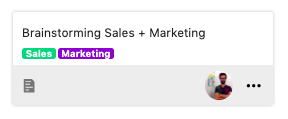
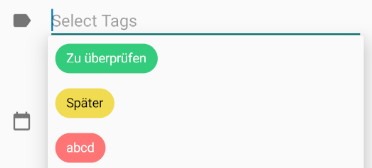
If you use round labels on cards they are very dominant due to the padding and the large color area.
I would like to bring a simple redesign of the labels up for discussion.
Describe the solution you'd like
A more square design with less padding (like github) should save space and reduce the optical impact. IMHO the round design also doesn't look professional.
@juliushaertl @jakobroehrl What do you think?
@stefan-niedermann I think this applies even more to the mobile app, as space is valueable here.
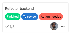
Deck v1.0.0
 bpcurse
All 13 comments
The change was discussed in https://github.com/stefan-niedermann/nextcloud-deck/issues/298#issuecomment-611368560 and was basically oriented on material design chips. I think the rounded layout fits pretty well into how Nextcloud UI components are looking these days with fully rounded buttons for example.
I agree that we probably could decrease the padding a bit more to give them a bit less priority than the actual card title cc @nextcloud/designers and @jancborchardt
 juliushaertl
on 12 May 2020
juliushaertl
on 12 May 2020
Agree:
- the labels are too rounded, maybe a more square shape can help
- the padding is too large
In the previous, the square shape was quite right, but the padding too low.
 Nyco
on 12 May 2020
Nyco
on 12 May 2020
Are the labels clickable to use as a filter? Then their clickable size needs to be 44px at least. This can be separated from the visual part though, which could be made to appear smaller.
 jancborchardt
on 12 May 2020
jancborchardt
on 12 May 2020
Are the labels clickable to use as a filter
No in the board view they are just indicators without any action. The whole card itself is clickable.
juliushaertl
on 14 May 2020
Regarding consistency in design:
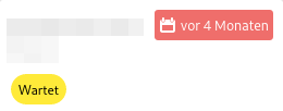
I think the design of the overdue indicator with less top/bottom padding would be a good solution.
bpcurse
on 16 May 2020
@bpcurse your proposal would make the due date hard to distinguish from tags, therefore 👎 from me.
 stefan-niedermann
on 16 May 2020
stefan-niedermann
on 16 May 2020
@stefan-niedermann Thank you for clarification :)
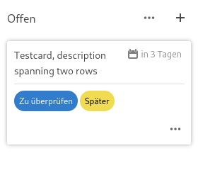
I get your point, but isn't there also the spatial factor and the calendar icon that should help in distinguishing them from each other?
What about introducing a new simple design element (light gray horizontal line) to structure the card and make this more obvious (see attached mockup)? @juliushaertl @jancborchardt
bpcurse
on 16 May 2020
Hi, yes, you're right. First look goes to labels. My proporsal is:
element.style {
    border-bottom: 2px solid rgb(202, 203, 205);
    color: rgb(0, 0, 0);
}
.card .labels li {
    flex-grow: 0;
    flex-shrink: 1;
    display: flex;
    flex-direction: row;
    overflow: hidden;
    padding: 0px 7px;
    /* border-radius: 15px; */
    font-size: 85%;
    margin-right: 3px;
    margin-bottom: 3px;
}
Or this one:
.card .labels li {
    flex-grow: 0;
    flex-shrink: 1;
    display: flex;
    flex-direction: row;
    overflow: hidden;
    padding: 0px 5px;
    border-radius: 5px;
    font-size: 70%;
    margin-right: 3px;
    margin-bottom: 3px;
}
 vix95
on 20 May 2020
vix95
on 20 May 2020
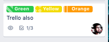
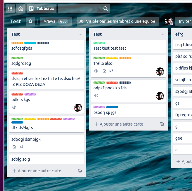
v0.8 design:
v1.0 design:
This proposed design:

Trello design:
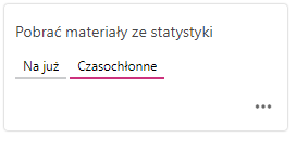
It look to me like we could even remove one more pixel of padding.
Nyco
on 9 Jun 2020
@stefan-niedermann How do you think about adjusting the android app as well, since we mainly changed this to be in sync. I think reducing the padding should still be fine since the label doesn't trigger and click/touch action so they are not really covered by the material chips
juliushaertl
on 14 Jun 2020
The Android app actually triggers touch actions when editing a card
- to remove a label
- to add a label
Though i could imagine to reduce the padding in the overview a bit
How much padding do you think would be appropriate? I want the user to be able to associate the labels from the overview with the labels in the edit mode. Therefore they shouldn't look too much different.
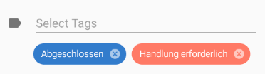
And do you want to also change the border radius like proposed by @Nyco ? While the labels in the files app (web UI) are also not round:
i still think that the completely rounded corners fit the overall design of Nextcloud better
stefan-niedermann
on 15 Jun 2020
It all makes sense on Android, but here, it is a ticket for the web app.
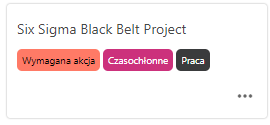
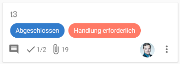
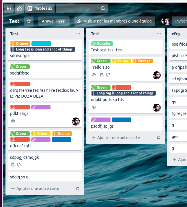
The main problem with this padding is that it occupies way too much space on the screen and on the card, and steals a lot of attention. Currently, the card title is supposed more important than the tags, but it is less visible.
For one card:
For a whole Deck:
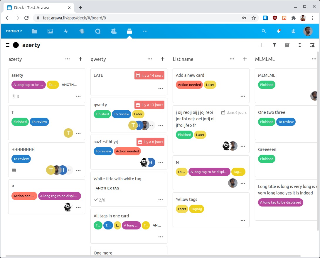
Here you can clearly see that tags a widlely dominating the global Deck, it is barely possible to pay attention to cards titles.
As a comparison, Trello, it is more readable:
Nyco
on 17 Jun 2020
It all makes sense on Android, but here, it is a ticket for the web app.
I can see that this issue is in the repository of the web UI, though the underlying problem you are describing would also affect Android - if it's an issue that the title should get more attention compared to the labels then it affects all clients.
We try to keep the UI similar if possible for a better orientation for users of both apps. Usually the Android app simply follows the design of the Web UI (respecting Material design).
But in this case @juliushaertl asked for my opinion and i just answered that the android app could not follow completely here because it uses the labels as touch target in some situations. Now we're looking for a solution (which can be either differing in this point or a common solution which we can follow in all clients)
stefan-niedermann
on 17 Jun 2020
Related issues
 langfingaz
·
3Comments
langfingaz
·
3Comments
 RobertZenz
·
4Comments
RobertZenz
·
4Comments
 PanCakeConnaisseur
·
4Comments
PanCakeConnaisseur
·
4Comments
 armaccloud
·
3Comments
armaccloud
·
3Comments
 scoopex
·
4Comments
scoopex
·
4Comments
Most helpful comment
The change was discussed in https://github.com/stefan-niedermann/nextcloud-deck/issues/298#issuecomment-611368560 and was basically oriented on material design chips. I think the rounded layout fits pretty well into how Nextcloud UI components are looking these days with fully rounded buttons for example.
I agree that we probably could decrease the padding a bit more to give them a bit less priority than the actual card title cc @nextcloud/designers and @jancborchardt