Deck: Show actual date instead of approximates in cards
Is your feature request related to a problem? Please describe.
I am experiencing two issues
- The subject text + Date next to each other is giving formatting issues, as #1672 should at least partially solve
- In my overview I can only see when something is planned (exactly) when I open each card individually due to the approximate due date
Describe the solution you'd like
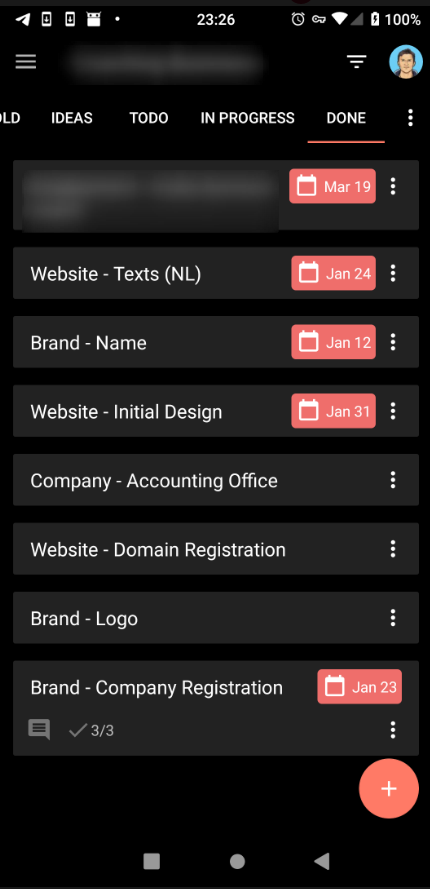
In the Android Deck app, the date is shown as an actual date, in the following format: Jan 24
This would be a solution to both the above issues;
- Less width is used as a result from which the text will also gain some more space.
- People can see the actual dates from their overview.
This will also bring the Android and Web App more in line with each other.
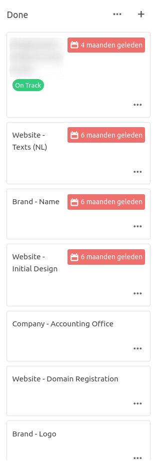
The following screenshot shows the difference in which the two apps show the same board. In my opinion the Android App shows the view more tidy.
_Android App_
_Web App_
 armaccloud
All 3 comments
No strong opinion here, just a few notes:
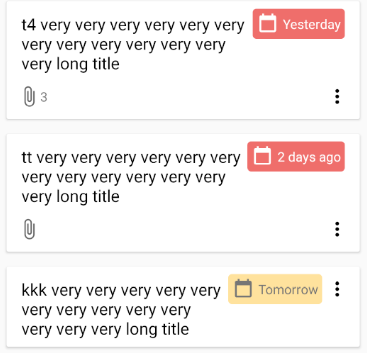
The Android app does also show relative timespans, but only for due dates which are pretty close to "today":
Less width is used as a result from which the text will also gain some more space.
This highly depends on the language and can easily be the other way around.
People can see the actual dates from their overview.
I think a combination of absolute / relative timespans might be a good solution in this case.
- Assuming we need a precision of 1 day in the overview
- Relative timespans are cognitively easier to read
- Use them for a short period around "today"
- Use absolute timespans for dates which are not close to "today"
 stefan-niedermann
on 17 Jul 2020
stefan-niedermann
on 17 Jul 2020
Yes @stefan-niedermann , that sounds like an elegant solution, to have the relative timespans some days around today for the web app also.
Less width
My remark
Less width is used as a result from which the text will also gain some more space.
was pointing to using the format like the Android app shows the date, which is truncated like Jan 24 instead of January 24. That way, you can also assure that the width of the absolute dates is mostly the same (maybe also using monospace?) making the view look consistent.
Actual dates
To solve the issue of not seeing the actual date, which in many cases is useful information (when planning dates & checking wehether all are correct) an idea would be to include a mouse-over on the timespan, so it shows the actual date when pointing the mouse over a relative timespan.
armaccloud
on 17 Jul 2020
Yes @stefan-niedermann , that sounds like an elegant solution, to have the relative timespans some days around today for the web app also.
I agree, and would think that one week is about the right point to make the difference
 kbeerepoot
on 6 Aug 2020
kbeerepoot
on 6 Aug 2020
Related issues
 jbonlinea
·
4Comments
jbonlinea
·
4Comments
 ampoz
·
4Comments
ampoz
·
4Comments
 PanCakeConnaisseur
·
4Comments
PanCakeConnaisseur
·
4Comments
 ghost
·
3Comments
ghost
·
3Comments
 juliushaertl
·
4Comments
juliushaertl
·
4Comments