Dashboard: Redesign errors displayed on login page
At the moment we are using simple component to display the error messages. It can be improved (see: src/app/frontend/login/template.html:19).
 maciaszczykm
All 12 comments
Issues go stale after 90d of inactivity.
Mark the issue as fresh with /remove-lifecycle stale.
Stale issues rot after an additional 30d of inactivity and eventually close.
If this issue is safe to close now please do so with /close.
Send feedback to sig-testing, kubernetes/test-infra and/or fejta.
/lifecycle stale
 fejta-bot
on 11 Sep 2019
fejta-bot
on 11 Sep 2019
/lifecycle frozen
 floreks
on 12 Sep 2019
floreks
on 12 Sep 2019
@maciaszczykm
Any plans as to how to improve the errors messages?
I would be interested in working on this
 anshulahuja98
on 13 Sep 2019
anshulahuja98
on 13 Sep 2019
@anshulahuja98 Hi, first of all, we would like to improve how the errors are styled and we are open to suggestions.
maciaszczykm
on 16 Sep 2019
Opinions on using a dialog box to show the error?
The dialog box will have an ok button to close the dialog
anshulahuja98
on 16 Sep 2019
I'd avoid having a dialog here. It slows down the login. IMO just and well-styled information that doesn't need to be closed before second login attempt would work just fine.
maciaszczykm
on 16 Sep 2019
How about using a snackbar?
Have a look at the demo I implemented
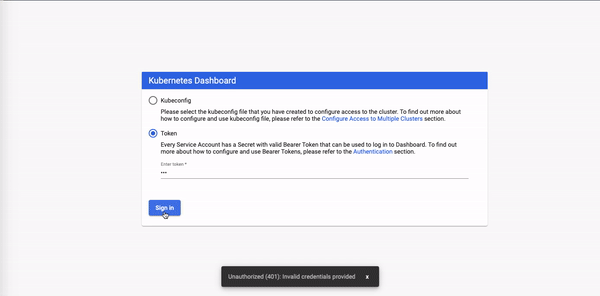
I can make changes to the colour of the text or the snack bar and an error fa logo
Just wanted to validate using snackbar in the first place
anshulahuja98
on 16 Sep 2019
If this seems a feasible approach, we can use it to improve error logging across the whole dashboard wherever relevant.
anshulahuja98
on 16 Sep 2019
Looks good.
maciaszczykm
on 16 Sep 2019
Great!
I'll drop a PR
anshulahuja98
on 16 Sep 2019
I'd use it for errors on login view for now only and style as an error. Remember to check if it will be properly displayed after forced logout when the token expires.
floreks
on 16 Sep 2019
So, there isn't a neat way to show multiple errors using this approach.
One method could've been to just concatenate all text into one snackbar, but it won't show up properly formatted.
Generating one snackbar per error would probably also not be a viable approach in this case.
anshulahuja98
on 24 Sep 2019
Related issues
 wheestermans
·
32Comments
wheestermans
·
32Comments
 Rahul91
·
71Comments
Rahul91
·
71Comments
 sigrlami
·
33Comments
sigrlami
·
33Comments
 stephenrlouie
·
44Comments
stephenrlouie
·
44Comments
 beardstack
·
29Comments
beardstack
·
29Comments
Most helpful comment
I'd use it for errors on login view for now only and style as an error. Remember to check if it will be properly displayed after forced logout when the token expires.