Darktable: Glitches about lighttable rewrite: list them all here !
Thanks to the awesome and big work of @AlicVB merged this day, we now have a far better and faster lighttable. This change also some thing from how users see them (a little). I will work this week on CSS part to improve it.
So, I suggest to all of you add posts here to precise UI glitches about this part here.
Please be the more precise as possible: which part (if screen capture, not a too big one but just the part to fix) you see. Precise also with which of the actual four themes you see that. I will begin (I don't check things a lot by now) with the first issue I will fix in the second post.
For what I've seen by now, I think issues will not be a lot !
@TurboGit or @aurelienpierre or @AlicVB. One of you could assign this issue to me and necessary labels? Thanks.
 Nilvus
All 17 comments
First issue:
On darktable-grey theme: text over thumbnails is not really readable (not to adjust color).
Nilvus
on 17 Mar 2020
More than that : as said (or not, don't remember) I've absolutely not done anything for theme other that the base one.
The idea was to first have a clean base theme, which will be easier to tweak after.
Again, thanks for taking care of this part, and ping me here or directly by mail if you need anything !
 AlicVB
on 17 Mar 2020
AlicVB
on 17 Mar 2020
More than that : as said (or not, don't remember) I've absolutely not done anything for theme other that the base one.
The idea was to first have a clean base theme, which will be easier to tweak after.
I confirm that you precise that on your PR.
Nilvus
on 17 Mar 2020
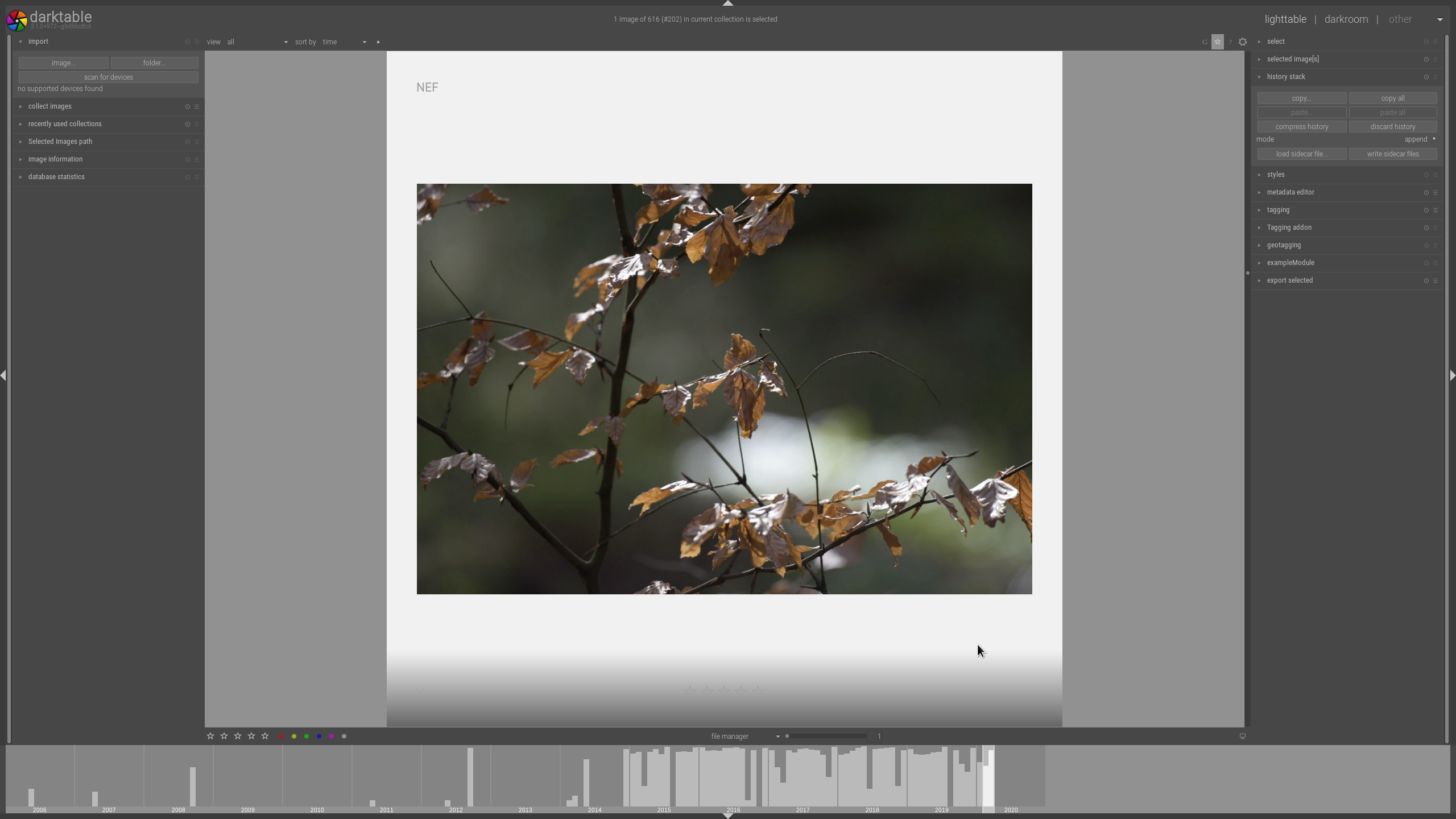
I donno this is a CSS clitch, actually I don't think so, but this is suddenly the max view I can get in lighttable view and I must say I do not like it so much (it was covering the full area before, w/o that DIA-Frame)....
 AxelG-DE
on 19 Mar 2020
AxelG-DE
on 19 Mar 2020
That's intended. The idea is to keep a coherent design between mode. You are still in filemanager mode, and it's how image are display here.
Better use (sticky)full preview if you want the image with the framing background. Note that now, you can show all panels in full preview mode if you need them.
(and yes, not configurable via css)
AlicVB
on 19 Mar 2020
I am medium happy as I used this view in the past regularly. But I don't wanna be against, as we gonna see, what new things might bring good in the future and I will get used to alt+W :-)
AxelG-DE
on 19 Mar 2020
I am medium happy as I used this view in the past regularly. But I don't wanna be against, as we gonna see, what new things might bring good in the future and I will get used to alt+W :-)
This full preview is quite better and having a more consistent behavior on same view is better. You will see that on full preview mode you can move on images with mouse wheel or left and right arrows !
Just an info about this: text over thumbnails fixed actually on my side. Will work tomorrow on some other little things like:
- improve stars and group/altered icons to be more consistent between them and more readable
- improve some CSS parts to be more consistent between them (just code optimizations and as precised some times before by @aurelienpierre, avoid having "grey" colors listed on CSS parts but having css parts related to define lines on start. That will help having consistency). The funny part (or not) ;-) !
A last precision: this is for lighttable filemanager part. Culling mode will be when @AlicVB will make rewrite of these parts and his work will be merged.
Nilvus
on 19 Mar 2020
Please avoid other things that CSS issues here. That will not help me ! Even if you could remove your last posts...
Nilvus
on 19 Mar 2020
sorry I shut up
deletion done
AxelG-DE
on 19 Mar 2020
Another issue posting by a user on french darktable Matrix channel:
- in filemanager, select just one image to show, go at the end and scroll (quite infinite scroll possible) and after it's impossible to scroll up to display image (needs to select another collection to reset the view). I'm not sure but will test if moving/updating undershoot/overshoot on CSS could help here or not (@AlicVB: what's your idea on that?).
Nilvus
on 19 Mar 2020
@AlicVB: another annoying glitch issue (that I can't fix with CSS). Go on a lighttable filemanager view without any image (for example rejected filter without of course any rejected image on it). Go then to preferences and change theme with different colors of course. See that lighttable background is not updated and text seems to loose antialiasing and sometimes not aligned correctly. I also had two times (second time tonight) a removed image (after rejecting it) remains partially visible on background on same view without any more image. So probably same refreshing issue. Hope it's clear.
Nilvus
on 19 Mar 2020
Go on a lighttable filemanager view without any image
Confirmed. It's even easier to trigger, just resize the darktable window and the text is overwritten and not replaced.

 jenshannoschwalm
on 20 Mar 2020
jenshannoschwalm
on 20 Mar 2020
This one is for @AlicVB:
- ensure scrollbar in darkrrom is enabled
- open darkroom and hide the filmstrip
- go back to lighttable
- select 4 thumbs per row, the idea is to have big thumbs to easily reproduce
- zoom in image by scrolling
- type
ctrl-fto enable filmstrip
The filmstrip is displaying large thumbs (same size as lightttable). See screenshot:
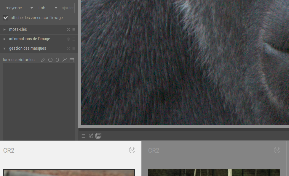
- if you scroll into the filmstrip the display goes back to normal, so probably just missing a redraw
 TurboGit
on 21 Mar 2020
TurboGit
on 21 Mar 2020
@AlicVB: I think you could assign this to you now. It seems there's no more CSS glitches and some glitches listed here remaining could not be fixed by CSS.
Nilvus
on 21 Mar 2020
Ok, I've fixed issues reported here in PR #4520 :
- @Nilvus : the zoom==1 scrolldown
- @TurboGit : the filmstrip redraw if darkroom scrollbars are on
@jenshannoschwalm : I've seen that you've fixed the empty collection window. Thanks a lot !
AlicVB
on 21 Mar 2020
Ok, I've fixed issues reported here in PR #4520 :
* @Nilvus : the zoom==1 scrolldown

* @TurboGit : the filmstrip redraw if darkroom scrollbars are on
@jenshannoschwalm : I've seen that you've fixed the empty collection window. Thanks a lot !
Oh, thanks @AlicVB. So maybe it's better now to close this issue as all listed glitches here seems to be fixed. If necessary, that could be reopen or new issues created.
Nilvus
on 21 Mar 2020
yes, better closing and open new issue(s). It will easier to follow !
AlicVB
on 21 Mar 2020
Related issues
AxelG-DE
·
5Comments
 Praveen-Rai
·
5Comments
Praveen-Rai
·
5Comments
 mjut
·
5Comments
mjut
·
5Comments
 schwerdf
·
4Comments
schwerdf
·
4Comments
 sboukortt
·
3Comments
sboukortt
·
3Comments