Cwa-website: Github button looks like a download button.
Where to find the issue
The main page.
Describe the issue
There's a big "github" call to action on the main page. This is only meaningful to a very small percentage of the population: those those who program, or are very close to programming jobs.
For everyone else in the world it looks exactly like the "download now" button they've been trained to click on on every website with this layout. Regular folks don't expect to see the source code, especially when they aren't told it will be the source code.
People don't read text on websites.

What would my grandparents think?
Suggested change
Replace it with a link to download and install the app, or make it more obvious this isn't the link that 99.9% of people want. I wouldn't even link to it, I would just say "The code is on github" and keep a link to github in the footer.
Improving the visits-to-downloads conversion rate here could actually save a life.
 Incognito
All 4 comments
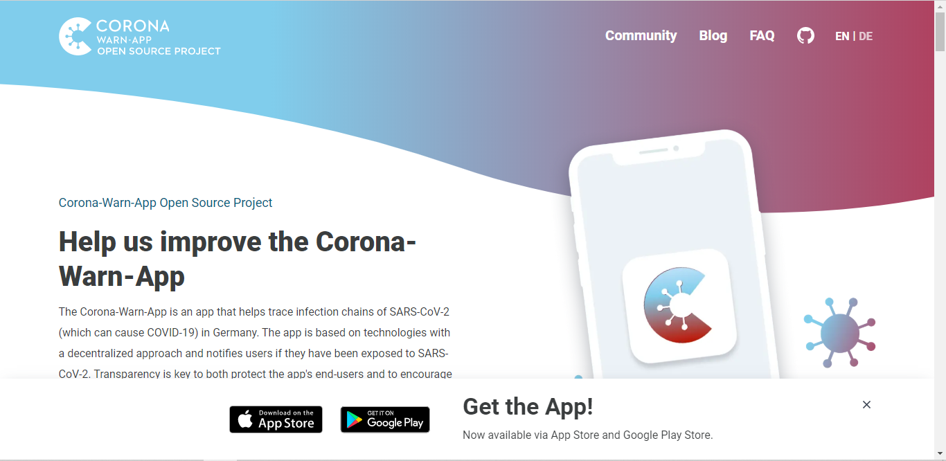
I think with this Message "Get the App" at first glance when you open the Website, everybody who wants to download the App will find the way to his/her App Store 👍
What do you think @Incognito ?
 Ein-Tim
on 24 Aug 2020
Ein-Tim
on 24 Aug 2020
It depends on the screen size. If the github link is below the fold it would be harder to get confused (for example, your screenshot keeps the github link below the fold which is good). Also, there's a question about training users to ignore these footer-bars, because every website now wants you to download some app (similar to GDPR popups being ignored by most people, they just search for the accept button quickly).
Incognito
on 24 Aug 2020
Hello @Incognito,
I will discuss this tomorrow and get back to you with an answer.
Thanks,
LMM
Corona-Warn-App Open Source Team
 GPclips
on 24 Aug 2020
GPclips
on 24 Aug 2020
The main purpose of the website is to promote the open source project. To this end, having the GitHub link front and center just makes sense.
In the meantime, this might have changed and we probably have many visitors who might not even be interested in going to GitHub in the first place. For them, finding the app download link (for their respective OS) is more important and catered to through the banner on the bottom of the page.
Other visitors will probably just go directly to the FAQ page or blog and never even see the home page. And when searching for Corona-Warn-App, this page is by far not the first target on Google.
We still want as many people as possible to engage on GitHub by letting us know about their problems, suggesting new features, etc. Hence, I will leave the button as-is for the time being.
If anybody has a good idea of how to balance these two aspects, we're more than happy to have a look at a respective PR.
 tkowark
on 28 Aug 2020
tkowark
on 28 Aug 2020
Related issues
 MikeMcC399
·
3Comments
MikeMcC399
·
4Comments
MikeMcC399
·
3Comments
MikeMcC399
·
4Comments
 ndegendogo
·
6Comments
MikeMcC399
·
3Comments
MikeMcC399
·
3Comments
ndegendogo
·
6Comments
MikeMcC399
·
3Comments
MikeMcC399
·
3Comments
Most helpful comment
I think with this Message "Get the App" at first glance when you open the Website, everybody who wants to download the App will find the way to his/her App Store 👍
What do you think @Incognito ?