Covid19india-react: A dark mode based on local clock
Is your feature request related to a problem? Please describe.
During night time, it might induce eye strain.
Describe the solution you'd like
A dark mode that toggles automatically with system time.
Describe alternatives you've considered
An alternative would be to continuously alter the intensity of the background as per time. But a dark mode might be preferred
Additional context
Add any other context or screenshots about the feature request here.
 gigatesseract
All 19 comments
@gigatesseract if this issue is not taken, i'd like to work on it. Also I was wondering, wouldn't providing a toggle button instead be better? The user can switch when he wants to.
 vandanachandola
on 7 Apr 2020
vandanachandola
on 7 Apr 2020
@vandanachandola what about using prefers-color-scheme?
 ciaasteczkowy
on 7 Apr 2020
ciaasteczkowy
on 7 Apr 2020
@ciaasteczkowy yes imo, using prefers-color-scheme along with a toggle button would do. That way, if a user generally prefers light mode but wants to access the website in dark mode, he can toggle. Is there a better way acc to you?
vandanachandola
on 7 Apr 2020
@vandanachandola exactly, a toggle + auto mode, which reacts on prefers-color-scheme instead of a defined time.
ciaasteczkowy
on 7 Apr 2020
@ciaasteczkowy yes imo, using
prefers-color-schemealong with a toggle button would do. That way, if a user generally prefers light mode but wants to access the website in dark mode, he can toggle. Is there a better way acc to you
Yes this sounds good! Assigning this to you, also before implemeting can we decide on the color palettes?
We can go with #161625 for backgrounds, and #bdbdbd for the texts? I have a feeling the other colors may not need translation since they're all transparent, but correct me IfI'm wrong about that – we can decide on the other colors too!
 jeremyphilemon
on 7 Apr 2020
jeremyphilemon
on 7 Apr 2020
I wanted to work on this as well :sweat_smile: A single person can fix this though. I will try solving other issues. Looking forward to the dark mode soon! :smile:
gigatesseract
on 8 Apr 2020
I wanted to work on this as well 😅 A single person can fix this though. I will try solving other issues. Looking forward to the dark mode soon! 😄
Hi @gigatesseract , I don't mind working on this on my own or in collaboration. If you wish to work together, you can reach me on Telegram @vandanachandola. Since I haven't decided on color palettes, I haven't started working on this yet.
vandanachandola
on 8 Apr 2020
@gigatesseract Oh my bad, I didn't think you wanted to be assigned too! I've assigned you both!
You can collaborate with @vandanachandola too imo :)
jeremyphilemon
on 8 Apr 2020
@ciaasteczkowy yes imo, using
prefers-color-schemealong with a toggle button would do. That way, if a user generally prefers light mode but wants to access the website in dark mode, he can toggle. Is there a better way acc to youYes this sounds good! Assigning this to you, also before implemeting can we decide on the color palettes?
We can go with
#161625for backgrounds, and#bdbdbdfor the texts? I have a feeling the other colors may not need translation since they're all transparent, but correct me IfI'm wrong about that – we can decide on the other colors too!
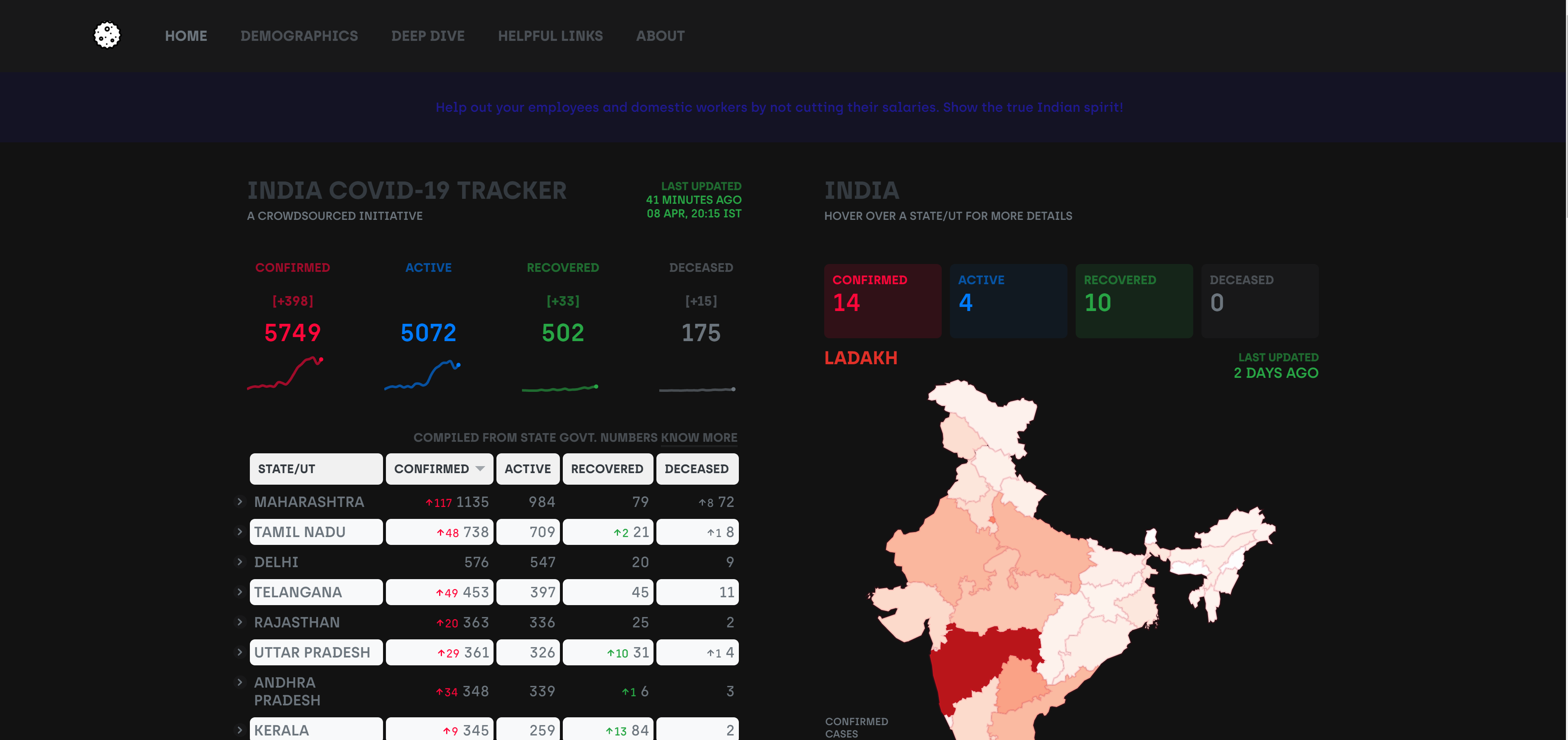
I checked out dark mode in a couple of websites. Recommended background color is #121212. Actually quite a few changes should be introduced in the palette - text color in the banner, the alternate rows in the table, h1 heading color is not clearly visible etc..
vandanachandola
on 8 Apr 2020
@vandanachandola I feel #121212 would be too dark. Can you open a PR so that I can experiment with some colors and figure out? :)
jeremyphilemon
on 10 Apr 2020
@jeremyphilemon @vandanachandola Can we also have a CSS filter (invert + hue-rotate(180)) for the map. Otherwise, the brightness of the map could blind someone
 shuklaayush
on 11 Apr 2020
shuklaayush
on 11 Apr 2020
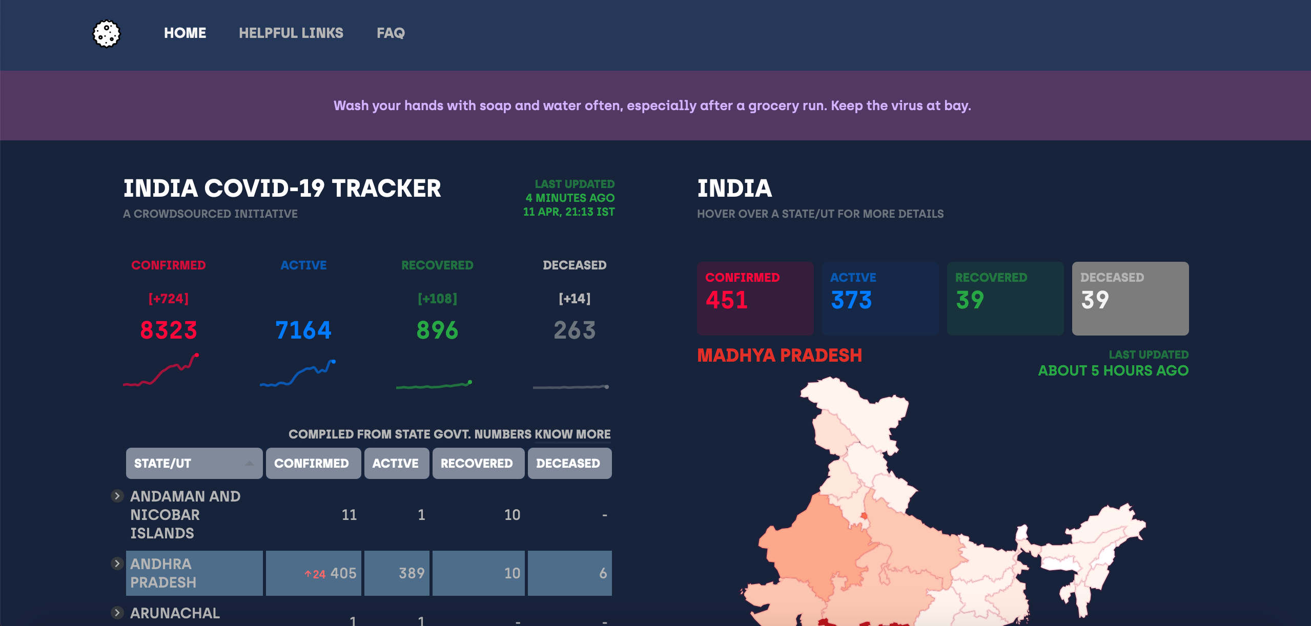
Can you check this theme ? @shuklaayush
I have tweaked a few colors.
 nikhilm19
on 12 Apr 2020
nikhilm19
on 12 Apr 2020
Personally I like the grey version better but the headers and even rows background is too bright. The map should also have some darker colours like @shuklaayush said.
ciaasteczkowy
on 12 Apr 2020
Do you mean the purple header, table headers? Haven't worked on the Maps for now. Will try! @ciaasteczkowy
nikhilm19
on 12 Apr 2020
Oh, sorry. @nikhilm19 I meant the table header.
ciaasteczkowy
on 12 Apr 2020
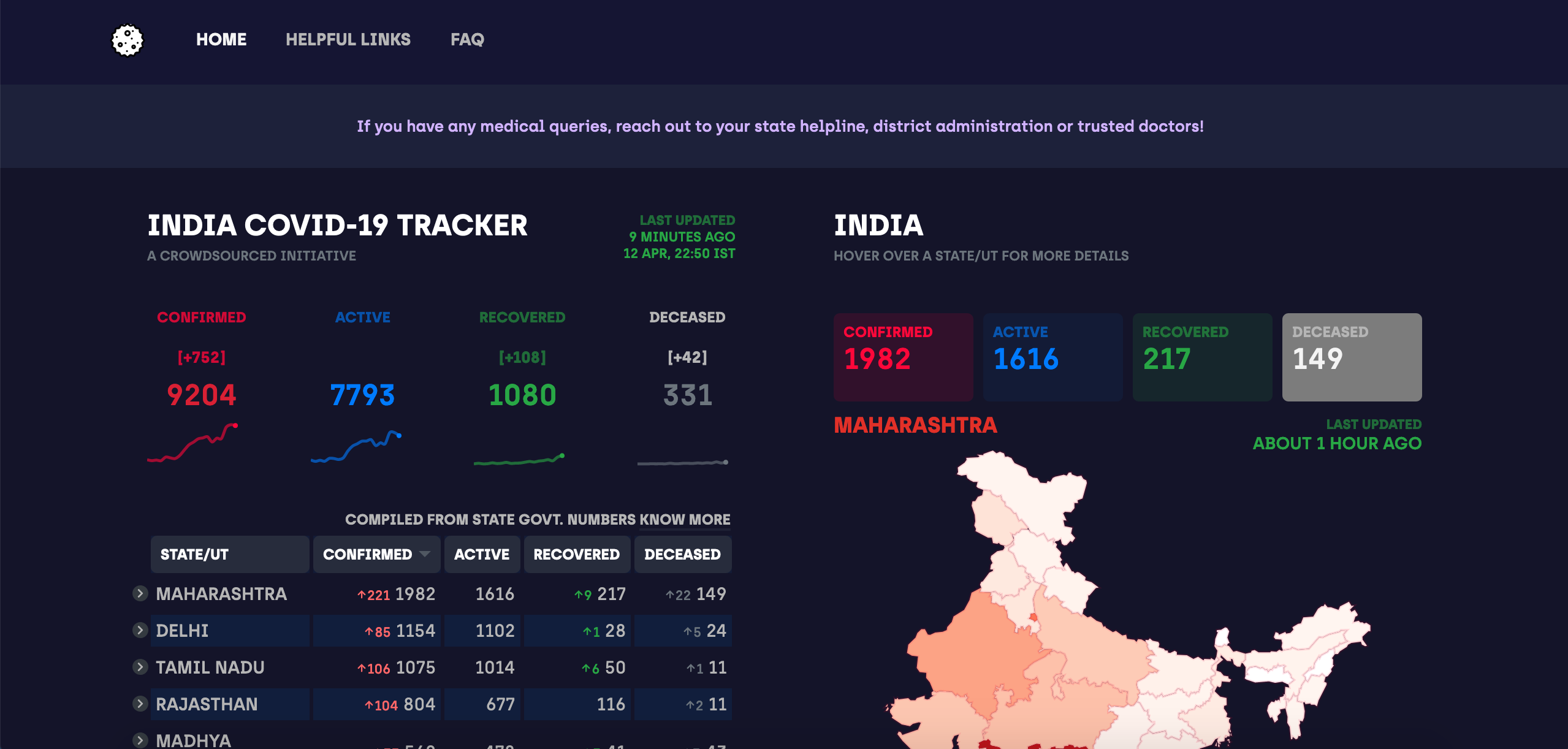
I still liked a blue theme. And tweaked as you said @ciaasteczkowy. Maps are left.
nikhilm19
on 12 Apr 2020
@nikhilm19 that looks much better. My vote still goes for grey ;) but now you have less contrast, which is nice in a dark theme.
ciaasteczkowy
on 12 Apr 2020
Yeah! Will try a grey theme too.
nikhilm19
on 12 Apr 2020
This looks great! Can't wait for dark mode
 officialakhil
on 13 Apr 2020
officialakhil
on 13 Apr 2020
Related issues
 linkwithsid
·
3Comments
linkwithsid
·
3Comments
 DikshantYadav19
·
5Comments
DikshantYadav19
·
5Comments
 akshitmehra
·
6Comments
akshitmehra
·
6Comments
 abbhhiisseek
·
5Comments
abbhhiisseek
·
5Comments
 amita-kapoor
·
3Comments
amita-kapoor
·
3Comments
Most helpful comment
This looks great! Can't wait for dark mode