Covid19india-react: Disable Scale Mode Uniform by default.
Disable Scale Mode Uniform by default.
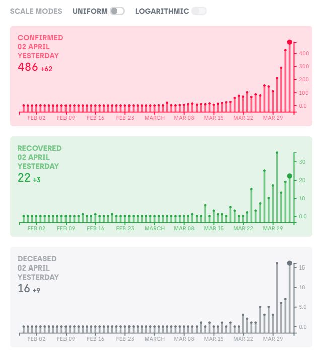
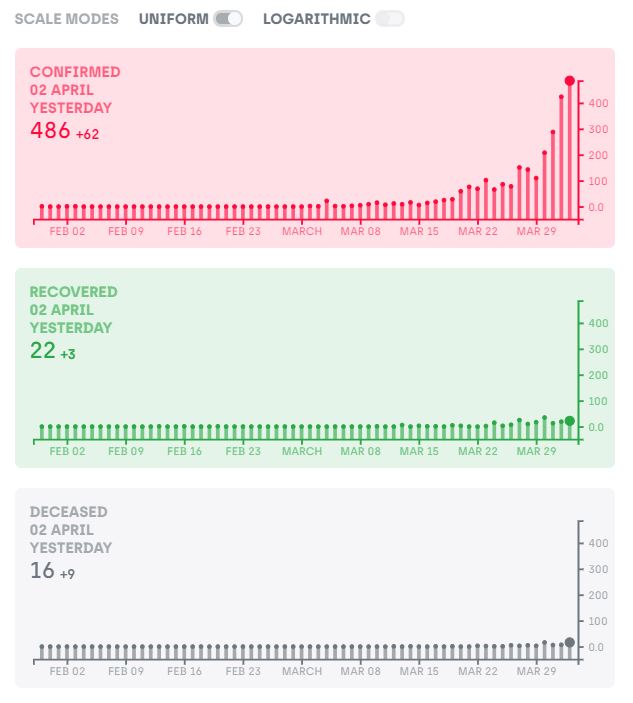
This will add more clarity to graph when we see the curve. If it is enables by default, 2nd and 3rd Graphs looks like a straight line.
 avinasshcm
All 15 comments
@avinasshcm I also feel the same. In coming days, recovery and death is going to be nowhere close to new cases. It makes sense to have uniform turned off.
@jeremyphilemon @JunaidBabu Please review.
 kousiksatish
on 2 Apr 2020
kousiksatish
on 2 Apr 2020
I think this is debatable. Ideally, all three curves should be shown on the same graph so that in future we can see recoveries reaching towards the total cases.
Having Uniform scaling on, is closer to that reality. @jeremyphilemon thoughts?
 sudevschiz
on 3 Apr 2020
sudevschiz
on 3 Apr 2020
With your close to reality recommendation, people cannot see proper variation in the graph. Please see the attached one.
Scale it not the thing which users see, what makes usability better is what is the variation in number compared to yesterday or day before or week before.
avinasshcm
on 3 Apr 2020
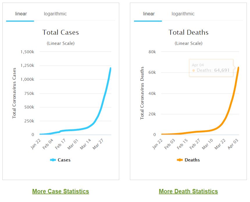
Please refer https://www.worldometers.info/coronavirus/country/india/
They have graphs without uniform scaling.
They have comparison graphs as below which makes more sense for such data. We can also implement that. May be Recovered vs Death in same graph
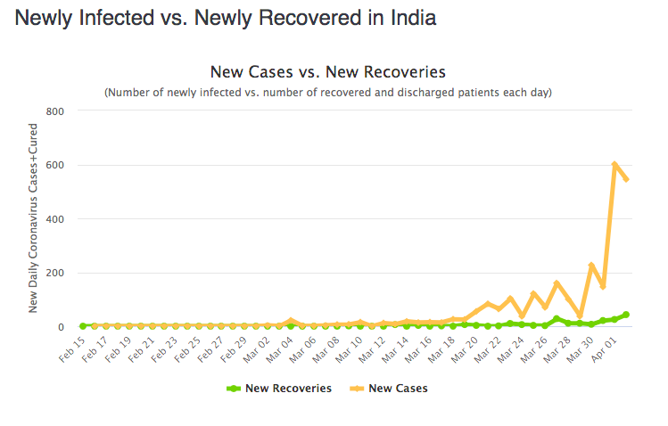
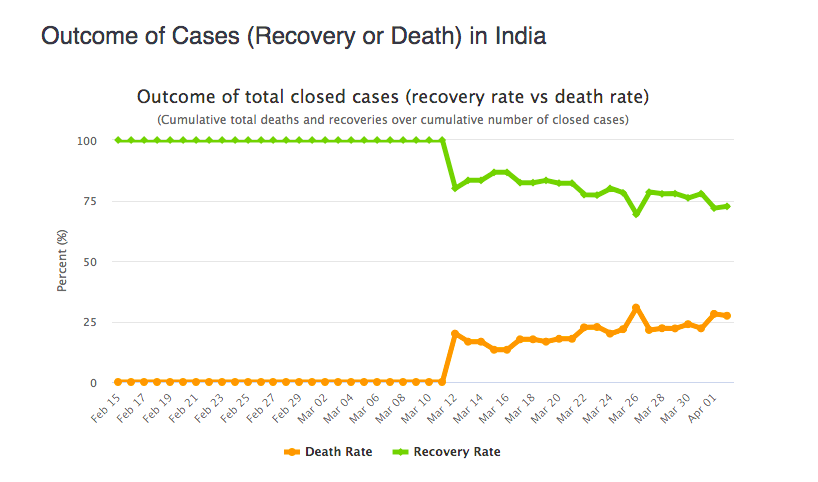
This is quite simple to implement and more useful for user.
kousiksatish
on 3 Apr 2020
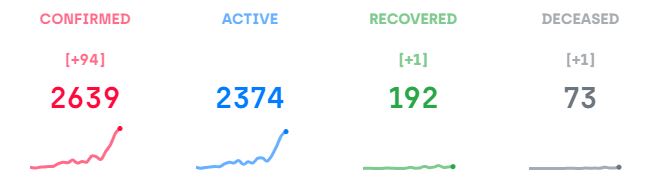
Same thing holds good for this graph too.
Recovered and Deceased is flat.
avinasshcm
on 3 Apr 2020
Once the recovery numbers pick up, won't it be nice to see it peaking :)
sudevschiz
on 4 Apr 2020
Fine, if you want to stick to your so called Close to reality feature. leave it.
avinasshcm
on 4 Apr 2020
If you dont have mindset to understand what graph is, its waste arguing with you.
avinasshcm
on 4 Apr 2020
@avinasshcm thanks for your feedback, I have to back @sudevschiz decision on this, not just on his intention to have it represent something "close to reality", but to have proper design in showing the graphs in the first place.
When you first see the graphs without uniform scaling turned on, there is a significant possibility of misinterpreting the graphs that the deaths are in par with the numbers of confirmed cases. Since both the graphs, without having checked what the y-axis are, look alike.
Your idea of "understanding the graph" is falling short behind not understanding that users may not see the Y-axis as non-uniform on first sight.
Hence, the button. Go ahead and click it for clarity. We wouldn't want to confuse users into thinking that the graphs for death are in scale in with the graphs for confirmed/recovered :)
 jeremyphilemon
on 5 Apr 2020
jeremyphilemon
on 5 Apr 2020
I agree with @jeremyphilemon that there is a chance of misinterpretation.
kousiksatish
on 5 Apr 2020
Firstly, thanks for your explanation.
Secondly, soon Worldometer is going to implement statewise patient data, and once it comes in, no body will be damn interested in your page. no matter what improvements you give it on your page.
avinasshcm
on 5 Apr 2020
Good Luck guys
avinasshcm
on 5 Apr 2020
To tell you about End user experience, no body will give a damn about what number you display in y-axis scale. the only information they expect is compared to yesterday or day before, what is the change today. whether it is more than yesterday or less than yesterday.
avinasshcm
on 5 Apr 2020
avinasshcm
on 5 Apr 2020
@avinasshcm aww :)
jeremyphilemon
on 5 Apr 2020
Related issues
 iDhruv22
·
6Comments
iDhruv22
·
6Comments
 akshitmehra
·
6Comments
akshitmehra
·
6Comments
 SumanthKongani
·
6Comments
jeremyphilemon
·
6Comments
SumanthKongani
·
6Comments
jeremyphilemon
·
6Comments
 shekhars271991
·
5Comments
shekhars271991
·
5Comments