Covid-19-data: Enhancement: Provide new cases per capita as core statistic?
The NYTimes covid pages have a lot of great information, but I find that the one statistic I most want -- new cases per capita -- just isn't provided.
Total cases, and total cases per capita, are not meaningless statistics, but I think they provide very little information about the current state of affairs. For example, NY remains at the top of the current list due to events months ago:
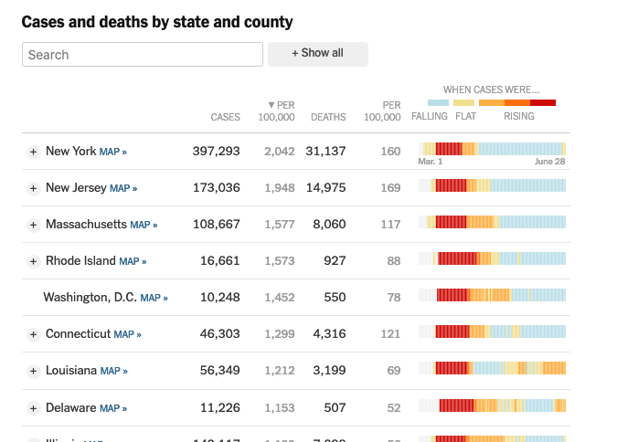
but if you're a person walking around NY today, what you actually want to know about is the current new case rate, as that tells you about the risk to you walking around the city. And NY doesn't have the highest risk any more, not by far, making that table a little misleading.
Similarly, the title "Hot Spots" over this map suggests this is telling us about current problems, but if one clicks on "per capita", then it's no longer about hot spots in any meaningful sense, since again the risk to a person in NY today isn't that high compared to other localities:
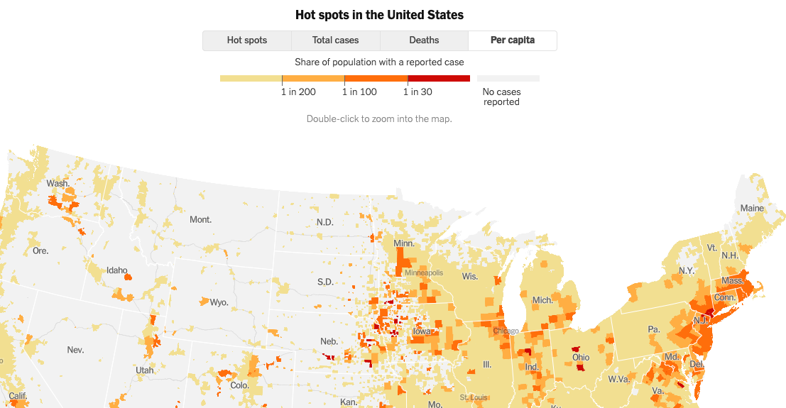
In general, I don't know that total cases really has anything to tell us, but even if you want to include it, I think reporting new cases per capita at equal or higher billing would be a service to readers.
 nickeubank
All 6 comments
Hi @nickeubank,
Using the awesome NYT data, we provide that here (click the bars to drill down to counties):
https://www.cvleaderboard.org/USA/coronavirus-cases-by-state/
Best,
--Geoff Millikan
 gmillikan
on 29 Jun 2020
gmillikan
on 29 Jun 2020
This dataset (and repo) is focused on our data .csvs, and what methodology drives the .csv contents. It does not include code or figures that drive NYT's own analysis and presentation of the data.
We'll forward on your comments.
 tiffehr
on 29 Jun 2020
tiffehr
on 29 Jun 2020
Thanks! There a better place I should direct these comment then?
nickeubank
on 29 Jun 2020
We read _many_ comments from readers on our Coronavirus stories and graphics. Our Community team enables our Comment system based on conversation/comment quality as well as active interest, at their own discretion. I suspect our Community team has not enabled comments on our Coronavirus maps because it would be challenging to moderate a quality discussion.
Also, we have more than 70 maps and it would be hard to track comment threads across so many localities.
tiffehr
on 30 Jun 2020
@nickeubank Thanks! Yes, you can sort by rank (instead of alphabetically) just click the "sort by rank" link at the top of the page. Also, the data in each of the charts is downloadable. Just click the square icon in the upper right hand corner and select "download as Excel."
https://www.cvleaderboard.org/USA/coronavirus-cases-by-state/
gmillikan
on 1 Jul 2020
saw that, so deleted my initial comment! :) Thanks!
nickeubank
on 1 Jul 2020
Related issues
 bcunning
·
5Comments
bcunning
·
5Comments
 Montana
·
3Comments
Montana
·
3Comments
 wescrockett
·
5Comments
wescrockett
·
5Comments
 curiouspeat
·
4Comments
curiouspeat
·
4Comments
 brambow
·
5Comments
brambow
·
5Comments