Conversations: /me should be displayed outside of speech bubbles
General information
The command "/me does something" represents an action which can be seen, but isn't said. Conversations renders it in a speech bubble as if the user would talk to his self "User does something" instead of using some other way to display it.
I suggest to use space between speech bubbles and maybe some italic text to display "/me" actions.
Steps to reproduce
- Write "bla bla"
- Write "/me does something"
I use this ascii art for the speech bubbles used in Conversations:
<( Hello )
Expected result
<( Bla bla [User] )
* User does something
Actual result
<( Bla bla [User] )
<( *User* does something [User] )
 allo-
allo-
All 13 comments
I don’t think it is worth breaking the bubble design for that.
 iNPUTmice
on 22 Apr 2018
iNPUTmice
on 22 Apr 2018
The whole point is, that a bubble suggests speech, while a traditional IRC like /me does not. It's kind of talking to yourself when you display it inside a bubble, while it should convey something which can be observed (but not heard).
It's your choice if you want to support it that way, but the point is that supporting /me does not make much sense with bubbles. Not supporting it at all is an obvious option for sticking with speech bubbles only, but converting actions to spoken words seems wrong.
allo-
on 22 Apr 2018
@iNPUTmice would you be open to merging a request if someone else implements it?
 badrihippo
on 18 Oct 2019
badrihippo
on 18 Oct 2019
@badrihippo Mockup?
 licaon-kter
on 18 Oct 2019
licaon-kter
on 18 Oct 2019
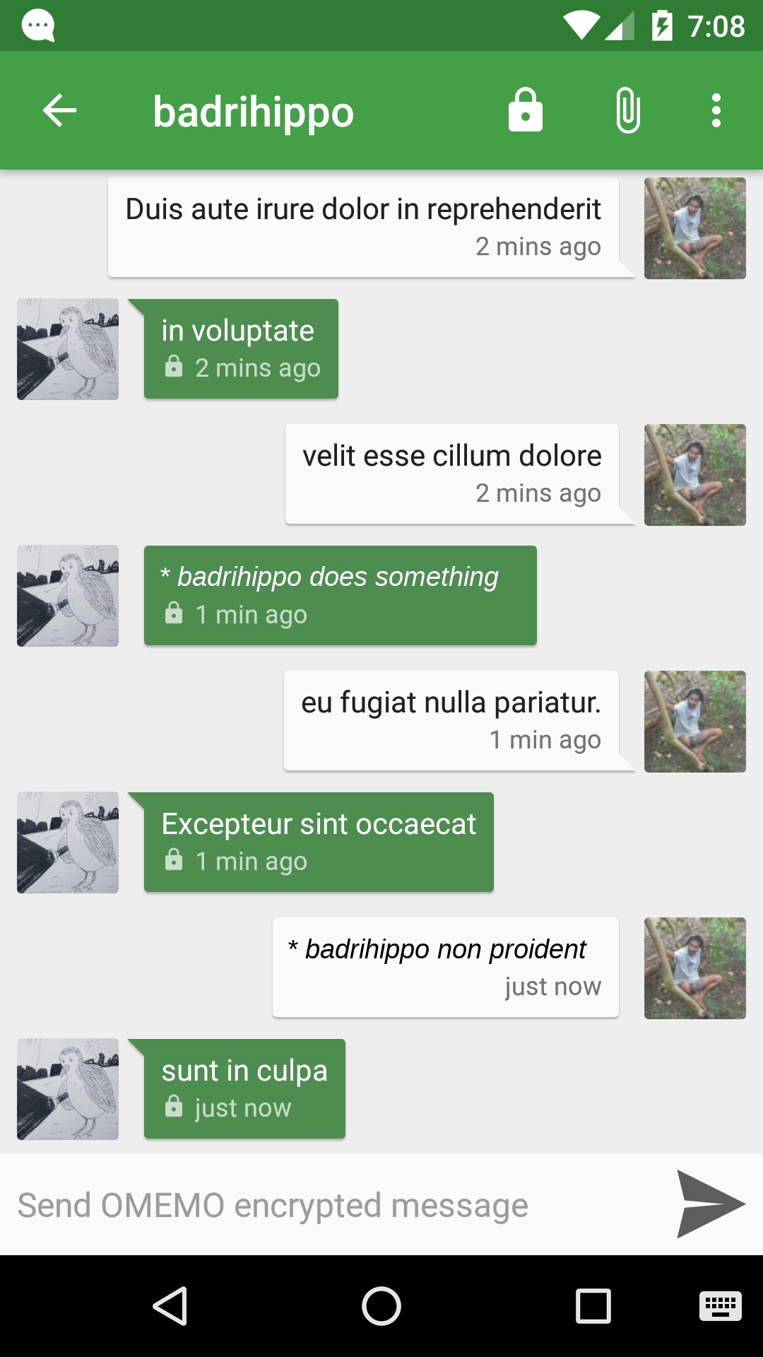
@licaon-kter one option is to remove the bubble border completely; that will immediately make the /me commands stand out.
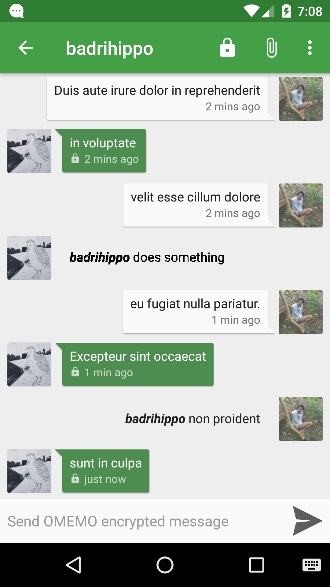
Of course, this would eliminate extra info like "sent at" time and whether it's encrypted or not. Given the use-case this may not be such a big issue, but if required perhaps we could modify the design further (for example by adding the "lock" icon to the beginning or end of the message.
Another less-invasive option is to simply remove the arrow next to the speech-bubble in /me commands.

To emphasise the difference, I'd suggest some other stylistic tweak, such as perhaps displaying the whole message in italic (either with or without the asterisk).
@licaon-kter @allo- what do you think? Do you have any further suggestions?
badrihippo
on 10 Dec 2019
displaying the whole message in italic (either with or without the asterisk).
Interesting yes
remove the arrow next to the speech-bubble
displaying the whole message in italic (either with or without the asterisk)
Not changed enough
licaon-kter
on 10 Dec 2019
If it was like the "date bubble"? Still the question of 🔒 remains. WhatsApp has "events" like this:

 subpub
on 10 Dec 2019
subpub
on 10 Dec 2019
If it was like the "date bubble"? Still the question of lock remains. WhatsApp has "events" like this:
@subpub something like this?
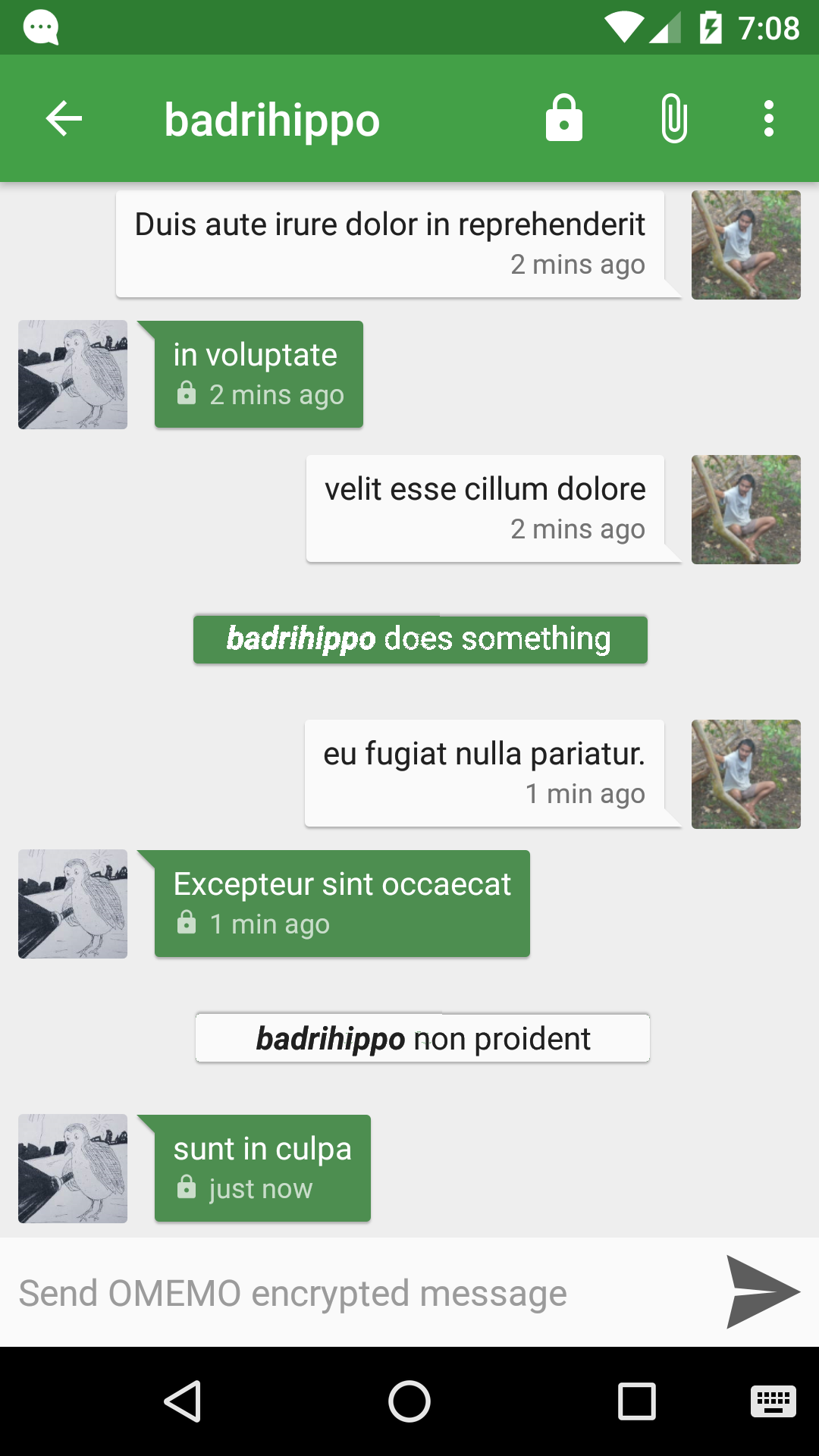
We could add the lock icon to the beginning of the notification, or to the bottom-right corner. Multiline comments will still be distinct because they'll show in the middle of the screen rather than the side.
But I'm wondering if there are any security issues? People may confuse these with system-generated events (imagine /me leaves the room when they're actually still there). It might also be a good idea to include the person's profile-picture, so they can be identified more easily (eg. if multiple people have the same "name" or one person decides to change their nickname in the middle). Or is it not necessary to worry about it in this case?
Another option I was thinking of was making them similar to the "[person] has read up to this point" markers. Of course, this will have the same issue of being potentially confused with system messages.
badrihippo
on 11 Dec 2019
something like this?
Yeah
We could add the lock icon to the beginning of the notification, or to the bottom-right corner.
+1
But I'm wondering if there are any security issues? People may confuse these with system-generated events
Conversations does not have any "system events" (atleast not till MIX)
It might also be a good idea to include the person's profile-picture, so they can be identified more easily
+100
Another option I was thinking of was making them similar to the "[person] has read up to this point" markers
I think it looks weird if some messages were inside bubbles and some were not. Also I remember the developer saying something about removing the bubbles completely in the future. So, I think the developer should make the final decision
subpub
on 11 Dec 2019
@subpub
Conversations does not have any "system events" (atleast not till MIX)
This should be fine then. ~But what's MIX?~ [EDIT: Never mind, I [found it](https://xmpp.org/extensions/xep-0369.html)]
I think it looks weird if some messages were inside bubbles and some were not. Also I remember the developer saying something about removing the bubbles completely in the future. So, I think the developer should make the final decision
Okay, in that case I guess "small centred bubbles, with the profile-picture included" would be good enough. But would you suggest putting the profile-pics inside or outside the bubble? Inside looks good for short messages but it'll look messy on multiline. On the other hand, outside looks messy in both unless we find a creative way of placing them. Maybe inside, but inline with the text (so wrapped text goes under the pic without leaving a margin? :thinking:
badrihippo
on 12 Dec 2019
Like this?

Pic from Fasthub
subpub
on 12 Dec 2019
Wow, looks like even Hangouts supports the /me command now :open_mouth:
Here's their implementation:
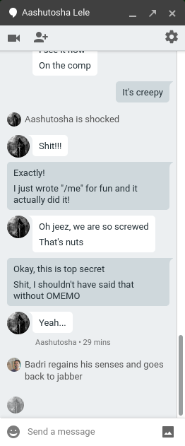
This seems to show a smaller bubble, and no border or background for the speech-bubbles, but text still leaves a space under the profile-picture while wrapping.
@subpub in our case, I think the screenshot you sent works better though. I'll send in another mockup when I get the time and we can comment on it.
badrihippo
on 13 Jan 2020
Is there any progress? Some of the mockups looked really good, but the issue is still closed.
allo-
on 21 Oct 2020
Related issues
 kromonos
·
3Comments
kromonos
·
3Comments
 mfvescovi
·
4Comments
mfvescovi
·
4Comments
 streaps
·
3Comments
streaps
·
3Comments
 pravi
·
4Comments
pravi
·
4Comments
 eyome
·
3Comments
eyome
·
3Comments
Most helpful comment
Wow, looks like even Hangouts supports the
/mecommand now :open_mouth:Here's their implementation:
This seems to show a smaller bubble, and no border or background for the speech-bubbles, but text still leaves a space under the profile-picture while wrapping.
@subpub in our case, I think the screenshot you sent works better though. I'll send in another mockup when I get the time and we can comment on it.