Contao: make notification bell counter more visible
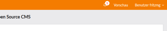
Imho the counter on the notification bell currently goes unnoticed pretty easily (red on orange). Just a small suggestion on how it could look differently:
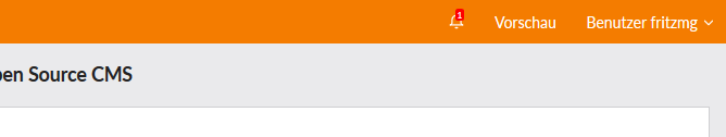
vs.
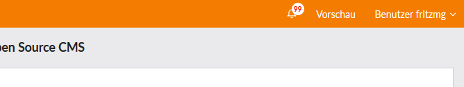
Example with bigger numbers:
CSS used:
{
  top: 4px;
  left: 20px;
  width: 18px;
  height: 18px;
  background-color: white;
  color: red;
  text-align: center;
  line-height: 18px;
  font-size: 10px;
  border-radius: 100%;
  padding: 0;
  font-weight: 700;
}
Any thoughts? :)
feature
 fritzmg
👍4
All 3 comments
Die Frage ist, wie auffällig soll es sein. Ich persönlich bin kein Freund davon, das Icon zu überdecken.
Vielleicht eher etwas in diese Richtung:
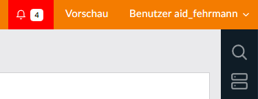
Das ist nicht ausgearbeitet. (sprich vll. ungenau) :-)
 OMOSde
on 17 Nov 2018
OMOSde
on 17 Nov 2018
👎2
👍1
As discussed in Mumble on November 22nd, a more visible circle in white or blue is a good idea, however it should be a little smaller than in the screenshots.
 leofeyer
on 22 Nov 2018
leofeyer
on 22 Nov 2018
See #289.
leofeyer
on 18 Jan 2019
Was this page helpful?
0 / 5 - 0 ratings
Related issues
leofeyer
·
3Comments
 Mynyx
·
3Comments
Mynyx
·
3Comments
 adojck
·
3Comments
adojck
·
3Comments
 xchs
·
3Comments
xchs
·
3Comments
 mathContao
·
3Comments
mathContao
·
3Comments