Contao: user icons: mouseover + better lock icon
In Contao 4.9 the backen user icons looks like
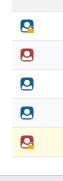
I am honest: I am not really lucky with them in some little points:
1) there is a little orange lock on the corner if 2FA is used

but in the list view the icon is so little, that it is difficult to see the lock: orange on red is very hard to see (also for me who is not red-green-"blind") and the edge of lock is mostly the same like the edge of the icon.
2) there is no mouseover text hint, that would describe the icon (red = administrator, blue = non-administrator, with lock = 2FA activated). It would help me to understand the icons and get a quick overview of my backend users.
What do you think about it?
 mathContao
All 3 comments
what would be your proposed solution?
 aschempp
on 7 Sep 2020
aschempp
on 7 Sep 2020
I won't mix up the user icon (user or admin) with the type of login (PW or PW+2FA).
For the type of login I would use a second icon:
The second icon could look like:
no 2FA required or no 2FA set up: no icon or 3 points in a row (like a password input)
2FA required, but not set up: open lock or just the borders of a lock or a grey lock
2FA set up: closed lock
mathContao
on 7 Sep 2020
I like the idea of having two icons. I'm not sure we need a separate one for _2FA enforced but not enabled_. We could simply use a grey or colored lock. @contao/developers wdyt?
aschempp
on 10 Sep 2020
Related issues
 zonky2
·
3Comments
zonky2
·
3Comments
 theDyingMountain
·
4Comments
theDyingMountain
·
4Comments
 kikmedia
·
4Comments
kikmedia
·
4Comments
 leofeyer
·
3Comments
leofeyer
·
3Comments
 rabauss
·
3Comments
rabauss
·
3Comments
Most helpful comment
I like the idea of having two icons. I'm not sure we need a separate one for _2FA enforced but not enabled_. We could simply use a grey or colored lock. @contao/developers wdyt?