Components: <mat-dialog-actions>: Button spacing does not match MD spec
Bug, feature request, or proposal:
Buttons that are inside mat-dialog-actions currently have no padding/margin to the left or right. There should be padding between buttons as described in the Material Design spec.
Buttons inside mat-card-actions do have a margin left and right of 4px, providing some sort of spacing.
What is the expected behavior?
See Material Design dialogs specs:
https://material.io/guidelines/components/dialogs.html#dialogs-specs
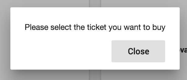
What is the current behavior?
See screenshot below taken from the Angular Material example site.
 )
)
What are the steps to reproduce?
Visit the Angular Material example site:
https://material.angular.io/components/component/dialog
What is the use-case or motivation for changing an existing behavior?
Match Material Design spec.
 jnamesky
All 10 comments
As an extension, would it not be possible to get some sort of button-group class?
Im finding that buttons pretty much anywhere have incorrect spacing.
A button group class that applies the correct padding horizontally and then vertically in smaller screen sizes would be very useful, and due to it being part of the spec, should be provided in the scope of this library.
 Kyderman
on 9 Mar 2017
Kyderman
on 9 Mar 2017
The button-group class is a good idea - and it would be great to have the ability to vertically stack these button groups on smaller screens (or whatever size you'd require).
jnamesky
on 9 Mar 2017
For now we're just using a modification of the md-card-actions button styling.
.mat-dialog-actions .mat-button:first-child, .mat-dialog-actions .mat-raised-button:first-child {
margin-left: 0;}
.mat-dialog-actions .mat-button:last-child, .mat-dialog-actions .mat-raised-button:last-child {
margin-right: 0;}
.mat-dialog-actions .mat-button, .mat-dialog-actions .mat-raised-button {
margin: 0 4px;}
This is what I do in my SCSS:
.mat-dialog-actions {
  // align buttons to right as shown in Material Design guide
  justify-content: flex-end;

.mat-button {
  &:not(:first-child) {
      margin-left: 1em;
    }
  }
}

.flex-spacer {
  flex: 1 1 auto;
}
If I want to push a button to the left side, I put a greedy span in-between the buttons.
<span class="flex-spacer"></span>
But if you want to support RTL layouts, that's a whole other issue.
 arlowhite
on 26 Apr 2017
arlowhite
on 26 Apr 2017
Hello,
I'd like to contribute to this by adding another problem with alignment: when I right align the actions in my dialog by using <md-dialog-actions align="end"> it still doesn't follow the guidelines in terms of spacing:
These 2 are from the guidelines:


And this is generated by this simple code:
<h2 md-dialog-title *ngIf="data.title">{{data.title}}</h2>
<md-dialog-content>{{data.message}}</md-dialog-content>
<md-dialog-actions align="end">
<button md-button md-dialog-close>Close</button>
</md-dialog-actions>
This is the result:

You can see that there is an extra space there, is it a bug or am I supposed to use something else instead of md-buttons?
 demetrio812
on 7 Jul 2017
demetrio812
on 7 Jul 2017
@demetrio812 yep, I'm seeing that as well. It's due to this CSS:
.mat-dialog-container {
padding: 24px;
}
It seems to make it impossible to align the action buttons with the spacing defined in the Material Design spec.
 Splaktar
on 19 Jul 2017
Splaktar
on 19 Jul 2017
@demetrio812 I was able to work around this using the panelClass API of md-dialog, setting my dialog's ViewEncapsulation.NONE, and applying the following styles to my class:
this.dialog.open(CustomDialogComponent, {panelClass: 'customDialog'})
.customDialog {
.mat-dialog-container {
padding: 24px 0 0;
[mat-dialog-title],
.mat-dialog-content {
padding: 0 24px;
}
custom-dialog {
display: flex;
flex-direction: column;
}
.mat-dialog-actions {
padding: 8px;
.mat-button {
padding: 0 8px;
min-width: 64px;
&:nth-child(even) {
margin-left: 8px;
}
}
}
}
}
These seemed to have the best match with the Material Design spec.
Splaktar
on 19 Jul 2017
I had to put together some new styles for the latest stable builds:
.customDialog {
.mat-dialog-container {
padding: 24px 0 24px 0;
[mat-dialog-title] {
margin: 0 24px 24px;
}
.mat-dialog-content {
margin: 0;
}
app-custom-dialog {
display: flex;
flex-direction: column;
}
.mat-dialog-actions {
padding: 8px;
.mat-button {
padding: 0 8px;
min-width: 64px;
&:nth-child(even) {
margin-left: 8px;
}
}
}
}
I also think <span style="flex: 1 1 auto;"></span> or <span class="flex-spacer"></span> shouldn't be necessary, it would be good to have a standard like like the old angular had. I understand angular/flex-layout takes care of layout now, but this is such a common use case I think it should be built in. Besides there's no clear way of how to achieve this with angular/flex-layout anyway.
 jpike88
on 15 May 2019
jpike88
on 15 May 2019
This is what I do in my SCSS:
.mat-dialog-actions {
  // align buttons to right as shown in Material Design guide
  justify-content: flex-end;

.mat-button {
  &:not(:first-child) {
      margin-left: 1em;
    }
  }
}

.flex-spacer {
  flex: 1 1 auto;
}
If I want to push a button to the left side, I put a greedy span in-between the buttons.
<span class="flex-spacer"></span>But if you want to support RTL layouts, that's a whole other issue.
Thanks for the code. It fixed my issue.
 jerrychong25
on 3 Sep 2020
jerrychong25
on 3 Sep 2020
Related issues
 Hiblton
·
3Comments
Hiblton
·
3Comments
 shlomiassaf
·
3Comments
shlomiassaf
·
3Comments
 constantinlucian
·
3Comments
constantinlucian
·
3Comments
 michaelb-01
·
3Comments
michaelb-01
·
3Comments
 kara
·
3Comments
kara
·
3Comments
Most helpful comment
This is what I do in my SCSS:
If I want to push a button to the left side, I put a greedy span in-between the buttons.
But if you want to support RTL layouts, that's a whole other issue.