Hi, I am a graphic designer, I want to help others in graphic design.
After I reviewed your project, you have no logo on this project. Therefore I want to contribute to this project by creating a new logo / icon. what do you think?
 mansya
All 7 comments
That's very nice to hear and we would love that for sure! :heart:
I guess, to not break any existing CSS rules or at least not too many, it should have a similar size as the currently used icon or the icon + "CodiMD".
If you do a icon + "CodiMD" in one logo, we need a icon only, anyway to provide it as favicon and apple-icon as we already do here:
https://github.com/hackmdio/codimd/blob/master/public/apple-touch-icon.png
If you simply replace this image as well as this one, most places should be already done:
https://github.com/hackmdio/codimd/blob/master/public/codimd-icon-1024.png
(Maybe even with awesome vector graphics, but that's up to you, I'm just dreaming)
 SISheogorath
on 29 Jun 2018
SISheogorath
on 29 Jun 2018
Thank you for your offer! If you wish to talk about attributes or values that might be interesting to convey, we're in a chatroom on riot and gitter.
 ccoenen
on 30 Jun 2018
ccoenen
on 30 Jun 2018
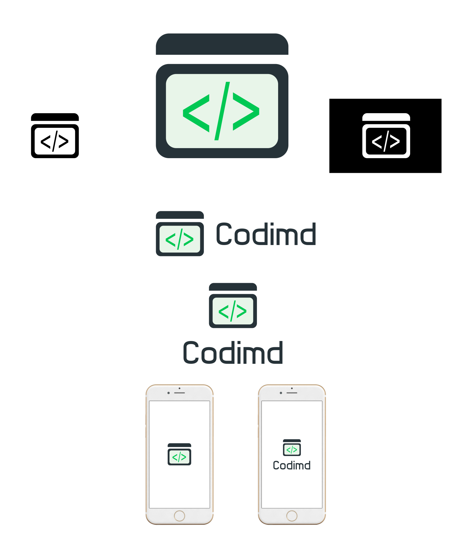
I have design a new logo for this project. What do you think ? do you like it ?
mansya
on 3 Jul 2018
Why are the < and > misaligned? It gives the whole thing a kind of nervous energy...
Furthermore, wouldn't it make more sense to use symbols actually used in Markdown? </> screams XML to me.
Lastly, I was under the impression, the MD part was supposed to be capitalized.
 kindfulkirby
on 3 Jul 2018
kindfulkirby
on 3 Jul 2018
I'm sure these were a lot of work and they are technically sound logos. I would really love to get in touch with you in a more interactive form, though.
Regarding the draft:
- It is unclear what the logo is trying to convey. As @ttheuer pointed out, you're citing symbols from XML or HTML, which MarkDown is actually trying to replace for regular use cases.
- I find there's a lot of emphasis on the top bar element. Again, it is not clear what this represents or what it is for.
- To me, a very important part of CodiMD - the USP if you will - is live collaboration on text. The old logo gets half of that right (the text/document part). Right now neither collaboration nor text is represented in any way. I'm not married to those ideas, and they don't need to be added in as cartoonish as they were in the old logo, but a logo should stand for something.
- I am OK with the choice of font, but the "i" might need a little tweaking (it is extermely narrow compared to all the other letters).
- The name should be capitalised CodiMD as pointed out by @ttheuer
I've noticed that you do a lot of logos and icons in open source projects and I commend you for that. This is a much needed thing that is often overlooked. If I may give one piece of advice, then it would be to start with rough sketches and a lot of variety instead of jumping into one specific idea right away.
ccoenen
on 3 Jul 2018
What dou you think ? do you like it ? which one do you like ?
mansya
on 4 Jul 2018
Hi @mansya feel free to join us in riot or on any first sunday a month for our community call (Subscribe to issue #911 to get notified in advance!)
I'm closing this ticket for now, as it hasn't been updated for about two months. Before going in any other direction, we should probably really talk about which direction a logo should take.
I'd also be delighted to revive/reopen this ticket.
ccoenen
on 3 Sep 2018
Related issues
 yaxu
·
4Comments
SISheogorath
·
4Comments
yaxu
·
4Comments
SISheogorath
·
4Comments
 almereyda
·
4Comments
almereyda
·
4Comments
 mxmilkiib
·
3Comments
ccoenen
·
4Comments
mxmilkiib
·
3Comments
ccoenen
·
4Comments
Most helpful comment
Why are the < and > misaligned? It gives the whole thing a kind of nervous energy...
Furthermore, wouldn't it make more sense to use symbols actually used in Markdown?
</>screams XML to me.Lastly, I was under the impression, the
MDpart was supposed to be capitalized.