Cockpit: networking: tricky to navigate to Firewall page
Cockpit version: 220
OS: RHEL
Page: Networking
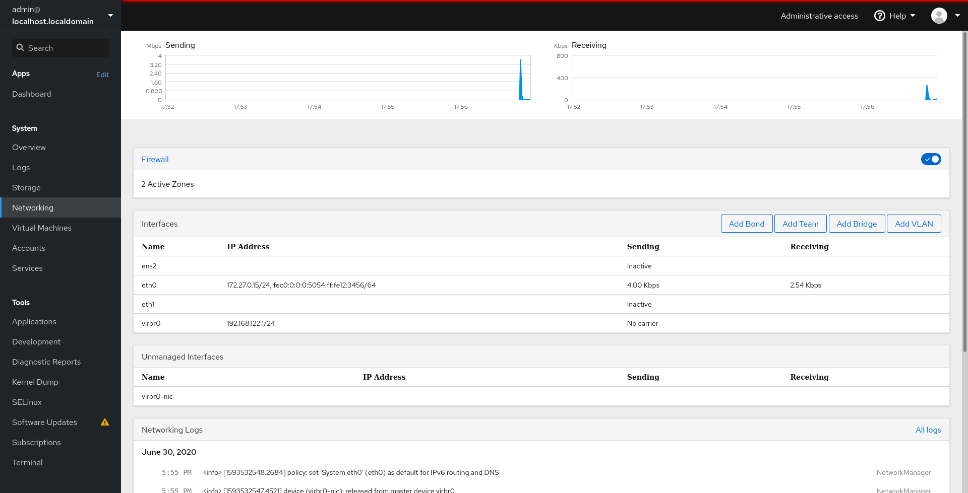
I a usability study we ran in June with 5 participants, one participant had great difficulty finding the firewall page, and another spent quite some time hunting for it before finding it.
This could be because the panel in the Firewall section doesn't look clickable enough.
 andreasn
All 13 comments
Note that all participants first instinct was to find firewall ports in the Networking page, it was only once they ended up there that they had trouble getting to the subpage.
andreasn
on 2 Jul 2020
Yeah, they often just looked at those 'Add Bond,Add Team... buttons.
I feel like we should have similar button on the firewall panel saying something likeManage firewall`.
 marusak
on 2 Jul 2020
marusak
on 2 Jul 2020
I'm working on a redesign of the page which incorporates a fix for the discoverability of the firewall section. I discussed it with @andreasn in our meeting today and I'll try to get it closer to an implementable state next week (as it's the weekend for me now).
Here's a preview:
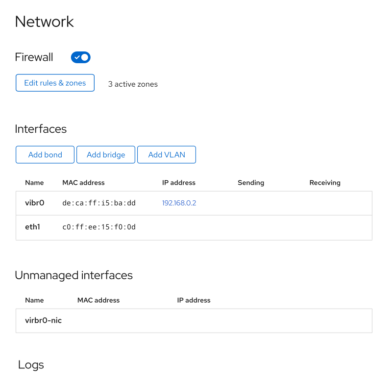
(Perhaps this is even enough to start?)
Despite the graphs being absent on the mockup, we're still going to have them on the page. I just haven't incorporated them yet.
 garrett
on 2 Jul 2020
garrett
on 2 Jul 2020
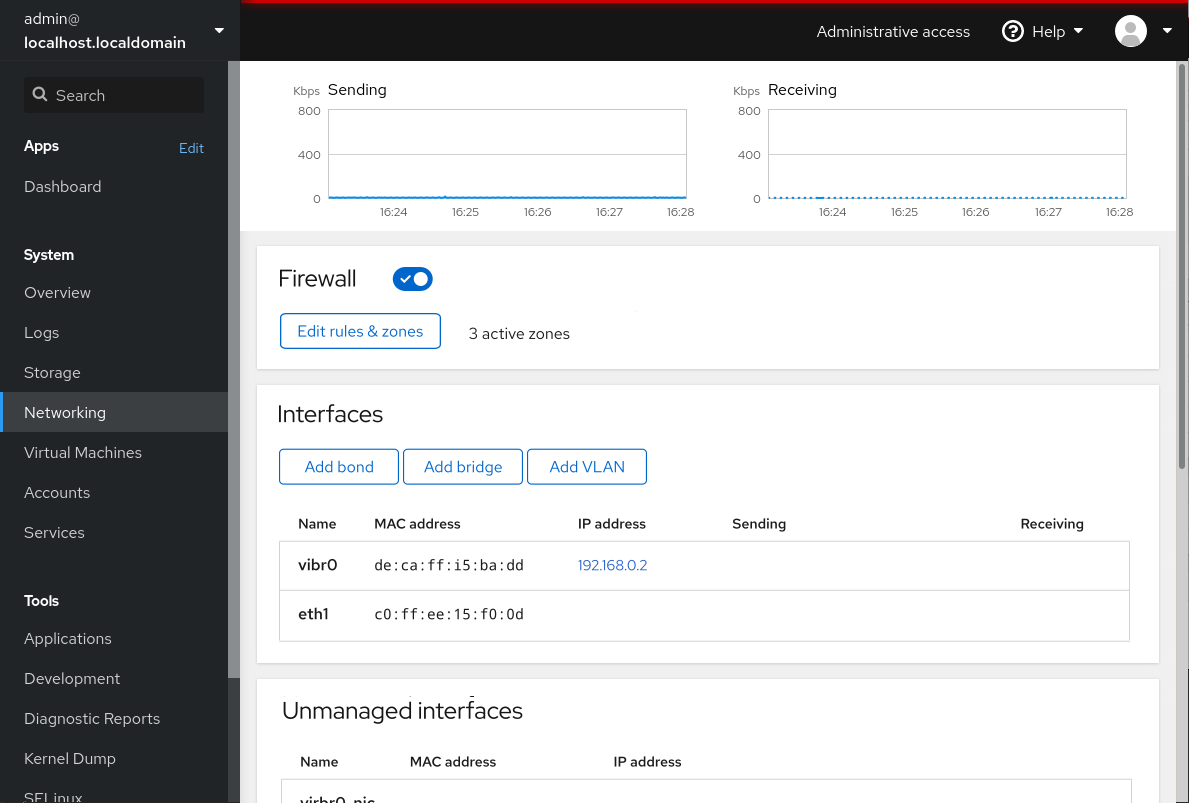
How should we lay it out on the page?
Version one - no cards:
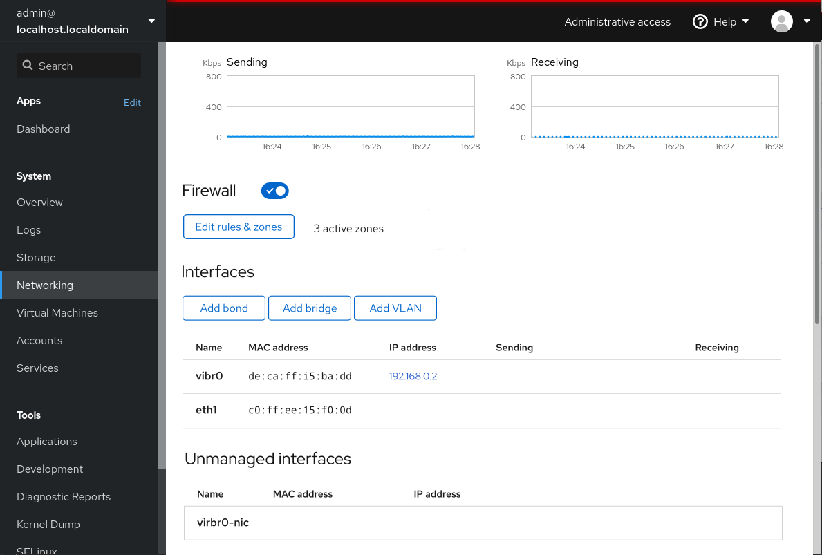
Version two - two different cards, one for graphs, one for the rest
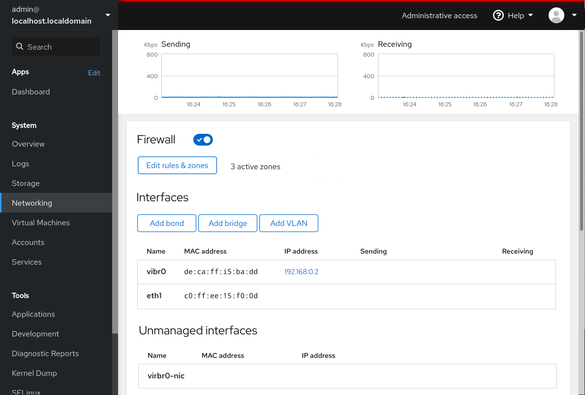
Version three - split it all up into cards
I'm good with either approach, so let me know what one you like best.
andreasn
on 15 Jul 2020
Oh, I hadn't considered using cards here. They're generally used for splitting things up horizontally as well, but they do reinforce which widgets belong to which section, as seen in version 3. Option 2 is odd — having a everything in one card doesn't make much sense, IMO.
(I still think the sending / receiving graphs are way too large. They should be de-emphasized... in another PR.)
TL;DR: Let's go with 3?
garrett
on 16 Jul 2020
Sounds good!
andreasn
on 16 Jul 2020
Agree, option 3 seems like the best one to me as well.
marusak
on 16 Jul 2020
Thanks for the design! I put that into our quarterly plan as COCKPIT-677, this appears relatively easy to to implement.
 martinpitt
on 17 Jul 2020
martinpitt
on 17 Jul 2020
The firewall issue is fixed in #14509. @garrett's design had a MAC address entry, but I think that's outside the scope of this issue. So closing.
andreasn
on 31 Aug 2020
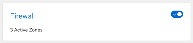
Wait. Was the issue fixed? I don't see a button to edit the firewall on the redesigned page. (Which was the entire point.)
garrett
on 1 Sep 2020
The button is there.

 KKoukiou
on 1 Sep 2020
KKoukiou
on 1 Sep 2020
Oh, whoops. Wrong branch. :facepalm: Sorry.
garrett
on 1 Sep 2020
I had some sort of weird hybrid:
garrett
on 1 Sep 2020
Related issues
 jacksnodgrass
·
6Comments
jacksnodgrass
·
6Comments
 mehdiMj-ir
·
5Comments
mehdiMj-ir
·
5Comments
 kai4785
·
4Comments
kai4785
·
4Comments
 MauriceNorden
·
3Comments
MauriceNorden
·
3Comments
 gorgitko
·
6Comments
gorgitko
·
6Comments
Most helpful comment
Agree, option 3 seems like the best one to me as well.