Client: Multisig UI: Signature input fields hidden after 3
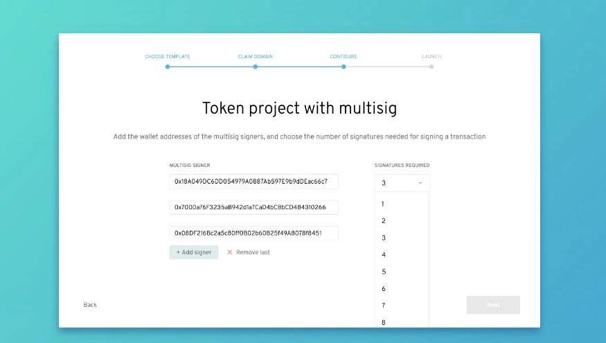
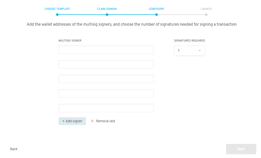
During the multisig org creation process, if you add more signatures after three, the rest of the input fields are "silently" hidden. This also makes the number of signatures available to select from larger than the visible number of signers.
Running in Chrome Version 67.0.3396.99
 john-light
All 30 comments
OS: Mac Sierra 10.12.6
 mariapaulafn
on 10 Jul 2018
mariapaulafn
on 10 Jul 2018
Same on Brave v. 0.23.31
mariapaulafn
on 10 Jul 2018
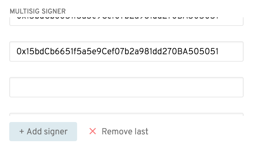
This is due to how the scrollbar in the input area is hidden. There are actually more input fields, the UI just doesn't show them in an obvious manner.
 sohkai
on 11 Jul 2018
sohkai
on 11 Jul 2018
You're right @sohkai the scroll bar does not show up, tested just now and found the scroll, you gotta scroll down intuitively for the bar to show up.
mariapaulafn
on 11 Jul 2018
I can think of 2 ways to solve this off the top of my head.
- Force the scroll bar to be always visible when there are more than 3 input fields.
- Change the scrolltop of the container when
+ Add signeris clicked so the newest input field is displayed (should be enough of a visual queue to show users that they are scrollable.
While looking at this issue I also noticed that since there are no z-indexes set, the bottom nav bar sits on top of the dropdown for signatures required. Any option higher than 6 become no longer selectable.
Probably a good idea to also add a max height to the dropdown and enforce scrolling when the list is too long?
EDIT:
I tested by adding some styling to ::-webkit-scrollbar and ::-webkit-scrollbar-thumb to override the default scrollbar behaviour on chrome and it looks pretty promising
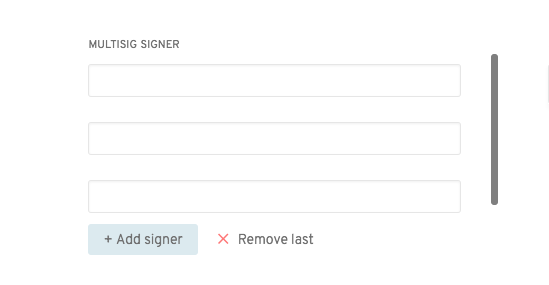
The scrollbar shows when the number of input boxes >= 3
 Huanzhang89
on 16 Aug 2018
Huanzhang89
on 16 Aug 2018
I like option 1, and yes, we should set a max height for that dropdown 😅. It might be nice to add something in https://github.com/aragon/aragon-ui/blob/master/src/components/DropDown/DropDown.js for this :).
sohkai
on 17 Aug 2018
Yeah agreed. Will make a separate PR for aragon-ui
Huanzhang89
on 17 Aug 2018
With styled components, the pseudo selectors for the scrollbar need to be added to the InputView component inside ConfigureMultisigAddresses.js as the only way I've found so far for pseudo selectors to work in styled components is with the following syntax (adding &)
const InputsView = styled.div`
  ...
  &::-webkit-scrollbar {
    -webkit-appearance: none;
    width: 7px;
    position: absolute;
  }
`
I think styling for things like the scrollbar should be consistent across the whole app and therefore should be applied to the App component (probably even better to make this change in aragon-ui instead of here).
So, @sohkai @bpierre how do you guys feel about importing an App.css in AragonApp.js over in the aragon-ui repo for special cases like this?
Other option is to just add the above code to components where we want to force the scrollbar to display, but that would result in some code duplication.
Let me know what you guys think and I'll make the relevant PR
Huanzhang89
on 17 Aug 2018
My feeling is that we should avoid a CSS file unless absolutely necessary.
We can create a generic show-scrollbar style and then use that elsewhere to avoid duplication. See unselectable as an example (and usages). This should work even with the child (&) selector being there...
sohkai
on 17 Aug 2018
Some thoughts:
About the scrollbar solution
I think we should avoid forcing a scrollbar always visible if it’s not what the user agent does by default, like on iOS or macOS without a mouse.
This problem appeared late and I made the content scrollable to “make it work”, but we should probably iterate on the design rather than “fixing the fix” 😄 ping @jounih
About the DropDown
A DropDown doesn’t seem right here. @jounih Maybe we could use a NumberInput instead ([-][2][+])?
About making the DropDown scrollable: I think it could be a feature for the most extreme cases, but what I was having in mind for the problem of having an input taller than the viewport was:
- Add a
PopOvercomponent in Aragon UI. This would be a box that appear on top of everything, and that moves itself to stay inside the viewport (like the menus behave on most operating systems). It would also make sure the focus is following properly when opened / closed (for screen readers). - Use this component in
DropDown,ContextMenu, and probably other components in the future (e.g.ComboButton).
@Huanzhang89 @sohkai @jounih what do you think?
 bpierre
on 17 Aug 2018
bpierre
on 17 Aug 2018
Agreed @bpierre I feel the solution I proposed is more like a "hacky fix". Didn't really try to think too deep about it since it was a good first issue, woops.
I like the PopOver component idea, although we need to be careful with the transitions of when it opens/closes so it doesn't feel jerky to the user. (Maybe animate outwards from the centre when clicked on?)
Huanzhang89
on 17 Aug 2018
Will ask @jounih to take a look at a design refresh, but we might need a hacky solution to carry us over for the meantime for the mainnet release since this has been a major source of confusion.
I do like the NumberInput though, feels much more natural than the dropdown.
sohkai
on 20 Aug 2018
So for the moment how about making the hacky fix directly in aragon-app, with a comment to remind us that it should be removed when the new design is ready?
https://github.com/aragon/aragon/pull/327
Will make a separate PR for changing the DropDown to a NumberInput.
Huanzhang89
on 21 Aug 2018
discussed this with @bpierre - the option for changing the number is best the way he suggests, ie.
-[ ]+ rather than a dropdown.
For the scrolling issue, there is a simple solution:
The white container at the moment is fixed height. We should make it dynamic height, if the content is beyond a certain height. So the container grows with content, and you'll scroll the whole page rather than just inside the container
Does that make sense?
 jounih
on 21 Aug 2018
jounih
on 21 Aug 2018
By the container do you mean the ConfigureMultisigAddressesContent component or ConfigureMultisigAddresses component?
Do you mean something like this? Where if there are too many input boxes, the add and remove buttons go out of view, thus prompting the user to scroll down the page?
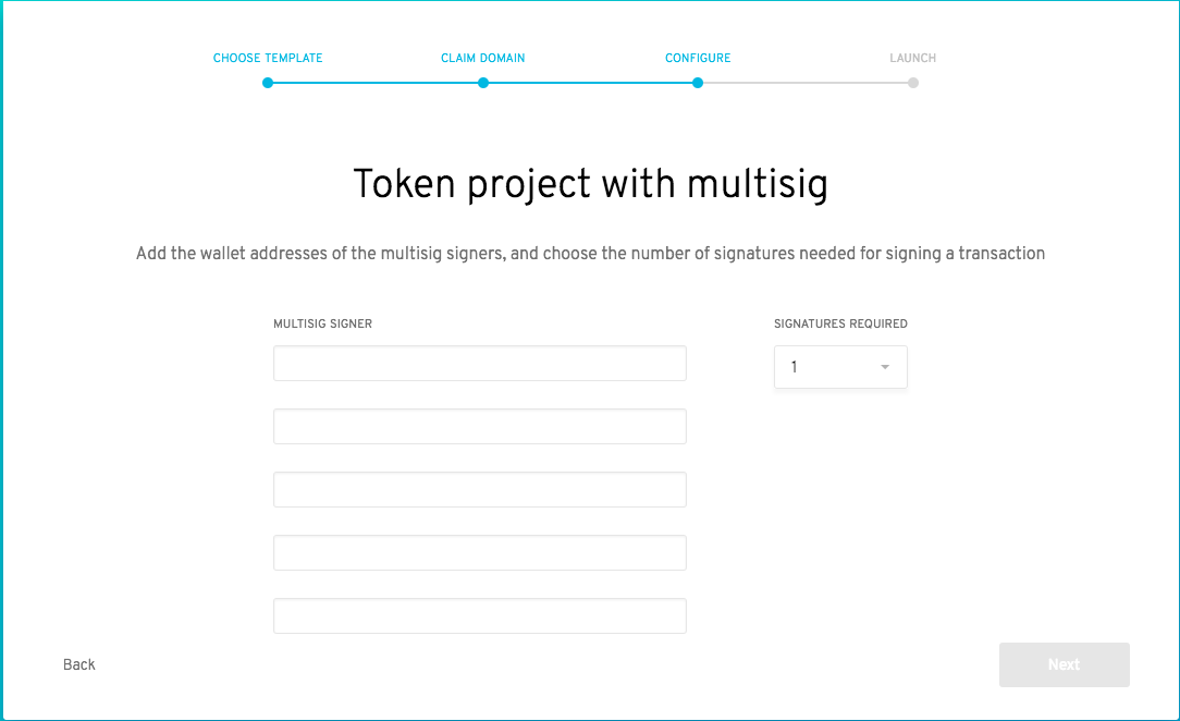
We also need to keep in mind that there is a footer at the bottom of the the app which means any content that overlap with the footer is no longer clickable.
Or do you mean something like this:
Where the Header and Footer are always visible and fixed to their positions on the page and everything else is scrollable in between. Note this will also require changes to the progress bar component since it currently has no background color and has top:40px instead of padding-top: 40px
Huanzhang89
on 21 Aug 2018
Allowing the page to be arbitrarily large seems like a weird UX when all the other screens are fixed.
Another idea could be to have arrow controls to scroll the list of holders that only appear after 3?
sohkai
on 21 Aug 2018
@sohkai I think having one page increase in height as you keep adding fields (only visible in edge cases where you add 3+ multisigs) is a better trade off than non-native scrolling
@Huanzhang89 it's a little difficult to say without seeing the whole page - could you take a quick video or screenshot of the whole page including the blue bg?
jounih
on 21 Aug 2018
I think this may get fixed with the popover/dropdown component positioning without other design fixes
jounih
on 10 Oct 2018
Won't be addressed by PopOver component. Gradient approach suggest by @luisivan will be implemented by @jounih
 chris-remus
on 10 Oct 2018
chris-remus
on 10 Oct 2018

jounih
on 10 Oct 2018
@jounih Just to confirm: would the scrollbar still be beside the input fields, or the entire container? Right now it looks like it's the entire container, and you'd have to scroll to get to the add / remove buttons.
sohkai
on 11 Oct 2018
Hi! i am trying to do this one and i have some questions @sohkai @jounih when we scroll what is going to happen with the Title "Token project with multisig " and the description ? should it stay fixed? or also scroll behind the stepsbar?
 rperez89
on 4 Nov 2018
rperez89
on 4 Nov 2018
@rperez89 Can't speak for @sohkai or @jounih but imo only the input fields should scroll. So even the text multisig signer should stay in its place.
Huanzhang89
on 5 Nov 2018
I've updated the design with the position of the scrollbar - let's keep the title and description below it static, and scroll the fields only
jounih
on 5 Nov 2018
@jounih @sohkai hi! do you know a better way to get the gradient effect without having to set as an absolut position?
const FieldGroups = styled.div
display: flex;
height: 200px;
overflow-y: auto;
justify-content: center;
div:first-child {
margin-right: 50px;
}
&:after {
content: ' ';
position: absolute;
left: 280px;
height:25px;
top:470px;
background:linear-gradient(to bottom, rgba(255, 0, 0, 0),white);
z-index:1;
}
rperez89
on 6 Nov 2018
@rperez89 Probably needs to be absolute but I would anchor it to the bottom: of the div rather than set left/top explicitly. @bpierre ideas?
jounih
on 6 Nov 2018
@rperez89 @jounih Yes I would set it to absolute, one at the top + one at the bottom, with pointer-events: none so we can click through them.
Not sure it would work, but maybe we could also try with an inset box-shadow?
bpierre
on 6 Nov 2018
@rperez89 actually, let's hold fire on this for a bit - we are thinking of limiting multi-sigs to 3 max, in which case scrolling might not be needed. Thanks!
jounih
on 6 Nov 2018
ohhh ok! i will find another issue 👍 . Thanks!
rperez89
on 6 Nov 2018
Closing for #454.
sohkai
on 14 Dec 2018
Related issues
 luisivan
·
4Comments
luisivan
·
4Comments
 izqui
·
3Comments
john-light
·
3Comments
sohkai
·
4Comments
john-light
·
3Comments
izqui
·
3Comments
john-light
·
3Comments
sohkai
·
4Comments
john-light
·
3Comments
Most helpful comment
ohhh ok! i will find another issue 👍 . Thanks!