With the introduction of JSP code examples that will live alongside the React code examples under the React Component tab it doesn't make sense to keep the name of the parent tab React Component.
 kresimir-coko
All 23 comments
I don't see a real problem with putting the same JSP examples on the same page. I'm just concerned that depending on some documents we may have more component-oriented descriptions in React than the JSP, and I don't know if that will help or confuse. In v2 we had the same for SOY, WebComponents, and HTML, and for some people, they missed a lot more information about the components because the document was more the basis of HTML just with the examples in SOY.
I know that most JSP APIs must be consistent, but I think there are some different exceptions or use cases. I think if we can keep this under control it should be a good thing to go ahead with it.
 matuzalemsteles
on 3 Jul 2020
matuzalemsteles
on 3 Jul 2020
The other option is to have different tabs as it was in the original proposal... I'd lean towards that option for the reasons @matuzalemsteles mentions and to make them more discoverable... but I missed that conversation, so...
 jbalsas
on 3 Jul 2020
jbalsas
on 3 Jul 2020
How much documentation relating to JSP do we have? Is it enough to warrant an entire parent tab? From the beginning of the conversation this type of example was being referenced. Nowhere in the discussion, as far as I understood, has it been mentioned to add a big tab, e.g React Component | JSP | Markup & CSS
kresimir-coko
on 6 Jul 2020
How much documentation relating to JSP do we have?
It's not about how much we have, but about how much we SHOULD have ;)
jbalsas
on 6 Jul 2020
how much we SHOULD have
I agree, what kind of information should there be, like an API Table like React? Some tips and tricks on how to use the JSP component? Perhaps the infrastructure needs to be setup before we do that, for example, what is the API Table gonna reference, like the React ones reference the IProps of their matching component.
kresimir-coko
on 6 Jul 2020
Yeah, the API could be interesting... that info is in the .tld, so we'd need to manually duplicate it, though 🤔
jbalsas
on 6 Jul 2020
React Component tab should be renamed to Component
I don't think renaming the tab alone is enough. We have a structural problem where the code sample is embedded in a page that is crammed full of React-specific syntax (and in some cases, React-specific props).
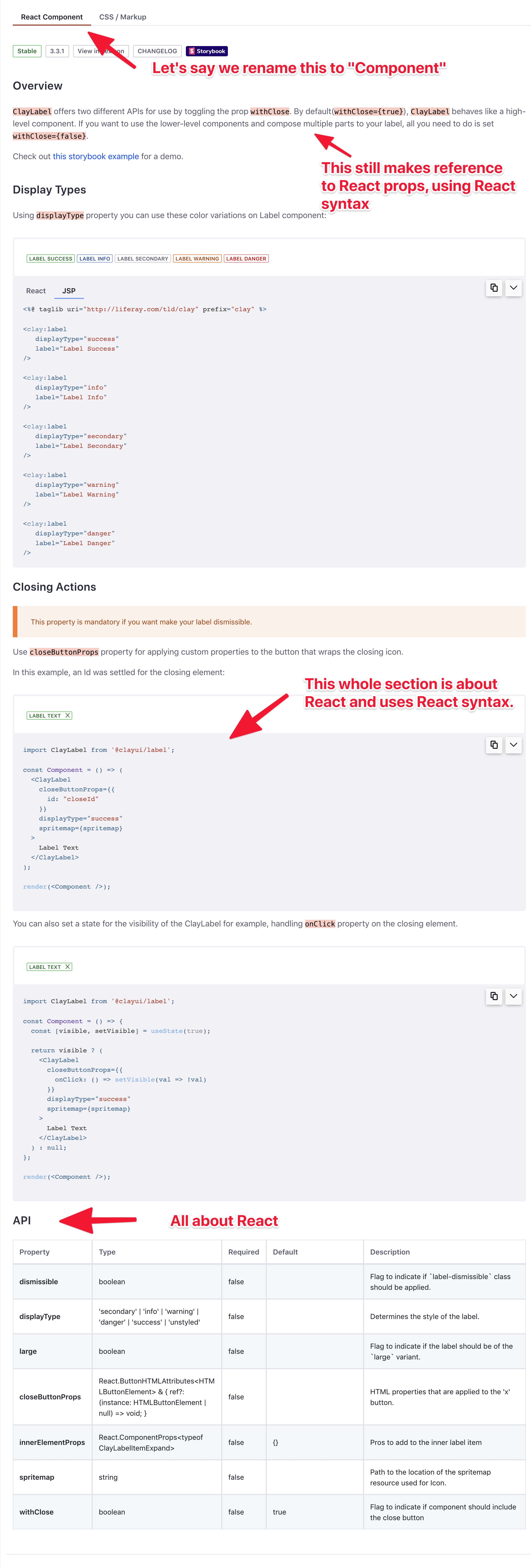
Having the JSP snippet buried in the middle doesn't seem very discoverable or coherent.
 wincent
on 6 Jul 2020
wincent
on 6 Jul 2020
Nowhere in the discussion, as far as I understood, has it been mentioned to add a big tab, e.g
React Component | JSP | Markup & CSS
I believe it was mentioned here?
I was expecting to see JSP code at the same level as
React ComponentandCSS / Markup.
wincent
on 6 Jul 2020
I believe it was mentioned here?
Yes it is. I meant prior to these issues I'm opening now, back when we were making the tabular functionality for the Editor.
I'm not married to any idea, just kinda annoying that now that I started working on it, we're circling back to something that was supposed to be decided few months ago here and here
kresimir-coko
on 6 Jul 2020
I'm not married to any idea, just kinda annoying that now that I started working on it, we're circling back to something that was supposed to be decided few months ago here and here
That's life and work @kresimir-coko, no point in being annoyed 😘
jbalsas
on 6 Jul 2020
no point in being annoyed
You're right! I do agree with all points here, renaming the tab wouldn't do much for discoverability of the JSP documentation. Perhaps this current iteration is fine for now, and we can make a new version after we define what content exactly goes into the JSP docs and make a dynamic API fetch, etc.
kresimir-coko
on 6 Jul 2020
Perhaps this current iteration is fine for now
Sure. As they say:
- Perfect is the enemy of good
- Done is better than perfect
- etc
Getting this "right", or better, is something to have on the radar, but we don't have to stop the world and rework everything this instant.
I only comment on this kind of thing because I very much enjoy it when...
wincent
on 6 Jul 2020
What if we went with no parent tabs and only had tabs for the code examples(react/taglib/css)?
My concerns for multiple parent tabs is that the descriptive content gets stale quickly and if we tend to focus in on what vein(tag/react/css) of clay we are working on. If combine the tabs and have just different examples, it might make the descriptive content more cohesive and Clay more unified as a whole. For example, the button page would have descriptions of its various types and uses, and then the examples would have tabs for each means of implementation.
 bryceosterhaus
on 6 Jul 2020
bryceosterhaus
on 6 Jul 2020
What if we went with no parent tabs and only had tabs for the code examples(react/taglib/css)?
Sounds good to me... maybe rather than technology, we could have tabs by "scope":
- Basic Examples
- Advanced Examples
- API
And inside, we could have different tabs per-technology where they make sense...
Would that make for a better information architecture?
/cc @mwilliams2014, @drakonux, @dsanz
jbalsas
on 7 Jul 2020
@bryceosterhaus with the out-of-the-box thinking. I like it, the current layout doesn't have the best support for what we want in the future.

kresimir-coko
on 7 Jul 2020
First, my apologies for jumping in once work has started. I understand that any suggestions at this point may be taken as a negative comment about existing work, so plase take these as just ideas from someone approaching this.
I lean towards something along the lines proposed by @jbalsas to organize the information. Below I provide some reasoning.
First page, or "tab" about the component should describe its purpose, along with some basic usage samples, which should be self-explanatory by definition, so that "doing The Right Thing™ isn't a great feat of skill" but the inevitable result (sorry @wincent , I could not find a better way to convey the concept). It'd be nice (but not mandatory for all cases) that these basic samples include at least one in each technology. This tab shall receive a generic name such as Overview.
Then, we can illustrate advanced examples or nuances not covered yet. Taking the badge as example, the sections about "Anchors", "links inside" or "truncating text" describe things one would like to know/need to use, _regardless_ the technology. When I read these, I wonder why should they appear only in the "CSS/Markup" tab? Isn't it possible to truncate text or create a badge with a link using React? How to make "pilled badges" using JSPs? If we split by technology, then by example/feature, component features become siloed, as it the feature would only be reachable in the specific technology.
I may be wrong, but for me, these sections illustrate reader how to exercise non-immediately-obvious cases that would prove, or demonstrate, how far we can go using this component.
Furthermore, these are feature-oriented descriptions, where technology is the _mechanism_ to exercise these features via code samples. Wouldn't it be nice to see how to create vertical variation of button groups inside a JSP, or even better, combined with React? This tab should receive a more specific name such as Usage and this is where component features should bright.
And the third one would be the API. Here, I have some doubts as it looks like the API may not be equally accessible using either technology. Therefore, I'm not sure if the API itself should be given by technology, or just a single page where any technology-specific aspect can be noted by badges or even in a dedicated column of the table. For instance, in the badge component, the "displayType" API property would be equivalent to the css classes illustrated in the variations section under CSS/Markup tab. I believe these are 2 ways to exercise the concept of badge display type, so they shall be described as the component API and illustrate how to exercise them in both cases.
Please take the above as some reflections from a newcomer!
Best
 dsanz
on 7 Jul 2020
dsanz
on 7 Jul 2020
Very intricate answer @dsanz I love it. Work hasn't really started on this issue so it's fine, you're not gonna ruin anyone's day 😄
I like all the points you presented, the Clay docs are due for a revamp IMO, especially the points about Usage descriptions which are nested under a specific component in one of the tabs under a heading that might not match the Usage.
I'd love a visual representation of how it should look, like a flowchart or something like that, to guide us better.
kresimir-coko
on 7 Jul 2020
What if we went with no parent tabs and only had tabs for the code examples(react/taglib/css)?
My concerns for multiple parent tabs is that the descriptive content gets stale quickly and if we tend to focus in on what vein(tag/react/css) of clay we are working on. If combine the tabs and have just different examples, it might make the descriptive content more cohesive and Clay more unified as a whole. For example, the button page would have descriptions of its various types and uses, and then the examples would have tabs for each means of implementation.
This is a good idea, but as I showed in this screenshot, there is a bunch of React-specific details that leaks out into the text, so in order to pull this off in a truly coherent way, you would need to rework all of the content outside of the code examples too, and then make a point of ensuring that all future such text is written in an implementation-agnostic way, which might be hard.
We should also be careful to strike the right balance here, of making the documentation as useful as we can to Liferay employees, while doing so at a reasonable cost. If six of us put our minds to this full-time, I am sure we can make some of the best documentation in the world, but the point of diminishing returns will reached long before we get to that level of investment.
wincent
on 7 Jul 2020
Furthermore, these are feature-oriented descriptions, where technology is the _mechanism_ to exercise these features via code samples. Wouldn't it be nice to see how to create vertical variation of button groups inside a JSP, or even better, combined with React? This tab should receive a more specific name such as Usage and this is where component features should bright.
https://undux.org/ is a good example of a site that provides 4 variants for every single code sample. Admittedly, it is much easier for them because the 4 "languages" (Flow, TS, ES6, ES5) are really all just JS at the end, so there isn't too much of a difference between them.
The proposal is good, but I think it's going to be hard given the delta between the technologies at play here.
wincent
on 7 Jul 2020
I thought it wouldn't change so fast after this conversation 😅, but I would wait a while before changing all our documents, @dsanz's proposal is a very big change in the structure of the information and will probably have a lot of work, maybe going tabs and gather feedback from product developers is the best option? before proceeding with a very big change.
I also like the idea of @dsanz, but I worry about the degree of maintenance of these documents and the workforce to change them. The contact of this repository is more with the React and CSS components, so it is likely that we lost some sync of information from the Taglibs so this can make it more difficult.
matuzalemsteles
on 8 Jul 2020
@matuzalemsteles we don't have to go fast with it, but explore our options. I'm open to spending some time making a POC to see how it would look. When it comes to the content, we can probably keep the same content as we have now, for the time being, primarily restructuring it. Have complex, specific examples in one tab, have paragraphs that explain the usage, and the last tab would be the API.
@jbalsas pinged both @matuzalemsteles and @diegonvs in Slack to see if you guys can help me bootstrap the site to fit what I was going for in my PR #3477 . So let me know your thoughts so that we can either close this for now, or keep working on it.
kresimir-coko
on 9 Jul 2020
@matuzalemsteles we don't have to go fast with it, but explore our options. I'm open to spending some time making a POC to see how it would look. When it comes to the content, we can probably keep the same content as we have now, for the time being, primarily restructuring it. Have complex, specific examples in one tab, have paragraphs that explain the usage, and the last tab would be the API.
Sounds good!
@jbalsas pinged both @matuzalemsteles and @diegonvs in Slack to see if you guys can help me bootstrap the site to fit what I was going for in my PR #3477 . So let me know your thoughts so that we can either close this for now, or keep working on it.
Yeah, I will leave my comments on #3477 😉
matuzalemsteles
on 9 Jul 2020
Fixed in #3701
kresimir-coko
on 30 Sep 2020
Related issues
kresimir-coko
·
3Comments
 dgarciasarai
·
3Comments
dgarciasarai
·
3Comments
 pat270
·
4Comments
pat270
·
4Comments
 joseigor
·
5Comments
joseigor
·
5Comments
 hold-shift
·
3Comments
hold-shift
·
3Comments
Most helpful comment
First, my apologies for jumping in once work has started. I understand that any suggestions at this point may be taken as a negative comment about existing work, so plase take these as just ideas from someone approaching this.
I lean towards something along the lines proposed by @jbalsas to organize the information. Below I provide some reasoning.
First page, or "tab" about the component should describe its purpose, along with some basic usage samples, which should be self-explanatory by definition, so that "doing The Right Thing™ isn't a great feat of skill" but the inevitable result (sorry @wincent , I could not find a better way to convey the concept). It'd be nice (but not mandatory for all cases) that these basic samples include at least one in each technology. This tab shall receive a generic name such as Overview.
Then, we can illustrate advanced examples or nuances not covered yet. Taking the badge as example, the sections about "Anchors", "links inside" or "truncating text" describe things one would like to know/need to use, _regardless_ the technology. When I read these, I wonder why should they appear only in the "CSS/Markup" tab? Isn't it possible to truncate text or create a badge with a link using React? How to make "pilled badges" using JSPs? If we split by technology, then by example/feature, component features become siloed, as it the feature would only be reachable in the specific technology.
I may be wrong, but for me, these sections illustrate reader how to exercise non-immediately-obvious cases that would prove, or demonstrate, how far we can go using this component.
Furthermore, these are feature-oriented descriptions, where technology is the _mechanism_ to exercise these features via code samples. Wouldn't it be nice to see how to create vertical variation of button groups inside a JSP, or even better, combined with React? This tab should receive a more specific name such as Usage and this is where component features should bright.
And the third one would be the API. Here, I have some doubts as it looks like the API may not be equally accessible using either technology. Therefore, I'm not sure if the API itself should be given by technology, or just a single page where any technology-specific aspect can be noted by badges or even in a dedicated column of the table. For instance, in the badge component, the "displayType" API property would be equivalent to the css classes illustrated in the variations section under CSS/Markup tab. I believe these are 2 ways to exercise the concept of badge display type, so they shall be described as the component API and illustrate how to exercise them in both cases.
Please take the above as some reflections from a newcomer!
Best