Context
Due to LEXI-760 we are reviewing the design proposed by Commerce Team.
What is your question?
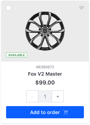
Is the Clay Card component flexible enough to allow Commerce Team to build the following custom Card?
Doubts
- Do we allow to change the Background color of the Image section? (gray color for this example)
- Does the Clay Card provide a way to locate the checkbox in another place for example top-right?
- Which are the benefits to make this composition a high-level component?
Kind regards,
David
 drakonux
All 9 comments
- Its not currently possible to change the background color of the image, unless you add custom css, for example
.image-card .aspect-ratio {background-color: red;}. - It's not currently possible to locate the checkbox in a different corner. We would need to update
clay-cssto account for this. - In order to make this a high-level component, we would likely want to see multiple use cases across multiple products. If this is commerce specific, we would likely let them create their own high-level to use.
cc: @pat270 what do you think about 1 and 2?
 bryceosterhaus
on 14 Jan 2020
bryceosterhaus
on 14 Jan 2020
Hello!!
- We should ease this change. If you need more definition or information please tell me and I will open a new ticket.
- Ok. It's not a requirement yet. I was exploring how flexible was the component. In anticipation of a new requirement from a product team.
- Understood. For me, it's ok if they can build it with our low-level component. It's all said.
Thanks!
cc: @laugardie
drakonux
on 15 Jan 2020
1) I'm not sure if Clay Card allows components other than sticker inside aspect ratio e.g., .label and button? There are only background-color utilities provided by Bootstrap that can be used to change the background-color of aspect-ratio at the moment. The only way to align .label and button is to use aspect-ratio-item-* utilities on them with margin utilities:
aspect-ratio-item-top-left // This doesn't exist I need to add this
aspect-ratio-item-center-middle
aspect-ratio-item-top-center
aspect-ratio-item-top-right
aspect-ratio-item-right-middle
aspect-ratio-item-bottom-right
aspect-ratio-item-bottom-center
aspect-ratio-item-bottom-left
aspect-ratio-item-left-middle
2) Clay CSS actually has utilities to move the checkbox to different corners. The classes are:
form-check-top-right
form-check-middle-right
form-check-bottom-right
form-check-bottom-left
form-check-middle-left
and should be placed at the same level as form-check-card.
My test markup is included at the bottom. You can copy paste it into clayui.com. It's close, the margin utilities won't work because clayui.com is on an older version I think. The way I would go about it is to allow other items to be included in aspect-ratio inside Clay Card and have a custom card type card-type-product with CSS overwrites either in Clay CSS or Commerce.
<div class="card-type-asset form-check form-check-card form-check-top-left">
  <div class="card">
    <div class="aspect-ratio card-item-first">
      <div class="custom-control custom-checkbox">
        <label>
          <input class="custom-control-input" type="checkbox">
          <span class="custom-control-label"></span>
          <div class="aspect-ratio card-item-first bg-light">
            <img alt="thumbnail" class="aspect-ratio-item aspect-ratio-item-center-middle aspect-ratio-item-fluid" src="../../images/switch_on_icon.png">
          </div>
          <button class="btn btn-outline-secondary btn-outline-borderless btn-monospaced btn-sm aspect-ratio-item-top-right c-mt-2 c-mr-2" type="button">
            <span class="inline-item">
              <svg class="lexicon-icon lexicon-icon-heart-full" viewBox="0 0 512 512"><path class="lexicon-icon-outline" d="M256,113.4C148.7-6-30,105.3,31.3,253.4C58.4,311.2,222,457.7,240.6,474.1c8.7,6.9,21.7,7.9,30.8,0.1c18.6-16.5,182.2-162.9,209.3-220.7C546,104.7,353.3-6,256,113.4z"></path></svg>
            </span>
          </button>
          <span class="label label-success aspect-ratio-item-bottom-left c-mb-3 c-ml-3">
            <span class="label-item label-item-expand">Available</span>
          </span>
        </label>
      </div>
    </div>
    <div class="card-body text-center">
      <div class="card-subtitle" title="AR385672">
        <span class="text-truncate-inline">
          <span class="text-truncate">AR385672</span>
        </span>
      </div>
      <div class="card-title c-mb-1" title="Fox V2 Master">
        <span class="text-truncate-inline">
          <a class="text-truncate" href="#1">Fox V2 Master</a>
        </span>
      </div>
      <div class="card-title c-mb-3" title="$99.00">
        <span class="text-truncate-inline">
          <span class="text-truncate">$99.00</span>
        </span>
      </div>
      <div class="c-mb-3 c-ml-auto c-mr-auto">
        <div class="input-group">
          <div class="input-group-prepend input-group-item input-group-item-shrink">
            <button class="btn btn-secondary" type="button">-</button>
          </div>
          <div class="input-group-item input-group-prepend">
            <input aria-label="Add or remove items" class="form-control" placeholder="0" type="text">
          </div>
          <div class="input-group-append input-group-item input-group-item-shrink">
            <button class="btn btn-secondary" type="button">+</button>
          </div>
        </div>
      </div>
      <button class="btn btn-primary btn-block" type="button">
        Add to Order
        <span class="inline-item inline-item-after">
          <svg class="lexicon-icon lexicon-icon-shopping-cart" viewBox="0 0 512 512"><circle class="lexicon-icon-outline shopping-cart-wheel1" cx="144" cy="464" r="48"></circle><circle class="lexicon-icon-outline shopping-cart-wheel2" cx="432" cy="464" r="48"></circle><path class="lexicon-icon-outline shopping-cart-basket" d="M495.9,352.1H192.5c-17.7,0-32.4-14.2-32.4-31.8s14.9-31.9,32.6-31.9c2.5,0,305-34.8,305-34.8c8.1-0.9,14.2-7.7,14.2-15.9V80.1c0-8.8-7.1-15.9-15.9-15.9H129.2l-20.8-53.9C106,4.1,100.1,0,93.5,0H16C-5.5,0.7-5.1,31.7,16.1,32h66.5l88.2,228.5c-24.4,9-42.6,32.2-42.6,59.7c0,35.3,29.2,63.8,64.5,63.8H496C517.9,382.5,516.6,353,495.9,352.1z M288.1,160.1v-64h94.5L384,160L288.1,160.1z M480.1,160H416l0.1-64h64V160z M256,96.1l0.1,63.9h-89.9l-24.7-63.9H256z"></path></svg>
        </span>
      </button>
    </div>
  </div>
</div>
@drakonux @laugardie @bryceosterhaus
 pat270
on 16 Jan 2020
pat270
on 16 Jan 2020
Added to https://github.com/liferay/clay/milestone/15 so we can prioritize it :)
 jbalsas
on 3 Feb 2020
jbalsas
on 3 Feb 2020
@drakonux do we need to implement this number input in Clay or is it just the image section they need? Corbin answered this.
pat270
on 6 Feb 2020
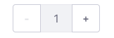
Hey, @pat270 for now no. That's a custom text group Commerce made and they can build it if they want with Clay components.
We should have a friendly request for a new numeric input (to review the design, accessibility, etc) and study the benefits to use it instead of the native one.
drakonux
on 7 Feb 2020
Hey @pat270, we should allow the card layout in markup.
That is, header/body where:
- The header can have a background and an image and elements can be positioned in the 4 corners
- The body takes arbitrary HTML (we don't need to provide this, just make sure it's possible to do it)
Then we can build the necessary low-level pieces to make it possible to assemble such a card.
jbalsas
on 7 Feb 2020
I see this issue is still open so I just wanted to check in and see if anyone needs anything from the Commerce team. Want to make sure no one's blocked by us. Thanks
 corbinmurakami
on 21 Feb 2020
corbinmurakami
on 21 Feb 2020
I think we can go ahead and close this. We provided a demo of this here
bryceosterhaus
on 28 Apr 2020
Related issues
drakonux
·
3Comments
bryceosterhaus
·
4Comments
drakonux
·
4Comments
pat270
·
4Comments
 bicienzu
·
3Comments
bicienzu
·
3Comments
Most helpful comment
.image-card .aspect-ratio {background-color: red;}.clay-cssto account for this.cc: @pat270 what do you think about 1 and 2?