Clay: Configure padding when using ClayList in sidebar
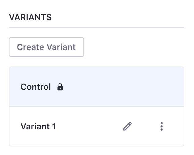
We are currently using ClayList component to list all the variants that an AB Test have in the sidebar panel. It look like this:
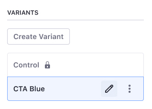
But our design mockup requires less padding that the default one:
We are not using custom CSS. Is there a configuration property for the component to do that? Like compact or small?
Thanks :)
 dgarciasarai
All 7 comments
I think there is nothing similar to ClayList, @pat270 can rate this better!
 matuzalemsteles
on 21 Aug 2019
matuzalemsteles
on 21 Aug 2019
It would be possible to create a new configuration property for the component to do that?
dgarciasarai
on 21 Aug 2019
If we add to CSS, I see no problem adding a new property for that.
matuzalemsteles
on 21 Aug 2019
@dgarciasarai
What does not using any custom CSS exactly mean? Are you still able to customize Sass variables?
I haven't seen any design for List Group from the Lexicon Team that looks like that. List Groups inside Sidebar look like: https://liferay.design/lexicon/satellite-components/sidebar/infopanel/.
Unfortunately, I'm not willing to add every little size variant to the project because the use case is too specific.
You can add the class sidebar-list-group to list-group and if you have access to customize variables you can try something like:
$sidebar-list-group-type: normal;
$sidebar-list-group-autofit-col-padding-x: 0.5rem;
$sidebar-list-group-autofit-col-padding-y: 0.5rem;
$sidebar-list-group-sticker-size: ((
  size: 2rem,
));
 pat270
on 21 Aug 2019
pat270
on 21 Aug 2019
Hey @drakonux, can you analyze this request? See if it makes sense and why it differs from the default?
I remember we did a "small" variant for WEM, so maybe this drinks off of that? Should we standardize this or keep it custom?
 jbalsas
on 21 Aug 2019
jbalsas
on 21 Aug 2019
Yeah. It makes sense. Besides, today I've been talking with some of the Portal product designers and they also need this for their sidebars components.
As @jbalsas said, you also did some variants for WEM in 7.2 (inputs, sections, etc.) so from my side, I'm going to create an epic to generate specifications for small (SM) components in Clay. I'll keep you posted.
@dgarciasarai Lexicon will try to prioritize SM lists in the Lexicon epic. Once the definition finishes, we will create a ticket in Clay mentioning you.
 drakonux
on 22 Aug 2019
drakonux
on 22 Aug 2019
I saw the request here https://issues.liferay.com/browse/LEXI-667
Thank you all!
dgarciasarai
on 22 Aug 2019
Related issues
drakonux
·
4Comments
 hold-shift
·
3Comments
drakonux
·
3Comments
hold-shift
·
3Comments
drakonux
·
3Comments
 kresimir-coko
·
3Comments
kresimir-coko
·
3Comments
 bryceosterhaus
·
5Comments
bryceosterhaus
·
5Comments
Most helpful comment
@dgarciasarai
What does not using any custom CSS exactly mean? Are you still able to customize Sass variables?
I haven't seen any design for List Group from the Lexicon Team that looks like that. List Groups inside Sidebar look like: https://liferay.design/lexicon/satellite-components/sidebar/infopanel/.
Unfortunately, I'm not willing to add every little size variant to the project because the use case is too specific.
You can add the class
sidebar-list-grouptolist-groupand if you have access to customize variables you can try something like: