Clarity: core: disabled state colors for cds-button
Describe the bug
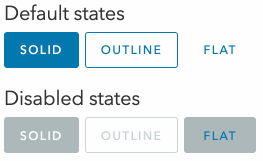
The flat variant of cds-button, when disabled, has incorrect text color, and gets some background interaction on hover:
How to reproduce
You can see the code for the above screencast at https://stackblitz.com/edit/react-ts-js9w2u?file=index.tsx
Expected behavior
I would expect a flat button to not react on hover at all when disabled, and have white text color.
Version
Clarity (both @cds/core and @cds/react): 5.0.0-next.0
 astorije
All 6 comments
@Shijir : What is our status on this?
 mathisscott
on 5 Jan 2021
mathisscott
on 5 Jan 2021
Looks like this was fixed with the theme fixes in the 5.0 release
 coryrylan
on 26 Jan 2021
coryrylan
on 26 Jan 2021
I noticed that, thank you!
Quick question though, was it on purpose that:
- text on disabled state is dark gray on gray, as opposed to white on gray (as it was on disabled solid before)?
- outline disabled has changed? I think the previous way worked better
/Cc @jaybellew1 @sbaldwa-cht
astorije
on 26 Jan 2021
@astorije ah yes I see the diff comparing to clr-ui. I'll check on if they are supposed to be synced as one disabled style now or each different. Comparison this is clr-ui

coryrylan
on 26 Jan 2021
Hey @coryrylan, it looks like #5518 fixed this issue so I think it can be closed.
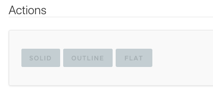
Given the following buttons:

We correctly get the following now:

So that's much better!
However, would you be open to adjusting the solid-disabled text color like the following? Disabled text is rather hard to read at the moment:

astorije
on 5 Feb 2021
@astorije hey yeah lets leave this issue open and I'll update the title
coryrylan
on 5 Feb 2021
Related issues
 BugsyFTW
·
3Comments
BugsyFTW
·
3Comments
 reddolan
·
3Comments
reddolan
·
3Comments
 nkolchakov
·
3Comments
nkolchakov
·
3Comments
 ChrisKaun
·
3Comments
ChrisKaun
·
3Comments
 JohannesRudolph
·
4Comments
JohannesRudolph
·
4Comments