Clarity: clr-icon in a non-primary button has a higher order and overlaps everything
Describe the bug
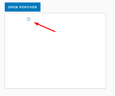
An icon inside a link button sits on top of everything.

It only looks okay when the button is a primary button, a danger or a success button.
How to reproduce
Here's a StackBlitz link:
https://stackblitz.com/edit/clarity-light-theme-v2-w4uyt4
Expected behavior
Should have the same z-index with the link button.
Versions
App
- Angular: [e.g. 6]
- Node: [e.g. 8.10.0]
- Clarity: [e.g. 0.12.5]
Device:
- Type: [e.g. MacBook]
- OS: [e.g. iOS]
- Browser [e.g. chrome, safari]
- Version [e.g. 22]
Additional notes
_Add any other notes about the problem here._
 whizkidwwe1217
All 10 comments
For the primary button it's also above the popover body. It's just white on white, but can be detected by cursor change on hover.
 Jinnie
on 22 Jul 2019
Jinnie
on 22 Jul 2019
The transform property of the clr-icon creates a new stacking context so it overlaps the popover body. I have to set the z-index of the popover body to a positive value to correct the order of elements.
 wendellestradairely
on 25 Jul 2019
wendellestradairely
on 25 Jul 2019
@hippee-lee Hi! Are smart popover changes solving this issue? ( im referring to changes from #3374 ) Let me know if this still require investigations.
 AlexMarcuBytex
on 5 Sep 2019
AlexMarcuBytex
on 5 Sep 2019
This issue is not using any Clarity popovers so the new utility isn't applicable in this context. This will still need investigation.
 hippee-lee
on 5 Sep 2019
hippee-lee
on 5 Sep 2019
Oh, you re right! The popover is just for the example here. Sorry for this confusion! Im trying to figure what would be the solution here without setting z-index to the popover body.
AlexMarcuBytex
on 6 Sep 2019
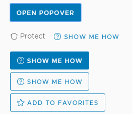
Hey @AlexMarcuBytex I would start with the layers we already have. Looking at the demo it seems like btn-primary, btn-success and btn-danger classes handle the icon correctly wrt layering. I would look at what is different between those classes and the btn-link & btn-outline classes.
I'm guessing here but I think the link and outline classes are missing the proper layer for clr-icon's inside them.
hippee-lee
on 6 Sep 2019
btn-primary, btn-success and btn-danger have the same bug as btn-link & btn-outline. in that example those buttons are just using a white icon so you wont see that something is wrong with the layers. The problem is clearly caused by the transform property as @wendellestradairely presented above. I think that if you want to solve this, you must get rid of the transform. I see this is used to center the icon together with the text inside the button. Maybe we can find another solution to make it look like it should.
AlexMarcuBytex
on 10 Sep 2019
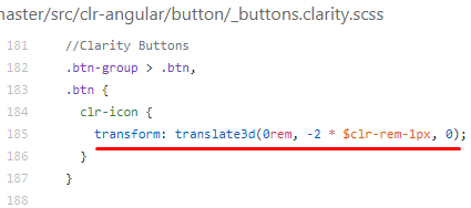
A transform causes an element to play by 3d rules, and doesn't play by the flat rules properly causing stacking issues here. We're basically nudging the icon up 2px (.083333rem) to align it more nicely. The line-height of button text and icon sizes are off by 4px, so we push up.
It might be ok to use margin-top: -0.0833333rem instead of the transform, but we really need to validate this across the demos carefully.
 gnomeontherun
on 12 Sep 2019
gnomeontherun
on 12 Sep 2019
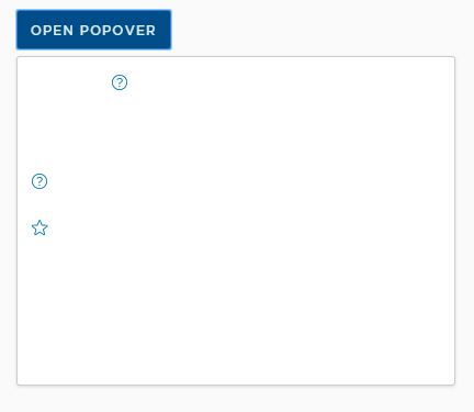
I found the transform is used in this case too.
.btn-sm:not(.btn-link) {
    clr-icon {
      width: 0.5rem;
      height: 0.5rem;
      transform: translate3d(0rem, -1 * $clr-rem-1px, 0);
    }
  }
I think this should be removed, not replaced because it makes the image be decentered.
With transform

Without transform

AlexMarcuBytex
on 12 Sep 2019
There is a workaround available for this issue, and we recommend using it for Clarity Angular. We would consider a contribution to address this issue if someone is able to work out a solution. As we build Clarity Core implementations, we expect that this issue won’t be an issue or will be configurable on the application side. To help us clean up our backlog, we are going to close this with a functional workaround available and suggest you follow updates for Clarity Core for enhancements that can support your use case with Clarity Core components.
gnomeontherun
on 1 Feb 2021
Related issues
 vzayko
·
3Comments
vzayko
·
3Comments
 aaronfrost
·
3Comments
aaronfrost
·
3Comments
 BugsyFTW
·
3Comments
BugsyFTW
·
3Comments
 thojo
·
3Comments
thojo
·
3Comments
 srikanthps
·
3Comments
srikanthps
·
3Comments
Most helpful comment
A transform causes an element to play by 3d rules, and doesn't play by the flat rules properly causing stacking issues here. We're basically nudging the icon up 2px (.083333rem) to align it more nicely. The line-height of button text and icon sizes are off by 4px, so we push up.
It might be ok to use
margin-top: -0.0833333reminstead of the transform, but we really need to validate this across the demos carefully.