Feature Proposal
What is the change?
The SmartPopover will be used to organize both the trigger element and its associated content for components that need to add ‘popover’ functionality. Current Clarity components that make use of popover functionality include: ClrSignpost, ClrTooltip and ClrDropdown, ClrButtonGroup, ClrDatePicker, ClrTabOverflowContent and ClrOptions (in the ClrComboBox). The ClrDatagrid also has the following popover child components: ClrDatagridColumnToggle, ClrDatagridFilter and ClrDatagridActionOverflow components.
As a result of this enhancement, these components will be updated to use ‘Smart Positioning’ that detaches the component content from the DOM and renders it in the Body in order to:
- Prevent clipping issues that occur due to relative positioning
- Intelligently detect content that is outside the browser viewport and dynamically update the contents position if this occurs
This change will also attempt to add a solution that preserves the accessibility for keyboard users who navigate the focus up and down the DOM tree.
## Why should it go into Clarity?
Adding ClrSmartPopover will address issues related to popover content clipping when relatively positioned inside an absolututely positioned container.
https://github.com/vmware/clarity/issues/2683
Filters and Hideable Column toggle component popovers overflow inside the datagrid
### Reported and related issues:
- #2683 Adding ClrSmartPopover will address issues related to popover content clipping when relatively positioned inside an absolututely positioned container
- #2240 Intellignet popobrt posiioning using @angular/cdk overlay module
- #1262 clr-dropdown should support a dynamic clrPosition
- #1213 Popover floats through the top of the screen
- #755 Dropdowns in Cards get clipped
Once this is complete issue #1757 can also be addressed.
## Does this change impact existing behaviors? If so how?
While this would not impact existing popovers it would enable the Clarity components mentioned above to be migrated to the new solution. Once all instances of the original popovers have been replaced the original solution should be deprecated and then removed in a subsequent release.
## If this change introduces a new behavior, is this behavior accessible?
This is still an unknown. However, there are solutions that can be used to address a majority of the use cases out there. See tabbable for an example of a possible approach that identifies elements that are tabbable and then manage the focus for the orphaned Popover content by identifying the focusable element before and after and adding an event listener to those elements so that the orhpaned popover content is still keyboard accessible. A drawback to this approach is that an approach like tabbable cannot conver all possible scenarios and this puts the onus on the consumer to add and manage the addition of tabindex="0" or tabindex="-1" to remove and manage the subtraction of an element from the array of tabbable elements.
There may be a way to do this (identify tabbable elements before and after a specific node) using a standard browser API but I haven't found anything yet.
## Examples
A list of examples that offer some or similar behavior include:
- tabbable see this in action with this react demo
- jQueryUI Tooltip
- jQuery Position
- @angular/material/cdk overlay
- material-ui/Popover
Component Architecture
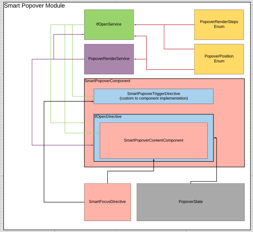
Services
- PopoverRenderService: Responsible for coordinating the view creation, position, clipping detection, append and destroy steps
- IfOpenService: Responsible for keeping track of the open/close state and passing it to subscribed entities
Directives
- PopoverTrigger: responds to click/enter events and toggles the content. Projects whatever content is given.
- ClrSmartOpen - Responsible for view creation and placement on the body. Uses SmartPopoverState utility for positioning coordinates; and uses the renderer to append to the body
Enums
- PopoverRenderStep - each discrete step of creating and positioning popover content
- PopoverPosition: the twelve possible positions on a container box that need to be aligned
Components
- SmartPopover - Projects content and provides a default trigger if consumer doesn't supply one
- SmartPopoverContent - projects consumers content, provides a close button
States
- PopoverState - keeps reference to the trigger element, calculates content positioning based on the PopoverPosition
- PopoverFocus - Place class for where I think the element focus logic should go. Might also be a service
Implementation
Work will be done on on a feature branch topic/smart-popover
- [x] Create ClrSmartOpen directive that create a content view on the body element
- [ ] Add PositionState for calculating correct position
- [ ] Add PopoverRenderService and break up the view creation, positioning, clipping detection, smart positioning, update and destruction steps into event subscriptions (similar to datagrid rendering cycle)
- [ ] Fill in any integration testing gaps between components and services
- [ ] Add PopoverFocus service/directive
 hippee-lee
All 6 comments
Utility is built but I had to disconnect it from that PR so that this issue stays open until I merge the topic branch into master.
Next PR will be renaming and name spacing the ClrPopoverNext module.
Final PR will be to rebase master on top of the topic branch.
hippee-lee
on 24 Jul 2019
@hippee-lee Can we update this ticket as resolved?
 gnomeontherun
on 29 Aug 2019
gnomeontherun
on 29 Aug 2019
Closing with the merge of PR: #3720 into master that brings the utility and uses it on the datagrid popovers.
hippee-lee
on 30 Aug 2019
Hello,
Is the popover supported for signposts inside datagrid ?
I've tried with the latest Clarity version but the signpost is cut inside the grid:
snapshot - https://www.screencast.com/t/cZEcwAPC5
example - https://stackblitz.com/edit/clarity-7fb2bb
 danail-vasilev
on 30 Oct 2019
danail-vasilev
on 30 Oct 2019
We haven't pulled it through to Signposts yet, this is coming soon though to v3.
gnomeontherun
on 30 Oct 2019
Hi there 👋, this is an automated message. To help Clarity keep track of discussions, we automatically lock closed issues after 14 days. Please look for another open issue or open a new issue with updated details and reference this one as necessary.
![github-actions[bot] picture](https://avatars.githubusercontent.com/in/15368?v=4&s=40) github-actions[bot]
on 3 Sep 2020
github-actions[bot]
on 3 Sep 2020
Related issues
 aaronfrost
·
3Comments
aaronfrost
·
3Comments
 elesueur
·
3Comments
elesueur
·
3Comments
 beaker1977
·
3Comments
beaker1977
·
3Comments
 nkolchakov
·
3Comments
nkolchakov
·
3Comments
 gperdomor
·
3Comments
gperdomor
·
3Comments