Clarity: Change background styling for hovered elements
Summary
_Summary the request and address the questions as appropriate._
- What is the change?
- Why should it go in Clarity?
- Does this change impact existing behaviors? If so how?
- If this change introduces a new behavior, is this behavior accessible?
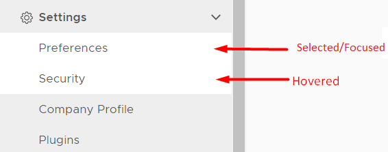
Hovered and focused/selected background styles are the same. Not be able to distinguish the difference between focused/selected and hovered states.
It kinda "feels heavy" and it looks like the hovered element is already selected when the hovered and focused/selected state have the same styling. It would look nicer when the hovered background color is lighter or any style that is different from the focused/selected state.
Use case
_Provide some specific details about how this change would improve your application and use case._
I'm developing a search component with hovered and selected/focused state using Clarity's themed SCSS style variables but I need to be able to differentiate the hovered state from the focused/selected state.
Current style for hovered and focused/selected are the same:
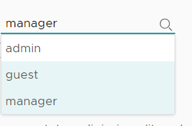
Expected:
Examples
_Are there any examples in other projects that demonstrate this feature or enhancement?_
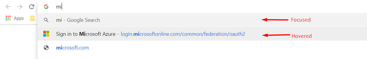
Example in vs code dropdown or in the autocomplete in the address bar of Chrome browser, you could see the difference between hovered and focused/selected states.

_Is there a workaround for this feature at the moment, even if it is less than ideal?_
The workaround is easy to implement by just dropping in some CSS but it would be much better if this is built right into the Clarity core styling.
 whizkidwwe1217
All 15 comments
Light theme
hover for vertical nav: #CCCCCC
Dark theme
hover for vertical nav: #253647
These changes will address the issue by creating appropriate contrast between hover and selected states, and meet a11y requirements.
Inconsistencies remain in this component but are out of scope for this issue. These should be addressed in 2.0
 colinreedmiller
on 7 Nov 2018
colinreedmiller
on 7 Nov 2018
Hi, @colinreedmiller, @mathisscott
On many places throughout Clarity we're using #d9e4ea for the focused entity.
Namely - sidenav, dropdown, wizard.
Won't it be better to use this color, so the user gets the same focus experience everywhere?
For the dark theme it seems that we're using #324f61 (for focus) vs #29414e (for hover).
The sidenav on the dark-theme does not seem to make difference though.
Please, advise how to proceed.
 Jinnie
on 16 Nov 2018
Jinnie
on 16 Nov 2018
@jinnie
We will be investigating different options after 1.0 for 2.0 or later. At this time, we wanted a change that was minimal but fixed the issue for our users .
Please proceed with the change indicated above .
 mathisscott
on 16 Nov 2018
mathisscott
on 16 Nov 2018
@mathisscott
I don't see a specific component mentioned for fixing in this bug. IMO, it is general. So I had to check all cases that are affected by this issue. The work will be the same if I will put #cccccc or #d9e4ea. Only in the first case we'll have to later change the (newly introduced #ccc) shade of grey to the shade of blue we use everywhere else in the project. This will double the work, not minimise it.
If you think that the change should be minimal, please specify in which component it should be done, as I've pinpointed several so far.
Jinnie
on 16 Nov 2018
@jinnie
In Colin’s comment. He says “vertical nav”. The change we want is what Colin outlines in his comment. Only the vertical nav.
Any wider change to hovered elements in Clarity is outside the scope of this issue and is something we would look at for after 1.0.
I hope this clears things up for you.
https://vmware.github.io/clarity/documentation/v0.13/vertical-nav/basic-structure/charmander
mathisscott
on 16 Nov 2018
Done for the light theme and ready to submit.
But I am not able to find the dark theme hover color #253647 nowhere on the Clarity palette.
Do we have exceptions for hovers, do we need to add it to the palette, or should I use these colors from theme.dark.clarity.scss instead:
$clr-global-selection-color: #324f61;
$clr-global-hover-bg-color: #29414e;
Jinnie
on 16 Nov 2018
You can add it to the palette for now, and add a comment to it for us to check if we want to consolidate colors in the future.
 youdz
on 16 Nov 2018
youdz
on 16 Nov 2018
I never added the dark theme colors to the palette. They came right from the sketch mockups.
 hippee-lee
on 16 Nov 2018
hippee-lee
on 16 Nov 2018
The hover colors story is finished, but we still need to address the other parts of this issue after 1.0:
- consistency of the colors used in different components (dropdowns, navs, wizards, etc)
- dark theme colors inclusion in the official palette
Jinnie
on 27 Nov 2018
@jinnie You are absolutely right about consistency. Upon examining this issue it became clear that dealing with all of it was out of scope so we chose a direct solution that allowed us to fix the vertical nav only. The larger theme of consistency across components will be addressed in the refresh - thanks for the attention.
colinreedmiller
on 27 Nov 2018
@colinreedmiller
Is this one of the visual change issues we would need a rollout plan for?
mathisscott
on 10 Jan 2020
@mathisscott current guidance is that no visual changes are adopted without a rollout plan so technically the answer is yes. However, in this case the change is really an enhancement to the existing design and subtle in the larger scheme of things. I am fine with making this update without a rollout plan. The larger concern I have is with regard to the consistency across the system. At the time this issue was raised we decided to make a change in the side nav only - lets make sure this is still the best approach.
colinreedmiller
on 10 Jan 2020
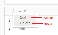
A similar issue for the datagrid single action.
see also https://v2.clarity.design/datagrid/single-action
 RobArbor
on 21 Feb 2020
RobArbor
on 21 Feb 2020
Need to review with design/a11y folks on requirements for this change.
 gnomeontherun
on 21 Feb 2020
gnomeontherun
on 21 Feb 2020
Clarity cares deeply about accessibility, and we work with our accessibility team to identify and triage issues. We have an internal tracking system to identify and verify accessibility issues, which has captured this already. Some issues with Clarity Angular are difficult to solve without causing side effects or breaking changes, and we have to balance concerns with fixing issues and breaking changes. As we build out Clarity Core, we are able to address these root cause accessibility issues and recommend adopting the Clarity Core implementations as they become available. We are closing this issue as we have the issues tracked internally. Please follow our development and releases to see when we release relevant Clarity Core components to make this possible.
gnomeontherun
on 1 Feb 2021
Related issues
 mayesgr
·
3Comments
mayesgr
·
3Comments
 aaronfrost
·
3Comments
aaronfrost
·
3Comments
 Thatkookooguy
·
3Comments
Thatkookooguy
·
3Comments
 reddolan
·
3Comments
reddolan
·
3Comments
 beaker1977
·
3Comments
beaker1977
·
3Comments