Select one ... (check one with "x")
[ ] bug
[x] feature request
[ ] enhancement
just found similar in internet (for example)
Expected behavior
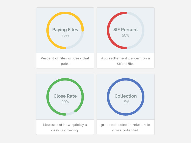
Donut Chart for dashboard widgets
You have spinner element, that element perfectly fit for making another component "Donut Chart" with
or w/o percentage and possibility to change colors
 pumano
All 17 comments
 icepeng
on 8 May 2018
icepeng
on 8 May 2018
I try to create simple svg and it works good. If you want that component we can collaborate on it. I don't know your development process, but I wish to help with it.
pumano
on 8 Jun 2018
Hi @pumano
We've updated our contribution guidelines
This is normally something we would consider for a chart library. But I think it could make sense in our library of components as-is for now.
Let me know if you still want to contribute and I can get someone on our team to go over anything in the contribution process that is not clear.
Thanks!
 mathisscott
on 19 Jul 2018
mathisscott
on 19 Jul 2018
@mathisscott thanks, currently I'm busy, but I will start it as soon as possible.
pumano
on 10 Aug 2018
Hello guys, I have some time for create reusable (mostly draft) component. You can check it via stackblitz: https://stackblitz.com/edit/angular-clarity-donut-chart
Component have possibility to override some settings via options.
I know it's not finished version and not cover most cases, if you need that component, you can review code, and then provide me info how I can submit it and what changes I need to do for meet your needs.
pumano
on 22 Apr 2019
Thanks for the update, we'll review this to decide if this is something we are really ready to incorporate or not, and if so we can do a deeper dive on the design.
 gnomeontherun
on 22 Apr 2019
gnomeontherun
on 22 Apr 2019
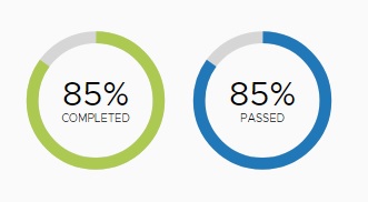
Thanks @pumano for the initial design, we are going to have our UX design do an audit of this and we're not planning to talk about this as a doughnut chart since it is more of a progress bar in a circle. It could be used for a loader indicator but without more interactivity we don't think its a chart. We'll circle back soon with design inputs.
gnomeontherun
on 25 Apr 2019
It can be used as progress bar for loading and as chart for example for dashboard, for showing progress in my case.
pumano
on 25 Apr 2019
There is a need for a large label / value display component, of which circular progress is a part. Often values are important in the information hierarchy, particularly in dashboards as in the above example where the design uses a double affordance to illustrate the value of 85% - both numeric and with the circular progress bar graphic.
This may be the best choice for some use cases, while others may see the graphic as purely decorative, or may require a different graphic such as a trend line, may have layout needs that make a circular graphic representation inappropriate, or may simply prefer a textual / numeric label value pair that works graphically because of its design (size) e.g.


The design for this should cover a small variety of styles, allowing the designer using the component to utilize the attributes most suited to their use case.
 colinreedmiller
on 9 May 2019
colinreedmiller
on 9 May 2019
@colinreedmiller
Re: circular progress. I don't see any example of that above. Are we still waiting on that design?
mathisscott
on 9 May 2019
@mathisscott - We have no design yet. My point above is that circular progress is a single case of large label/value and any component that addresses this need should consider a few standard depictions of large label/value rather than simply focusing on the use of a circular indicator only.
colinreedmiller
on 9 May 2019
Moving forward with Circular Progress as defined here and tabling additional label/value dashboard widgets as referenced in #1810 for the time being.
UX recommendation is full circle and half circle variations including label and value with animation on load. I will do some research on this leading to the creation of a design spec.
colinreedmiller
on 31 May 2019
@pumano are you able to contribute to this? I did some initial studies using our type classes, colors and size conventions to get started in alignment with Clarity.
colinreedmiller
on 4 Jun 2019
@colinreedmiller yes, I can, just tell me what to do :)
pumano
on 4 Jun 2019
@colinreedmiller
When you get the chance, could you post a link to your design here so I can work off it? This is a 20% time project for me over the next couple of months.
mathisscott
on 21 Aug 2019
Closing this so we can move dev work through #4043
mathisscott
on 14 Jul 2020
Hi there 👋, this is an automated message. To help Clarity keep track of discussions, we automatically lock closed issues after 14 days. Please look for another open issue or open a new issue with updated details and reference this one as necessary.
![github-actions[bot] picture](https://avatars.githubusercontent.com/in/15368?v=4&s=40) github-actions[bot]
on 25 Aug 2020
github-actions[bot]
on 25 Aug 2020
Related issues
 clane
·
3Comments
clane
·
3Comments
 vzayko
·
3Comments
vzayko
·
3Comments
 yandong01
·
3Comments
yandong01
·
3Comments
 gperdomor
·
3Comments
gperdomor
·
3Comments
 aaronfrost
·
3Comments
aaronfrost
·
3Comments
Most helpful comment
@colinreedmiller
When you get the chance, could you post a link to your design here so I can work off it? This is a 20% time project for me over the next couple of months.