Clarity: Multi-Alert component styling issue
Select one ... (check one with "x")
[x] bug
[ ] feature request
[ ] enhancement
Expected behavior
The multi-alert component should render properly even if we have more than 10 alerts.
Actual behavior
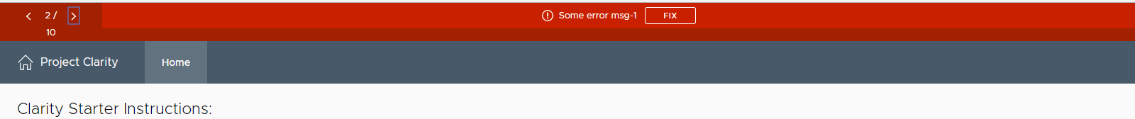
If there are more than or equal to 10 alerts, styling gets affected as shown below.
It renders properly in alert #1 and style is getting affected once we navigate next alert say alert#2.

Reproduction of behavior
https://stackblitz.com/edit/clarity-light-theme-v11-t4hsga?file=index.html
Environment details
Angular version: 4.x.x
Clarity version:
OS and version:
Browser: [all | Chrome XX | Firefox XX | IE XX | Safari XX | Mobile Chrome XX | Android X.X Web Browser | iOS XX Safari | iOS XX UIWebView | iOS XX WKWebView ]
 shravansofts
All 7 comments
@shravansofts
What is the use case for wanting more than 9 alerts?
 mathisscott
on 5 Mar 2018
mathisscott
on 5 Mar 2018
It is a general usecase for any app-level alert component. Imagine a web app has a use case to show all tasks/warnings/error/licensing issues to user at app level and user has to click on action/acknowledge.
Having 10 alerts is quite common scenario for any app-level alerts usecase.
shravansofts
on 6 Mar 2018
That's a fairly simple fix: the CSS style for .alerts-pager has a width of 144px, but that is not enough to accommodate double-digit characters (including padding, etc.). For paging > 10 and < 20 the required width is 178px and for >= 20, it's 188px.
I am not sure how desirable the above will be, as it is getting very close to the .branding width of 204px, though.
 gomesjj
on 6 Mar 2018
gomesjj
on 6 Mar 2018
@gomesjj
I tried to change the width as you suggested. But it is not working.
https://stackblitz.com/edit/multialert-style-issue?file=app%2Fapp.component.css
can you tell me what is missing here to use this workaround?
Thanks,
Shravan
shravansofts
on 7 Mar 2018
@shravansofts
You need to be a bit more forceful to override the style a host descendant. Please see: https://stackblitz.com/edit/clarity-light-theme-v11-3h4ejc?file=app%2Fapp.component.css
Jose
Edit: Fixed link
gomesjj
on 7 Mar 2018
@shravansofts
I am sorry, but it seems the link above is not working as it should… But anyway, the reference from @adityarb88 makes much more sense, and I should have thought of that. Adding the "white-space: nowrap" style is way better than increasing the width of the component.
Please see this updated plunker stackblitz
Also, note that the use of ::ng-deep (also /deep/ and >>>) is deprecated, so this workaround should have a very short shelf-life. Hopefully the Clarity team will release the proper fix soon.
Note to self: Do not make comments on any threads after a few glasses of wine!
Jose
gomesjj
on 7 Mar 2018
Hi there 👋, this is an automated message. To help Clarity keep track of discussions, we automatically lock closed issues after 14 days. Please look for another open issue or open a new issue with updated details and reference this one as necessary.
![github-actions[bot] picture](https://avatars.githubusercontent.com/in/15368?v=4&s=40) github-actions[bot]
on 23 Sep 2020
github-actions[bot]
on 23 Sep 2020
Related issues
 reddolan
·
121Comments
reddolan
·
121Comments
 vmwareux-vivian
·
41Comments
vmwareux-vivian
·
41Comments
 Harsh072
·
23Comments
Harsh072
·
23Comments
 gitnarendra
·
27Comments
gitnarendra
·
27Comments
 corganfuzz
·
24Comments
corganfuzz
·
24Comments