Description

A spinner button component is a button component that generates a spinner inside of a button to indicate that a process is running. At the end of the process, a check icon is generated to indicate that the process is complete.
Use cases under consideration
- page requests that require time to process
- buttons (all types & sizes)
- icon buttons
- forms: inline buttons
Documentation
- Key features: add/remove spinners to all types of button components, apply screen reader text while process is running, and add/remove success state*
- We recommend using spinner buttons only for actions that require some time to process**
- We do not recommend using spinner buttons for links, navigating to different pages, or opening/closing a modal or wizard
*This feature may apply to situations where an action navigates to a new page but still requires time to process (i.e. logging in)
**For longer running processes, we recommend using a progress indicator or _circular progress indicator (not a currently existing component)_
States
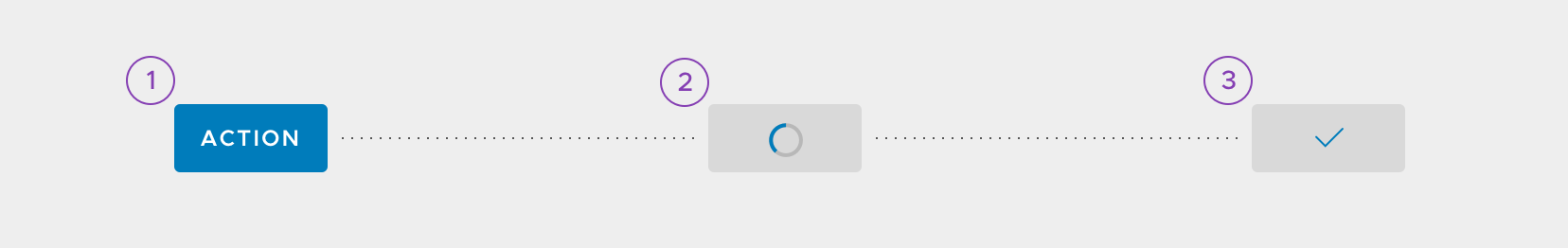
- Default state acts just like a normal solid button would, darkening on hover.
- Loading state transitions into a disabled state, hides the button label, and injects a rotating spinner.
- Success state remains disabled, injects a check icon to indicate the success of an action, and returns back to default state.
Toggling Success State
- Success state can be toggled on/off according to the type of process that is taking place
- Ex) If a spinner button is applied to a “Log In” action, the success state should be toggled off because the process will result in navigating to a new page.
Usage
- For processes that require time to take place, such as creation or deletion actions
- For longer running processes, we recommend using a progress bar or a circular progress indicator (component in progress)
- Use spinner buttons for actions that update the content on the current page without navigating to a new one.
- Use spinner buttons for actions that will navigate to a different page or open/close a modal or wizard.
Accessibility
- For accessibility, screen reader text is available for the Loading and Success button states
- Apply contextual text such as “Saving” and “Saved” to inform screen readers of what is happening
Button Types
Solid

Outline

Flat

Icon

Small
x-small spinner: 13px by 13px, 1.5 border thickness

Block


Inverse
inverse spinner: full circle (white border, 15% opacity), 1/3 circle (#007CBB border)

Button Group

Animation (not to be included in Documentation)
onClick
Default state -> Loading state

- Button changes to disabled state
- Button label fades out (opacity: 0, animation-duration: 100ms)
- Spinner fades in (opacity: 1, animation-duration: 100ms, animation-delay: 200ms)
onSuccess
Loading state -> Success state

- Spinner fades out (opacity: 0, animation-duration: 100ms)
- Check-line icon scales in (scale: 1, animation-duration: 300ms, animation-delay: 100ms, curve: Spring(damping:0.5))
return to default
Success state -> Default state

- Check-line icon scales out (scale: 0, animation-duration: 300ms, curve: Spring(damping:0.5))
- Button changes to default state
- Button label fades in (opacity: 1, animation-duration: 100ms, animation-delay: 200ms)
Related/Original Issues: #1139 and #463
 gracesnoh
All 8 comments
This looks good, but is there an onFailure state? I didn't see any examples.
 joshjohnsonux
on 20 Sep 2017
joshjohnsonux
on 20 Sep 2017
@joshjohnson72 Good question, for now I think it would be best to display errors outside of the button (in the form of an alert or even an inline form validation). The spinner would stop before it gets to the success state, and return back to the default state:

gracesnoh
on 20 Sep 2017
I agree that when you hit an error you need space to explain the error, and the button doesn't afford that. Only downside I see is that space has to be reserved for that possible error alert, or all the other elements will be shifted.
joshjohnsonux
on 20 Sep 2017
@joshjohnson72 Thanks for bringing that up, what I meant to convey wasn't an empty space reserved for an alert but rather the point that an alert would show up if there was an error. Correct me if I'm wrong, but alerts take up the entire width of the screen and should only shift elements down vertically:
gracesnoh
on 20 Sep 2017
From the Clarity site on Alerts: "Alerts could appear within modals. It is recommended that no more than one alert appear within modal. Their function should not ve to validate, validation should be done inline and closer to the error itself."
I would tend to agree that the inline action should have errors shown near to it.
joshjohnsonux
on 20 Sep 2017
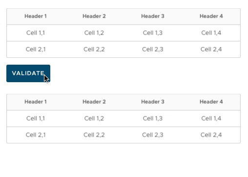
@joshjohnson72 I believe that is referring to inline form validations like this:

Which would also work with these spinner buttons:

My example just happens to have a button called "Validate" but it isn't referring to the same type of validation in that context 😅
gracesnoh
on 20 Sep 2017
A couple of additional notes here:
• This component will take the place of our current "Loading Button". If at all possible, we should repurpose that directive so we can introduce this functionality without a breaking change.
• The screen-reader only labels should be projected content so that users can also i18n it.
• Moving from one state to another should be declarative on the user's part so that way they can have full control of the button's loading state.
Great job, @gracesnoh ! Thanks for putting this together.
 mathisscott
on 21 Sep 2017
mathisscott
on 21 Sep 2017
Hi there 👋, this is an automated message. To help Clarity keep track of discussions, we automatically lock closed issues after 14 days. Please look for another open issue or open a new issue with updated details and reference this one as necessary.
![github-actions[bot] picture](https://avatars.githubusercontent.com/in/15368?v=4&s=40) github-actions[bot]
on 29 Sep 2020
github-actions[bot]
on 29 Sep 2020
Related issues
 reddolan
·
3Comments
reddolan
·
3Comments
 vzayko
·
3Comments
vzayko
·
3Comments
 Thatkookooguy
·
3Comments
Thatkookooguy
·
3Comments
 gperdomor
·
3Comments
gperdomor
·
3Comments
 ChrisKaun
·
3Comments
ChrisKaun
·
3Comments
Most helpful comment
I agree that when you hit an error you need space to explain the error, and the button doesn't afford that. Only downside I see is that space has to be reserved for that possible error alert, or all the other elements will be shifted.