Clarity: [Vertical Nav] Add option for collapse trigger to be bottom aligned and for submenus to act like an accordion
Select one ... (check one with "x")
[ ] bug
[x] feature request
[x] enhancement
Expected behavior
Should be useful having a property to set the collapse trigger on the bottom, something like this:
Also, increase the size of icons when the nav is collapse should be nice:

The screenshot are from ant.design
 gperdomor
All 8 comments
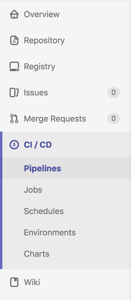
Other posible improvements: show submenu on the right without expand the item inside de navbar (issue submenu in the screenshot), only expand the current selected menu (CI / CD, in the image)

gperdomor
on 18 Aug 2017
@gperdomor
I think I understand the use case for having the collapse trigger at the bottom of the sidebar (as a configurable option).
But what is the use case for only expanding the active section? How is that better than allowing users to expand and navigate directly to an item in the submenu?
 mathisscott
on 18 Aug 2017
mathisscott
on 18 Aug 2017
@mathisscott reasons could vary, from personal preference or to avoid confussions... For example check this image:
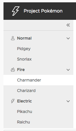
I don't know if Charmander is a root menu or a sub menu, I don't know that menu is from Fire group, I need check the down arrow to know that, in the gitlab version I know exactly where I am.
In the other hand, imagine you have a lot of root menu, for example in a modular app where each module can add only one menu entry, but many submenu entries, as user y need do something, but maybe you don't know where is the link, so you start to expand one by one until you get it... Now you have a lot of expanded entries, which could be ugly (IMO) and confusing at least for the common user, also you get a lot of vertical scroll.
If you have a lot of expanded menus, you can produce scroll in the navbar and you can lost the current menu of sight.
And maybe more reasons...
gperdomor
on 18 Aug 2017
@gperdomor
Re: Charmander. I disagree. The design of the vertical nav makes it fairly clear that Charmander is a child of Fire. I don't know that the gitlab design makes it any clearer. It is a noisier design that, at first glance, led me to believe that CI/CD was a child of “Merge Requests” and that Pipelines was a grandchild of that navigation element. There is no indication, for example, that CI/CD is in fact expandable. No arrow, caret, or anything. So I don't think that this UI is a good model for the described use case.
Re: a lot of root menus and submenu entries. I think that is definitely an edge case. And, at some point, should inspire a product team to reconsider their information architecture. I fully agree that it would be ugly. But I don't know if the reason it would be ugly is Clarity.
I'm on board with an option to put the collapse trigger to the bottom. And even an option to force only one sub-menu to be expanded at a time. But forcing it such that only the active submenu is ever expanded is too much, IMO. And it would require a user to click root menu items blindly and inhibit exploration of their child menus. Basically compounding the problem you mention, not solving for it.
An option to force only one submenu to be open at a time (like an accordion) solves the bad-information-architecture-and-can’t-fix-it issue you describe.
mathisscott
on 18 Aug 2017
For the collapse trigger placement, we need a boolean input that defaults to the existing top aligned collapse trigger but aligns the trigger to the bottom when set opposite to the default setting -- most likely using flex-order: -1.
For the accordion functionality, that's a little trickier. We will again need a boolean input but this one will be used inside the vertical nav behavior logic to close all other root-level menus when a new one is opened. We'll need to make sure the root-level header maintains highlighting as expected.
mathisscott
on 18 Aug 2017
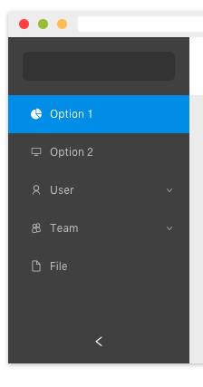
You confusion is caused because I'm hover the issue menu, this is the normal view:
You right about the carret, in gitlab is missing. but the left color in all menu group I think is a good idea...
Anyway, is only a proposal about possible things that could be improved, but the suggestion is improve the component api and make it more flexible, and I know, is the first release of this component, and is great :D
gperdomor
on 18 Aug 2017
While I think both the request for the collapse to be at the bottom and the different treatment of sub-menus both have some degree of merit, I'd suggest they be split into two issues, as they don't have strong dependencies on one another.
 joshjohnsonux
on 22 Oct 2017
joshjohnsonux
on 22 Oct 2017
Our current design supports clicking the bottom of the vertical nav (if there is space) to act as a toggler.
This is a worthwhile enhancement request, but is challenging to implement due to the existing behaviors and nature of Clarity Angular. As we build out Clarity Core, this should be possible to realize with the applications managing the state and functionality more directly instead of Clarity Angular.
In an effort to clean up our backlog and focus our attention, I’m going to close this as likely to be resolved by upcoming implementations in Clarity Core. Please follow our development and releases to see when we release relevant components to make this possible.
 gnomeontherun
on 29 Jan 2021
gnomeontherun
on 29 Jan 2021
Related issues
 dennitsa
·
4Comments
dennitsa
·
4Comments
 yandong01
·
3Comments
yandong01
·
3Comments
 amellnik
·
3Comments
amellnik
·
3Comments
 mayesgr
·
3Comments
mayesgr
·
3Comments
 Vad1mo
·
3Comments
Vad1mo
·
3Comments
Most helpful comment
You confusion is caused because I'm hover the issue menu, this is the normal view:
You right about the carret, in gitlab is missing. but the left color in all menu group I think is a good idea...
Anyway, is only a proposal about possible things that could be improved, but the suggestion is improve the component api and make it more flexible, and I know, is the first release of this component, and is great :D