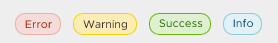
Clarity: Warning buttons with same color as danger ones
Select one ... (check one with "x")
[x ] bug
[ ] feature request
[ ] enhancement
Expected behavior
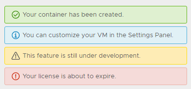
warning button should have the same color as warning alert or warning icon
Actual behavior
warning button has the same color as danger button
Reproduction of behavior
Environment details
**Angular version: 2.3.1
**Clarity version: 0.8.5
OS and version:
Browser: [all | Chrome XX | Firefox XX | IE XX | Safari XX | Mobile Chrome XX | Android X.X Web Browser | iOS XX Safari | iOS XX UIWebView | iOS XX WKWebView ]
 mindhells
All 7 comments
@mindhells could you provide us with more details on a use case where the warning button is used not to warn the use of a "danger"? We didn't find an individual use case for warning vs. danger that's compelling enough to keep both.
 jaffoneh
on 3 Feb 2017
jaffoneh
on 3 Feb 2017
@jaffoneh I've 2 actions for the same context: "undo last change" and "reset". You can say in both cases there's a danger to warn the user with ... I though myself there could be 2 levels of danger (same thing already exist with alerts or badges or icons...).
From the pure technical point of view: why to have 2 clases doing exactly the same?
mindhells
on 6 Feb 2017
@mindhells that's a fair use case. For lack of use cases, we were thinking of removing the "warning" state of a button from our documentation but keeping it in the code to ensure that applications that could be using it don't break.
jaffoneh
on 6 Feb 2017
@mindhells I am closing this based on the last comment. When we looked at it again, having danger and warning is confusing to a user especially when used together. We're defaulting to using the "danger" button when needed to warn the user about an issue and provide a way for the user to choose "another safe" action to take otherwise.
jaffoneh
on 9 Feb 2017
For a future review, check this example: http://valor-software.com/ng2-file-upload/
mindhells
on 9 Feb 2017
@jaffoneh Have any plan to add warning button ? because current style not easy to identify.

Why only label and alert have warning style ?
This is my template solution , using yellow color palette. Hope have a formal color.

$clr-btn-warning-color: $clr-white;
$clr-btn-warning-bg-color: $clr-yellow-light-midtone;
$clr-btn-warning-hover-bg-color: $clr-yellow-dark-midtone;
$clr-btn-warning-hover-color: $clr-btn-warning-color;
$clr-btn-warning-box-shadow-color: $clr-yellow-dark;
$clr-btn-warning-disabled-color: $gray-darker;
$clr-btn-warning-disabled-bg-color: $gray-light-midtone;
$clr-btn-warning-disabled-border-color: $clr-btn-warning-disabled-color;
$clr-btn-warning-checked-bg-color: $clr-yellow-dark-midtone;

$clr-btn-warning-outline-border-color: $clr-yellow-dark-midtone;
$clr-btn-warning-outline-color: $clr-yellow-light-midtone;
$clr-btn-warning-outline-hover-bg-color: $clr-yellow-lighter;
$clr-btn-warning-outline-hover-color: $clr-yellow-dark;
$clr-btn-warning-outline-box-shadow-color: $clr-black;
$clr-btn-warning-outline-disabled-color: $gray-darker;
$clr-btn-warning-outline-checked-bg-color: $clr-yellow-dark-midtone;
$clr-btn-warning-outline-checked-color: $clr-white;

$clr-global-button-properties-map: (
  warning: (
    background-color: $clr-btn-warning-bg-color,
    border-color: $clr-btn-warning-bg-color,
    color: $clr-btn-warning-color,
    hover-background-color: $clr-btn-warning-hover-bg-color,
    hover-color: $clr-btn-warning-hover-color,
    active-box-shadow-color: $clr-btn-warning-box-shadow-color,
    active-box-shadow-width-top: 2px,
    disabled-color: $clr-btn-warning-disabled-color,
    disabled-background-color: $clr-btn-warning-disabled-bg-color,
    disabled-border-color: $clr-btn-warning-disabled-bg-color,
    checked-background-color: $clr-btn-warning-checked-bg-color,
    checked-color: $clr-btn-warning-color
  ),
  outline-warning: (
    background-color: transparent,
    border-color: $clr-btn-warning-outline-border-color,
    color: $clr-btn-warning-outline-color,
    hover-background-color: $clr-btn-warning-outline-hover-bg-color,
    hover-color: $clr-btn-warning-outline-hover-color,
    active-box-shadow-color: $clr-btn-warning-outline-box-shadow-color,
    active-box-shadow-width-top: 1px,
    disabled-color: $clr-btn-warning-outline-disabled-color,
    disabled-background-color: transparent,
    disabled-border-color: $clr-btn-warning-outline-disabled-color,
    checked-background-color: $clr-btn-warning-outline-checked-bg-color,
    checked-color: $clr-btn-warning-outline-checked-color
  )
);

.btn.btn-warning,
.btn-warning .btn {
    @include populateButtonProperties(warning);
}

.btn.btn-outline-warning,
.btn.btn-warning-outline,
.btn-warning-outline .btn,
.btn-outline-warning .btn {
    @include populateButtonProperties(outline-warning);
}

.checkbox.btn,
.checkbox-inline.btn {
  &.btn-warning {
    @include btn-checked-styles(warning);
  }
  &.btn-warning-outline
  &.btn-outline-warning {
      @include btn-checked-styles(outline-warning);
  }
}

.radio.btn,
.radio.btn {
  &.btn-warning {
    @include btn-checked-styles(warning, radio);
  }
  &.btn-warning-outline
  &.btn-outline-warning {
      @include btn-checked-styles(outline-warning, radio);
  }
}

.btn-group {
  &.btn-warning .dropdown-toggle {
      @include populateButtonProperties(warning);
  }
}
 jewway
on 29 Mar 2018
jewway
on 29 Mar 2018
Hi there 👋, this is an automated message. To help Clarity keep track of discussions, we automatically lock closed issues after 14 days. Please look for another open issue or open a new issue with updated details and reference this one as necessary.
![github-actions[bot] picture](https://avatars.githubusercontent.com/in/15368?v=4&s=40) github-actions[bot]
on 1 Oct 2020
github-actions[bot]
on 1 Oct 2020
Related issues
 beaker1977
·
3Comments
beaker1977
·
3Comments
 clane
·
3Comments
clane
·
3Comments
 mayesgr
·
3Comments
mayesgr
·
3Comments
 elesueur
·
3Comments
elesueur
·
3Comments
 dennitsa
·
4Comments
dennitsa
·
4Comments
Most helpful comment
@jaffoneh Have any plan to add warning button ? because current style not easy to identify.

Why only label and alert have warning style ?


This is my template solution , using yellow color palette. Hope have a formal color.
