Clarity: Provide validation for select boxes
Select one ... (check one with "x")
[ ] bug
[X] feature request
- [ ] Design validation messages for select boxes
- [ ] Implement validation/errors for select boxes
- [ ] Add documentation/example of form validation for selects and multi-selects to website
Expected behavior
We need design/implementation for form validation/error messages for select boxes.
Note this should include multi-selects.
This should also be done in relation to Issue #45
 jaffoneh
All 19 comments
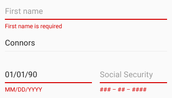
Here is the recommended design for validation on a select list (box)

We are aware the recommendation has the icon on the outside. We carefully looked at both options and chose to have it on the outside due to potential touch target conflicts.
 reddolan
on 11 May 2017
reddolan
on 11 May 2017
@reddolan: How does the error message appear? On hover or on focus? On input fields it appears on focus.
 adityarb88
on 12 May 2017
adityarb88
on 12 May 2017
@adityarb88 I'll let @reddolan confirm but it would have to be either click, hover, or both since it is outside.
jaffoneh
on 12 May 2017
I'd say on hover, for a consistent experience.
 taivu
on 31 May 2017
taivu
on 31 May 2017
Hover is problematic because hover on mobile devices cannot be relied upon.
I say it should be on focus, like the other validations.
 mathisscott
on 31 May 2017
mathisscott
on 31 May 2017
@mathisscott I agree with you and was about to mention that
reddolan
on 31 May 2017
Is there a plan for when this, and validation for other form components, will be implemented?
 jacobbutton
on 6 Jun 2017
jacobbutton
on 6 Jun 2017
@jacobbutton: This ticket hasn't been prioritized yet. The teams priorities for the next few weeks is pretty much decided. But we will try to look into this as soon as possible. Thanks for checking in.
adityarb88
on 6 Jun 2017
On the VMware CSP UX team, we have standardized form behavior to disable the submit button until the user has completed all required fields in valid formats. (This behavior has not been defined in clarity, but our team made the decision to standardize our forms as such.)
In this context, select boxes don't need validation, since there are no cases in which a user could enter invalid information. The select box validation would only make sense if:
1) Submit button is always active.
2) We choose to inform the user if they have skipped a required select box, or have clicked to open the select options then clicked out of the field without selecting a value.
 nbewley
on 21 Jun 2017
nbewley
on 21 Jun 2017
@nbewley I don't know if I understand the entire experience. I have a few questions:
- Are all select boxes preselected with a value or are they started with a blank value?
- If started with a blank value how does the user know they need to select a value if they missed it?
- How does a user know they need to go back and fill out a select box if there is no way to alert the user?
- If a user misses a required select box and goes to click the Submit, what happens? Do they get a error tooltip on the Submit button, nothing at all, or something else?
reddolan
on 22 Jun 2017
Thanks @reddolan, agree that cases 2/3 need a closer look. In our case, we will inform the user if they skip the selectbox with an error "[field_name] is required."
Indeed, it appears this is how others implement such patterns. This could be something to consider adding to the Clarity guidelines in the future, should other teams implement this pattern.
nbewley
on 23 Jun 2017
@nbewley
how will the user be informed?
- Upon clicking the disabled Submit button
- or as they pass it in the form (tabbing)
- or something else?
by other's implementations are you speaking to the error message being displayed below the form field?
reddolan
on 23 Jun 2017
Our implementation alerts the user onblur (tab), showing the clarity error message in the event of an invalid field. We could also implement some behavior if the user clicks the disabled submit button to inform them, although we have not designed such an experience at this point.
By others' implementation of this pattern, I mean:
"If you are performing inline form validation, and the field with the error is clearly marked, the submit button may be disabled until the error is corrected."
I am in agreement with you that since we have implemented inline form validation, we need to clearly mark the selectbox with an error if the user skips the field. Thanks for your input!
nbewley
on 23 Jun 2017
Is there an update on this? It is a bit strange not to have validation on essential fields such as a drop down select and textarea!
 hakkio
on 12 Sep 2017
hakkio
on 12 Sep 2017
@hakkio
All of our form designs are going through a design review at this time. So it's actively being worked through our UX team. Please subscribe to this issue to get updates when it moves into development.
mathisscott
on 12 Sep 2017
Hi Team, Can you please advise if there's any update on this request ?
 rpusarla
on 2 Mar 2018
rpusarla
on 2 Mar 2018
@rpusarla
This work is currently in-flight. We are re-working the DOM structure of form controls and then applying our changes to input fields. Selects are on the horizon. But will be sometime after input fields.
This is all work that will be in 0.12 or later. We are currently in 0.11.
mathisscott
on 2 Mar 2018
This has been completed in master.
 gnomeontherun
on 16 Aug 2018
gnomeontherun
on 16 Aug 2018
Hi there 👋, this is an automated message. To help Clarity keep track of discussions, we automatically lock closed issues after 14 days. Please look for another open issue or open a new issue with updated details and reference this one as necessary.
![github-actions[bot] picture](https://avatars.githubusercontent.com/in/15368?v=4&s=40) github-actions[bot]
on 22 Sep 2020
github-actions[bot]
on 22 Sep 2020
Related issues
 steven-zou
·
24Comments
steven-zou
·
24Comments
 whizkidwwe1217
·
45Comments
whizkidwwe1217
·
45Comments
 vmwareux-vivian
·
41Comments
reddolan
·
31Comments
vmwareux-vivian
·
41Comments
reddolan
·
31Comments
 mrmokwa
·
28Comments
mrmokwa
·
28Comments
Most helpful comment
Hover is problematic because hover on mobile devices cannot be relied upon.
I say it should be on focus, like the other validations.