Ckeditor5: The nested editable selection indicator is broken
When there are colspans/rowspans in cells the border-based selection is messed up:

I've found that the box-shadow: inset plays well:

I've used this:
.ck-widget.table {
    & td,
    & th {
        &.ck-editor__nested-editable.ck-editor__nested-editable_focused {
            border-style: none;
            box-shadow: var(--ck-inner-shadow), 0 0, inset 0px 0px 0 1px var(--ck-color-focus-border);
        }
    }
}
 jodator
All 4 comments
Let's try to fix it if @jodator's patch is ok. If not, we don't have to prioritise it.
 Reinmar
on 19 Jun 2018
Reinmar
on 19 Jun 2018
To reiterate an earlier comment on this:
Use outline instead of border:
https://codepen.io/david-twist/pen/NMQOwO?editors=1000
.highlight {
  outline: 1px solid var(--ck-color-focus-border);
  outline-offset: -1px; /* progressive enhancement - no IE support */
  box-shadow: inset 0px 2px 3px 1px rgba(0, 0, 0, .1);
  background-color: rgba(71, 164, 245, .2) !important;
}
[edited example style to align with the design intent of current approach— I added a background color and subtle inner shadow, as I think it helps with comprehension]
 dtwist
on 20 Jun 2018
dtwist
on 20 Jun 2018
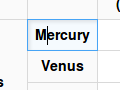
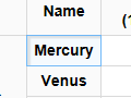
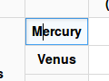
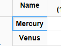
Below is a comparison of a highlighting solutions on different browsers:
- Current:
Chrome | Firefox | Edge
-----------|-----------|-------
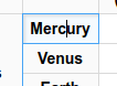 |
|  |
| 
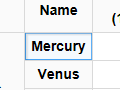
- Using
box-shadow:
Chrome | Firefox | Edge
-----------|-----------|-------
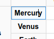 |
|  |
| 
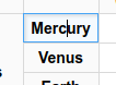
- Using
outline:
Chrome | Firefox | Edge
-----------|-----------|-------
 |
|  |
| 
From the above:
- The current solution is broken on Chrome - no go.
- The
box-shadowsolution is slightly worse (on Edge) from others and doesn't look so nice (also the upper shadow sometimes get lost on Edge). - Looks nice everywhere IMHO.
I'd go with @dtwist solution:
.ck-widget.table {
    & td,
    & th {
        &.ck-editor__nested-editable.ck-editor__nested-editable_focused {
            border-style: none;
            outline: 1px solid var(--ck-color-focus-border);
            outline-offset: -1px; /* progressive enhancement - no IE support */
        }
    }
}
@oleq & @dkonopka Let me know if you wish to change the background as well.
jodator
on 21 Jun 2018
The solution is not perfect because there's often a border next to the outline but it definitely looks better than it used to.
 oleq
on 29 Jun 2018
oleq
on 29 Jun 2018
Related issues
 hamenon
·
3Comments
hamenon
·
3Comments
 wwalc
·
3Comments
wwalc
·
3Comments
 MansoorJafari
·
3Comments
oleq
·
3Comments
MansoorJafari
·
3Comments
oleq
·
3Comments
 pjasiun
·
3Comments
pjasiun
·
3Comments
Most helpful comment
To reiterate an earlier comment on this:
Use outline instead of border:
https://codepen.io/david-twist/pen/NMQOwO?editors=1000
[edited example style to align with the design intent of current approach— I added a background color and subtle inner shadow, as I think it helps with comprehension]